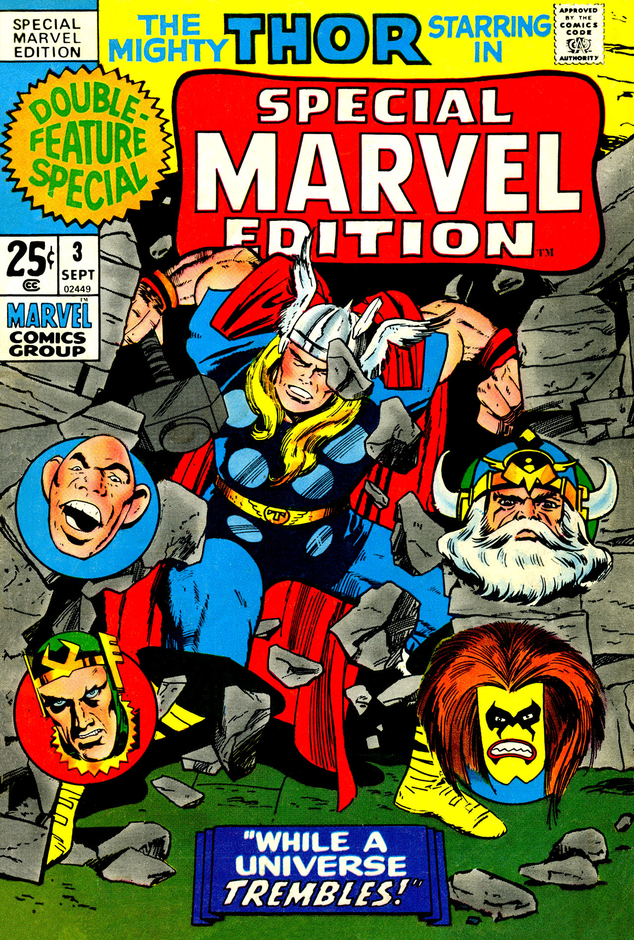


One of the calculations that I had to make whenever I found myself in a place like the Batcave, the South Shore Mall-located comic book shop, was how to make the most of my meager funds. The Batcave had a huge selection of back issues, but even though many of them were more well-worn reading copies that were priced to move, I only had so much coin to work with. And so I tended to gravitate to the early Marvel reprint titles, which were double-sized. As reprints, they were priced affordably (reprints not having any intrinsic collectability factor, at least among the fans of that time) and given their package size, they provided twice as much bang for the buck. I suspect the fact that I’d never even heard of a series called SPECIAL MARVEL EDITION was responsible for me picking up this issue on that outing, as I wasn’t especially a Thor fan. But it was something new to me, and that made it attractive.
For the first two decades of its existence, Marvel maintained a robust reprint program. As the growing conceit of the Marvel universe was that all of the stories took place within the same shared continuum, it was therefore important for newcomers to be able to catch up with what had already transpired. Plus, it was an easy way to extend the line and command additional rack space in a competitive marketplace without any A & E costs. During this time, creators weren’t recompensed when their work was reprinted–an awful situation for them, but a gold mine for Marvel. Reprint books never sold especially strongly, but with the lower ceiling to profitability, they made up a considerable portion of Marvel’s publishing plans. SPECIAL MARVEL EDITION began in 1971 as a vehicle to continue to reprint Thor stories, which had prior to this filled the back pages of MARVEL TALES. The three stories in this issue were all from JOURNEY INTO MYSTERY right before the book officially changed its title to THOR. And in fact, I had experienced a stripped-down version of these stories before, on the 1966 MARVEL SUPER-HEROES cartoon series.
This was the period in which Marvel fully embraced serialized storytelling, having found success with it particularly in AMAZING SPIDER-MAN. So the three issues reprinted here all kind of flow seamlessly into one another, rather than presenting themselves as a trio of discrete units. Jack Kirby was driving events as the primary plotter and illustrator, and had been mixing more and more of the mythological aspects of the strip’s Tales of Asgard back-ups into the main narrative, creating a more complex tapestry for the Thunder God. In the first story, Loki’s pawn the Absorbing Man has found his way to Asgard, where he challenges Odin for supremacy. Not his or Loki’s best idea as it turns out, since Odin dispatches the pair of them relatively effortlessly, exiling them to deep space. For Thor’s part, he’s been blackmailed into also bringing reporter Harris Hobbs to Asgard, but the overwhelmed newsman find his cameras destroyed and returns to Earth without any evidence of his journey to the fanciful realm. Oh, and off in an “Asian Jungle” that appears to be in Viet Nam, a local Witch Doctor comes into possession of the mystic Norn Stone that Loki had discarded issues prior to this, and is empowered into a might Demon. Kirby packed a lot into 16 pages.
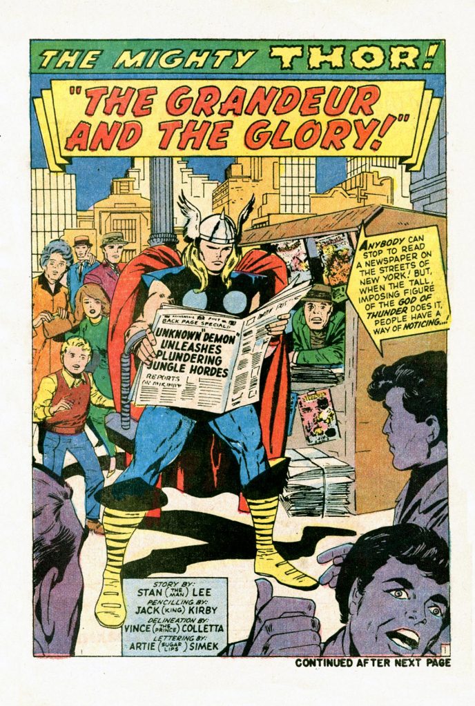
By the second story, the Demon’s activities in routing the invading Communist forces have caught the Thunder God’s attention. But Thor has bigger problems involving his love life. His beloved Jane Foster had been held captive by Harris Hobbs as part of the reporter’s scheme to get Thor to take him to Asgard, and even now, she’s traumatized by the event and doesn’t understand the connection between herself and the Thunder God. In defiance of Odin’s regal command, Doctor Don Blake chooses to reveal the truth to Jane, transforming into Thor right in front of her. This is a pretty big status quo change for the strip, as Jane’s memory doesn’t get erased again nor is some trick later used to indicate that Blake was just faking, as might have happened in a Superman story of this period. When he finds out what his son has done in defiance of his edict, Odin hits the roof. Meanwhile, in Olympus, home of the Greco-Roman Gods, a bored and restless Hercules is dispatched to the world of Man by his father Zeus, to get him out of his hair.
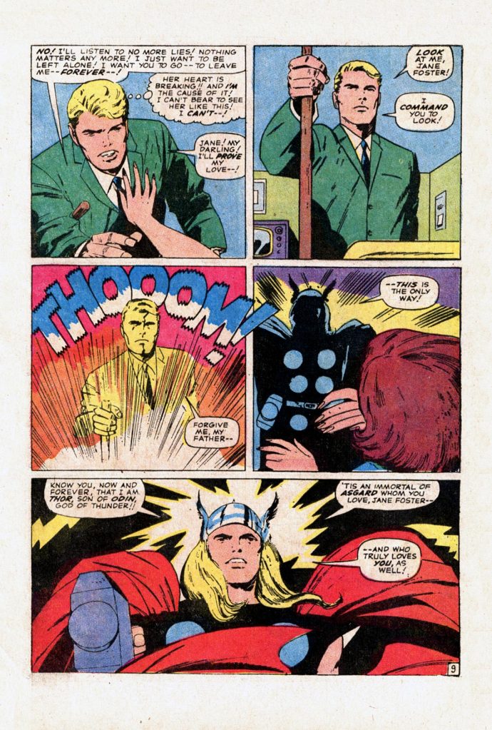
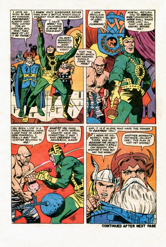
By the end of the issue, having heard further reports about the Demon’s rampage, Thor realizes that he’s got no choice but to intercede, even though he promised Jane that he’d stick around. By the story’s end, Thor and the Demon prepare to engage in one-on-one combat. It’s worth talking about the inking of Vince Colletta at this point, I think. I never cared for it, even before becoming aware of the many time-saving shortcuts he routinely took. But there are others who like Vinnie’s work, especially on THOR where his thin linework gave the strip a sort of flavor of antiquity, like an old wood carving or something. To me, Colletta’s work over Kirby always felt rushed and unfinished, like he was doing the bare minimum to get by. And indeed, he sometimes was. This page is a good example. It’s powerful and dramatic, but that comes from Kirby’s compositions and layouts. The blacks all feel raggedy and the ting lines rob the power of the effects. Plus, every panel looks just a little bit empty, as backgrounds are reduced to a bare minimum.
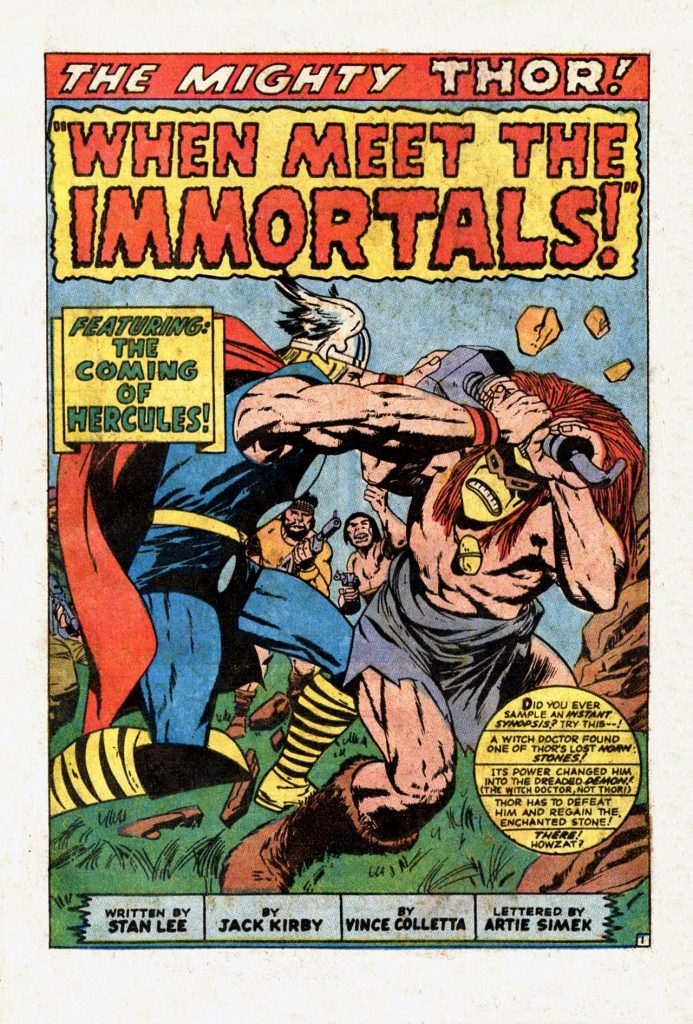
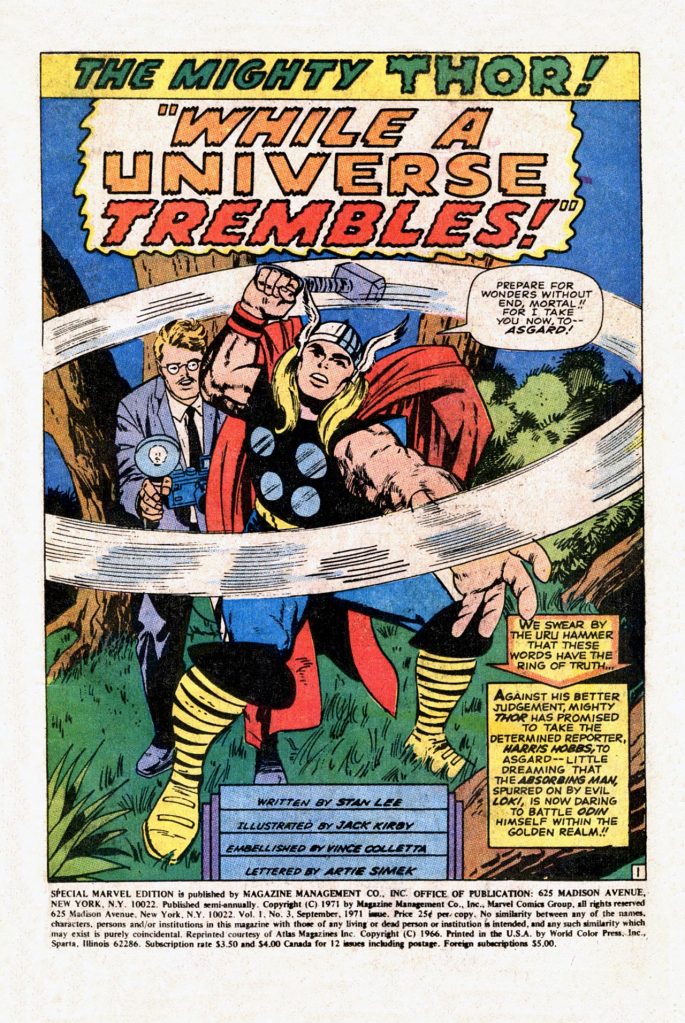
As we moved into the third story in the issue, Kirby once again covered a whole bunch of ground. Thor battled the demon, defeating the Witch Doctor and reclaiming the lost Norn Stone that made him a threat in the first place. But when he attempts to convey the lost Stone back to Odin, his father flips out on him for having divulged his secret, banning him from ever returning to Earth. So Thor has to fight his way through the entire Asgardian army to reach the Rainbow Bridge and escape–which he, being the hero, of course does. Meanwhile, on Earth, Hercules wastes no time in establishing his bona fides, despite being more egotistical and arrogant that Thor. He winds up having eyes of Jane Foster, who must somehow be catnip to ancient Gods. Thus, after Thor had battled his way back to her side through the worst Odin and Asgard can dish out, he’s shocked to see Jane sharing a soda with another God. Cuckolded, Thor decides that the right thing to do at this point is to feed Hercules his hammer, which he prepares to do as the story is To Be Continued! For some reason, the credits on this splash page were trimmed down by a line, so that Kirby and Colletta weren’t specifically credited with anything in particular. Oops.
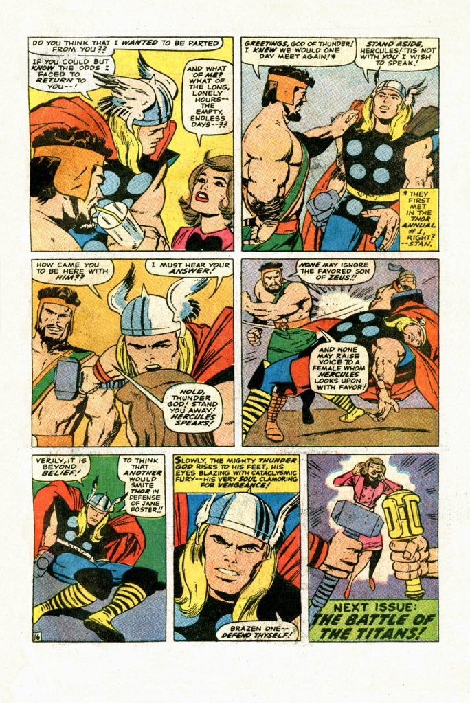
On top of the fact that Kirby keeps events moving, layering subplots on top of plot so that there’s always something interesting going on, scripter and editor Stan Lee was beginning to embrace the more formalized pseudo-Shakespearian language that he’d use for Thor and his coterie of characters. You can tell that Lee is having a lot of fun coming up with such declarations for his Asgardian players. He and Kirby are also good at this point in contrasting the fantasy concerns of Asgard with the mundane goings-on of contemporary Earth. I think it was this balance that helped to make THOR feel like a relevant super hero series. it also doesn’t hurt that, when you strip all of the godly paint off of it, the story is about a guy whose father wants him to take over the family business and doesn’t like the girl his son is dating. Those very elemental character conflicts resonated with the audience even when they couldn’t necessarily connect to Asgard’s goings-on proper.
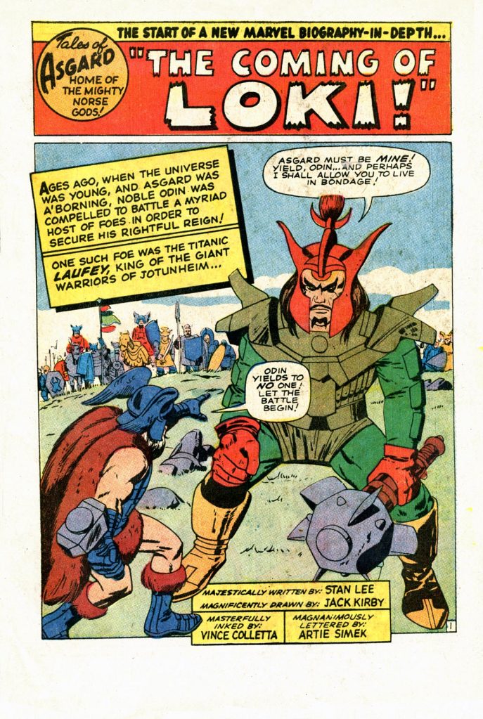
To fill out the back pages, a single Tales of Asgard story is reprinted, this one beginning the story of how Loki of the Storm Giants was adopted by Odin and became the God of Evil. Interestingly, in this story Kirby clearly depicts Odin as using what would one day be Thor’s enchanted hammer. But Lee ignores this detail entirely, possibly not agreeing with it. There would often be these disconnects between Kirby’s intentions and Lee’s preferences, and they’d occasionally make it into print as a discordant note in an otherwise entertaining story. Anyway, the story here is mostly an excuse for Kirby to cut loose with crazy battle visuals, but again here Colletta blunts their effectiveness by rendering them in a thin, dead line.
 The Tom Brevoort Experience
“He and Kirby are also good at this point in contrasting the fantasy concerns of Asgard with the mundane goings-on of contemporary Earth.”
There’s a letter in a late-1960s issue of Sub-Mariner where whoever answered them said that whenever Thor or Namor spent too much time (respectively) in Asgard or Atlantis without some mortal connection, sales dipped
LikeLiked by 2 people
I completely agree with the need for both heroes to make the connection with our more mundane world. It’s not a coincidence that I didn’t start collecting Thor as a kid until Gerry Conway brought him back to Earth after dealing with something called the Black Stars and that I finally dropped the series a few years later when Len Wein sent him off on a quest to find Odin.
LikeLiked by 1 person
i want to say it was matt fraction who stated- “thor’s biggest villain in the early days wasn’t loki or surtur or the destroyer, it was vince colletta”
and i agree
(apologies if the credit to fraction is incorrect, all credit to whoever did say that then…)
LikeLike
I don’t know if Jack Kirby left Loki’s father’s “name” for Stan Lee to use or if Stan Lee was the one who mistakenly gave Loki’s mythological mother’s name Laufey ( The Leafy One/Full of Leaves:; she is also known as Nal (Needle ) ) to his father ( whose name in mythology is Farbauti which means Dangerous Hitter/Striker, Sudden-Striker, Anger-Striker -Wikipedia and Google AI ), but I would like to know how he ended up with the wrong name.
LikeLike
Did Harris Hobbs ever face justice for taking Jane Foster captive? He is one unethical reporter. Stan might not for some reason want Odin to be the earlier wielder of Mjolnir but a writer in this century had Odin using it as a member of the Prehistoric Avengers ( 1,000,000 B.C. ).
LikeLiked by 1 person
Jason Aaron had Odin using it in that “pre-historic Avengers” line-up. Made sense to me, but that was a few years ago, I didn’t know Odin was shown using it before Thor way back in the Silver Age/early 1960’s. (Was that still the Silver Age?)
LikeLiked by 1 person
“Laufey” is in fact a name still in common use among Icelandic women. See https://en.wikipedia.org/wiki/Laufey, which lists no fewer than five notable women with the name.
LikeLike
I been meaning to bring this up, but as far as I know Jane Foster is Marvel’s only Lois Lane/Carol Farris: Meaning Jane wanted to be Mrs. Thor like Lois wanted to be Mrs. Superman and Carol Farris wanted to be Mrs. Green Lantern back then. Pepper Potts never wanted to be Mrs. Iron Man ( Only his alter-ego Tony Stark ), Betty Ross never wanted to be Mrs. Hulk ( Only his alter-ego Bruce Banner even after she found out he was the Hulk ), Karen Page never wanted to be Mrs. Daredevil, None of Peter Parker’s girlfriends wanted to be Mrs. Spider-Man.
LikeLike
I’ve always loved Collettta’s work on Kirby. Alex Toth always advised in comics art, to get rid of ALL non-essential clutter, to SIMPLIFY. C C Beck was also of this philosophy. These reprints were my first exposure to Kirby, and I LOVE them. Other inkers just feel WRONG to me.
Just an opinion, and I totally understand why others may find me to be, well, off my nut. (?)
LikeLiked by 2 people
I get where you’re coming from. The book that got me started on collecting comics was Iron Man #45, inked by Vince Colletta. It was he and George Tuska’s art that led me to seeking out that next issue.
There are certainly examples that support the harsh criticisms of Colletta’s inks. But there are also ones where his style worked.
LikeLiked by 1 person
Stylistically I don’t mind Colletta’s inks on Kirby. I prefer the lush look that a Sinnott or Wood gives Kirby, but Kirby’s work is still appealing with a rougher ink line. Where I jump off the Colletta train is when the inks look incomplete and inconsistent… like FF annual 3.
He was a terrible fit on Gene Colan … but he generally fit pretty well when inking Tuska or Don Heck in the 70’s. I think by the time the 80’s rolled around though that Colletta’s “lack of slick” was a much tougher pill to swallow.
LikeLiked by 3 people
I can’t think of an issue where Colletta inked Colan, but I’m not sure I want to know either. That does not seem like a good combo at all. I’m also in agreement that there are certainly better inkers for Kirby. And, oh my goodness. You had to mention FF Annual 3. That was bad. Horrendous and/or painful are also terms that come to mind.
LikeLiked by 2 people
There is good and bad in all approaches. Good minimalism is Toth. Bad minimalism is Colletta. With Toth, less is more. With Colletta, less is just less.
LikeLiked by 3 people
Alex Toth had that ability to know what was and wasn’t needed to convey an image. There was a reason he designed so many cartoon characters for Hanna Barbera for all those years
LikeLiked by 1 person
And when you have Toth and Colleta combined the result is… The X-Men #12. A very important issue for introducing the Juggernaut but the art is… well, is something.
LikeLike
I guess it was underwhelming because I have zero specific recall. Before Cockrum, Roth was my X-Men artist. Looking back, his strengths and style kinda made him Marvel’s Curt Swan.
LikeLiked by 1 person
Well said. But he met those deadlines. 😉 Maybe “deadline” describes his inking, too. I think Tom used it above.
LikeLiked by 1 person
According to his Wikipedia Vincent Colletta didn’t have fans among some of the people he worked with: Joe Sinnott told author Marc Flores. who writes under the pen name ronin Ro, “when I penciled the romance stories, I used to tell myself, Vince wrecked what I did….He would eliminate people from the strip and use silhouettes, everything to cut corners and make the work easier for himself”. Writer Len Wein told an interviewer what he enjoyed most about working on Luke Cage was, :Getting to work with the wonderful George Tuska, before Vinnie Colletta got his hands on the pencils and ruined them”. Colletta was reassigned from inking The Tomb of Dracula when publisher Stan Lee determined Colletta had taken unacceptable shortcuts on issue #9. Gene Colan, penciler on the series (and on several earlier projects inked by Colletta ), remarked many years later that “when he wanted to he could do very good work, but he didn’t take his time with my stuff.” Plus more non-fans and he did have admirers too.
LikeLiked by 1 person
This was the high water mark for the Thor series under Kirby, IMHO. The serial nature of the soap opera, the high drama and the faux-Shakespearian language all combined to make a special allure. I don’t even mind Vinnie C’s inking on these books, cause it feels right to me. Much better than Syd Shores or Bill Everett. One month I was surprised to see Marvel ship two separate titles containing a Thor reprint of the return of the Grey Gargoyle, and bought a copy of each of them as they arrived on the spinner rack in my small town. Turns out it was completely my error, as I discovered it was simply one store that held back the book and magazines from being put out on time, and for some reason, I thought one was a Thor Annual and the other was a marvel Special Edition. Turns out it was the same exact book. Ah, memories…
LikeLiked by 1 person
Nice scans. Still using a scanner from 1999?
LikeLike
Feel free to donate a new one. 😉
LikeLiked by 1 person
Those Colletta inks hurt my eyes. Look at the photostats of Kirby’s pencils. Kirby did not use sketchy hatch lines. He did not use feathering. His line work was not tentative or hesitant. Colletta just completely misrepresented what Kirby put down on the page. The only person worse was whoever redrew all of Kirby’s Superman and Jimmy Olsen faces (Murphy Anderson?) at DC.
Mike Royer was Kirby’s best inker because he emphasized the bold, graphic, stylized nature of his drawings. Once Royer took over, those Fourth World images just sprung to life. Joe Sinnott was probably my second favorite Kirby inker.
LikeLiked by 2 people
I disdained these reprint packages as a back-issue buyer — I wanted the real thing, especially once I discovered somewhere that the reprint stories sometimes cut pages. But I also had the advantage that the back issues were cheaper when I started buying, I probably had more spending money (due to my ruthlessly-efficient paperboy activities), and on top of that my friend David Nickles had lengthy runs of various Marvel series that I could read through. So I wanted my own copies, and was buying them up pretty fast — but I wasn’t in the dark if I didn’t own the books yet.
This era of THOR was absolutely cooking — there was so much going on, in multiple locations, featuring so many characters. It was like, every time Kirby needed a break in the action, he’d cut to another plot line, and if there wasn’t one handy, he’d start another one up. This really felt to me like the Marvel Universe was a dynamic place, where there was always something going on, and things never quite returned to the status quo. And so, in the books where there wasn’t as much popping, it still felt like there could be — that around any corner might be another story that could impinge on the characters’ lives.
LikeLiked by 2 people
hi Kurt – a fan of your work! Like you, I got a paper route in the mid 70’s when old comics were still kinda affordable – including (almost) the entire run of Kirby’s Journey Into Mystery/Thor. Alas, my collection was assembled in dribs & drabs, so never got to read these great stories in order. They (along with a sizable Silver/Bronze collection) now sit in long boxes stored far away, and I’m finally contemplating selling them. I guess there are reprint collections out there, but it’s not the same…
LikeLike
I think it was Joe Quesada who said John Romita, Jr’s Kirby-esque drawing looked carved from granite. i think it was in reference to JR, Jr taking over Thor in the 2000’s, with Dan Jurgens writing, and the great Klaus Janson inking. Klaus could give drawing hard edge, but with all those inks is was more like wet stone. 😉 And I think that something similar could said about Vin Colletta’s inking. Tom said it’d been compared to wood etchings. And though Kirby’s smoother, polished imagery is lost, the power and dynamics of his figures remained, despite the sand-blasted finishes. One of those combinations that creates something different than each on its own.
Colletta’s rough impact was worse on more delicate drawings, that couldn’t withstand his “minimalist” approach. I’d imagine Cury Swan’s drawings would look like granular dotted lines under Vin’s inks. I’d hate to’ve seen him try to ink Michael Golden. Or Gene Colan, as somebody mentioned. Definitely not Alan Davis. Egads. Though vin was likely close to retirement by then.
But comics has always been a “bidness” first. And I’ve read that Vin was a fast workhorse. If a job was running late, he’d bang it out quicker than most anyone else. As Alan Moore said about Marvel, they kept the trains running on time. It’s partly we spoiled fans, who want what we want when we want it, but still at the highest quality.
And hen I think of Adam Hughes in “Amazing Heroes”, on Brian Bolland’s late “Camelot 3000”. When an issue came out almost a year late, everyone still drooled over the exquisite linework. Adam went on to say, then look at an inferior art job, and try saying, “This is awful, but I’m sure glad it came out on time.” 😉 Years after “Camelot 3000”, or any other beloved art job, most people reconcile that it was worth the wait.
I really wish the colorists had been credited back then. I’d be interested in knowing who worked on those books. Did they exit the profession soon after credits were given? I imagine some of the colorists who we knew from the early-mid 1970’s (and eve later) credits had worked on some of the 1960’s comics. I love the light blue streaks on Thor’s shiny helmet.
Thor still looks good here. Bottom panel, page 9, there’s a bit of “Prince Valiant” in the face. It’s a testament to Kirby that the power and grandeur broke through the rougher hewn finishes. I can’t think od another artist’s work that’s strong enough to endure Colletta’s chisel. 😉
LikeLiked by 2 people
Your point hits the “yin and yang” of being a long time comic book collector. I recall being crabby whenever I’d see a reprint pop up in one of my favorite titles back in the 70’s. But I’d also grumble when I see an issue where the art was clearly rushed. But then jump forward a few decades where I’m patiently waiting months the next Planetary with John Cassidy’s exquisite art or what seems an eternity for Bryan Hitch’s gorgeous art on the Ultimates. By that time, it was understood that few top notch artists not named JR JR could keep up with a monthly schedule.
And yeah, I fondly recall the Jurgens-Romita Jr-Janson Thor. I didn’t know that JR Jr had that inner Kirby, but he certainly called it out on that series.
LikeLiked by 2 people
The reason Camelot 3000 and other upscale projects were treated differently than the newsprint titles was because they had different printers who had different policies re: scheduling and billing.
Newsprint titles were generally printed at World Color Press in Illinois. The printing reservation was made a good while in advance of the material being delivered. If the publisher didn’t meet the reservation deadline, WCP would charge penalties. As such, there was an immediate financial incentive for the publisher staying on schedule, and speed artisans like Colletta would be very much in demand.
As I recall, the more upscale books of the time were printed at Ronalds in Montreal. I believe the policy there was that a printing reservation couldn’t be made until the material was delivered. There were no printer penalties for the publisher not staying on schedule. As such, deadlines were more flexible at the editorial stage. As can be expected, and as we all remember, the upscale books were far less concerned about keeping to announced release dates.
Incidentally, both Ronalds and WCP were eventually bought out by Quebecor. Ronalds was acquired in 1988. WCP was acquired in 1999.
LikeLiked by 1 person
I read these stories in Marvel Masterworks Vol. 52, but even after looking them over I only vaguely remember them. I really started enjoying the early Thor stories when they started bringing more and more of Asgard into the main strip. I also really enjoyed the Tales of Asgard backup stories, sometime even more than the main story. As I’ve said before, I’m not a fan of Kirby’s art, but, I think his style works extermely will for Asgard and the Norse gods.
LikeLiked by 1 person
OMG, Cassaday’s “Planetary”! Another comics pro great (and by many accounts a good dude), gone far, far too soon. 😦
Hitch definitely hit a high mark on “The Ultimates”. He stepped away from his “Alan Davis homage” style into his own.
There were hints of Kirby in JR, Jr, but I think it really became more obvious when he drew that pretty cool “Amalgam” from DC & Marvel, “Thorion of the New Asgods”. It was a whole friggin’ “Easter basket” of “eggs”. Combining Odin All-Father and Highfather; Lok’de’Saad; Baldar Lightray; and THANOSEID! Digitally inked by the colorist, Lovern Kindzierski? (Digital Chameleon?)? I forget, and I’ve sold off almost all my old comics, so I can’t check.
I remember reading where then editor Bob Harras (or maybe Ralph Macchio?) noted that JR, Jr would be ideal for the Thor relaunch in 1998. And JR, JR himself referenced the “Thorion” job as peaking his interest, and wanting to do more with Thor after getting to draw that fusion of Thor and Orion.
LikeLiked by 2 people
I’d forgotten all about Thorian. What a remarkable and absolutely fun comic! So many neat eggs planted throughout it! You’re making me regret having sold my collection as well. And yes, it was that book that landed JR JR the job on Thor when it relaunched in 1997.
LikeLiked by 1 person
I usually like Colletta on Kirby. This time it was indeed awful.
LikeLiked by 2 people
Replying here to your above comment about the X-men’s Werner Roth being Marvel’s Curt Swan. I always thought Roth’s X-men were solid comics. He was a good fit for the material.
LikeLike
It was meant as a serious compliment to Roth. His action was solid but his skills with the mundane parts are what elevated him in my eyes.
LikeLike
I figured as such.
LikeLiked by 1 person
Am I the only one who thinks the face of the Demon who Thor fights in this issue looks like one of those inflatable car dealership guys with the long wavy arms?
*Ahem!* There was an interview with Vince Colletta conducted by Jim Shooter that appeared in Marvel’s Bullpen Bulletins page some time in the early 1980s. I recently came across it. Honestly, it sort of made me laugh, because Colletta actually states:
“I think the inker should follow the penciler’s style and try to make it come through. A lot of inkers these days overpower the pencils, though.”
I mean, Colletta just described himself to a tee right there. Way too many of his inking jobs had him overwhelming the styles of a variety of pencilers.
Okay, I will concede that his characteristic thin, feathery line did fit the mythological material of the Thor series, but he still could have done a better job. I know Colletta was fast. The thing is, so was Joe Sinnott, but he never let the quality of his work suffer.
LikeLiked by 1 person
I remember that interview! The perfect example of the pot calling the kettle black! Thanks for unearthing that BB! (Gonna have to read it again later.)
LikeLiked by 1 person