One of the many things that fascinates me about the history of comics is the manner in which these stories and characters were exported around the world–the mad, slapdash, haphazard manner in which the Marvel super heroes made their way across the globe. It was typical that color guides might not be provided, resulting in some of the oddest color choices imaginable on otherwise-recognizable characters. Often, a local artist might be commissioned to do a new cover more appealing to the sensibilities of the territory in which these stories now found themselves. And occasionally, artwork was sent from stats shot before all of the eventual changes and corrections were made to it. It’s all pretty interesting stuff, at least to me. So here is a number of different international editions featuring the various Marvel characters. I’ve got lots more in my files, and will continue to share them should this prove to be popular.
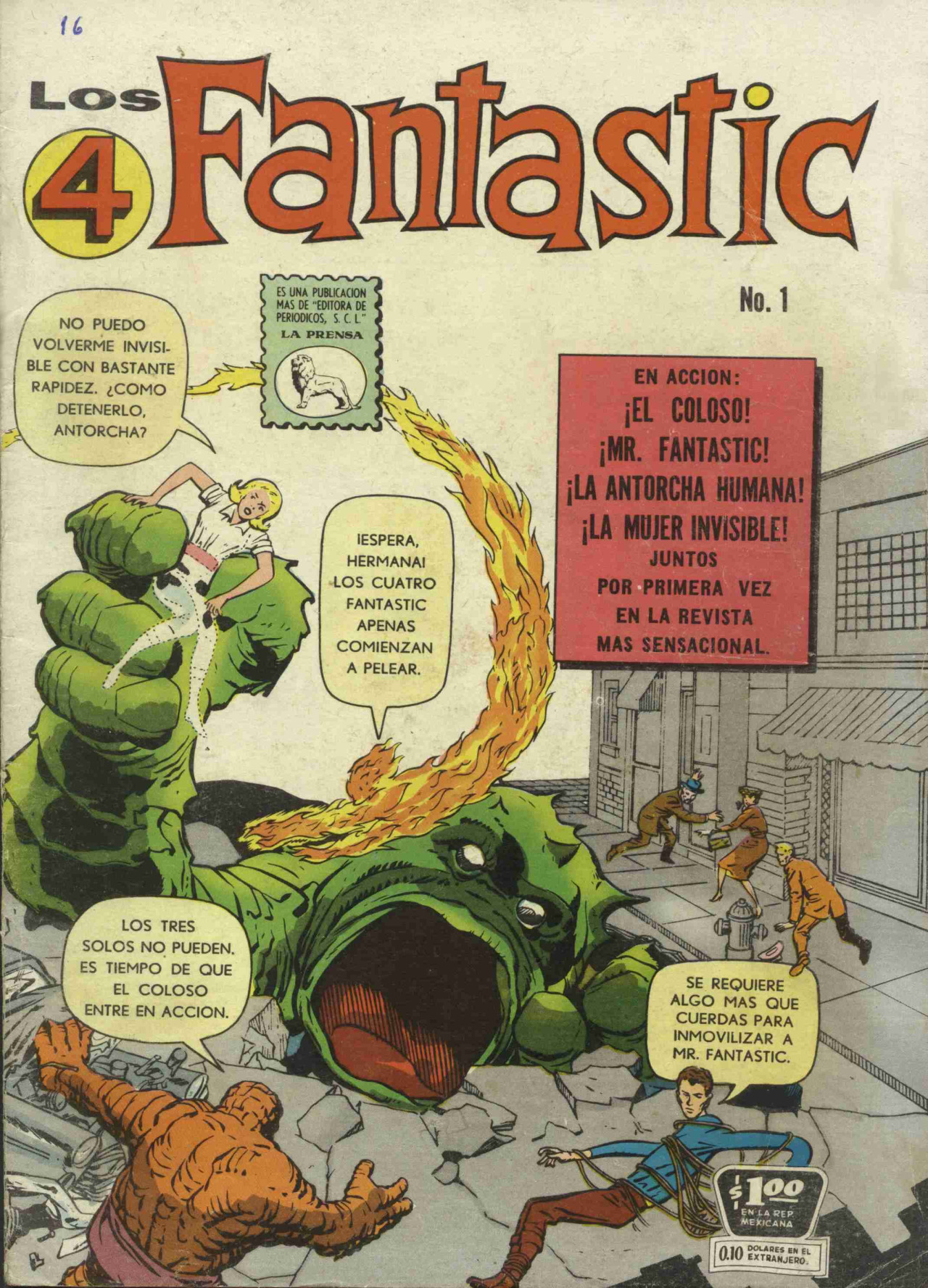
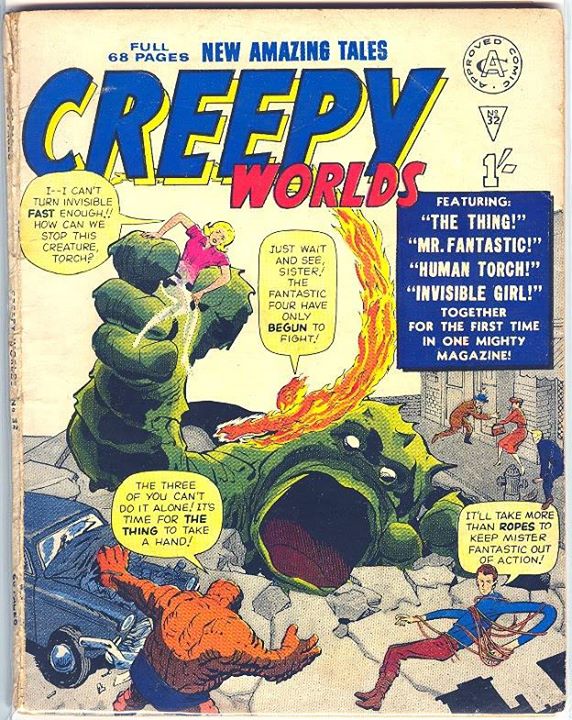
I always like to start with the Fantastic Four. Here are two printings of FANTASTIC FOUR #1–the first as a feature in a United Kingdom black and white edition of CREEPY WORLDS by publisher Alan Class, and the second a Mexican edition of LOS 4 FANTASTIC. What’s interesting here is that, in order to match their publishing dimensions, the Alan Class version adds artwork to the left side of the cover, whereas the Mexican edition adds artwork to the right.
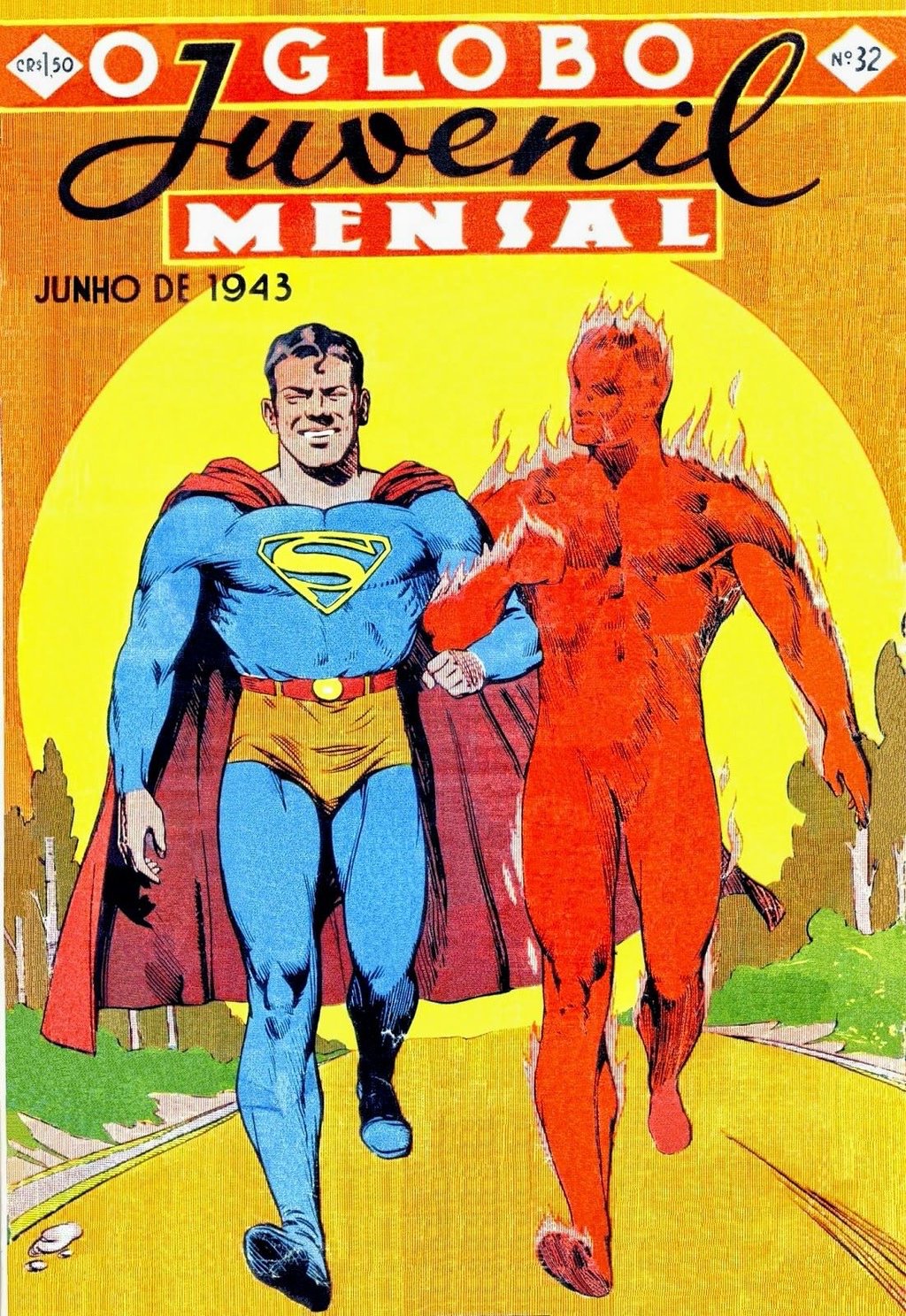
Here’s a Brazilian edition from 1943 where a local artist swiped and doctored a Superman cover to put him arm-in-arm with the Human Torch, a strange pairing to be sure. The Torch hasn’t even bothered to extinguish his arm–good thing that the Man of Steel is impervious to pain!
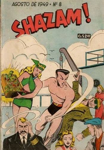
And in another bit of international crossing over, here’s the Sub-Mariner and Namora appearing in an issue of SHAZAM!, also from Brazil. The magazine more typically reprinted stories featuring the golden age Captain Marvel and his Family.
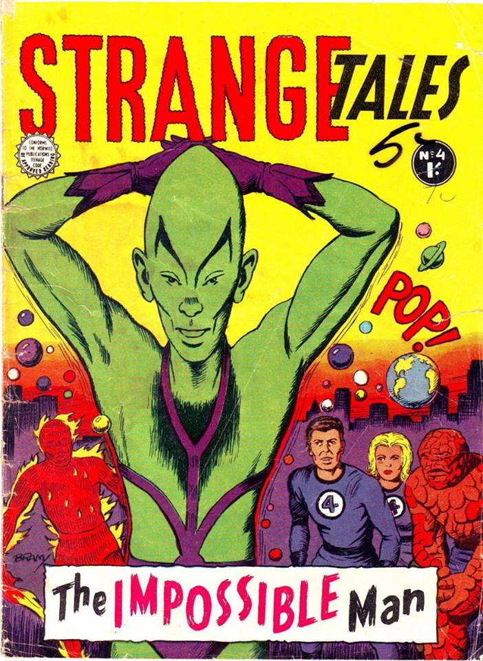
There’s something really weird and off-putting about the manner in which te Impossible Man is posing on this new domestic cover for a STRANGE TALES issue reprinting FANTASTIC FOUR #11. He looks like he thinks he’s in a deodorant commercial or something.
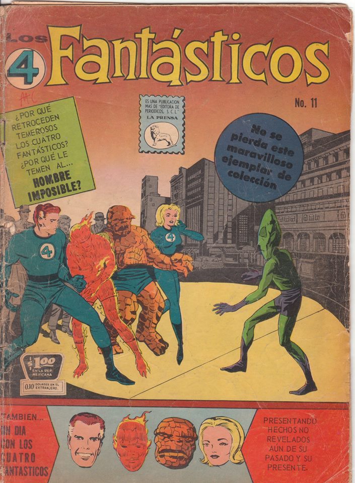
Here’s the same story in Mexico, using the American cover–but in this case, it’s the version from before corrections were made to Sue’s hair and legs.
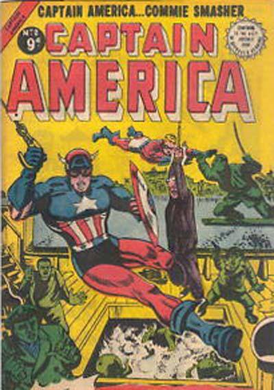
This 1954 UK edition of CAPTAIN AMERICA chooses interesting color schemes for Cap and Bucky. I’m particularly fascinated by the fact that they interpreted Cap as having a short-sleeved shirt.
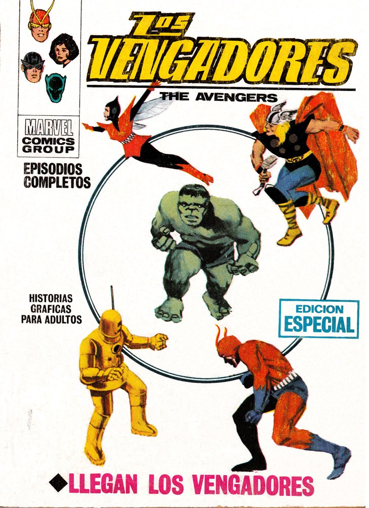
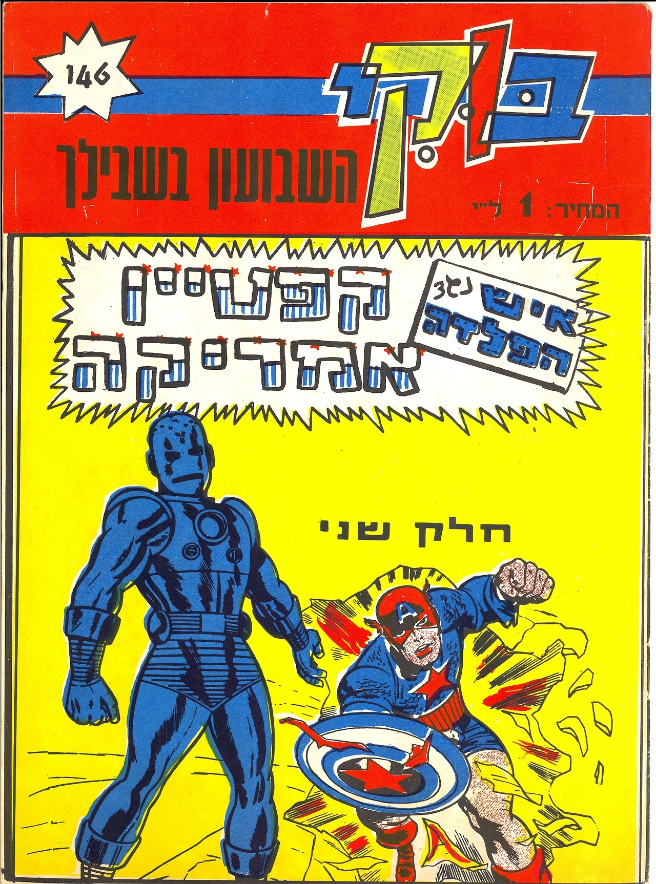
The second issue of AVENGERS, with new cover artwork painted locally. In this case, the artist was swiping from several figures in the story and on the original cover.

This issue of the British weekly FANTASTIC used the original cover artwork, but because they had chosen to run this story out of sequence and after the subsequent issue in which Iron Man had gotten new armor, they had the Iron Man figure redrawn and updated.
And we’ll end on a pair of ghastly coloring jobs. Not only is much of the detail missing from this TALES OF SUSPENSE cover, but the colors have been applied to the Captain America figure haphazardly (dig his bare legs this time!) and Iron Man is all blue–which, I suppose, is a fair choice for a man dressed in armor if you don’t have other color reference.

And an extremely ugly version of X-MEN #1 from the Australian publisher Newton. The coloring on the covers of the Newton editions is especially frightful, and there doesn’t seem to be any rhyme or reason to it. But if you look closely, it seems as tough somebody provided the publisher with reference of the X-Men’s later individual color schemes–so Marvel Girl is in green and yellow, Angel in yellow and red, and Cyclops in blue and yellow. Magneto, however, they just had to make up.

Interesting.
LikeLike
Is that stippling on Cap’s face, knuckles, and legs on the next to last cover supposed to be hair? Wild!
LikeLike
I love foreign reprints. I’m especially fond of the French titles from the 70s & 80s, often with beautifully painted original covers on glossy heavy cardstock. A typical book would include four complete stories, with a cover price not much higher than a standard American comic.
LikeLike
You’ve got to admit the Spanish cover artist (Rafael López Espí) was really good. He used a few wrong colors here and there, but he probably didn’t have many references (the interiors of those books are in B&W), and the composition and dramatism of the covers were usually pretty good.
Side note: I feel like Daniel Acuña has a fair influece in his style from those covers.
LikeLike
Both of those FF#1 covers use an alternate stat. The cover image of the original comic featured five pedestrians watching the street fight, and some signage on the building behind them. This commonly-reprinted version has only three people (one of them different) and no signage. That alternate version was widely used (including on the FF Marvel Milestones in 1991) until someone apparently realized the error and standardized on the correct version.
LikeLike
As with FF#1, this X-Men cover uses an early stat. The energy bolt (or whatever) from Jean’s head was removed, as was the hillside in the background. Marvel often used this early stat on reprints (again, on the Marvel Milestones book) before standardizing on the correct version
LikeLike