 Great Covers: FOREVER PEOPLE #3 and MISTER MIRACLE #3")
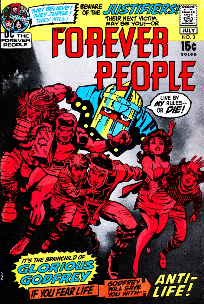
It must be said that Jack Kirby’s time at DC in the early 1970s was not without its difficulties. There are all sorts of theories for this, ranging from editorial fear to jealousy to a simple dislike for the King’s work among portions of the staff. What he was doing definitely didn’t fit in smoothly among the other DC titles of the era, and it seems a bit like there was some trial-and-error going on. This is apparent in some of the coloring choices on early issues of Kirby’s Fourth World titles. On a few of them, Kirby wanted to continue his experimentation with incorporating collage images as a background or environmental element, but almost uniformly, these printed like mud on the final covers–which seems amazing to me given the technical know-how of a bunch of people who were then around. DC’s team also didn’t seem to know how to approach coloring Kirby’s covers, which led to decisions such as this one. For whatever reason, the decision was made to knock out the heroes of the series, the titular Forever People, in a monochrome red and make the focal point the small background image of one of Darkseid’s Justifiers. For all that, it’s still not a terrible cover, and certainly you can see that Justifier from a room away. But I suspect that if you simply colored the Forever People representationally, the entire image would have more impact. The characters would pop off of the greys of the phot-background nicely, and the emphasis would be on the new heroes, as it must have been when Kirby penciled this piece. I will say, this was definitely unlike anything else that was then appearing on the stands, so there was some sort of ethos to going this route–but it’s one that I don’t find in the service of the image or the cover.
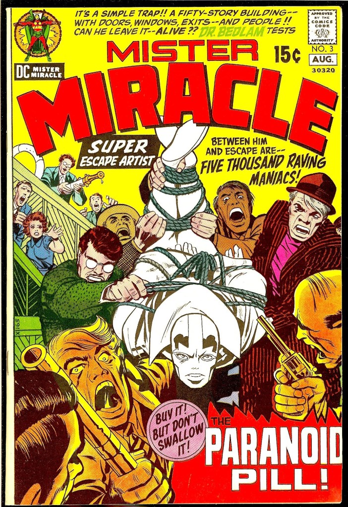
Speaking of baffling decisions along these lines, this one is another head-scratcher, one released at almost the same time. Most of this cover to MISTER MIRACLE #3 is colored normally, but for some reason the decision has been made to keep the titular hero in black and white. And again here, it pops, but sort of for the wrong reasons. And it works, but only because Kirby’s composition is so strong to begin with. But it’s another case of somehow trying to keep the attention and the emphasis off of Kirby’s new heroes. I can’t imagine anybody approaching the coloring of any Superman or Batman cover at DC in this manner in this era. It somehow reads like a mistake, like somebody forgot to color Mister Miracle.

That Mister Miracle #3 cover definitely looks like a mistake. It’s an odd mishmash of coloring technique… the small crowd in the background looks like normal comic book coloring, the foreground folks are done in an expressive style… and the two dudes in the middle have different builds for their heads and hands. The all white Mr. Miracle is a head scratcher…especially since all of the color builds that make up his costume are used throughout. Perhaps the hand-stripper at the printer messed up but someone at DC would surely have to sign off on a proof before printing.
LikeLike
“Mister Miracle” #3. Made me think of Mr. Knight from your current “Mook Knight” series.
LikeLike
Well, I can’t argue wit you this week, Tom!
That FOREVER PEOPLE cover is a head-scratcher. Maybe the PERCEIVED problem with the FP is that they were, as a group, SO colorful it was hard to have any focus when they were all on the cover, when really the answer should have been to embrace that psychedelic cacophony and just run with it. No one character would have popped, but the GROUP would have. Especially with that gray background. And then you throw the Justifier into an ominous red monochrome.
As for MISTER MIRACLE— I remember being very confused by that cover when it came out, myself— as if someone forgot to finish the job. And it would have been simple to color the crowd in very neutral colors and have Miracle’s naturally bright costume pop. That yellow background is a horrendous choice, since it almost instantly dictates you can’t color the hero in his primarily-yellow outfit! It’s almost as if the background was colored FIRST, and then they had to figure out how to make the rest work. Which probably didn’t happen, but you never know who might have said to the colorist “How ’bout a yellow cover? We haven’t done many of those lately!” Whatever the case, it’s unfortunate because there’s a really nice cover buried here.
LikeLike
I have generally disagreed with your assessment of the Marvel monochrome (or semi-monochrome) covers, but I agree on both of these.
And according to Mighty Mark Evanier, Kirby had no idea why they colored MISTER MIRACLE 3 that way either. He asked, but did not get what he though were clear answers, and ultimately figure they just screwed up.
LikeLiked by 1 person
I’m sure it’s my nostalgia for these issues, but I’ve always cottoned to both of them. I’m the rare fan of the Kirby-Colletta era on the Fourth World (not to say that Royer wasn’t the master inker when his turn came) and these covers really pop for me. They did the work from the chaotic madness of the spinner rack. I’m such a Fourth World sucker, it’s hard for me to not like it all regardless.
LikeLike
Forever People 3 was an amazing issue, making the Justifier cult a perfect allegory for fascists and authoritarians past or future (“Tell us Godfrey, tell us how our pride has been dragged in the dust!”).
It was foolish to give Godfrey superhypnotic powers post-Crisis because he’s much creepier when people make a voluntary choice to surrender to anti-life.
Which is not to dispute your post but it’s worth saying.
LikeLike
Paranoid pill. Mad Bomb.
Hmmmm…
LikeLike
They coloured in Mr Miracle for the collected reprint and the cover looks just fine, no clash with the yellow at all.
LikeLike