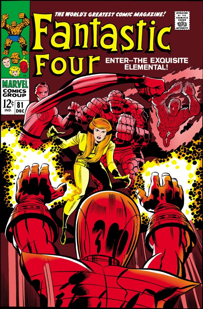
Here is another example of the phenomenon that we looked at last time: a perfectly fine cover image by Jack Kirby that has been deliberately colored in such a way as to render it unattractive and unappealing. As I said last time, going to this sort of monochromatic color scheme was a last ditch move that either editor Stan Lee or publisher Martin Goodman (I tend to believe that it was Martin) would demand when they felt that a cover was too confusing and lacked pop. As before, though, the choices here are a bit baffling. I get focusing on Crystal, but also just the energy from the Wizard’s gloves? And a deep brown background? (Has there ever been a truly great comic book cover with a brown background?) In fairness to Stan or Martin, it sure does pop–but it does so in a way that fights the image that Kirby has drawn. And it didn’t have to be this way.
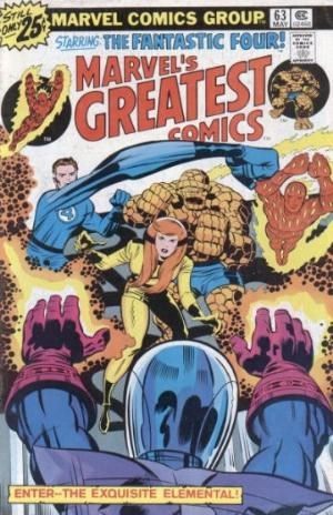
Ten years or so later, this same image was used when the story for this issue was reprinted in MARVEL’S GREATEST COMICS. Only here, it was colored representationally. And it all works fine. The characters pop, Crystal is still the focal point of the image, but the other elements are properly represented. And yeah, maybe it doesn’t pop quite as much as the earlier version, but it also puts the emphasis back onto Kirby’s image, as it should.

I love this cover, and think it’s much stronger than the MGC version.
Plus, this is, sentimentally, one of my all-time favorite FF issues.
LikeLiked by 4 people
I’m with you, Mr. Busiek. Regarding great brown covers – some of the best Batman covers were brown covers i.e. #244, #245, #253, Swamp Thing #7…
LikeLike
The original is colored best. No contest. Crystal being yellow is right where your eye is supposed to go.
I think these primarily red 60’s Marvel covers were generally pretty great….Xmen 17, 41, Ironman 13 to name a few. Less color is generally better.
LikeLiked by 1 person
X-MEN 17 is insanely good with just the red, white and black.
X-MEN 41 less so, but it’s hard to imagine anyone thought the line art was cluttered or confusing. IRON MAN 13’s pretty effective as well.
LikeLiked by 1 person
X-MEN #17 is an excellent cover, an instance where the monochrome really reinforces the drama and impact of the image. X-MEN #41, though, is a godawful mess where the image practically doesn’t matter. This sort of thing can and was done well, but almost as often, it was done poorly.
LikeLike
I’d argue that the Fantastic Four #50 is an example of a truly great (mostly) brown cover.
LikeLike
Not only do I love this cover— it’s the issue when I STARTED READING THE FF! This cover GRABBED me on the stands! This is a much more DRAMATIC coloring than the later version. THAT version I find flat and one-dimensional, because all the characters bleed into each other, tonally. Is your eye supposed to be attracted to the yellows? The blues? The oranges? It’s a mess.
Obviously we can agree to disagree, Tom, but if you pull out FF 87 as another “Bad Cover” I’m afraid we can no longer be friends. That’s another cover that stopped me in my tracks, even as a 10 year old, as something completely different from what I’d ever seen before. It was the most MOODY cover I’d ever seen!
LikeLike
Add me to the consensus. The “red cover” is waaaaay better!
LikeLike
The first one is fine, a classic using a muted colour pallet. The 2nd is much too busy. It looks like a Christmas decoration.
LikeLike
Here’s another vote for the original cover as being better. It’s just clearer in terms of telling a story. WHO is the “exquisite elemental”? The highlight-yellow makes it visually obvious, along with the glove energy giving a sense of immediate conflict. In the second version, it’s even plausible to think that’s referring to the Wizard, as he’s the one closest the viewer and attacking (which wouldn’t quite work if you know that “exquisite” as a description is typically gendered female, but some readers might not know that word at all).
LikeLike