

AMAZING SPIDER-MAN #186 represented something of a turning point for the character, as new writer Marv Wolfman began charting out the direction he wanted to take the wall-crawler’s life in next. Last issue saw Peter Parker graduate from college, which seemed monumental for a series so associated with that environment, and now he was ready to move forward into the next phase of his life. On the romantic front, Mary Jane had turned down his proposal of marriage and left New York, clearing the deck for new relationships to develop and blossom. And in this issue, another long-standing problem for the web-slinger was about to be reconciled. But we’ll get to that in a moment,

But the other big change was in the look of the artwork for the series. For the past several years, Ross Andru had been the artist-in-residence for AMAZING SPIDER-MAN, defining the look of the character throughout the 1970s. And his work hadn’t been to everybody’s taste. For all that Ross was excellent at depicting the city itself and creating insane forced perspective panoramas as Spider-Man swung through its canyons, his figures tended to be larger, more muscular and a bit stiff when it came to the hero himself. Ross’s Spidey was once described to me as looking like, “a little old man in a Spider-Man costume”, a description I’ve never forgotten. But now, there was a newcomer on the scene who brought a bit of classic energy to the series. This was Keith Pollard.

Pollard’s work has largely been forgotten by a lot of people, but he was a Marvel mainstay during this time. In fact, he pulled off the impressive hat trick of penciling FANTASTIC FOUR #200, AMAZING SPIDER-MAN #200 and THOR #300, all double-sized issues, during his run on each. You can tell that he was a bit tentative in this first outing–he swipes Steve Ditko Spider-Man figures all throughout the story. But Spidey hadn’t moved in that creepy Ditko manner in some years, and so seeing the wall-crawler contort in that manner here felt like a real return to form. I know that as a reader myself, I was knocked out by this issue and thought it looked great, way more kinetic and engaging than any recent issue of the book I had read. Today, I can appreciate Ross Andru’s strengths and skills a lot more, but at the time, this was a big step in the right direction in terms of what I wanted out of Spider-Man artwork.
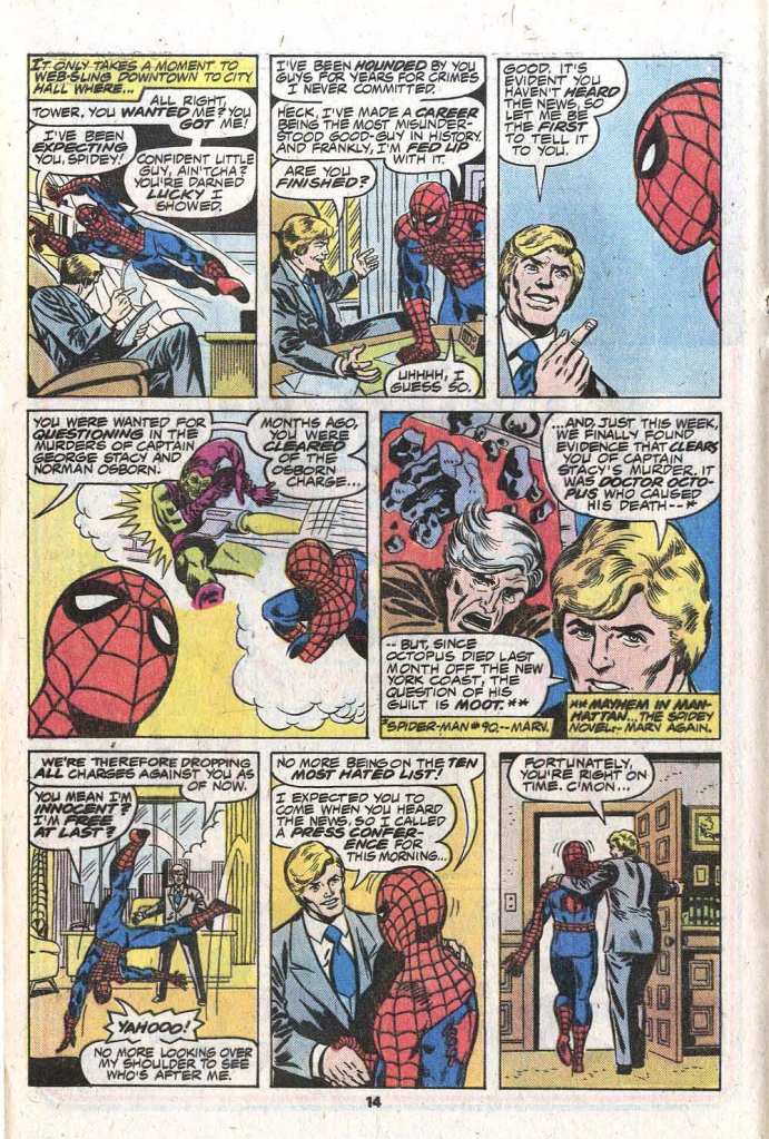
So getting back to that other sea change for the web-slinger, the issue opens with Spidey helping rescue people during a skyscraper fire–and fleeing when the cops arrive, because he’s still a wanted man. Aunt May’s still in the hospital and her Medicare is about to run out, so Peter is in even more desperate straits to raise some quick cash to pay for her treatments. And so, he goes to confront the District Attorney, to clear his name. When he arrives, D.A. Tower informs him that he’s been cleared in the matters of the deaths of Norman Osborn and George Stacy, and that all charges against him have been dropped. For the first time in close to a decade, Spidey is no longer wanted by the police! As Spidey tries to leave the D.A.’s office, he’s accosted by reporters who want to know what his next move is. Needing some time to get his bearings, he tells them that he’ll hold a press conference in Central Park that evening.
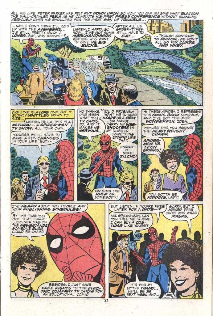
Marv Wolfman plays the press conference for laughs, even if a few of them are a bit inside baseball. He gets off a few cheap shots at the CBS Spider-Man television show as some producers approach him to be the subject of such a series. And Jenette Kahn, DC’s new publisher, puts in an appearance, offering to star Spidey in a comic book in which he’d battle Leon Spinks, a reference to the long-promised SUPERMAN VS MUHAMMAD ALI tabloid. (it looks to my eye like caricaturist supreme Marie Severin may have done some work on the Jenette faces here.) Spidey, though, has already given his comic book rights over to the Children’s Television Workshop for use on the ELECTRIC COMPANY show.
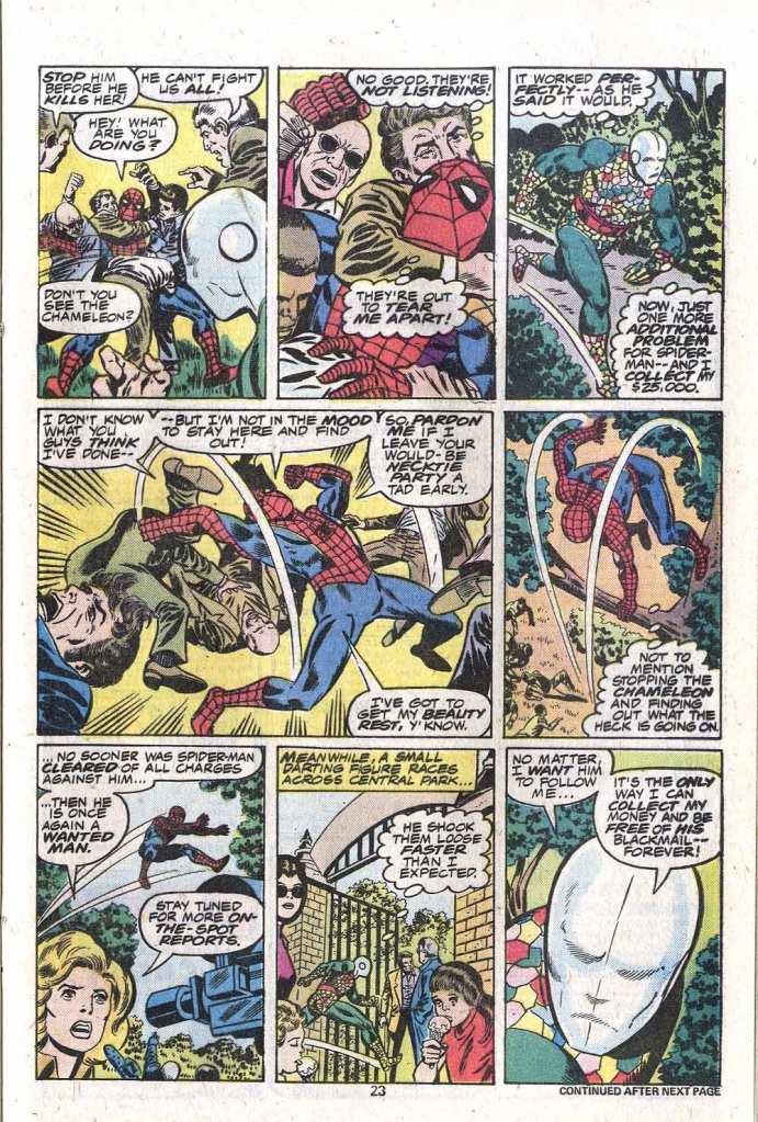
Of course, this being a Marvel comic book of the 1970s, we need to work in some big action before too long, and this comes in the form of Spidey’s old foe the Chameleon. He’d shown up earlier in the issue when he was one of the people the web-slinger saved from that burning building. But here, he’s got a new hologrammatic suit that can allow him to change his identity at a second’s notice. So when he shows up in Spidey’s line and reveals himself, the wall-crawler attacks–but to the gathered crowds, it looks as though he’s beating the hell out of an old woman. So the crowd, naturally, turns against the web-head, and Spidey needs to fight his way through them without injuring anybody, while pursuing the Chameleon through the park. You would think that Spidey could simply web up the Chameleon, but he never seems to do so here. It could be that the intent is that Spidey is out of expensive web-fluid, but that isn’t the way that Wolfman scripts these sequences, so I don’t know what was up with it all. Anyway, Spidey’s reputation is being soiled before the public once more.

In the end, though, Spider-Man is able to catch up with the Chameleon and clobber him, and unmask his shenanigans in front of the enraged mob. Flash Thompson is among them, and he comes out here in big support for his hero, encouraging the crowd to show Spidey how much they love him, and so the issue ends with the wall-crawler being cheered and carried on the shoulders of the citizenry, perhaps the first time in his publishing career that such a thing has happened. Meanwhile, the shadowy villain who hired the Chameleon to ruin Spidey’s press conference and his absolution continues to scheme. Who is he? Well, we’d find that out, but not for a number of issues yet.

This issue bugged me a lot.
Oner of the longest-running markers in the series, and it was dispensed with in a conversation. “Oh, that situation you’ve been trapped in for years? Never mind, it’s all over.” I wanted to see it resolved in a story, not just in a bureaucratic reassessment.
And it’s the lead hook on the cover, too!
Grr.
LikeLike
Esposito looks particularly good on Pollard here. I wouldn’t start reading Spiderman regularly for a few more issues but I loved the build up to the 200th issue, and Wolfman and Pollard’s work was pretty solid throughout. I particularly enjoyed Pollard on Ironman and FF. Met him once… very nice fellow. So accomplished and seemingly everywhere at one time, and then it’s like he disappeared.
LikeLike
Sadly, it looks like garden-variety Esposito to me. I understand he was a very nice guy and extremely dependable — and not just dependable on his own jobs, either. Apparently, at Marvel at the time, editors who gave the then-very-undependable Frank Giacoia work could know their deadlines would be met, because Esposito would finish any job Giacoia was late on. Still, for. all that, I just never liked his work.
On the Pollard front, I’ve often wondered how much the MASTER EDITION of the Marvel Handbook affected Pollard. It was a long stretch of work that was very easy (since it involved adding surface details to a set of standardized figures), very lucrative (since it paid well and probably paid nice royalties on top of it) and very much Not Comics. So it took up a big chunk of his time and was very nice to his bank account, but after it was over he had to adjust back to storytelling, which he was out of practice on, and to do it for less money on the usual tight deadlines.
It may be that the experience, profitable though it was, made it much harder to do regular comics thereafter.
Or, for all I know, it could have been something completely different.
LikeLike
Thanks for the feedback. I think Esposito could be pretty uneven depending on the penciller. He was generally solid on Andru. Likewise for me… he was not a favorite, but on this issue his inks look complete unlike his inking on other pencillers during this period.
I was aware that Pollard did the handbook (and he was a good fit) but what you say here makes sense as a possibility. It was a big gig.
LikeLike
I think Esposito flattened out Andru almost every time, losing the effectiveness of the great depth Andru put into his art. Andru inked by Giordano, Romita, Giacoia and others who were good at separating places was a joy to read, but I thought Esposito just drained the work of depth and power.
But then, Andru and Esposito were lifetime best friends and partners, and Andru would request Esposito every time he could, to be working with his friend. I can’t fault that. I just didn’t like the results.
LikeLike
I always loved Andru’s art even if I found his costume designs not much to my taste. Finally seeing reprints of his older DC work just made me love his stuff even more. I came in too late for Ditko and Romita so Andru and Buscema were my younger self’s Spider-Man artists. Now I’d say Bagley is it for me from an incredible pool of potential artists to prefer but honestly? I don’t care for his costume designs either. I already know I disagree with this blog on two artists (I also couldn’t get enough Frank Robins, who by the way got no credit or mention of doing the original series for Invaders at Wikipedia) but I also don’t share any affection for Keith Pollard’s art. He could lay out a story that was easy to follow but tome he was always the guy on a series who was between two artists I preferred.
LikeLike
This was part of the first Spider-Man comics I read (#182-#187), and while Pollard’s work was pretty good, I remember that even back then Andru’s work was much more to my liking.
I also believe that Marie Severin must have drawn the Jenette Kahn faces.
One noteworthy point about this comic is that Marv managed to stick a reference to his Spider-Man prose novel (“Mayhem in Manhattan”), making clear that it was part of the main comic’s continuity.
LikeLike
I loved Andru’s pencils inked by Giordano. Some great DC covers, especially featuring Superman. Too bad they weren’t the regular art team. Keith Pollard waxed & waned between influences. He showed tremendous skill with figures, faces, and storytelling. Sometimes his faces looked closer to J.Buscema’s, especially on issues of “Thor”. His Spidey work’s look shifted towards the character’s previous established artists. Without being able to post pics, I can’t show examples of where I thought Pollard was more individualistic, where he didn’t just emulate other versions. But his figures had inherent power, and he knew anatomy well enough to try some dynamic poses.
He drew & inked a 2nd story in “Moon Knight” #26, 1982. The lead was a mid blowing, several levels higher tour de force by Sienkewicz. Keith’s story, “The Cabbie Killer”, written by Denny O’Neil, brought the visuals back down to Earth. A little clunkier, not a fever dream. But solid, and may have either paled in comparison to Sienkewicz’s pages, or were a relief for anyone who thought Bill’s brilliance was beyond their liking. I enjoyed seeing different takes on the same character, that’s why I love so many of the visual variations of Batman. as long as each passes the bar on basic fundamentals. And Keith’s did, easily. Bill’s were a revelation. But even here, Keith’s seemed influenced a little bit by Bill’s version. Keith’s MK was also especially sinewy, his figure & limbs a little more elongated (a Neal Adams trope), as MK was running, leaping, & kicking, similar to Bill’s take, than how Keith drew other characters. There are 2 panels worth framing & hanging on a wall (for different reasons than Bill’s were). Keith was much more conventional & less consistently stunning. But the 2 panels I thinking of could be among the greatest “hits” or highlights for MK. Page 4, bottom panel. Page 8, panel 4 (center wide shot). Tat panel is so good, I think it was used in MK’s handbook entry, or maybe an article elsewhere about MK, and at the time I thought it was by Bill.
“DC Comics Presents” Annual # 2, 1983. Inked by Mike DeCarlo. Again, at least a handful of panels featuring Superman that could be included in a character “highlights” picture book. Some could be swipes from Superman poses drawn by Buckler, Andru, or Jose Luis Garcia-Lopez. I don’t know well enough to say (except 1, which was definitely similar to the pose but not the face, shown in the “Knowledge is Power” posters that used to hang in public libraries). But Pollard’s Superman (and Clark, Jimmy, & others) was on-model with those other artists’ versions on those covers I mentioned before, but slightly more stiff. Far superior to me than Curt Swan’s, no disrespect intended. DeCarlo was influenced by Giordano, maybe that had an effect, too.
Inking can make or break. And meeting deadlines caused some pencil art to be “drained”, as Kurt commented, by inferior but timely inking. So much of Keith’s work tends to be lumped in with “meat & potatoes” artists like Ron Wilson, Chuck Patton, and later, artists who emulated a lot of those Bronze Age art values, like Tom Grummet, Paul Ryan, and others. But I thought, at his best, Pollard separated himself from many of his contemporaries. His style seemed “cleaner” & “quieter” than Rich Buckler’s. who’s probably my fave Bronze Ager. But Keith’s art had an elegance, that needed a fine inker to keep it intact. Someone with a similar style to Keith’s own inking, maybe Pablo Marcos. Keith’s meaty figures and dynamic fighting action should’ve won him a few “Conan” issues, if he’d been interested. I can only imagine how graceful and atmospheric, how much more depth it would have, if Al Williamson had inked his work.
LikeLike
A very fair assessment of Pollard’s work. I’d throw in Joe Sinnott as an inker who looked consistently good on Pollard. The results page to page are a bit uneven, but Alfredo Alcala provided pretty lush inks on an issue of Ironman…. which included a battle sequence that’s probably the best evidence of Pollard’s work displaying power I can recall.
LikeLiked by 1 person
Joe Rubinstein’s inks looked good over Keith’s drawings, too. There are plenty of powerful Pollard covers. His “Thor” covers, for sure.
LikeLike
What’s funny is by the time Wolfman wrote this issue, Superman vs. Muhammad Ali had come out and Sphinx had already beaten Ali to be champ. But then by the time this issue hit the stands, Ali had beaten Sphinx to regain the title! I guess Spidey was right!
LikeLike
Pollard wasn’t an especially thrilling artist, but seeing his art here was exciting because it meant Andru was gone, and thus it’s one of the few issues I shelled out for. I know Ross has his fans and I’m sure he was a great guy, but I never took to his stuff at all, and as his 7-year run on Spider-Man covered a crucial period for me as a budding comics fan, it meant I almost never picked up the book or developed the affection for the character that so many readers have. If it hadn’t been for the Pocket Books reprints of the Ditko material, I’d never have known what the fuss was about.
LikeLike