I don’t really want to make this a regular thing, since it’s always a lot easier to knock on something rather than being positive about it. But after last week’s QUASAR cover
I had a few people come back with comments of, “Oh yeah? Well, this cover is even worse!” And a few of them were. So here then is POWERS THAT BE #3, published by Broadway Comics. Broadway was former Editor in Chief Jim Shooter’s third attempt to start up a new company after he was ousted from Marvel. At Valiant, he wound up similarly on the outs thanks to what he says were some shady business practices, and I believe Defiant simply ran out of financing and had to close up shop. Broadway was a subsidiary of Broadway Video, the production company owned by Saturday Night Live creator Lorne Michaels, and they got into the comic book business for a few short years in the mid-1990s.
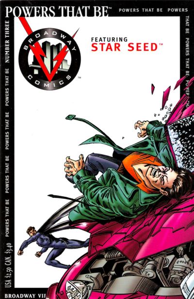
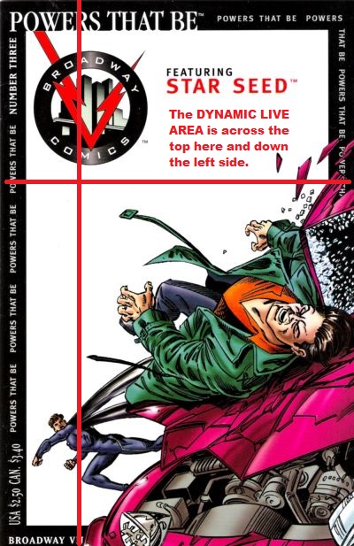
Shooter had some strange ideas for how to go about things at this new company, odd solutions to seeming problems. One such concern was in how to make the company’s offerings stand out on the crowded comic book racks of that time period. The answer was to give every cover a stark-white background, with the image fit into a black frame. Unfortunately, while this did make Broadway’s books stand out, it didn’t make them attractive to buyers, and this cover is a good example why. There’s a theory in comic book cover design called the “Dynamic Live Area”. What it is is an inverted L-shape that indicates the portions of the comic that are the most likely to be seen regardless of how it is racked. Breaking it down even further, it amounts the the leftmost inch of the cover, should the books be arranged fanned out on a rack, and the top third, if they’re in traditional drop-down racks that conceal most of the book behind the one in front of it. (Of course, many shops used full facing racks by this point, but not everyone had that luxury of space.)
This design almost aggressively avoids putting anything interesting in the Dynamic Live Area apart from the company’s oversized logo and some small type. The image on this particular cover is crowded into the lower right size. and with that stark white background, the guy who’s been punched doesn’t really pop against the bright magenta car he’s been hurled into. For that matter, the guy doing the punching is tiny and lacking in presence or impact. So much like the QUASAR cover, this is a piece where virtually every decision that was made about it was made poorly. There’s definitely a much more impactful version of this image that still adheres to most of what the firm was attempting to do, but this isn’t it.

This suffers from a lack of the ‘Kirby crackle’ and other linework effects that Jack would ladle on to intensify his fight scenes, but it’s still not as bad as the Quasar cover.
LikeLike
Looks like an attempt at a Gil Kane- style “punched right out of the frame” cover, but the figures aren’t dynamic enough. And I think any image would lose impact placed in that trade dress.
LikeLike
The angles don’t look right – he seems to be falling down onto the car, but the guy seems to have punched him in the opposite direction…
LikeLike
Not a good cover at all. I couldn’t tell he was being smacked into a car until I looked closely, and all the criticisms of it are apt.
Still better than the QUASAR cover, though.
I’m now reminded of the cover to some self-published book of the late 70s or early 80s, featuring some kind of minotaur god flying through space, naked, with a giant penis and pubic hair, and it was so poorly drawn that an ad for it ran in CBG for weeks before they noticed what it was they were printing…
LikeLike
Borders on magazines are at worst stodgy and at best “old school” design ala National Geographic and Time Magazine…. so its an off-choice for a cover design system for super hero comics. That said… the aforementioned Gil Kane probably could have pulled this. The guy getting slugged is the biggest thing on the cover and he just isn’t interesting.
Don’t think I agree where the sweet spot is for the visual on a well done comic book cover. The bottom two thirds would seem to the spot generally speaking.
LikeLike
You missed the point about how the comics appear on the racks entirely, then. The lower two thirds is the part most likely to be concealed.
LikeLike
Yes, that’s exactly what I said. The portions most likely to be visible are the top third and the lefthand inch.
LikeLike
You’re right. My bad.
LikeLike