
Continuing with our survey of FOOM #2, the second issue of the fan magazine published by Friends Of Ol’ Marvel, Marvel’s in-house fan club of the 1970s. The second issue, like the first, was put together by Jim Steranko and reflects his aesthetics in terms of its design and typography treatment.

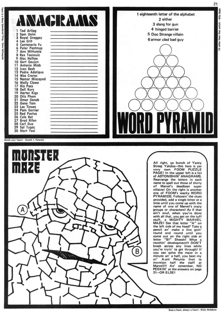
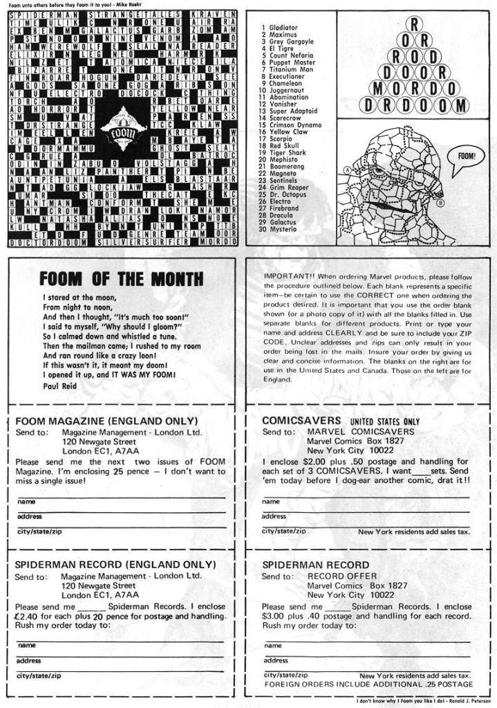
Another puzzle page. As I’ve mentioned previously, there was some question in the early days of FOOM just how much it should be aimed at older readers and how much at the youngest ones. Steranko attempted to service both groups, to varying degrees of success.
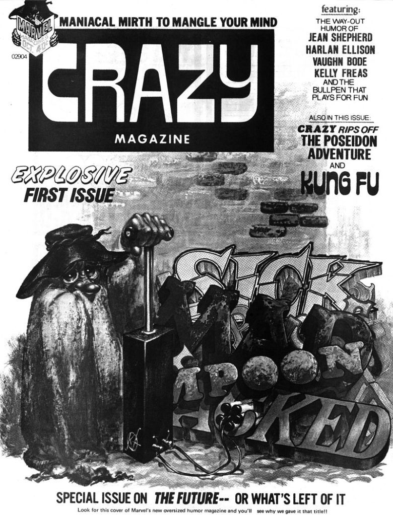
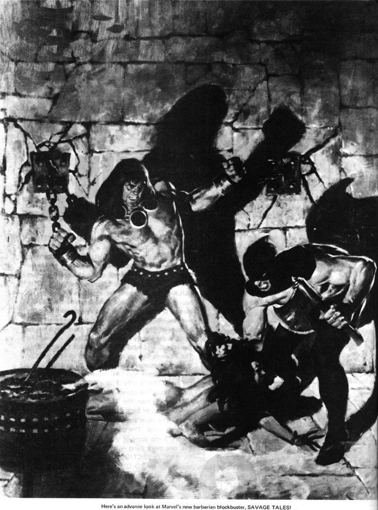
Marvel launched CRAZY as a black and white magazine in the format of the phenomenally successful MAD at this point, and it ran for many years as a third banana in the field, behind the aforementioned MAD as well as CRACKED.
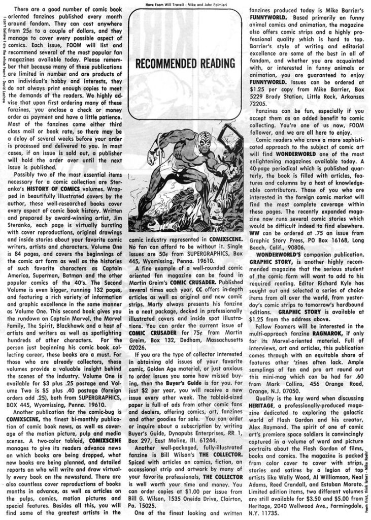
In a bit of shameless self-promotion, Steranko here reviews his own books, THE STERANKO HISTORY OF COMICS, as well as his own COMIXSCENE publication (which woudl mutate over time into first MEDIASCENE and then PREVIEW)


Has this FOOM cover been repurposed as a Hulk variant yet?
LikeLike
Though I do remember the FOOM ads in comics I bought around 73-74 I was probably too young to send money through the mail… so I missed it. But Marvel sent me a big Steranko FOOM poster as a “gift” for selling subscriptions around ’77 or 78? This would have been a number of years after the Marvel house ads for FOOM had stopped running I think.
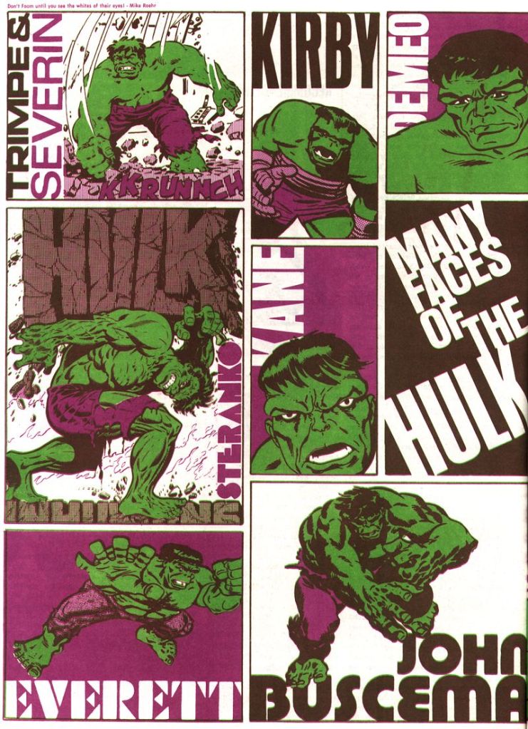
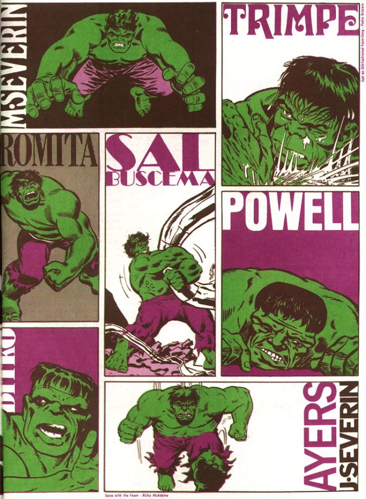
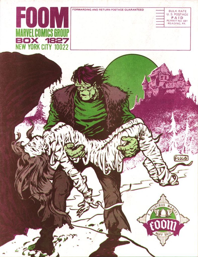
The front and back covers of this issue look like Steranko specced solid green and purple pantone inks and mixed them to make the brown and darker brown shades…..in effect using just two inks to achieve a wider range.
LikeLike