
This is another comic book that found its way into my household twice. The first time, I bought it during one of our periodic visits to by Grandparents’ house in Valley Stream. The other, I believe I got in a 3-Bag where there were other books that I wanted/needed. That would be the bane of the 3-Bag system: you’d want one comic but have to buy three in order to get it, whether you owned them already or not. I was never confident enough to tear open the bags and then try to just buy the individual issues I wanted like so many other kids clearly did–I was dead certain that I’d be stopped at the register and get in huge trouble. A master criminal, I wasn’t.
The story was the second part of a two-part adventure, one that also crossed over tangentially with the concurrent issues of UNCANNY X-MEN. This was all down to the fact that the creative team of Chris Claremont and John Byrne was exactly the same in both instances. In this issue of MARVEL TEAM-UP, though, Byrne was inked by Tony DeZuniga, who tended to be something of a heavy hand when it came to inking–he would routinely not so much ink as redraw whole cloth–it was easier and faster for him that way. But the combination doesn’t look bad here, though it’s not as polished as the finish that Terry Austin was starting to give Byrne’s work over in X-MEN.

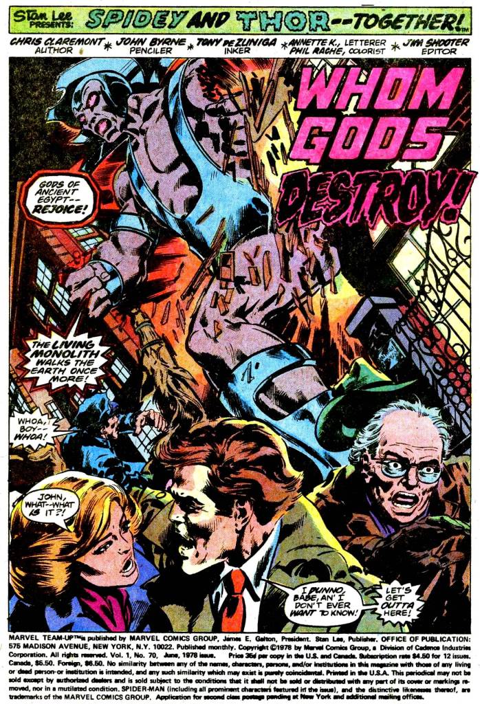
The story itself is pretty basic, though entertaining, with Claremont attempting to add some color and characterization through his dialogue. As Spidey describes to Thor on this page, last issue he’d gotten involved with some burglars who were also kidnappers. And their victim was Alex Summers, occasionally the super hero known as Havok. Havok’s powers come from the ambient Cosmic Radiation that bombards the planet–a power source also tapped into by the villain known as the Living Pharaoh. By imprisoning Havok and cutting him off from their common Cosmic Ray source, the Pharaoh transforms into the colossal Living Monolith–a villain from the Roy Thomas and Neal Adams issues of X-MEN that first introduced Havok. By the end of the prior issue, Spider-Man failed to prevent this transformation from happening, and so this month, as the Monolith crashes out into Manhattan, the wall-crawler is being crushed in one of its oversized hands.

The Monolith is getting off on his godlike power, and he contemptuously hurls Spider-Man away from him. Tumbling end over end, Spidey can’t get a web-line to connect and he looks finished–until he’s caught in midair by Thor, who has shown up in response to the crisis. The two heroes compare notes, with the web-slinger bringing the Thunder God up to speed. The duo swiftly realizes that in order to deprive the Living Monolith of his source of power, they need to free Havok. Thor hurls his hammer at the device in which the young mutant is imprisoned–but the Monolith reveals that he’s booby trapped it to explode should it be tampered with. Spidey snags Thor’s hammer with a web-line, diverting it from striking Havok’s prison–but he’s then comically dragged around after it, unable to halt its irresistible flight until it eventually returns to Thor’s hand.

The Monolith proceeds to go about his business, levitating himself in the air. But Thor’s had enough of this–he resolves to simply overpower the Monolith himself, and he knocks the immense villain into the east river with a throw of his hammer. The Monolith responds by grabbing a nearby boat and flinging it at the scion of Asgard. But in a pretty cool double page spread, Thor pulverizes it with one swing of his hammer. John Byrne was a relatively young artist at this point in his career, but images and moments such as this one made him a figure to watch, and instantly popular with fans. His versions of just about everybody became semi-definitive, and he was almost certainly the most popular mainstream comic book artist of the 1980s, with really only Frank Miller and possibly George Perez in his weight class.
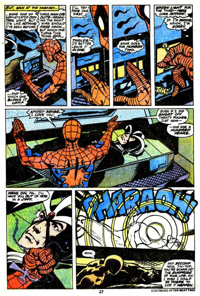
While Thor and the Living Monolith duke it out, hurling lightning storms and cosmic blasts at one another, their battle has moved away from the wall-crawler. Which is all right, as Spidey figures that he should probably do something about Havok. Returning to the Living Pharaoh’s lab, he’s able to kibosh a pair of the Pharaoh’s goons who are trying to secrete Havok’s pod away in the confusion, and then to employ his spider-sense as well as his natural science know-how to disarm the tamper-proof trap the Pharaoh had put upon it. Releasing Havok, Spidey realizes, will deprive the Living Monolith of his colossal stature, making it easy for Thor to clean up on him.

And that’s precisely what happens. In the midst of their battle, the Monolith’s power suddenly falters, and he’s lost within the cosmic storm that had been unleashed by his own powers clashing with Thor’s. Despite the Thunder God’s best efforts, he can’t locate the Living Pharaoh, alive or dead. But, hey, Havok is free, and the menace is over for the moment, so the three heroes are all willing to call this a win. So, yeah, not much of a story in this one. But entertaining nonetheless–the strong artwork pretty much carried things.

This one is near and dear to me. I remember this issue’s art vividly. It was the first or second comic I remember getting featuring Thor, the other was the momentous issue where Red Norvell becomes a slightly more traditional version of Thor. Which was another pretty spectacular looking story, by the great John Buscema, Marvel’s other (and earlier) top tier John B. artist. I first remember seeing Marvel’s Thor through licensed merch. Meego toys, 7-11 Slurpee cups. Stickers. But this MTU with Spidey and “Goldilocks”/”Blondie” was one of those comics I kept reflipping through, several times after reading and re-reading it. It had a live action, cinematic feel to it. In large part to Mr. Byrne, but I also think due to Tony DeZungia’s ruggedly naturalistic sense of lighting.
Man, I miss how newsprint sucked up the inks, giving a stark, sandy, graininess to the drawings. Especially for inkers like DeZungia, Klaus Janson, Dan Green, Joe Rubenstein, Terry Austin, Dick Giordano, etc. This seems like the perfect team to pay homage to Neal Adams’ original Havok/X-Men work. A few years later, maybe it’d be Bill Sienkewicz. Byrne is still recognizable, especially in Spidey’s slightly thicker build, the Monolith’s figure (Byrne’s figures often look more like action figure toys to me than actual bodies) and Havoc’s facial features, but that final close up of an emotional Havoc seems a clear homage to Adams’. Not to mention that egg beater head gear. DeZungia gives it all a dark, thick finish, like the images are sculpted. Not unlike Giordano over Adams’ pencils. And thinking about naturalistic comic book art, and the Adams/Giordano team, the older guy at the bottom right of the opening page reminds me of their other collaborator, Denny O’Neil (I wonder if that was intentional). I also like the inks on the middle by-stander (by-runner), “John”. Slick but solid, especially his hair.
Yeah, Tony could slightly overpower other pencillers, but he energizes Byrne’s art here in all the right ways, most definitely that beautiful splash page you included- Thor looks like something out of a fantasy illustration. The layout is brilliant. We follow the action in those smaller panels, our eyes carried over to the big payoff. Even if you cheat by skipping to the end of the sequence, it makes you want to glance back and absorb it again more slowly. Thor’s figure is perfectly balanced in both the small panel he’s shown charging forward in, and in the beautiful money shot to close the page. The inks do it for me. Byrne’s own inks could have been overkill. DeZungia gives that image of Thor throwing his hammer while hovering in the air a fine art finish, for an instantly classic pose.
There are some weaker panels, but the issue is crammed with panels, so some can’t get as much love or time as others. One of the few examples is Thor’s exit, carrying Havoc off. Thor’s arm extended upward, holding his hammer, the inks and pencils didn’t work. But in the flow of the sequential art, it’s a forgivable blip, especially compared to the majority of the images, like that beautiful hammer throw I was gushing about. Both Spidey and Thor look great throughout. You’re right, Tom, the art carries this issue, though the writing is fun. Claremont gets Spidey, and I still enjoy the “friendly, neighborhood ” nicknames the heroes give each other, revealing how familiar they are with one another. It’s something carried through the MU, and part of the “mighty Marvel manner”. Depending on who’s speaking, Spidey was “wall-crawler”, “web-spinner”, “web-head”. Thor was “Goldilocks” or “Blondie”, maybe “winghead”. Hulk was “Jade Jaws”. Iron-Man was Shell-head, etc. Fun stuff.
And Thor’s dialog wasn’t overly done, as other writers often did. It had just enough of the thee/thy/thou’s to make the point, without dragging his words down too heavily. That, and Byrne and DeZungia’s inherently powerful images of him, plus the timing of the story’s publication, has only one voice in my head for Thor, speaking his lines. And that’s the grand, smooth boom of Robert Ridgely (Filmation’s “Tarzan”, Ruby-Spears’ “Thundarr”). I can still hear it.
Thanks, Tom.
LikeLiked by 1 person
Honorable mentions for Phil Rache’s colors and Annette K.’s lettering. The reproduction/printing tech was a long way behind where it is now, 43 years later. But looking at these digital scans, there was a lot going on in both the color and lettering. Phil adds light blue to Thor’s helm in all the right places, along with Tony’s inks, giving it a metallic sheen. It comes like hard, polished stainless steel. The shades of green on the water of the river gives the right lighting to suggest more naturalism. And the background colors, the sky, the roof on the last page, how they fade into other shades is more artful and deliberate than just a printing effect. Vey atmospheric, throughout. The purples and greens remind me of Adrienne Roy’s work. The huge sound effects are a subtle but conspicuous red, not over bearing, with debris smartly jutting out in between the letters (Byrne’s doing, maybe). And the letters give the right emphasis to Claremont’s script. The Monolith’s “balloons” are doubly outlined in harsh, jagged strokes. And its words are bold and booming, even when there isn’t need for an exclamation point. Thor’s “I say thee NAY!” has the perfect, explosive outline. This is real skillful craft right here.
LikeLike
I forgot to ask, the the round, green “button” on the cover that states this issue was recognized by the Marvel Bullpen for it’s outstanding art, was that true? I believe it.
And, it’s a little funny that when Alex emphatically says, “Oh my God!”, Thor answers him. 😉
LikeLike
Oh, Man. Sincerest apologies to Mr. DeZuniga for misspelling his name over and over. Jeez. All I had to do was check the credits box. 😦
LikeLike