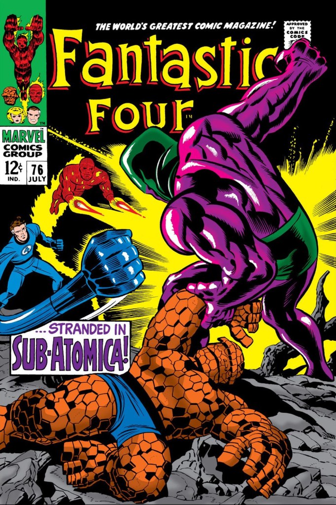
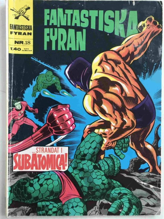
I ran across this Swedish printing of FANTASTIC FOUR #76 in my travels, and thought I’d share it. As happened on a not-infrequent basis, the local publisher, either by accident or because they were unfamiliar with what the colors of the characters were supposed to be, inadvertently switched the film for the yellow and cyan plates here, making everything come out weird and bizarre.
To reiterate what I had outlined earlier on this point. throughout most of their history, comic books were printed using the cheapest methods available. As such, they were limited to a palate of just 64 colors entirely–said palate being made up of percentage grades of four primary colors: Magenta (Red), Yellow, Cyan (Blue) and Black in 25%, 50% and 100% increments–said increments never to exceed 250% cumulatively, lest the paper that was being printed on buckle. Each page of a given comic book would be color separated into four sheets of film for printing, each one corresponding to one of those primary colors, which would be layered one atop the other to achieve the desired effect. Not only was this printing process imprecise (and responsible for that strange color haloing that you see in many early comics, where one of the color plates is out of register) but it was relatively easy to screw things up and to use the wrong film for the wrong color.

This conversation just reinforces my love for current (re)printing of old comics. I’ve become addicted to the Epic Collection line, even when I own the originals. Vibrant, flawless, on great paper stock.
LikeLike
I love it that the villain looks like a Luchadore!
LikeLike