A post from my old Marvel blog that touches on how the specific way we express certain ideas impacts on the way in which they are perceived and received.
October 21, 2009 | 1:00 AM | By Tom_Brevoort | In General
One day every week I head up a regular Reading Circle for the members of editorial, during which we select a current issue of a given title (from either Marvel or a competitor) to read and dissect, in the hopes of figuring out how to be better at what we do. It’s always an interesting discussion to be at the center of, in that, like you guys, there’s nothing a group of comic book editors likes to do more than talk about comics. We’re both excited by a book that’s working, and hyper-critical of an issue that falls down in some way or other.
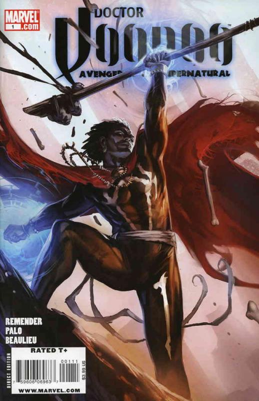
This week, though, we hit on an interesting point about the perception of the audience that I thought was worth sharing with a wider audience. To set the stage, this week’s book was the first issue of DOCTOR VOODOO, AVENGER OF THE SUPERNATURAL, edited by my office’s own Lauren Sankovitch (and on sale now at finer comic book emporiums everywhere.) The debut issue went over pretty well among the group, but then at one point somebody brought up the fact that they felt disoriented whenever some element of the sorcerous milieu came up-the Crimson Bands of Cyttorak, and so forth. They found these elements alienating, and felt disconnected from the story whenever they came up.
As the discussion continued, somebody (and I forget exactly who, but it wasn’t me) made the point that, were this a science fiction series, and the references were to holograms rather than astral forms, or equations rather than spells, the reaction would be completely different. In each case, the underlying concept is about the same, but the instinctive response was to accept the science-based incarnation more readily, and to question or wonder about how it worked less.
Isn’t that odd, the way we think? It’s mostly just a matter of semantics, but it completely changed the reading experience for at least one person. And it does underline a larger essential truth about the baggage people bring with them when they crack open a comic, turn on a television or go to a movie.
More later.
Tom B

Doesn’t surprise me. Lots of SF fans have this reaction to fantasy and vice versa (though the SF fans are usually more critical of the other genre).
LikeLike
Tom, that logo just doesn’t work for me. Not only is the font hard to read (at first glance I thought it said “Doctor Doodoo”), but the spear bisecting it makes it even more difficult. The art should have been reduced or repositioned, and the logo reduced to make it fit better. Making the logo a different color (red?) would also have helped to separate it from the art.
LikeLike