

This issue of IRON MAN was a bit more like it. After a pair of issues that were concerned with a war in deep space that I found it difficult to care about (the influence of STAR WARS was all over those issues, at least broadly) with #113 we were back in Earth, with grounded concerns and grounded super-villains. And we were right on the cusp of this series getting really, really good–it was already moving in a positive direction, and had been for a few months, but a trio of creators were waiting in the wings who would define Iron Man for the 1980s. But that’s still all to come.

On the other hand, this particular issue was penciled by Herb Trimpe, and I wasn’t a big fan of his work. He was a mainstay at Marvel for three decades, and I enjoyed his long run on HULK (especially when inked by John Severin, who often made the end product look more like his work than Trimpe’s). But as time went on, while his storytelling chops never flagged, Trimpe’s style became more stiff and stylized and less appealing to me. There’s a reason why his best-remembered runs of this period were on GODZILLA and SHOGUN WARRIORS–he was adept at drawing colossal lizards and intricate giant robots. But his human figures tended to have flat faces and to be framed and posed oddly. His work wasn’t really fluid. So he was one of those artists that I never really warmed to–and in fact, I would buy certain titles despite his presence rather than because of it.

This issue opens with Tony Stark unveiling the newly rebuilt headquarters of Stark International in a double-page spread drawn by penciler Keith Pollard that almost certainly started out as the design drawing of the place. Having returned from space, Tony Stark is rededicating himself to first principles, to making the world a better place through the efforts of his company. Along the way, we bit goodbye to recurring supporting characters Jack of Hearts, who heads off to a solo adventure in MARVEL PREMIERE, and S.H.I.E.L.D. Agent Jasper Sitwell, whose mission to guard Stark has once more come to an end. In effect, writer Bill Mantlo was clearing the deck for what was to come next. One thing he didn’t get rid of is Tony Stark’s Life-Model Decoy, who does double-duty at this event by posing as Iron Man while Tony himself is giving remarks. This thing was a little bit too convenient to have around when it came to safeguarding Iron Man’s secret identity, so it’d get blown to pieces in a couple of issues.

Later on, Iron Man is just lounging around atop his new complex in his full armor, as you do, when an explosion catches his eye. It’s his old thought-dead foe, the Unicorn, who has emerged from the sea and who is being prompted by an unseen voice–whom he refers to only as “The Other”–to seek out the solar converter that powers the new Stark plant and destroy it, consuming the entire place. As enemies go, the Unicorn was something of a loser, and even his new costume design can’t make up for the fact that he’s attacking Iron Man with a blaster that’s strapped to the top of his head.

The rest of the issue is simply a long, plotless fight in which Iron Man attempts to defeat teh Unicorn and prevent him from blowing up his company’s new facility. And it’s not even a great fight–Trimpe’s stiffness meant that most panels don’t have a whole lot of motion to them. The look like photos of staged action figures or some such, very lifeless. And I don’t think Joe Rubinstein’s inking really helps, the environments are so spartan and empty that the issue verges on feeling like a coloring book. I wonder whether Trimpe really did full pencils or was maybe working in breakdowns and Rubinstein didn’t do enough work connecting the dots when finishing them.
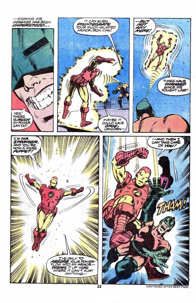
Seriously, I wish there was something of greater substance to say at this point, but there really isn’t. Just look at the page above for an example of how this one went. It’s not going to win any awards. There was a criticism sometimes levied against the Marvel books of the 1970s that they weren’t so much stories as they were shapeless fights with just enough scaffolding around them to make them seem like a story. That wasn’t always the case, but it’s a pretty apt description of this issue. Sure, the Unicorn’s powers are killing him, and that’s marginally interesting, and he’s got a mysterious benefactor who is pulling his strings, and it’s fun to work out who that might be. But in terms of substance, this issue is lightweight fare, without much of anything to make it truly memorable.

And the issue ends just as you might expect it would: the the Unicorn being smashed just as he’s about to reveal the identity of the secretive Other. Of course, for any Iron Man reader going over this story, the answer is obvious based on the character’s silhouette and the abilities he displays–it’s not much of a mystery at all. But it’s about all the book has to offer, so at least give it that.

I mostly enjoyed Mantlo’s run on Iron Man, although I certainly wouldn’t rate it as great, but entertaining enough. I fully agree with your assessment of Trimpe’s art. HIs depiction of people always struck me as odd, aside from when much improved upon by Severin’s inks. Tuska, IMO, had some of the same failings as Trimpe, and just as Trimpe was predominantly “the Hulk artist” circa 69 to 75, Tuska was “the Iron Man artist” for roughly the same time frame and as kid back then, I adjusted to their styles on those titles but really disliked it when they filled in on other titles, such as Tuska’s brief run on the Avengers just prior to the start of George Perez’s run (and whatever kinks Perez had early in his career, his art struck me at the time as dynamic and beautiful and a major improvement over the art of the previous several issues of the Avengers). The art on Iron Man would also get much better shortly as Romita, Jr., and Layton began their run .
LikeLike
I always appreciate your polite candor when it comes to saying how you feel about something, Tom, in this case the artwork of “Happy” Herb. I was still very young when these comics were published and had only been reading and collecting for 2 or 3 years. I don’t believe my opinion was sophisticated enough to quite land on why I didn’t much like Trimpe’s work, but I knew there was just….something that didn’t click with me. From that same time period, I had similar feelings when I’d find a comic with art by Steve Ditko. As a new collector who had no idea or awareness of Ditko’s long and admirable history in the industry, as an ignorant kid I could only tell you that these guys drew “weird”. Last on the list of guys who drew weird was the legendary Frank Robbins, who seemed to have a permanent assignment on Roy Thomas’s Invaders series. I didn’t fully develop an appreciation for the art of all 3 of these legends until I was an adult, and I’m honestly glad I can revisit the comics from this formative period in my life and look at them with new appreciation’
LikeLiked by 1 person
I also clicked on reply planning to start with ‘I mostly enjoyed Mantlo’s run on Iron Man’. The man was a font of ideas but it was very clear when he wasn’t particularly inspired. His Iron Man run looking back feels more like doing it for a paycheck than what he gave us with Micronauts and Rom. i also have to admit I loved Trimpe from the first time I saw his work in Incredible Hulk. I like a wide variety of stylized artists, loving Robbins as well from his too brief Captain America run going forward. I have to admit I’m still waiting to learn to enjoy Ditko and Kirby as well. I’m not one to think just because something’s not to my taste it must be inferior but that doesn’t help me enjoy their work.
The best part of this issue though is the lack of Jack of Hearts. I’ve hated that character since his debut! The cutesy civilian name of Jack Hart , the costume that is so fiddly and detailed that no one can draw it on model besides the awesome artist who designed it, that bizarre origin that turned a Spider-Man supporting character into an lien out of nowhere (tho’ I’m pretty sure that was still in th efuture of this issue of Iron Man), nearly plot point in his mini that wasted a great artist, and just the fact that Jack Hart is always being portrayed as whiny little b!tch. I’d rather see Captain Ultra in any given role than Jack of Hearts! Not even Rainbow Rowell is doing anything to change my mind and considering how beyond fatastic her Runaways was and her take on She-Hulk is says something.
God, that felt good to get off my chest.
LikeLike