
This issue of THOR is another comic that I got out of a 3-Bag purchased either at a department store or a toy store, which is where 3-Bags could be located in 1978, at least in my area–they’d already faded out of Supermarkets a while earlier. While I had begun to read THOR not long before, I still wasn’t quite on board with the series–it’s strange mix of archaic, sword and sorcery-style characters mixed with bizarre science fiction backdrops never quite hooked me. In part, I’m sure that was due to the fact that all of the Asgardian characters would speak in faux-Shakespearian English. Some writers could make such prose feel smooth and effortless–Stan Lee being the prince among them–but for most, it was a handicap that made it difficult for me as a reader to fully connect with anybody.
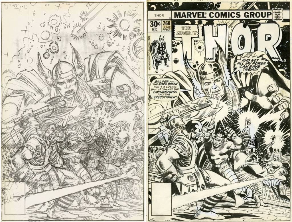
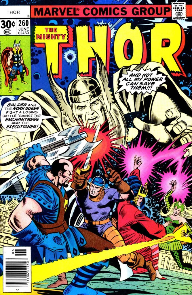
This particular issue was broken down by Walt Simonson, who would go on to become one of the most associated craftsmen to ever work on teh character. But those days were still a ways off. In 1978, Walter was only doing breakdowns, looser and more open pencils without any spotted blacks that would be taken to completion in ink by the finisher, in this instance Tony DeZuniga. So while Simonson’s storytelling survived the process, largely, his more geometric Jack Kirby-inspired drawings were softened up, in an attempt to pull them closer in line to the house look as established by John Buscema. As a result, it’s not a great showing–the pages look fine, but they’ve lost a lot of their life. The cover wasn’t inked by Dezuniga but rather Joe Sinnott, who did much the same thing, as we can see here. Again, the final image is all right, but it loses the crackle of the raw pencils.
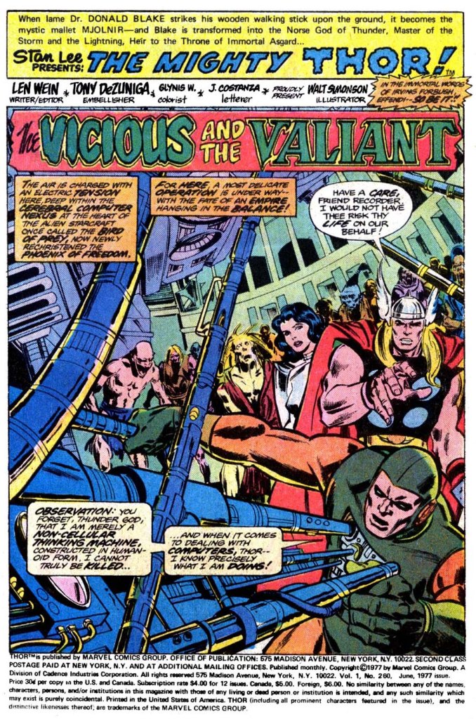
DeZuniga was what we occasionally call a “heavy sauce”–that is, he had a particular style to his work, and when he was inking (or, especially, finishing) he tended to make just about anybody’s work look like his. That can be a boon if his look was what you were going for, as seems to be teh case here. But it also meant that he overpowered most of the pencilers over whom he worked, burying their style almost totally. Looking at this splash page, all of the faces here are straight out of DeZuniga’s repertoire company, and while the page design is clearly Simonson, with the cables being used as a design element to break up the page and create interesting negative space, the lighting and the sheen on the figures is Tony all the way. This wasn’t a combination that I loved. If I’m being honest, I never entirely warmed to DeZuniga’s work at all over the years, despite being able to easily see how talented he was. It simply wasn’t all that appealing to me as a reader.
The other thing I wasn’t so crazy about when it came to THOR was the seeming repetition of plotlines. It was partially just the issues I wound up getting, but it seemed as though Odin was being abducted and replaced every few issues, requiring a quest across the stars in a flying Viking ship to locate and retrieve him, despite his supposed omnipotence. None of that was of the slightest interest to me, and it’s the source of the theory that I put forth during the period in which I was editing THOR years later: the book is best when it bounces around between three environments: Asgard, Outer Space and Earth. But you couldn’t spend too much time in either of the first two without getting back to the third or you’d lose the interest of the audience. So this was how we played things during my time. This issue, written by the wonderful Len Wein, bounces between the first two but never quite makes it back to Earth. I suspect that if somebody other than DeZuniga had finished it, I would have liked it a lot more.

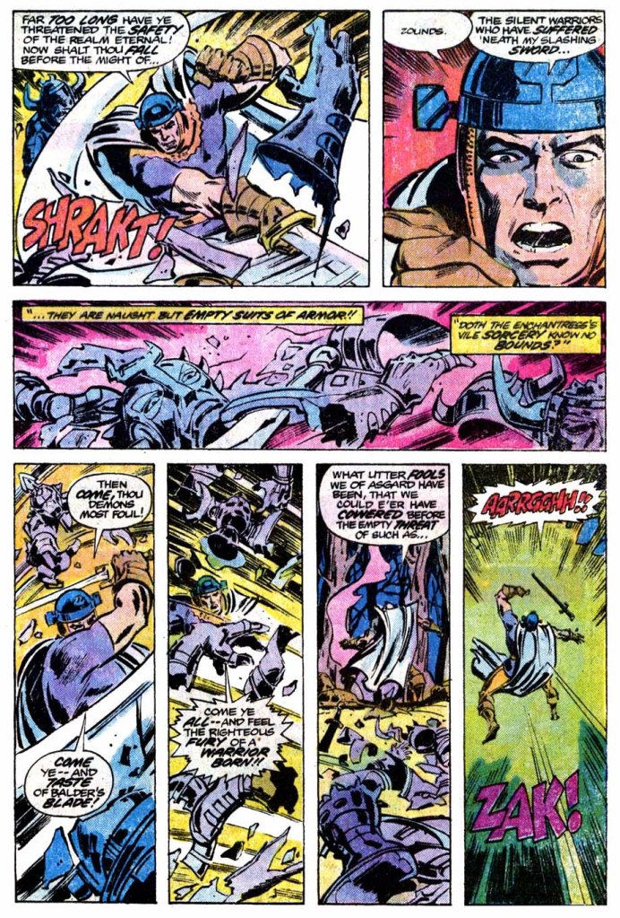
The story opens with just what I mentioned earlier: Thor and most of his companions searching through space on a quest to find the missing Odin. The Rigellian Recorder, who was also along for the ride, is able to pull some information concerning the All-Father’s whereabouts out of the computer systems of the pirate vessel Thor and his guys had taken down last month. And so, with a new heading, they sail off among the stars once again. Meanwhile, in Asgard, Balder, who’s been left behind to safeguard the Golden Realm in both Odin and Thor’s absence, finds himself beset by a mod of foes who turn out to be empty suits of armor manipulated by sorcery. But Balder the Brave is no easy prey, and he manages to hack his way bloodlessly through his foemen in a sequence that was probably pretty spectacular in Simonson’s pencils, but which became muddy under DeZuniga’s brush–only to be struck down by a mystic bolt hurled by the Enchantress.
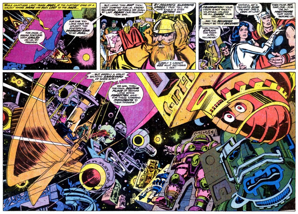
Even this, though, isn’t enough to put Balder on his backside more than momentarily, and he rises once again, his foes now clear no him: not just the Enchantress but also her regular right arm, the Executioner. Balder takes them both on at once, and despite the Executioner’s seemingly greater strength, Balder’s greater skill and battle savvy looks as though it may carry the day. But the Enchantress can’t allow that, and so she uses a spell to increase her partner’s strength even further, until he’s able to run roughshod over poor old Balder. This battle represented the major action of the issue, so it took up a considerable number of pages, despite the fact that it didn’t feature the title character at all. Meanwhile, Thor and his allies had come to an area of space clearly inspired by Jack Kirby’s conception of the Source Wall in his NEW GODS series, and the Promethean Giants who had attempted to breach it, and were punished for their hubris.

In this instance, these giants appear to herald the location of the Doomsday Star, the location where the Recorder’s intel indicates Odin is being held. But before teh Asgardian company can take any action, one of the colossi comes to life and begins attacking their ship. Meanwhile, back in Asgard, the tables are turned once again in the ongoing struggle between Balder and teh Enchantress and Executioner with the arrival of Balder’s would-be love interest Karnilla the Norn Queen. She’s every bit teh sorceress that the Enchantress is, and she immediately squares up the odds, allowing Balder to catch his breath and take on the Executioner without interference. This roves to be no great challenge–but as the triumphant pair regroup, they are once more challenged by a voice from off camera. It’s Thor, apparently, who says that he has returned and intends to slay both Balder and Karnilla. Now, clearly this is an impostor, but Balder and Karnilla don’t know that, so they’re appropriately concerned.
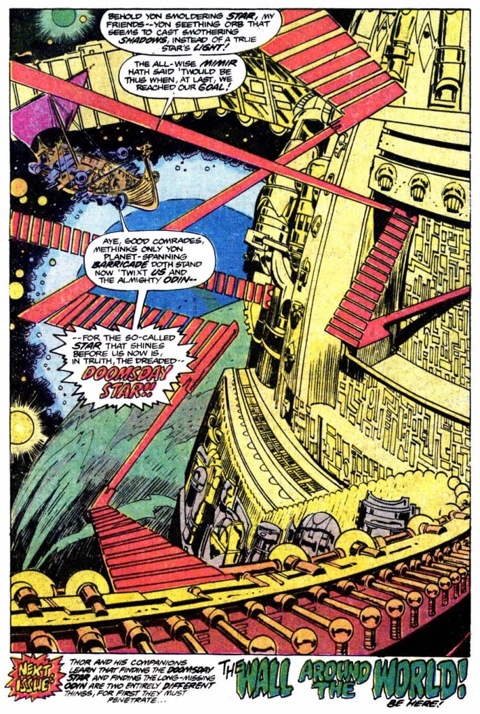
Back in outer space, Thor and the Asgardians engage with the attacking giant, turning their Starjammer’s new weaponry (taken from the bested pirate ship at the beginning of the issue) upon it. But in the end, it is of course Thor’s hammer and his strong right arm that end the conflict by smiting the giant. With that task accomplished, their ship sails on, finding a massive structure before them. And this final splash maintained much of the power of Simonson’s design. This, then, would seem to be the location of the Doomsday Star, and so the heroes’ quest has reached another turning point. To Be Continued! But I can’t say that I was very invested in any of this.

DeZuniga’s NOT a good fit for Simonson. It does overpower the drawings. But I do like DeZuniga’s style. It’s more Klaus Janson than Joe Rubinstein. There’s a great sense of lighting & mood in his expressive or impressionistic use of ink. But it’d be better to pair him with someone more suited for it. Let Walt be Walt.
Sinnott did the same, though it doesn’t look anything like DeZuniga’s finishes. It’s more Silver Age, Sinnott could’ve inked Curt Swan.
Makes me wonder what Tony’s inks would’ve looked like over Gene Colan’s “Dracula” pencils. I wouldn’t be surprised if they’d been paired together somewhere, sometime, considering all the years their careers probably overlapped.
So what’s the difference between doing breakdowns and doing layouts? Are they interchangeable? Or are breakdowns more specific, including more details in figure posing than layouts (or vice versa)?
LikeLike
DeZuniga did work with Colan, and to great effect, on DC’s 4-issue “Phantom Zone” mini-series, written by Steve Gerber. As you might imagine given that pedigree, it is very much worth a read.
LikeLiked by 1 person
Cool, thanks!
LikeLike
Oh, it’s a remarkable piece of work indeed.
LikeLike
I bought every hero book for years so of course I read Thor through this time. He’s never been a favorite character of mine either for some of the reasons you give. Simonson’s run is the only one I can call a favorite. I know the Thomas stuff is technically good but the stories also dragged on forever and felt like plot imposed over character (the arc with Red Norvell and the Eternals stuff especially bored me). I finally gave up during the Deodato run and aside from Jane as Thor I haven’t been tempted to buy more than an issue or two to see if whatever new creative team is doing appeals. It never does.
LikeLiked by 1 person
It’s the eyes!
For me, that was how I recognised and characterised DeZuniga’s work: those black “shadows” around the eyes. It should also be said that this was a trait he shared with John Buscema when the latter decided to ink his own pencils.
I can’t draw, so I have no basis upon which to criticise. However, I know what I enjoy upon the page and what I don’t. DeZuniga was, at least for me, better suited to black and white magazines than colour comics.
LikeLiked by 1 person
Working through Essential Thor V.4 a couple of years back, the repetition became obvious. Stan and Jack were often phoning it in near the end, then Jack left, then Stan left — and just a few issues after Odin vanished in the Infinity story and Loki seized power, we have an all-too-similar plotline in Gerry Conway’s run. His and Wein’s stories were readable but nothing I’d remember five minutes after glancing at them.
LikeLike