
This entry goes out to writer Dan Slott, who posted about SKATE MAN #1 on his Twitter stream this past week, causing me to bump this book to the top of my queue to cover here. SKATE MAN #1 and only was published in 1983 by Pacific Comics, the Direct Market comic book company spun out of Pacific Distributing. They’d established a beachhead in the marketplace with Jack Kirby’s CAPTAIN VICTORY and Mike Grell’s STARSLAYER, and eventually expanded it with releases from a wide variety of different creators. But in 1983, there was probably no creator that fans salivated for more than Neal Adams.

Pacific was very interested in having Neal contribute a series to their line, and initially things seemed to be going well, as Adams was up for the challenge. The perk of getting to keep ownership of the work definitely sweetened the pot for him in a way that DC and Marvel simply weren’t about to do just yet. So a preview ran in the third issue of CAPTAIN VICTORY for Neal’s new character launch, MS. MYSTIC, featuring a character that Neal had designed for a portfolio some months before. The first issue of the MS MYSTIC series came out not long afterwards and garnered some interest. But then–nothing.

The interminable wait between MS MYSTIC #1 and #2 has been eclipsed by time, but it was a long, drawn-out affair. The book simply did not appear month after month, and Adams and Pacific were being derided in the fan press for the delays. Fans want what they want when they want it, and there really isn’t much good in arguing with them about it. It became something of a running joke, one that didn’t subside even after MS MYSTIC #2 finally made its appearance close to two years later. But before that…
With relatively little advance fanfare, Pacific Comics released SKATE MAN #1, an entirely different Neal Adams creation. I’m just guessing here, but I suspect that SKATE MAN had initially been done for some other purpose and had been shelved–and at a certain point, it was just easier for Neal to pull it off the shelf and finish up whatever needed to be finished up on it than it was to complete the second issue of MS MYSTIC. And I’m sure that Pacific was happy to just have a Neal Adams comic, any Neal Adams comic, to publish. But that would maybe change a little bit–because reviewers were savage to SKATE MAN.

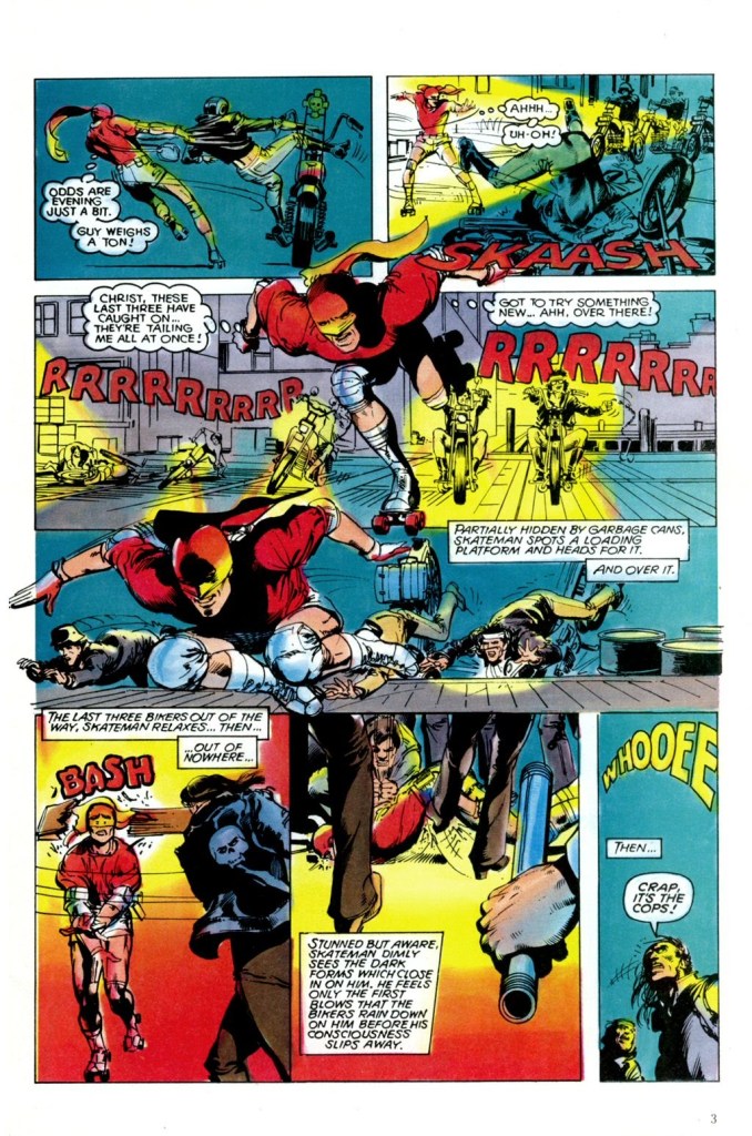
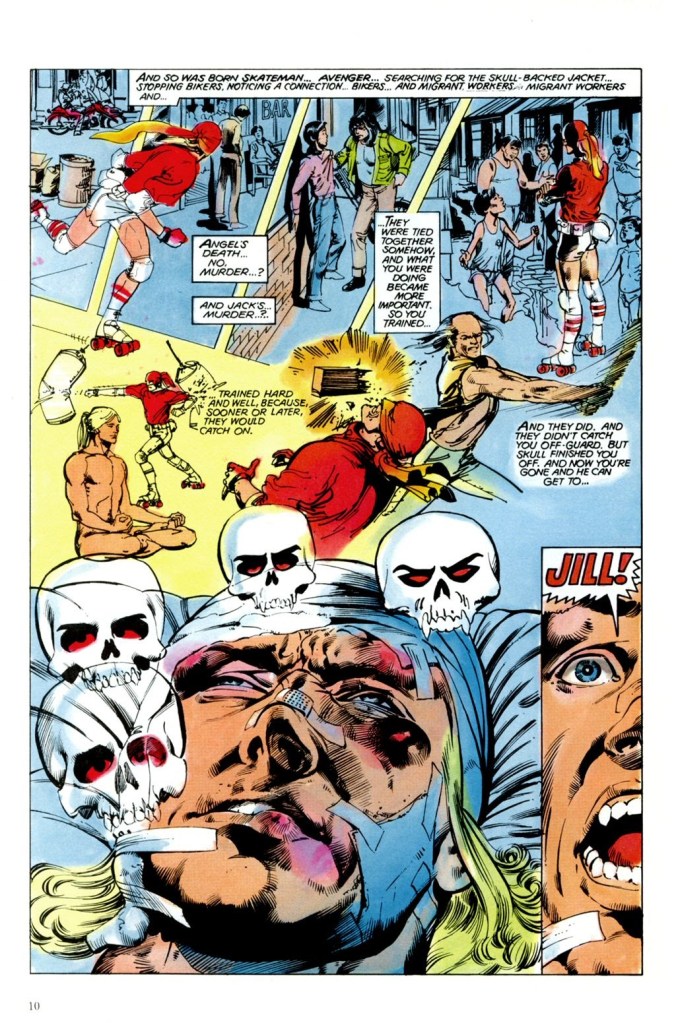
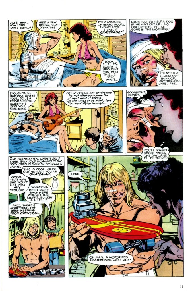
Adams had made his mark doing mostly more quasi-realisitc super heroes such as Batman and Deadman, books whose stories were a bit more real world and less fanciful than was the norm. So SKATE MAN was another step in that same direction for him, an attempt to create a super hero character who might actually be able to function in the real world. Skateman (it was lettered as one word in the copy, despite the logo being two words. Go figure) possessed no superhuman powers whatsoever. Rather, he was a veteran of the military and an accomplished martial artist who had gone on to have a career on the roller derby circuit. Not exactly the most conventional super hero in 1983.

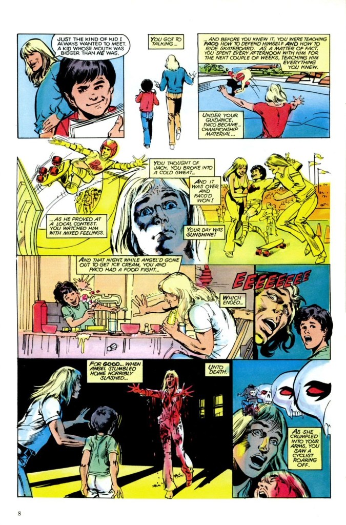
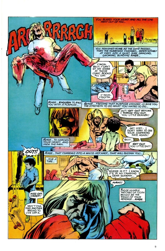
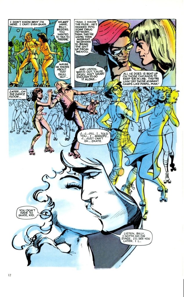
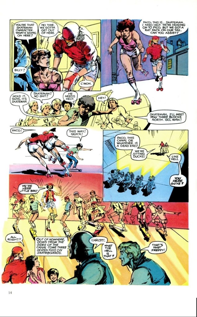
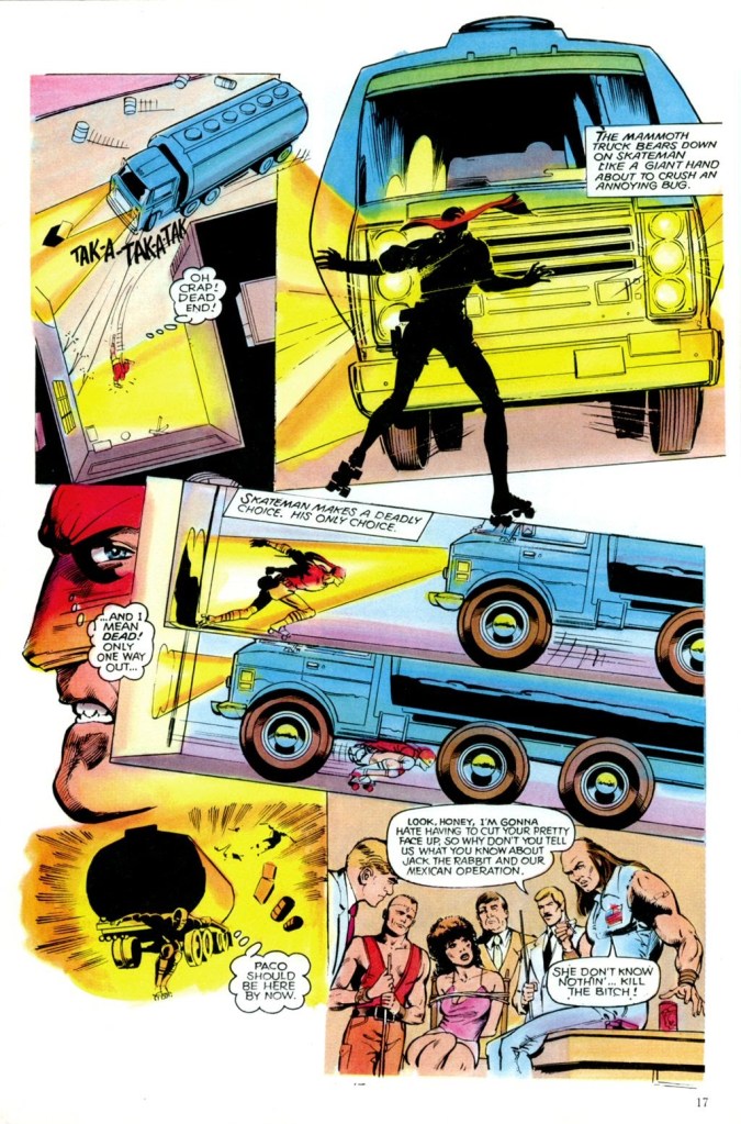
If anything, the book plays out like a television movie of the week. The lead character, Billy, is driven to put on a mask and do battle with bikers after his girlfriend Angel is killed by those same bikers in retaliation for the articles she’s been writing about them in the local weekly paper. As Skateman, Billy ambles around on a pair of roller skates–not exactly equipment conducive to being in a fight. But, hey, I’m not a martial arts roller derby champion–you do you, Billy!

But none of this is really any dopier than what filled the pages of a lot of comic books in the late 1970s. Where SKATE MAN veers right over the cliff into virtual self-parody is in its script. Neal Adams possesses many talents, but a skilled wordsmith he ain’t. He was attempting to channel the spirit of his longtime collaborator Denny O’Neil while also making the dialogue and situations seem real and plausible. What he wound up with instead was a series of memorably bad lines and a ton of purple prose. (“What the shit do you care, pigmeat?” being a classic.) The very fact that it took these absurd events so acutely seriously made it all the funnier.

One of the potentialities of the opening up of the Direct Sales comic book market was the chance to improve on the physical package. In 1978, a series of budget cuts had turned the average comic book into a pretty shoddy package: lousy printing, poor paper stock, mistrimmed often–none of it was attractive, and all of it was at the expense of the material. So one of Pacific Comics’ selling points was the fact that they were going to be printing their books on better paper and with full process color (as opposed to the standard color separations that were defacto in the field, the ones in which most colors were made up of a series of coarse dot screens of the three primaries.) This was also something that was of great interest to Neal Adams.
Unfortunately, the desire for better paper stock and the desire for better color separations wound up smacking into one another on SKATE MAN. Neal and his Continuity Studios team did full painted color on the book, but the better paper stock didn’t absorb the ink as much as standard newsprint would have. The end result is that the garish coloring job is even louder and more eye-splitting than it might otherwise have been. SKATE MAN practically glowed in the dark, so intense were some of the colors in the book. You couldn’t look at it directly, only out of the corner of your eye.
There was only this single issue of SKATE MAN–no further issues were ever released, nor were any planned as far as I know. But copies of the book circulated in quarter bins for the next twenty five years, always easy to find. (It was a Neal Adams book, so store owners had ordered it heavily, and sat on those unsold copies sometimes for years.)
SKATE MAN achieved a certain notoriety as one of the worst comic books ever published. Which is really a bit unfair. Yes, it’s overwrought and a bit silly, and yes, the coloring and printing sometimes makes it difficult to look at. But the actual drawing is solid throughout and the intention of creating a more plausible super hero archetype is a laudable one, for all that the end result missed the mark.


Neal is a gre
LikeLike
Wow, those pages, as goofy as they are, are gorgeous. This really seems like Adams on top of his art game. I agree that he is a much better artist than a writer, but man, do these pages sing. Even that cover rocks. I’ve never heard of this book, but I kind of have to have it now and will be on the lookout for it. Thanks for the article.
LikeLiked by 1 person
Yeah, this fits under the “Brand Echh”. But ML Miller’s right, these pages are damn good. Bill Sienkewicz and Mike Deodato, Jr. might agree. I don’t see any visual weak spots (except Skate Man’s design, not how he’s rendered). Anatomy, perspective, layout, linework. Pretty great. Wow. Kind of wasted on Skate Man. That logo looks more suited to a Hanna-Barbara TV animated cartoon. “But, hey, I’m not a martial artist roller derby champion”, either. Hahaha.
LikeLike
Jim Sherman did some uncredited pencilling on that book.
LikeLike
I enjoyed the two issues of Silver Age Spectre Adams wrote. But like Jack Kirby (though in a different way), dialog does not seem to be his strength.
LikeLike