
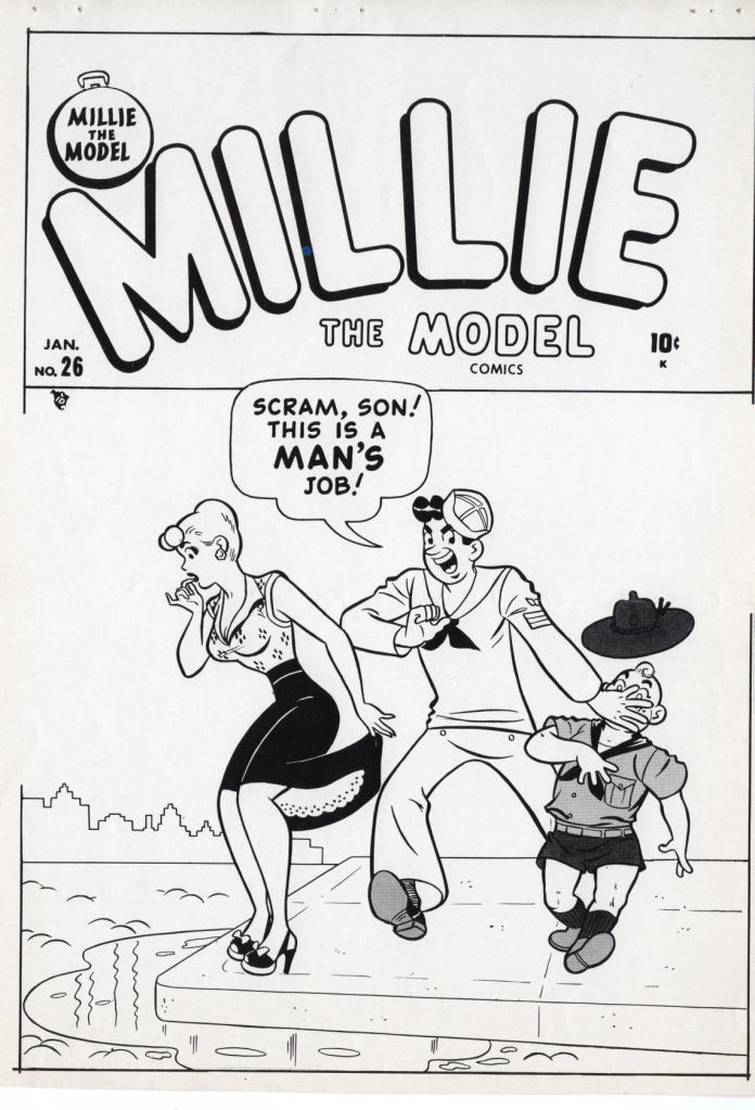
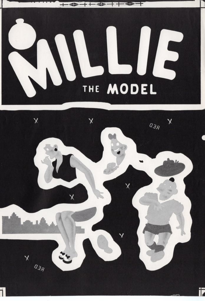
Creator Bill Morrison posted a set of images from the 3M color separation proofs for the cover to this 1951 issue of MILLIE THE MODEL, and so I thought they were worth showing off here. It’s relatively rare that proofs of this sort from that era turn up, and the relative simplicity of cover artist Dan DeCarlo’s artwork makes it much easier to understand how all of the individual color plates–Cyan, Magenta, Yellow and Black–combined to make up the final color cover. So here we are.


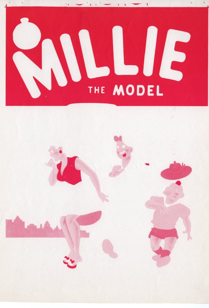
So here’s what the individual four color plates looked like when they were separated. At this time, comic books were limited to an overall palate of only 64 colors, those colors arrived at by mixing increments of 25%, 50% and 100% of these four primary colors (with the overall saturation never to go above 250% in total–at that point the paper would begin to buckle under all of that ink, ruining the run.)
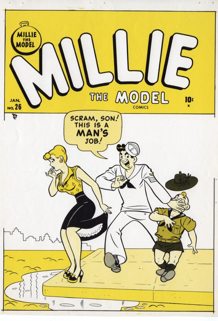

You can begin to see how color was built up here, as we add first the yellow plate and then the magenta plate beneath the black plate that contained the linework. There isn’t a whole lot of orange on this particular cover, but the fleshtone of everybody’s face and hands is made up of a simple mix of yellow and red dots.


The film for the cover wasn’t actually in color at all, but was black and white, and photo-negative.

And viola, a printed cover!

Ahh you take me back to my first job out in LA in 1986 at a four color separation house and printer. Thanks for the article.
On Sat, Apr 3, 2021 at 11:14 AM The Tom Brevoort Experience wrote:
> Tom Brevoort posted: ” Creator Bill Morrison posted a set of images from > the 3M color separation proofs for the cover to this 1951 issue of MILLIE > THE MODEL, and so I thought they were worth showing off here. It’s > relatively rare that proofs of this sort from that era turn” >
LikeLike
It’s great to see colour seps of this old stuff!

Thanks, Tom (and Bill).
About the colours:
The rule of 64 colours (plus black, 65) applied to the interior newsprint pages, exactly as you say, when they were printed with ‘flat tints’ confined to three values of cyan, magenta and yellow: 25, 50 and 100%.
Shown at my blog here:
And no black dots (usually).
Covers, on their glossy paper, were not so confined.
Firstly, as you show here, the black plate could contain dot tints as well as solid black.
This added a number of greys to the colour mix, which could of course be printed over colours as well as on their own.
Secondly, the colours themselves were not laid on in flat tints but halftones made from variable gradations of grey. The flesh tints on this cover show this clearly. They have graduated red shading in many places including the classic flushed cheeks.
As a result, covers could have many, many more colours than 64.
Another great, fun, and great fun aspect of colour separation!
Best wishes,
Guy Lawley
LikeLike