

Back in the days when he was the Editor in Chief of Marvel Comics, Jim Shooter had a particular story that he liked to use as an example when explaining to people what he thought needed to be on the page in a well-crafted Marvel story. It was this one, the Human Torch story from STRANGE TALES #114. It’s a bit of an obscure choice, but it clearly made an impact on Shooter at some point in his life. A write-up of Jim’s storytelling lecture using this story can still be found on his blog at http://storytelling.jimshooter.com/strange-tales/ in case anybody is interested.
I also built a storytelling presentation around this particular story, by a complete coincidence. And that’s what I want to share with you now. Mine is different from Jim’s in terms of the specific element that I am studying, and that is how Jack Kirby is composing his pages and his panels to guide the viewer’s eye across the page.
A bit of a preamble first, though. It’s worth noting that, at the time when this particular story was done, Jack Kirby was producing a mountainous volume of work for the newly-christened Marvel Comics Group. Mainly, this was a function of the page rates being so low–Kirby had to generate a lot of work quickly in order to keep his large family fed and sheltered. At the point when this story was drawn, it is estimated that Kirby was turning out close to six penciled pages a day. That’s an astonishing workload! Assuming a long 12-hour workday, that’s a full penciled page every two hours.
At that speed, while he was always a thinking artist, Kirby was forced to lead with his gut instinct. So all of the things that I’m about to point out weren’t compositional ideas that Kirby wrestled with, No, with instincts honed from over two decades in the field, Kirby made most of these decisions subliminally, having absorbed the particulars of storytelling so completely.
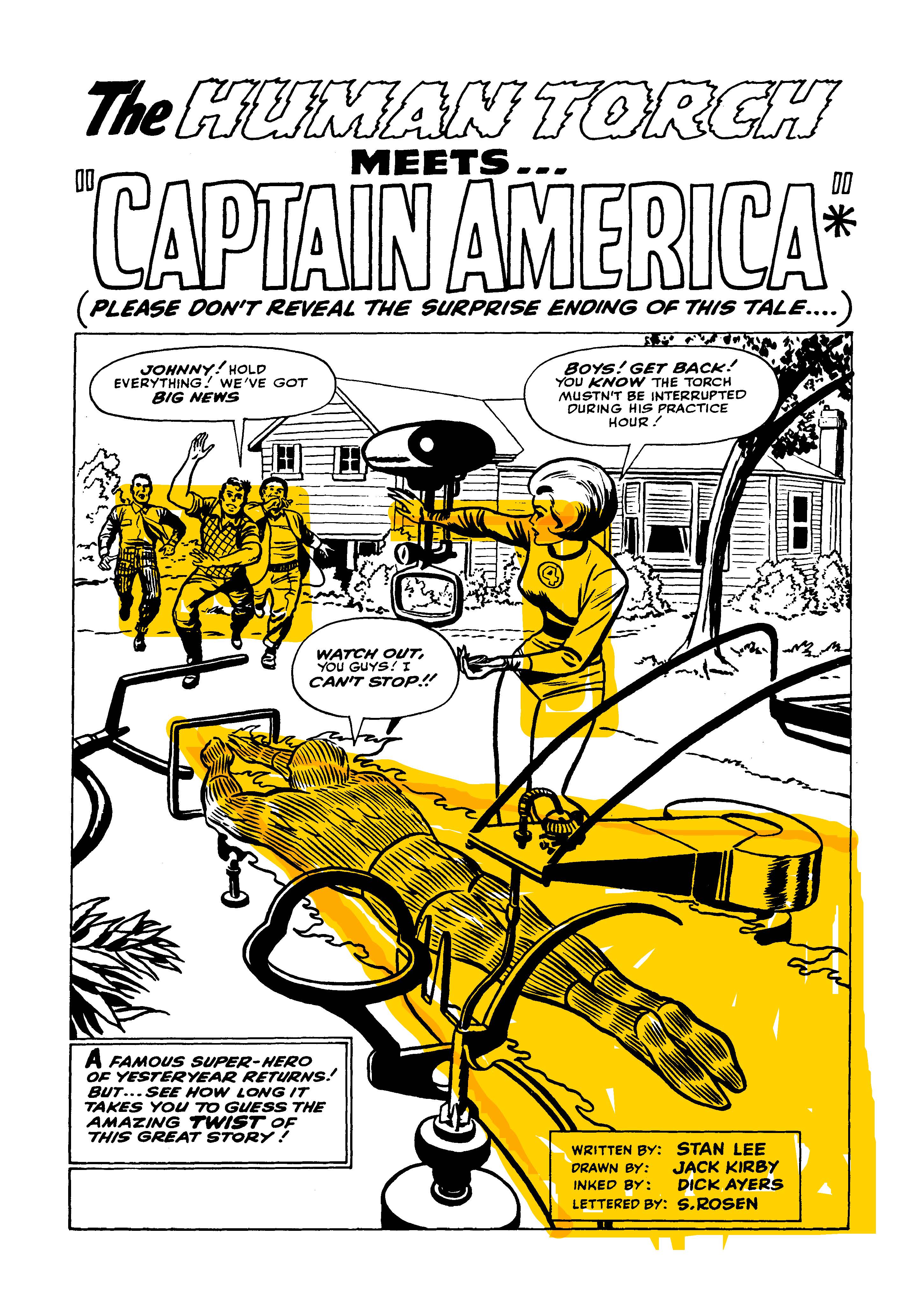
Kirby had a number of subliminal techniques that he would turn to time and again in this period of his career, and this opening splash page is a good example of the one I call “picture-in-picture”. Kirby would duplicate the camera movements of film in still frame, often within a single shot. What this amounts to is that there’s often the passage of time in a Kirby panel (in particular a horizontal panel) where the action on the far side of the image is happening a few seconds after the action on the left, so that as the reader’s eye moves across the image, the action moves with it–like one of those time-lapse photographs that you can take with your smartphone nowadays.
Here, the place where the eye starts is on the three kids running into the yard. They’re a focal point, a picture within the picture. Then, as the viewer’s eye moves naturally from left to right, Sue is there, perfectly positioned to catch their attention and subtly redirect their gaze downward, to where the Torch is doing his flying lessons and about to fly by. It this was a film shot it would begin on the kids, pan right to Sue and then widen out for the Torch to zoom by. Kirby accomplishes all of those moves in a single still image.
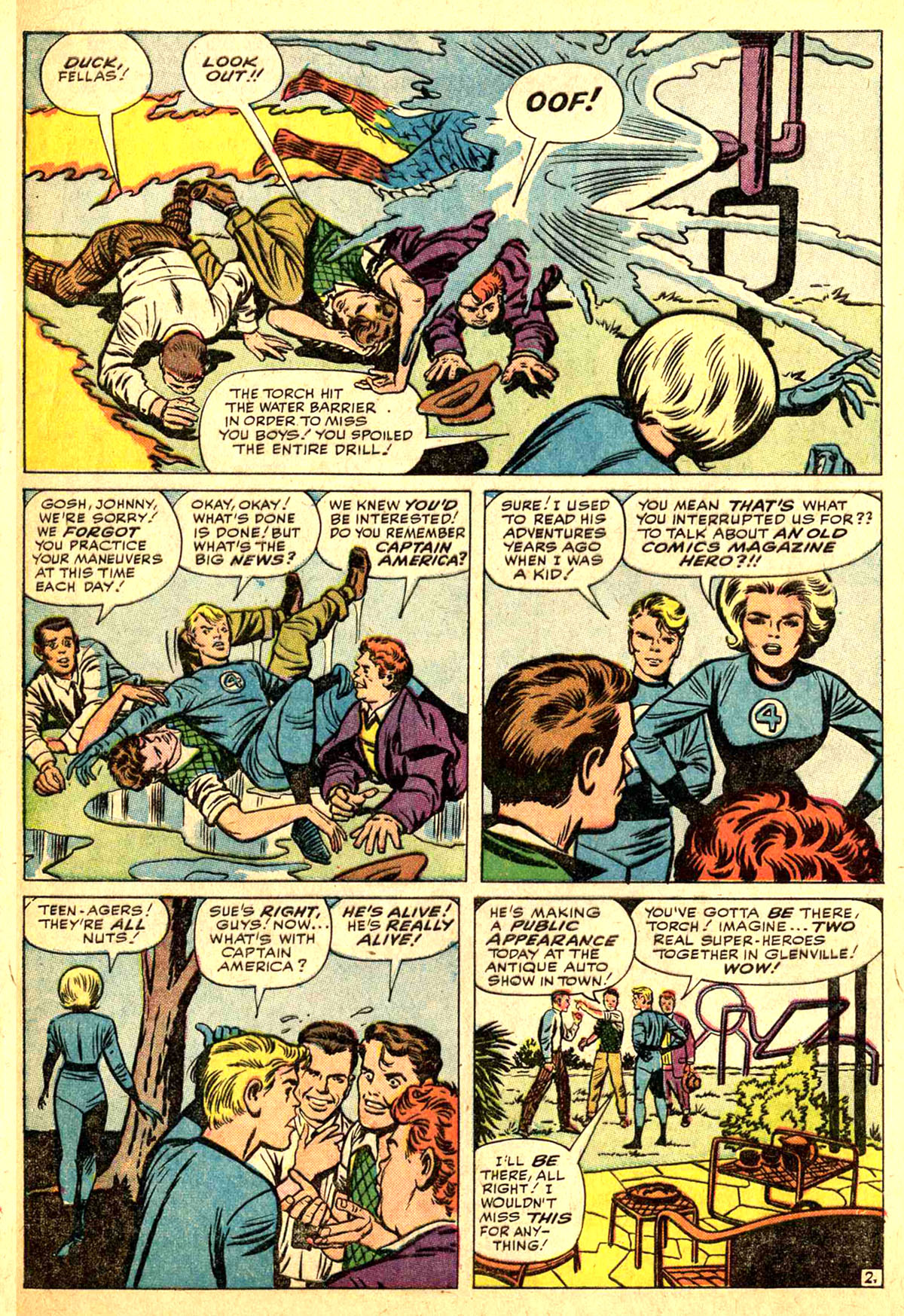

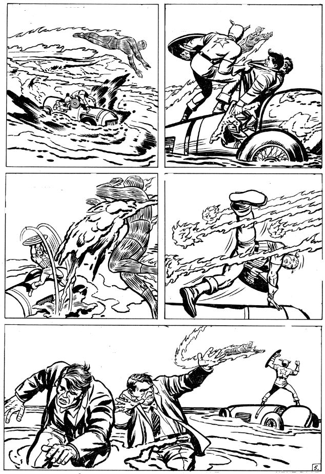
Here on Page 2, a number of different Kirby techniques are on display. In that first panel, the action that happens to the Torch at the right–being doused by the water spout–happens a few seconds after what we’re seeing on the left. In real time, the eye follows the Torch’s fire trail as, one by one, his pals duck under the way, until his motion is arrested by the water spout. The gushing water forms an X configuration, which helps to halt the eye and punctuate the moment. And look at Sue’s great gesture at the bottom right of that panel. Kirby’s characters tended to perform like silent film stars, striking heightened poses to get across either their actions and emotional states. Here, Sue’s pose also helps to form a portion of an invisible Z that connects the first two tiers. Kirby hits that design a lot, but there are clearer examples later on in this story. (It’s also worth noting that Kirby established the floating water spout in the background of the opening splash page, amazingly enough.)
In Tier 2, Kirby very subtly lines up all of the key points of interest and focus in the panel, for all that it’s an image of a bunch of disheveled guys falling all over one another. And those elements line up perfectly with the elements in the next panel, carrying through the movement until Sue’s body language stops us with a “reverse -X pose..”
And that lower left panel is another example of Picture-In-Picture. In a film, the camera would focus on Sue walking away, then Pan right to settle on Johnny and the kids talking. Again, Kirby combines two distinct beats into a single panel.
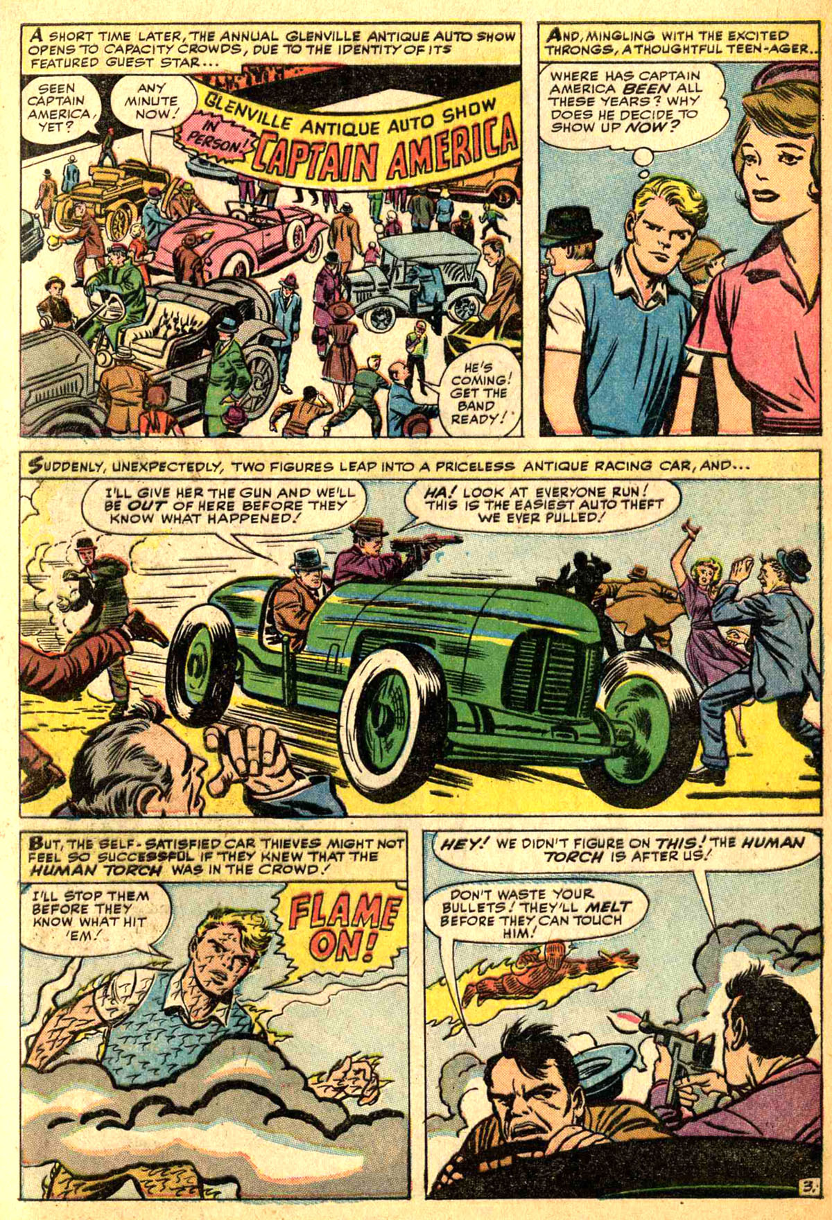
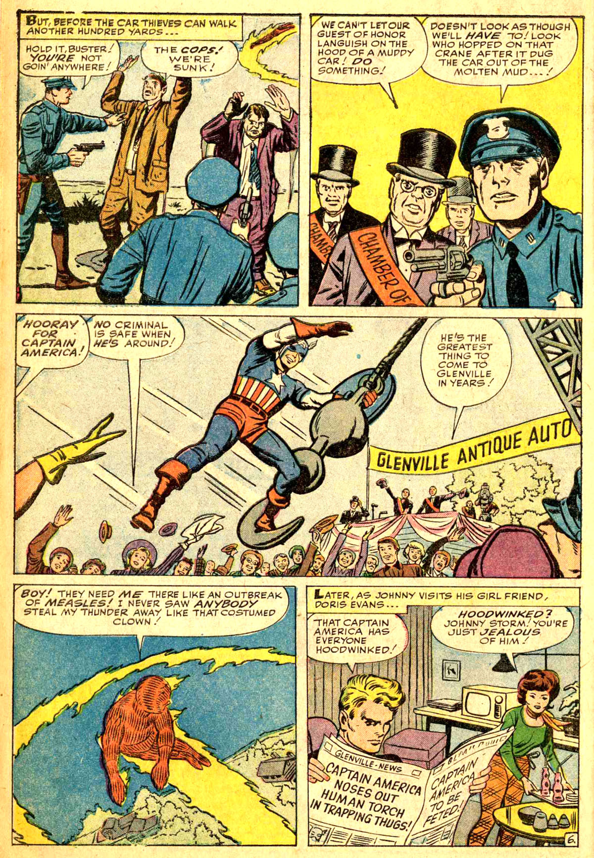
One of the ways that Kirby was able to economize his time on the pages he was forced to complete so rapidly was by shorthanding his backgrounds. Kirby was never a realist in terms of his rendering, but in this era he’d work to create the impression of an environment, just a sketch of one really, and rely on that to bluff him through. In that first panel, that auto show is pure bluff, it doesn’t look anything like what an actual auto show would look like–yet it unmistakably gives the impression of an Auto Show. Kirby may have gotten carried away on it, as it’s by far the most complex and detailed panel on the page.
In Panel 2, Kirby reinforces the impression of the crowd by positioning a woman in front of Johnny and a man or two behind him.
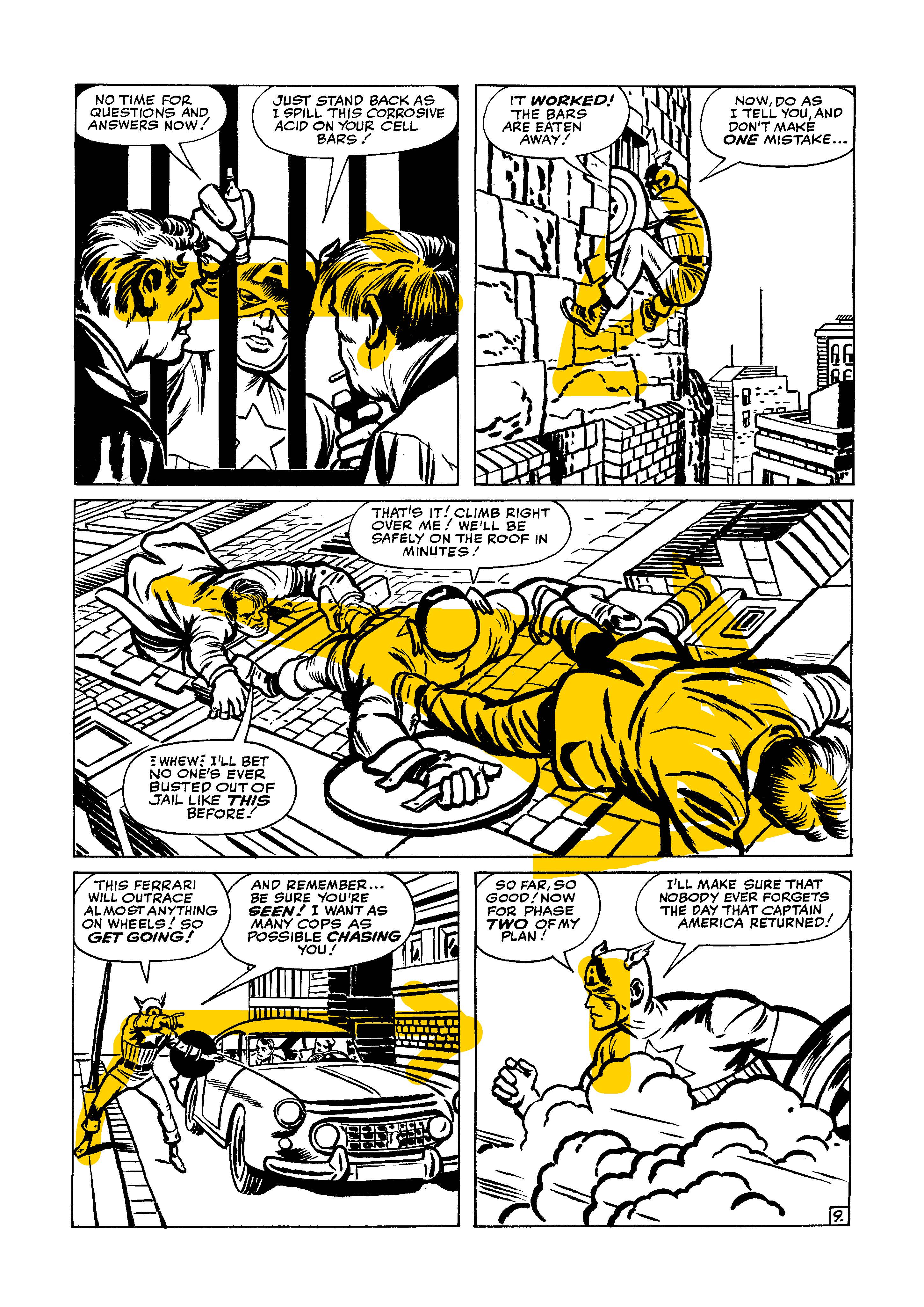
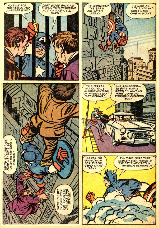
And in Panel 3, not only does Kirby have his left-to-right time trick going on here, but he couples it with a good use of forced/vectored perspective so that the car is coming forward dramatically–it doesn’t break the panel borders the way Kirby used to do in the 1940s, but it almost does. Feels kind of like Kirby was yearning for that sort of an image. Given that this story was the first time he had drawn Captain America professionally in 23 years, it’s not unlikely that he may have pulled out copies of his old bound volumes and been thinking about the sort of storytelling and figure work that made Cap such a hit in 1941. Also, everybody in this panel is overacting, but that’s what silently conveys what their reactions are. This kind of cartooning as largely fallen away in comics in recent years.
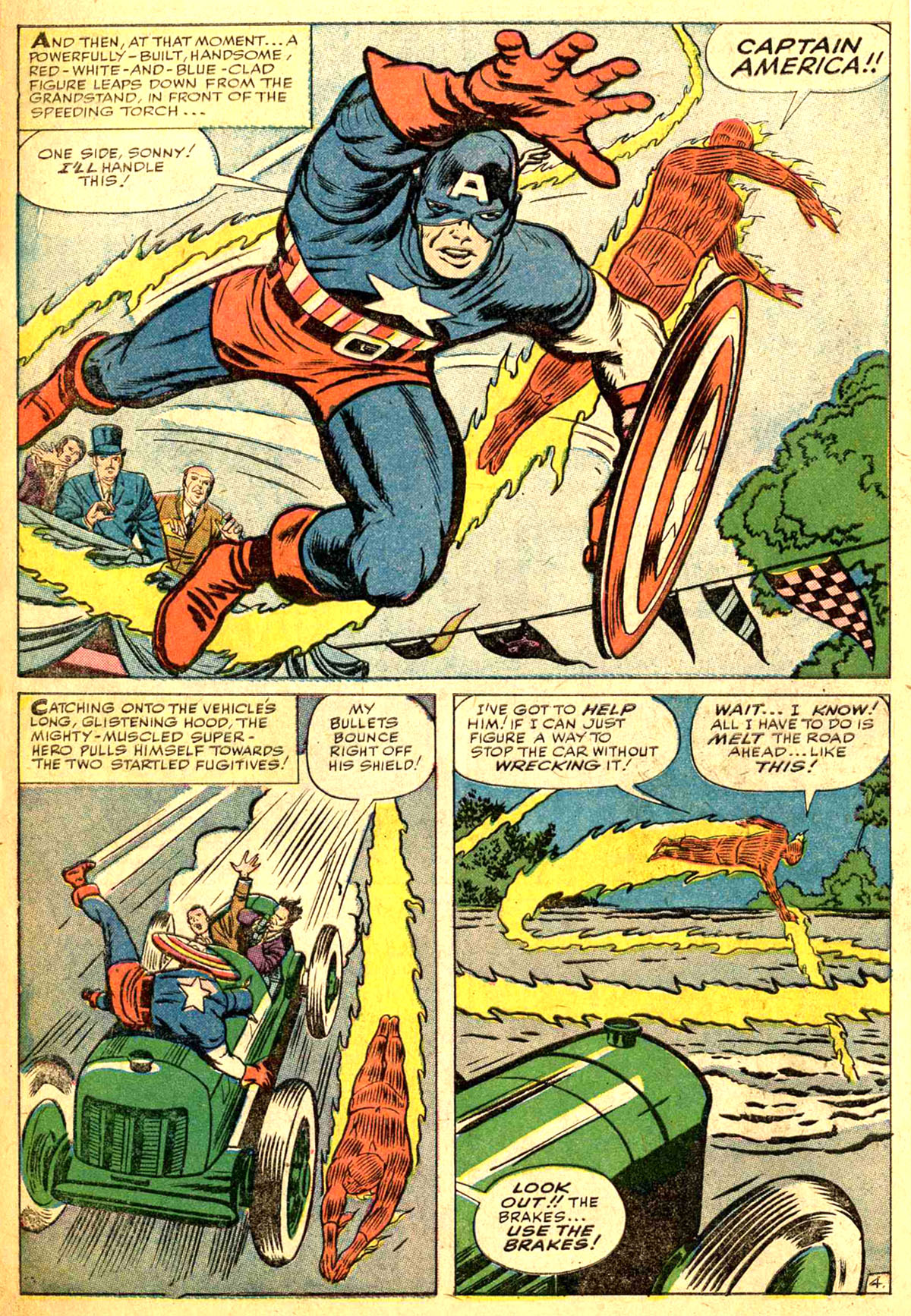
The first panel on Page 4 is the largest single frame in the story, apart from the opening splash page–Kirby is giving the entrance of Captain America the bombast that it needs. You instinctively know that this is a big deal simply given how large the panel is. Cap’s figure has a beautiful diagonal vector to it, and he’s coming forward as well, left to right, just like that car on the previous panel. But his hand and the curve of his fingers line up beautifully with the Torch’s arm, which he’s thrown up defensively as he draws up short as Cap dashes out ahead of him. The eye follows back down along the curve of Cap’s shield and then into the next panel.
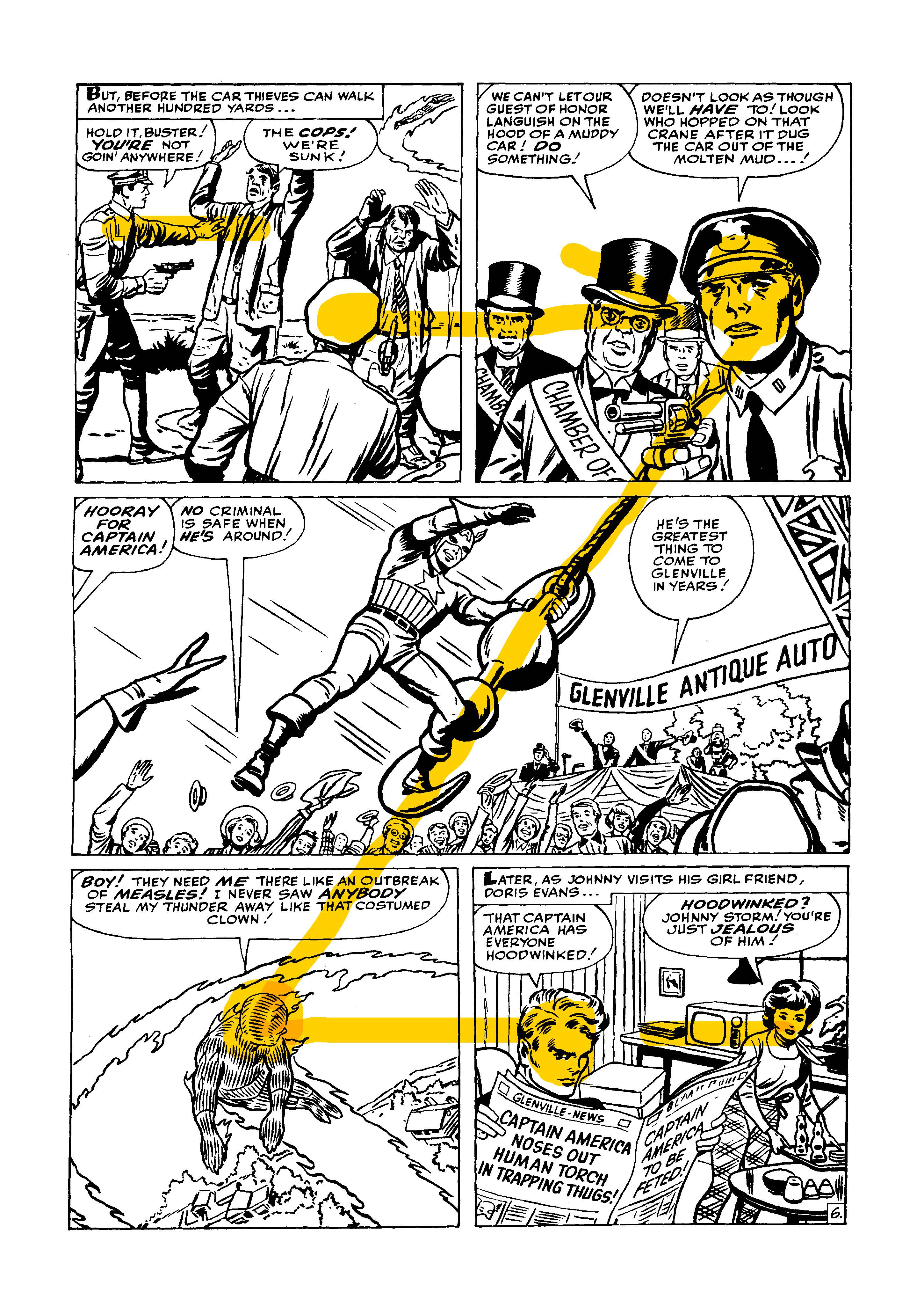
Kirby builds in another Z-pattern across the upper two tiers of the fifth page as well, but there’s more going on here as well. Tat crook’s arm in Panel 2 creates the diagonal bar of the Z, but it carries the eye right into Cap’s mudslinging attack, so it creates greater punch–Cap is literally throwing that mud into the viewer’s eye! In addition, the curve of the arc of the mud leads directly into the arc of Cap’s figure in the next panel as he dodges the Torch’s attack, directing the reader’s focus down into the last panel, where another Panel-in-Panel is taking place. The fleeing crooks are one beat, then the camera Pans right to where the Torch is confronting Cap a second later.
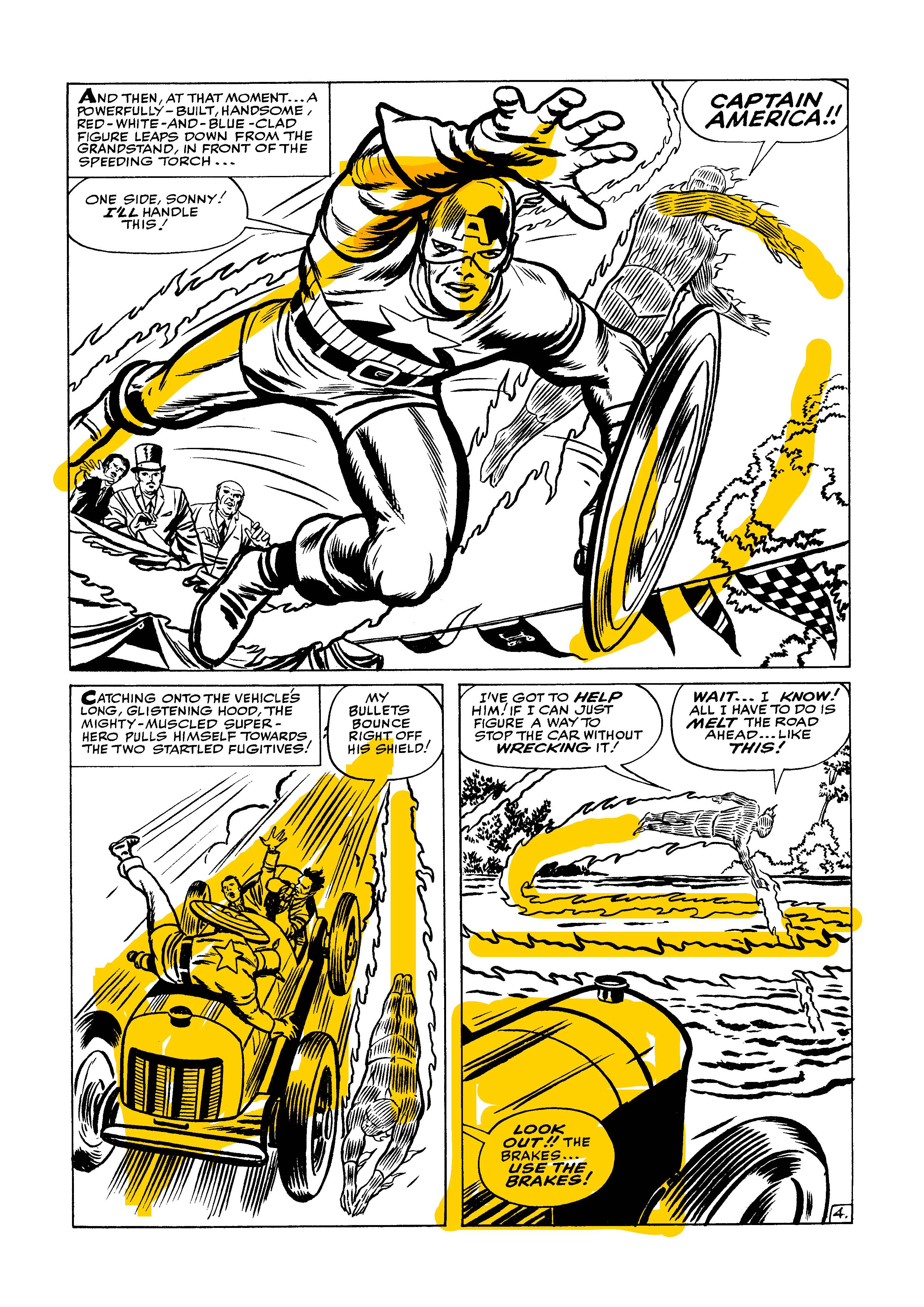
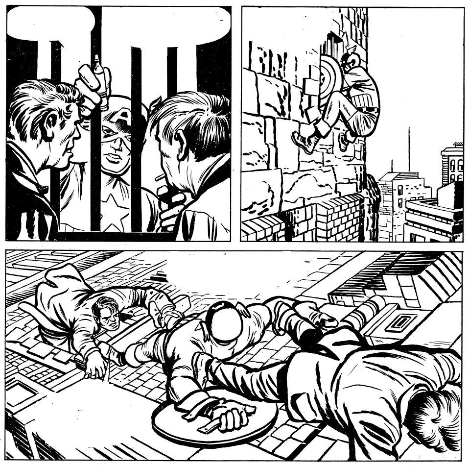
On occasion, the balloons blunt the effectiveness of some of these compositional details. That’s not really Lee’s fault–the copy had to go somewhere, and like Kirby, he’s just trying to tell the story in his own way. But that’s why I built a version of this page with the copy removed. This is how Kirby would have penciled it. It’s easy to see here that all of the scant backgrounds are cheated an impressionistic–Kirby didn’t need to slow down to look for reference, he gives the viewer just enough detail to get across the impression of places and objects.
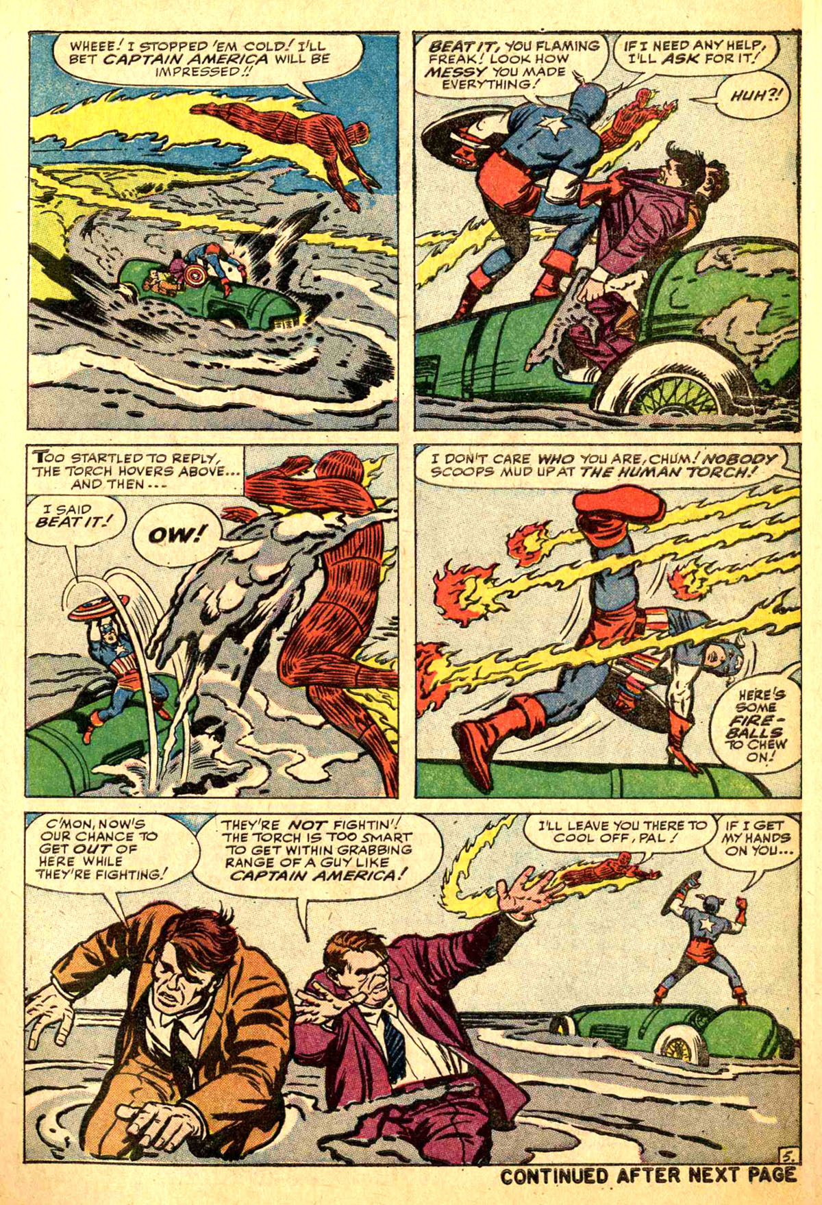
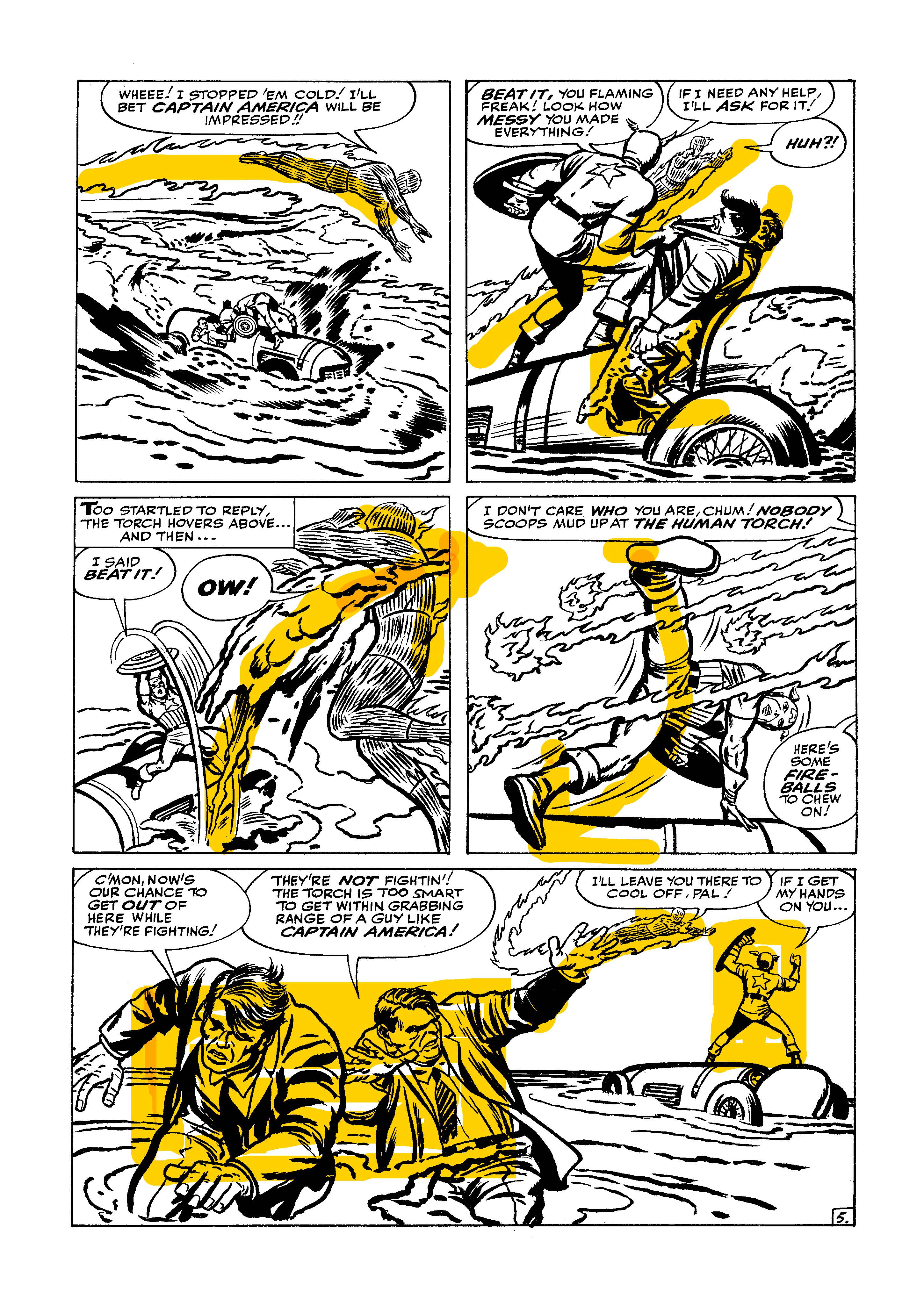
This is the clearest example of “Big-Z” storytelling in the issue, although there’s another one coming up that’s almost this overt. Here, Kirby uses the crane line that Cap is swinging on to overtly become the diagonal of the Big-Z. As usual, in the top tier, all of the focal points of interest line up, as they do in the bottom tier as well. All three heads are on the same level, even though the two shots are from different angles. The Torch figure in panel 4 is even directly looking at Panel 5 as much as he is the scene back over his shoulder.


Here’s another Big-Z, this one only taking up the top two tiers (which is more often ow Kirby would arrange his pages.) Look at the acting on these figures–Doris Evans’ stance in Panel 1 tells you everything, without a word being needed (and with only a minimum of lines.) Same thing with both Doris and Johnny in Panel 2.

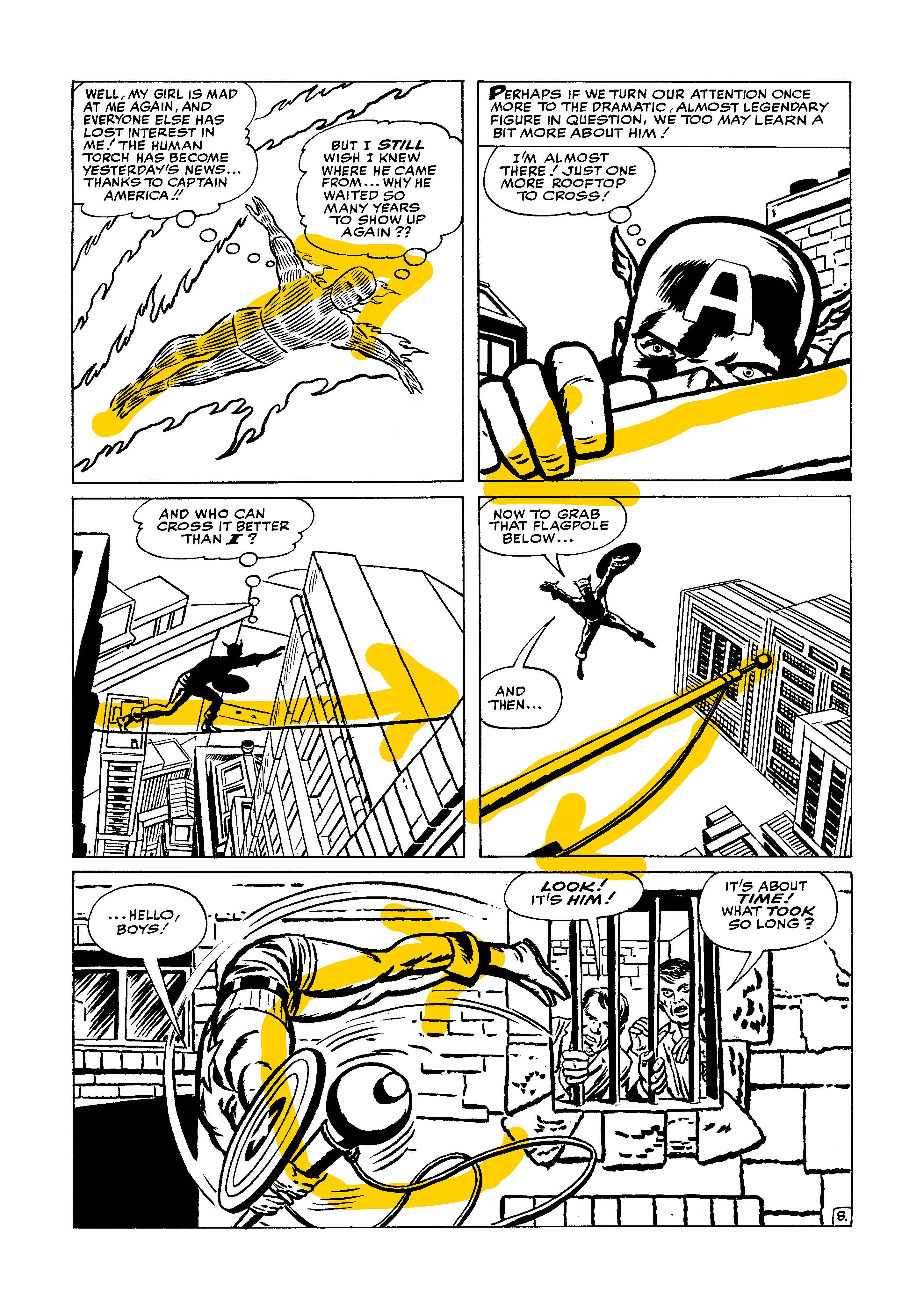
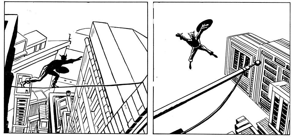
I love this page. It’s got to be one of my most favorite pages in the history of Marvel Comics. And it’s almost entirely thanks to Panel 4. That panel is awesome in its skill and simplicity. Nobody has ever drawn an image of a man leaping off a building towards an awaiting flagpole better than this one. The negative space and use of silhouette is sublime, the diagonals of the flagpole and the buildings conveying a tremendous sense of vertigo. It reads perfectly. And it’s stripped down, in that Alex Toth fashion, where there are no extraneous details to distract from the message. Panel 3 makes it even better, with the forced perspective used to establish the height (and thus the danger.)
And the way that bottom panel functions is amazing as well. The secret, I’m convinced, is in those two lines hanging off of the flagpole and being kicked up by Cap’s flip. They help to create that subliminal C-shape that both catches the eye and keeps it from flying off the bottom of the page and also to reinforce Cap’s spin around that flagpole. You can’t help but feel the motion in this shot. The crooks in the window form another Picture-In-Picture, this one overt as the window itself frames them as an element.

The central panel on this page–man! You could make the argument to me that it doesn’t work, and I couldn’t refute that argument. But, boy, it ALMOST does, and it’s at least memorable in its failure. What a crazy shot! You can almost see Kirby struggling with the narrative corner he’s painted himself into–he needs a vertical shot but the layout of the page doesn’t allow for one. So he just turns it on its side and attempts to bluff it through! Amazing! And again, he uses that forced perspective vector to give this image a feeling of movement and thrust.
EDITED TO ADD: Over on Facebook, Erik Larsen posted this makeshift rearrangement of the panels on this page illustrating tat Kirby could have done a tall vertical on the left had he wanted to. Erik agrees that this wouldn’t have been as interesting or memorable. But it does work. In addition, Kirby would have reworked Panels 4 & 5 in that case, because they would no longer be sitting next to one another.
That second panel is pretty great as well, the way the border of the building acts as a barrier to the eye, stopping it cold. Nice, simple creation of depth and height here–Dick Ayers’ inks really help to convey that illusion of depth here, with beefier, richer lines on the foreground building and Cap himself.
There are a few more interesting things going on in the back half of this story as well, but this seems like a good place to break before this becomes a novel. Hopefully, we can pick the rest of this up in the weeks ahead.

Superb analysis of Kirby’s techniques here.
….but I just can’t get past those red trunks on Cap.
LikeLike