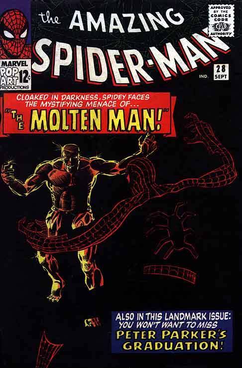
A pretty brilliant cover from Steve Ditko that reduces the iconic silhouette of Spider-Man down about as far as is possible while still keeping it identifiable. The fact that the caption boxes are also done in Spidey’s colors isn’t an accident, either.
I suspect the decision was made to color Spidey’s eyepiece red rather than keeping it its typical white because in white it would have been too strong an element, drawing the reader’s attention too much. Or it may have just been a goof, but an advantageous one.
