
As the potential audience for comic books opened up in the early 1980s with the rise and advent of the direct sales market, it wasn’t just young new would-be publishers who noticed. Some of the most established firms were just as aware of this new venue, and they geared up to enter it. One of them, surprisingly, was Archie Comics. Archie had spent the prior decade being very successful on the Newsstand, in part buoyed by the success of animated shows based on its characters. But they weren’t about to pass up an opportunity like this, nor the potential windfall that they might recoup. And so, the once again established the Red Circle line of books, an imprint under which they would produce super hero titles appropriately distanced from the Archie mainstream so as to not unsettle parents with their more action-oriented and therefore more violent content.

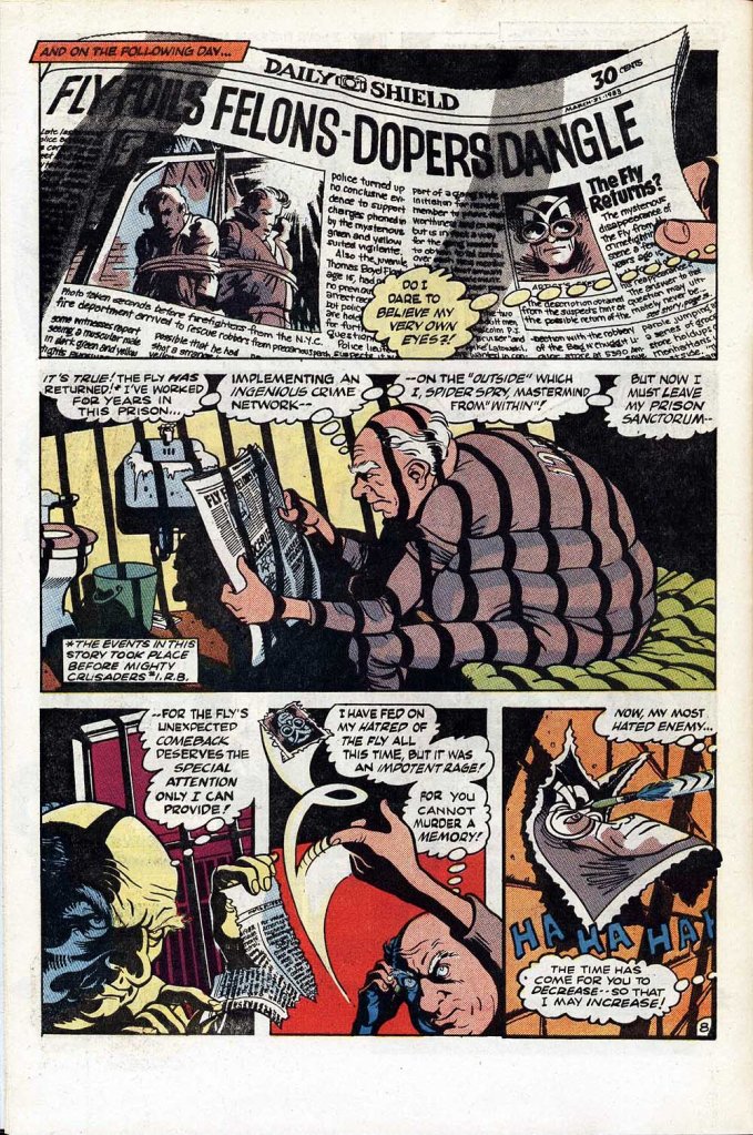
The Archie line had a backlist of super hero characters that they’d published off and on to varying degrees of success dating back to the Golden Age. So they hired Rich Buckler, who at that point was best known as a super hero penciler, to head up and oversee a new launch of those characters. This began with the first issue of a new iteration of MIGHTY CRUSADERS, featuring an octet of characters from the past united as a team in an adventure clearly patterned on the fare that Marvel in particular was producing. In short order, a bevy of other titles followed, including this one, THE FLY. Starring the character created by Joe Simon back in 1959, what made the series noteworthy at least at the time of this launch was the quality of the artwork.
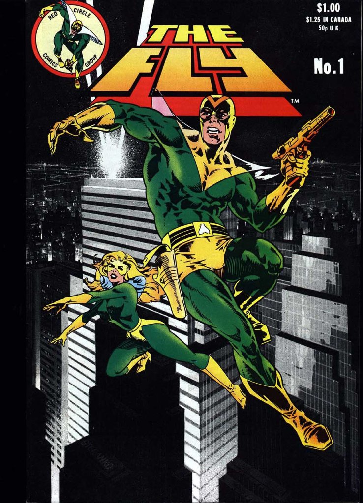
For a short time, Red Circle was able to boast of artistic contributions from some of the most exciting artists in the field at that time. This started right up front with a new cover by Jim Steranko, even then a legendary creator and a bit of a white whale. It had been close to a decade since Steranko had last produced any sort of comic book story material, but his body of work was exalted by fans, so having him as the forward face of this launch was good for business. Plus, the piece he did was also very attractive. Steranko would also contribute a cover to the second issue.

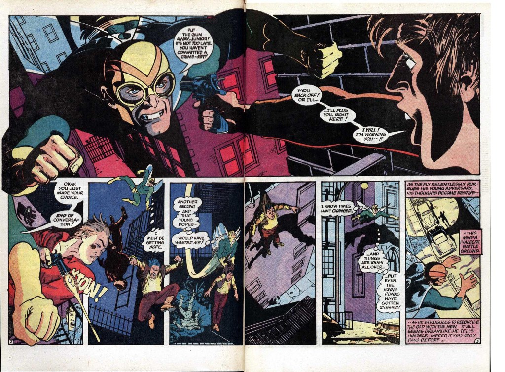
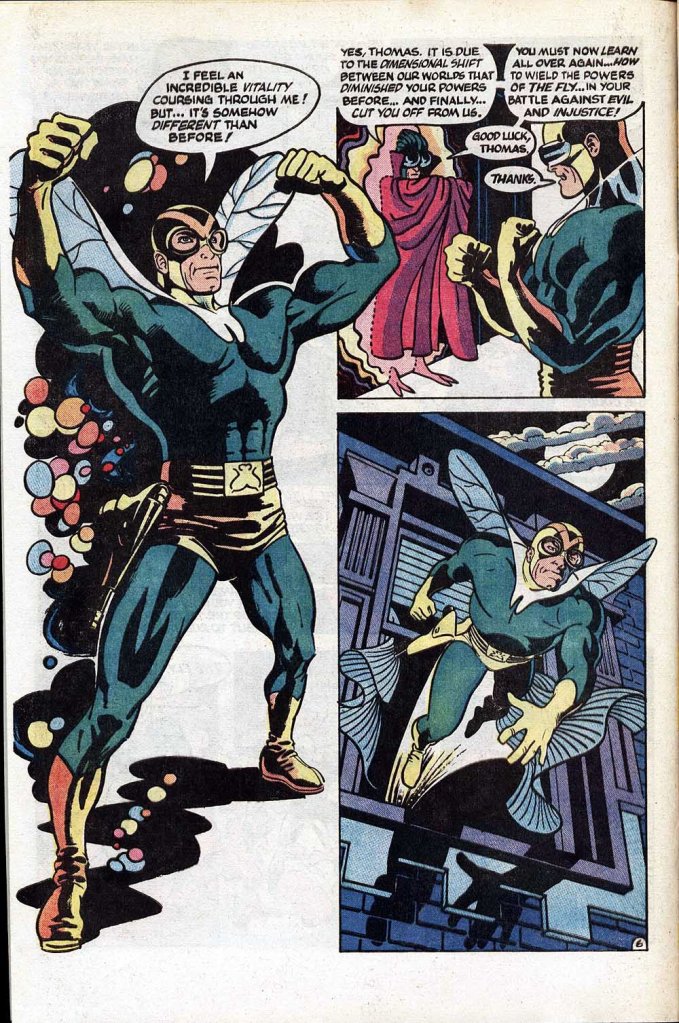
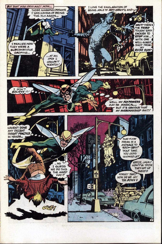
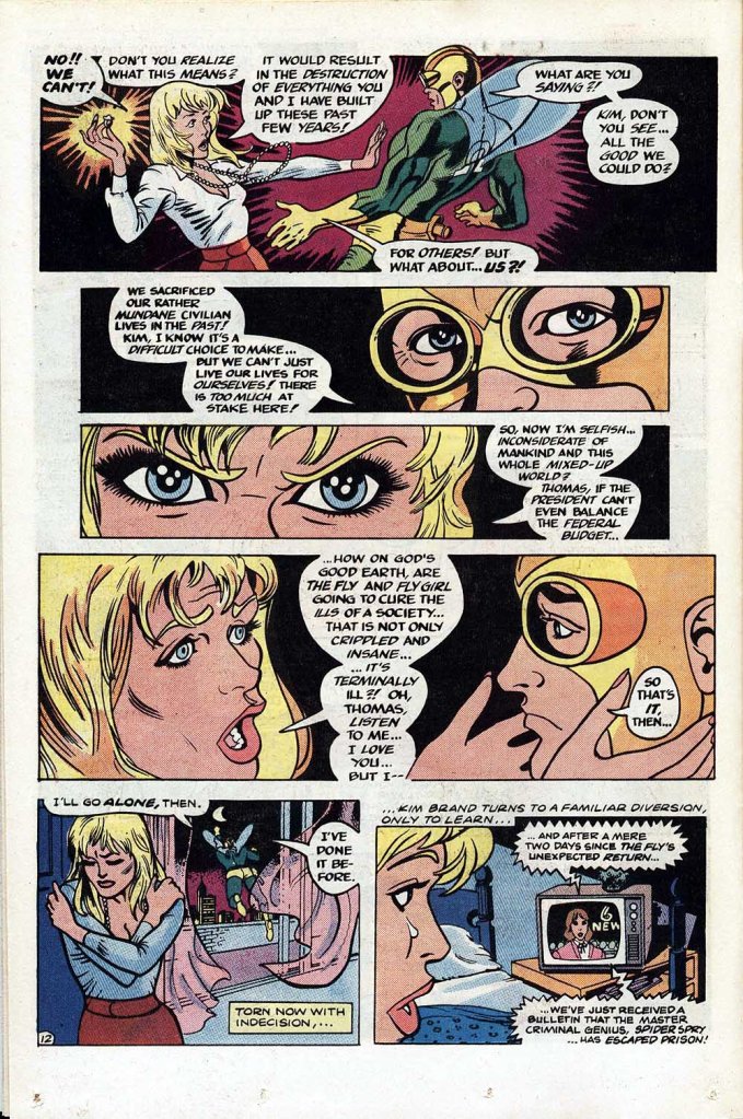
The interior artwork was similarly dazzling, produced by James Sherman. Sherman was a relative newcomer in the field, who had caught some attention for his work on LEGION OF SUPER HEROES. But he was a commercial artist as well as a comic book illustrator, and so he never wound up building up a sizeable body of work on any other feature after his Legion days were behind him. Here, he does a really beautiful job on The Fly, making the character seem modern and exciting–all this despite the fact that the narrative established that Troy hasn’t been the Fly since his last adventures were published in the mid-1960s, which would have him verging on middle age here. I don’t know that anybody especially cared.

Unfortunately for THE FLY and for the Red Circle line in general, the wheels came off the wagon very quickly. For all that he was an accomplished artist and had the connections needed to lure other young talent into working for the firm, Buckler was reportedly a bit unprepared to ride herd over the minutia of putting a comic book together, especially on a regular schedule. Books began to ship late, the contents were all over the map, and any momentum Red Circle had was tossed out the window. Buckler didn’t stay for long, but none of the folks they replaced him with were able to truly right the ship, especially since the books all still needed to come out on a regular schedule–there was no time to stop and retrench things. Additionally, Buckler had depleted the war chest of development money–offering the kinds of rates that would entice a Steranko into doing covers simply wasn’t sustainable, or an option moving forward.
Which is a bit of a shame, as the earliest Red circle releases showed some promise. This opening issue of THE FLY is relatively strong, but even though it ends on a cliffhanger, the following issue picks events up at a different point, a necessary decision given that Sherman’s story was running late. Things didn’t get better from there, despite contributions from some storied practitioners of the medium. The Red Circle line rapidly became just product, churned out without the people involved seeming to care all that much one way or the other.
This revival of THE FLY lasted for 9 issues before Archie gave up the ghost. Attempts to change the branding on teh books from Red Circle to Archie Adventure Line didn’t help, nor did adopting a cover trade dress emulating that of Marvel. As happened again and again historically, Archie as an organization always lacked the will to ever seriously commit to publishing super hero books regularly. They would dabble whenever the market seemed strong, but quickly retreat to the tried-and true of their line, teen humor comics, whenever the going got tougher or anything went wrong. And this 1983 attempt was no different.
Story-wise, while there were occasionally some interesting experiments attempted in the Red Circle books, the level of writing throughout was really quite lackluster. None of it was helped by the fact that Buckler in particular, in emulation of the appeal of the Marvel Universe, would continually refer to comics and stories published decades before, in a manner that seemingly expected a new young audience to be familiar with them. While there may have been some MLJ diehards who appreciated this continuity, to anybody not already steeped in the history, it was all perplexing. (Heck, there were two different heroes called The Shield on the MIghty Crusaders at the same time, with references to a third! How could any newcomer possibly be expected to keep all of this stuff straight–or to care about any of it?)


Interesting…I was also involved a bit
LikeLike
I have to agree on this, Tom, Jim Sherman’s art is beautiful. Holy spit, it’s fantastic. It reminds me of David A. Williams’s work. Or George Freeman’s. Even Steve Rude’s, because of the lighting. That opening page is a stunner, on a level of the best DD story. And it just continues to stun, page after page.
LikeLiked by 1 person
I enjoyed the Mighty Crusaders issues I read but I’m the kind of nerd who’s into past continuity.
TwoMorrow’s MLJ Companion argues that one reason these characters stay around is that multiple revivals mean most generations of comics fans have seen them, but there isn’t one definitive take that anyone feels bound by.
LikeLiked by 1 person
I loved Sherman’s brief, bright tenure on Legion so I wish I’d known he’d done this! BTW, did anyone else think the cover was by Don Newton before being corrected?
LikeLiked by 2 people
Actually, the art reminds me a little of Dan Spiegel, an artist who drew a lot of Gold Key comics and had a long run on Blackhawk.
LikeLiked by 1 person
The work is beautiful. It reminds me of Michael Golden.
LikeLike
Thanks for reminding me of this one. I’m definitely a fan of James Sherman’s work, and I wish he’d been able to do more in the comic book medium.
I’ve featured this issue in my latest Comic Book Coffee entry, with a link back to your blog post:
https://www.firstcomicsnews.com/comic-book-coffee-number-117-the-fly-1-1983/
LikeLiked by 1 person
I collected Fly, Jag Crusaders. Black Hood. I still have many of them.
LikeLike