
For most of the Golden Age of Comics, the partnership of Joe Simon and Jack Kirby had been a sales juggernaut. While they had their occasional flops, more often than not the combo was responsible for hit after hit–enough so that their names would sometimes be called on in the advertising, something that typically was anathema to the publishers of the era. However, by 1959, that partnership had reached its end. The contraction of the comic book field following the Senate hearings on comic books and juvenile delinquency and the formation of the Comics Code Authority saw any number of creators and publishers leave the field in search of greener pastures. And after their own self-financed publishing operation Mainline was forced to go out of shop (representing a sharp loss of revenue to the pair), Joe Simon got out of the business, leaving Kirby to fend for himself.
In the partnership, while both men tended to work interchangeably on the material they produced, it was almost always Simon who dealt with the publishers who contracted work from S & K. Despite his pugilistic nature, Kirby was a bit cowed by the often wealthy and well-to-do operators that he worked for, and preferred to focus on telling stories while his partner Simon did the hobnobbing and glad-handing. With Simon out of the game, Kirby was forced to fend for himself, which led to a number of years of struggle, as he tried to find purchase for himself at a succession of publishing houses, with only limited success until he’d eventually “wash up” (as it was once put) at Martin Goodman’s Marvel, where he’d revolutionize the super hero feature. But shortly before that, there was a little bit of a preview of what Kirby would eventually go on to do.
Even by 1959, there was a bit of evidence that there was still some life in the costumed adventurer series. After a number of fallow years, DC/National Comics was beginning to have some success with its newly revived super heroes from the past. This didn’t escape the notice of John Goldwater, the publisher of Archie Comics. While his firm’s bread and butter had been teenage hijinx for many years now, Goldwater wasn’t about to let a newly developing trend pass him by. And so, he and Archie took a tentative step into the super hero arena with a number of new titles, some of which would go on for several years. THE DOUBLE LIFE OF PRIVATE STRONG wasn’t one of these.
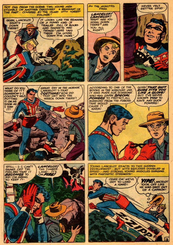
In setting up Archie’s new heroic venture, Goldwater turned to the person he felt understood making super hero comic books successful the best: Joe Simon. Simon contracted with Goldwater to produce two series. The first, THE FLY, was a reworking of a concept that had languished in development after it had been rejected by Harvey Comics, the SILVER SPIDER. The second would be a revival of Archie’s most successful super hero character of the 1940s, the Shield. Simon, in turn, reached out to his old partner Jack Kirby to get him on board for this venture as well, momentarily reuniting the team. Kirby didn’t have any particular interest in the Shield, but he and Simon were given the latitude to totally reinvent the character for the space age.
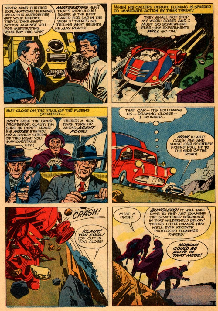
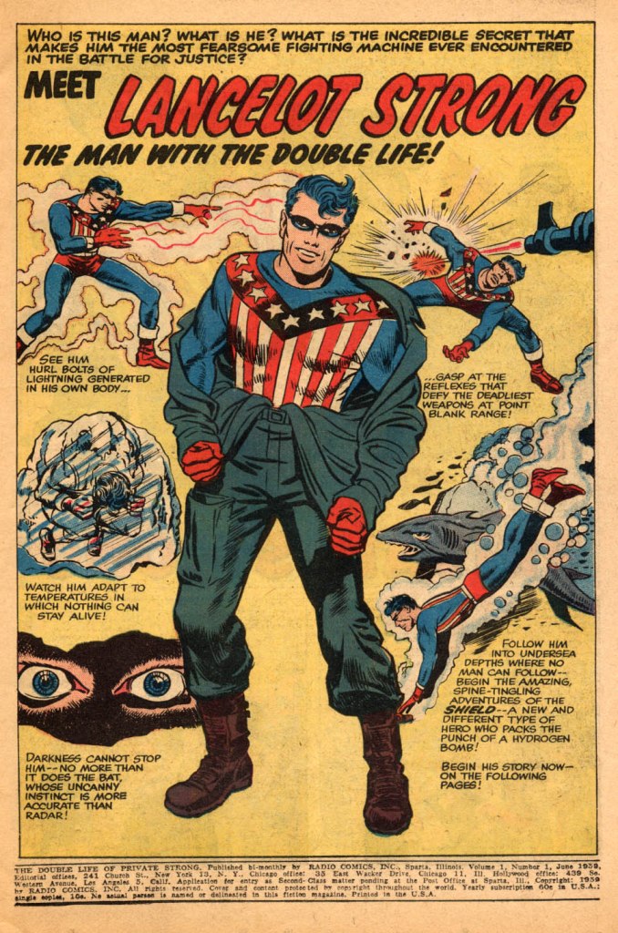
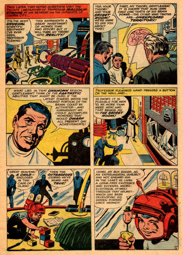
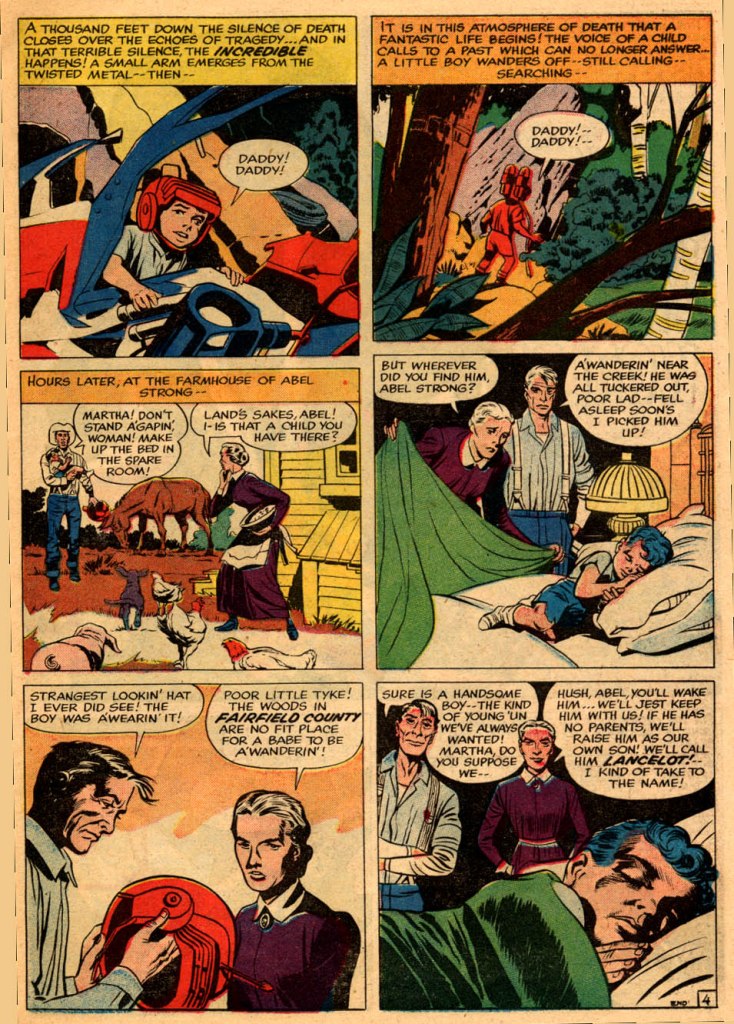
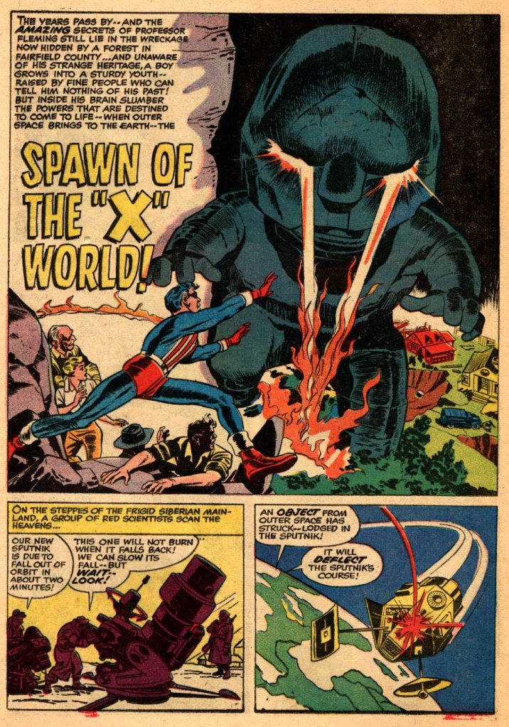
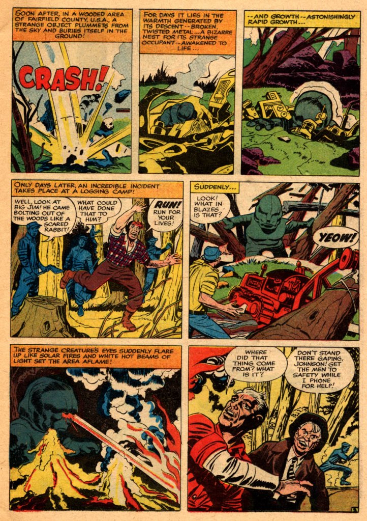
The end result was the first modern exploitation of Jack Kirby’s imagination on a Silver Age super hero character. The duo envisioned their new Shield as a military man in the mold of Steve Rogers, an army private who would secretly be a patriotic-themed hero. But that’s about where the resemblance ends. In the tradition of Doc Savage, Lancelot Strong was raised in isolation by his scientist father (alternately named Malcolm Strong and Professor Fleming, in an instance where it seems like something was changed mid-stream.), who used advanced techniques to give his offspring incredible abilities by allowing him to utilize the total power of his brain, rather than just a fraction. The presentation of this origin was much more plausibly built and rationalized than most Golden Age heroes, including the previous Shield. Simon and Kirby also redesigned the Shield’s costume, bringing him more in line with their aesthetic.
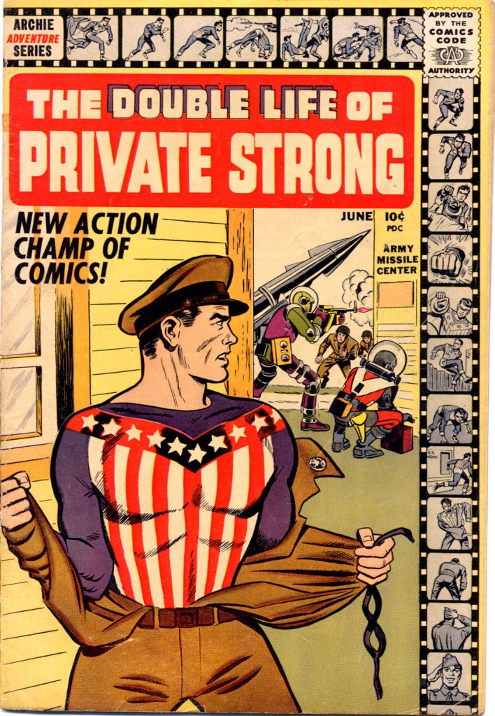
For some reason, perhaps caution on the part of John Goldwater (caution that would prove warranted given how things worked out) the Shield wasn’t debuted in a title under his own name, but rather launched as THE DOUBLE LIFE OF PRIVATE STRONG, perhaps as a way of disguising how much of a super hero concept this all was. It seems that Joe Simon penciled at least the Private Strong figure on the cover, making him look somehow less impressive than he did on the interiors as he strips off his army uniform in favor of his colorful costume and action. Both the film strip running across the top and down the side of the cover and the call-out referring to Private Strong as the NEW ACTION CHAMP OF COMICS have their antecedents in other previous Simon & Kirby efforts. So the whole thing was a bit of a stealth launch.
ADDITION: Jesse Simon tells me that the cover was penciled by George Tuska.
But it’s not easy to be stealthy when your competition owns the distributor, and so it was that THE DOUBLE LIFE OF PRIVATE STRONG came to the attention of Jack Liebowitz and Harry Donenfeld at DC/National Comics. They were fiercely protective of their dominance of the super hero marketplace, and in particular their marque character Superman. And they felt that the Shield/Private Strong veered to close to the Man of Steel in terms of the presentation and the kinds of feats that Simon and Kirby had him display in that first issue. From an objective standpoint, there doesn’t seem to be a whole lot of merit to these claims–but DC/National sent Archie a C & D, and threatened to sue. And so Goldwater got cold feet.
Consequently, Archie decided to cut bait with THE DOUBLE LIFE OF PRIVATE STRONG, ending the title after just two issues in order to placate Donenfeld, Liebowitz and DC/National. Simon & Kirby’s other creation, THE FLY, would last longer–but Kirby himself wouldn’t be much involved with it beyond its second issue, and even Simon was ousted in favor of Archie’s in-house editorial staff after four issues. The Fly was thereafter retooled as well, making the strip a little bit less adventurous and adult than it had been, even while aging up the protagonist’s alter ego, Tommy Troy,
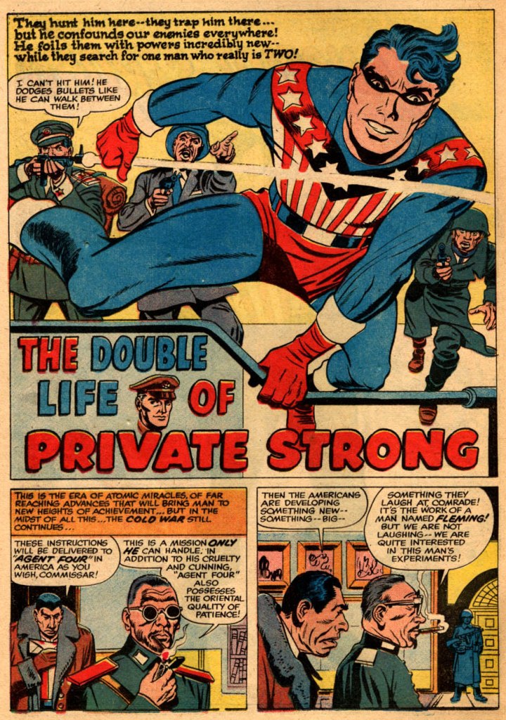
Which is kind of a shame. For readers of this period, THE DOUBLE LIFE OF PRIVATE STRONG was well-remembered, both for its story approach and for Kirby’s dynamic artwork. This was a more mature Kirby than the one who had toiled at the beginning of the Golden Age on costumed heroes, and the sense of dramatics and power and energy that he would soon apply to his Marvel creations is in full evidence here. If allowed to flourish for a bit longer, THE DOUBLE LIFE OF PRIVATE STRONG might have grown into something noteworthy.
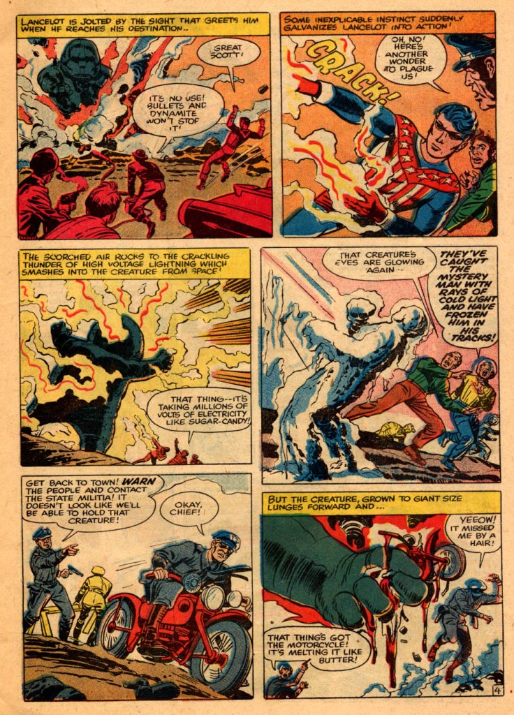
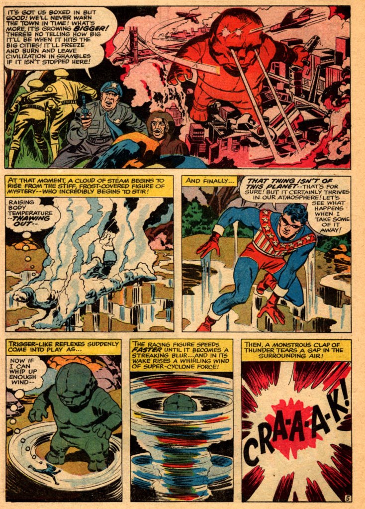
The manner in which the Shield pulls powers out of thin air as the situation calls for them is reminiscent of the way in which Kirby would handle later characters such as OMAC. His cadence can also be found in some of the copy (though not all of it–portions of these stories were definitely written or rewritten by Simon.)
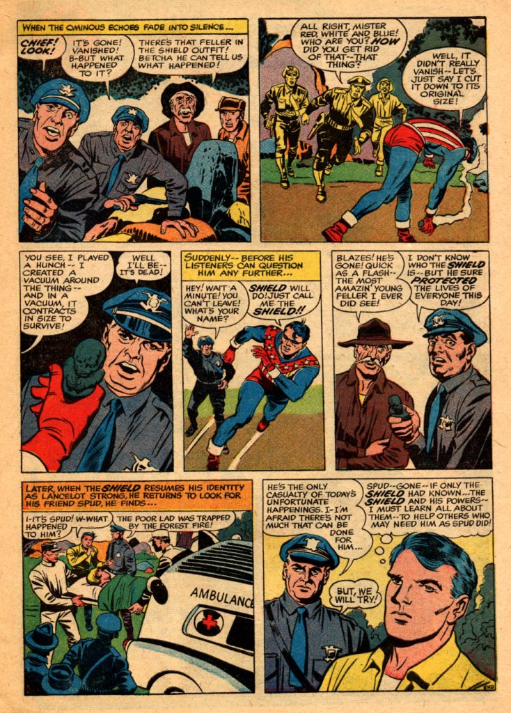
The cop’s second balloon in that last panel was lettered in after the fact by another hand, possibly as a sop to the Comics Code.

A favorite of Barry Windsor Smith, among others.
LikeLike
Yeah I see the similarities to Superman..blue and red costume. More similar to wonder woman.. sheesh…yeah Leibowitz was a rough character..I interviewed him
LikeLiked by 2 people
I’ve never seen this. Thanks.
LikeLiked by 1 person
The distributor code on that cover is PDC, not IND – I know that Independent News’ owners also had ownership stakes in other publishers and distributors, but I’ve never seen a claim that they were inter-connected to Independent News.
LikeLiked by 1 person
Great article! I was the guy who uncovered in the DC archives the cease-and-desist letter from DC to Archie regarding “the double life of private strong.” When I told Joe Simon about it, he was dumb struck! He had always simply been told or simply thought it was due to poor initial sales.
I spent a lot of time with Jo and we talked about all sorts of things over the years. I seem to remember him telling me the cover of the issue number one When I told Joe Simon about it, he was dumb struck! He had always simply been told or simply thought it was due to poor initial sales.
I spent a lot of time with Jo and we talked about all sorts of things over the years. I seem to remember him telling me the cover of the issue number one was by him and George Tuska. If someone could verify that, I would appreciate it. Joe’s layout design of the cover with the little film strips was to try to appeal to the readers who were being “stolen away” by the growth of television and movies. One final note, I remember joe telling me that the decision about the title of the book was a business decision and not a creative one. That has always led me to believe that there may have been at that time some legal issue… May be a trademark issue… with Archie using “the shield “as a title. That is another topic for some comic book historian or lawyer to research and investigate.
LikeLiked by 3 people
There is certainly a lot of Tuska in Strong’s profile on that cover.
LikeLike
The cuffs on the boots & gloves recall those on Joe & Jack’s Fighting American. I dislike the red underpants. The stars across the chest should be an a blue stripe, not red, if you’re following the US flag design.
I still think there’s potential in much of the ideas for the original Shield character. I see him drawn in the sturdy style of Ron Garney, or Lee Weeks (I won’t my breath for those greats to ever draw him). White hair, but no beard like the most recent version wore.
He’d have what few heroes in comics do, a long history in continuity to give him more perspective & experience. He’d be more cynical than Cap. With a grudge against the “military industrial complex” Eisenhower warned about. He feels they betrayed the dream.
The suit would be simple. Dark blue “SWAT” style combat fatigues, tucked into boots. That original head mask that left the hair exposed, there’s a gap of exposed skin on his neck, between where the mask ends, and his sleeveless steel wire mesh vest starts (bare arms because he’s invulnerable) The vest would be modeled on the original, but with the vertical red & white stripes ending at the blue field with a row of 3 white stars (no horizontal white stripe in between).
LikeLiked by 1 person