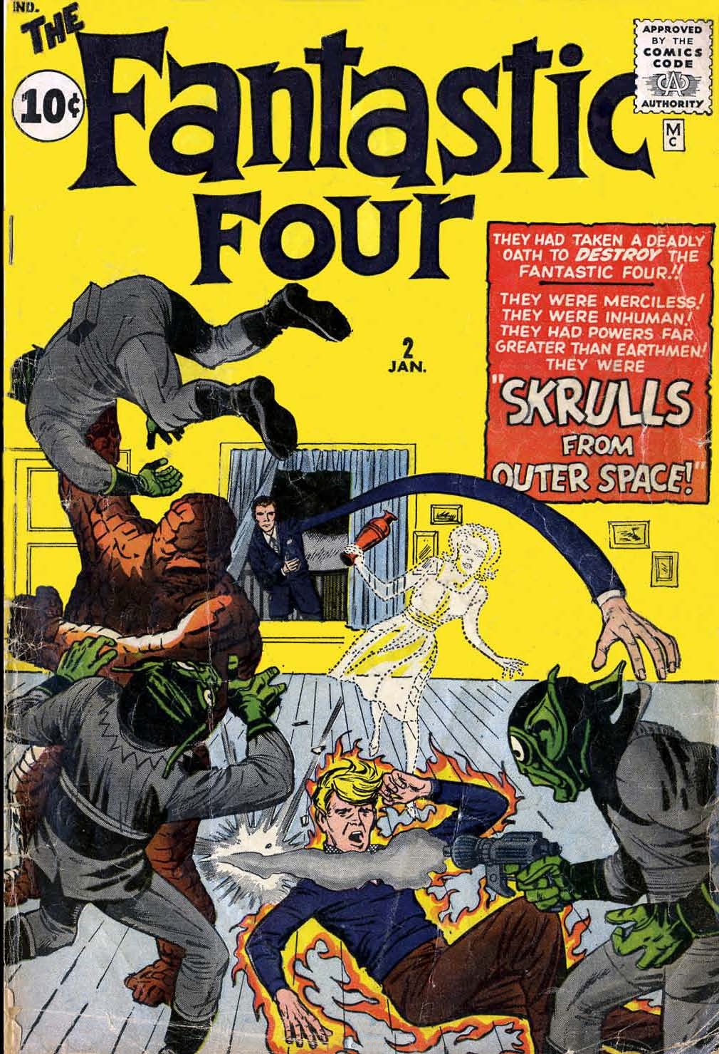
Continuing on in our analysis of the construction of the first three issues of FANTASTIC FOUR, our attention now turns to issue #2. But first, a bit of a statement of purpose.
Somebody over the course of the last week asked me why I was writing these pieces, what the point I was trying to make was. I feel as though the answer is relatively straightforward, but since at least one person didn’t understand it, I expect it’s best to clarify things out loud. I’m interested in comic book history and the manner in which these early comics were put together, so I enjoy studying them and trying to figure out what made them tick and how they came together. And as there are a number of points that have seemed evident to me that I haven’t seen other people talking about, writing up a series of pieces that could articulate some of those notions seemed like a good thing to do–in order to spread information as well as to encourage discussion of these questions. I don’t know that we’ll ever know with 100% accuracy exactly how all of these formative books were put together, but the more evidence we can line up, the better our understanding will be.
But I’m overtly not trying to prove that Stan Lee created the Fantastic Four, nor that Jack Kirby did so, As I’ve stated a couple times now, I believe the only credit that makes sense and correctly encapsulates the work is “Lee & Kirby”. Beyond that, while I don’t think the credit should necessarily be apportioned evenly, it seems tome to be an act of madness to try to divide things so that 83% belonged to one party or the other. It was the specific combination of these talents at that moment that made FANTASTIC FOUR and the other early Marvel books the successes they became, and that is something I feel confident may well never have happened without both contributors working in unison.
My analysis seems to indicate that on these first three issues of FANTASTIC FOUR, Lee and Kirby were working more closely together than they would on the subsequent releases. I’ll be able to show a bit more concrete evidence of the shape this took when we get to talking about issue #3, the earliest issue for which some of the original art pages are known to exist. Once we get to issue #4 and beyond, all evidence of another hand in the page and panel layouts vanishes–it’s all at least 99% Kirby. Whether this was because Lee wanted to take a more active hand in launching the series or things simply got too busy for this level of micro-management, or whatever the case may be, that’s the first point where things changed. (There’s also no evidence of this manner of oversight on, say, INCREDIBLE HULK #1, which also follows typical Kirby layout structures throughout its pages.)
Okay, enough preamble. Let’s get on to the main event. I’m not going to post every page of FANTASTIC FOUR #2, but I will take a look at some of the evidence of collaboration within it. Most of it, though, follows typical Kirby page and panel construction, so it’s safe to assume that he was driving the bus on any pages that I don’t post herein. It’s generally accepted that the art job in FANTASTIC FOUR #1 is pretty lackluster by Kirby standards. I wonder how much of that may have stemmed from the heavier hand on the art direction by Stan? Kirby was always more interested in telling a story than anything else, and here was a circumstance where some of those storytelling choices were taken away from him. Maybe that explains why the work was so relatively weak. (I would also conjecture that perhaps the choice of George Klein to ink these early issues–if indeed he was the inker as is generally believed today–was to try to give them more of a super hero feel than Kirby’s monster or romance or western work. Klein at the time was inking Curt Swan on SUPERMAN, and you really can’t get a more classic super hero finish than that.)
This cover to FANTASTIC FOUR #2 is itself pretty strange. At this point, it’s clear that publisher Martin Goodman was trying to stealthily bring out a new super hero comic without arousing the ire of his distributor, Independent News, which was a part of National Periodicals AKA DC Comics. They were known to be litigious and aggressive about protecting their virtual monopoly of the super hero marketplace.
Still, just looking at this cover, I can’t quite tell what sort of a comic book it is. As a super hero reader, I likely would have gone right past it on the racks. Similarly, I don’t know that it would have caught my attention if I was a fan of the “big monster” comics that Lee and Kirby were doing at this time. Oddly, both Skrulls on this cover whose faces we can see almost look as though they’re wearing rubber masks.

Here’s a comparison as to how the cover to FANTASTIC FOUR #2 was originally drawn and lettered, and what actually made it to the stands. Typically, alterations like this were requested by publisher Martin Goodman, who didn’t care much about content, but who believed that a strong cover was what sold the magazine.
Here, it seems likely that he was trying to tone down the super hero aspect of the cover a bit. The bursts featuring the individual characters’ names have been removed, as have their word balloons. Oddly, a halo of flame has been added to the Torch even as his balloon about not being on fire is eliminated. Finally, the redundant use of the phrase “THE DEADLY” was removed from the caption box. And a few photos were added into the now-empty space on the back wall. I don’t know that any of this was an improvement. The original cover was definitely cluttered, but it was also considerably more exciting.

As I mentioned earlier, the storytelling throughout FANTASTIC FOUR #2 is much more consistent with Kirby’s approach, indicating that Stan had fewer places where he insisted on a particular bit of art direction. It seems that Kirby was largely left to choreograph and draw this story on his own, as he would typically do.
The only credits on this issue are Stan and Jack’s signatures to the left of the caption box. Both of these look to have been added in after the fact, and neither one appears to be a genuine signature to my eye, although the Stan one does have the distinctive connection of the S and T he would usually employ..
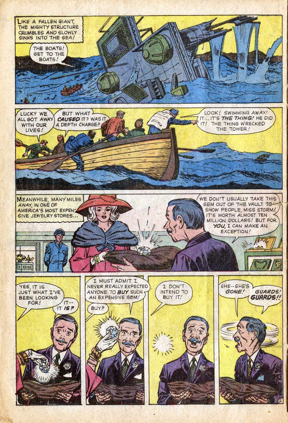
Kirby did use more horizontal panels on this particular story than he usually did, and tended to make them smaller, as though he was trying to cram a lot of story into a very small space. This page, for example, has seven panels. Was this a Stan layout? If nothing else, the four repeat-shot panels at the bottom of the page feel like a Kirby approach, and their space approximates two typical square panels.
It’s perhaps also worth noting that, much as in the opening to FF #1, here Sue Storm is seemingly characterized as a high society lady. That approach tot eh character wouldn’t last, but it does give us a sense as to what the simple starting point for the character might have been.
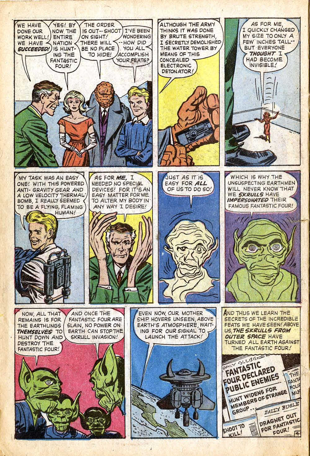
Another page with a surfeit of panels, although these all fall within Kirby’s typical grid-pattern. Jack is simply breaking one panel into two in most of these instances, so the storytelling still feels like his. That background line in the first panel, though, looks like an afterthought, so maybe Klein added it in the inks. The triptych of Reed transforming into a Skrull is a Kirby touch for certain.
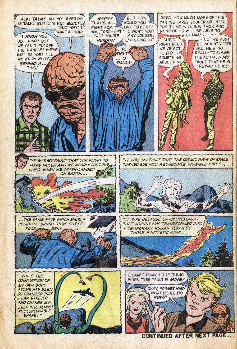
This page, with its origin flashback, has the feeling of Stan’s layout structure. I actually wonder if that origin flashback was an add-in, Stan deciding that he wanted or needed to recap the origin of the characters and their fantastic powers before proceeding. The top tier is paced like typical Kirby. That Reed head in the caption of Panel 4 is almost certainly the work of production man Sol Brodsky.
This whole sequence, with its triptych and quadratic repeated panel structure, feels like Kirby. Looks like the last word in the first balloon in that first panel was changed or relettered for some reason. (Did it initially say FIRE?)

That first panel looks to me like the artwork was shrunk and shifted over to the right side, allowing for the caption on the left. It looks as though Sue’s head was extended on the right up there as well. The third panel likewise has a bunch of odd black dead space at the right, which is obscured by the balloons. Johnny’s knuckles look weird to my eye as well. Makes me think that this page was monkeyed with after it was initially drawn. Panel 2 may have been added in after the fact.
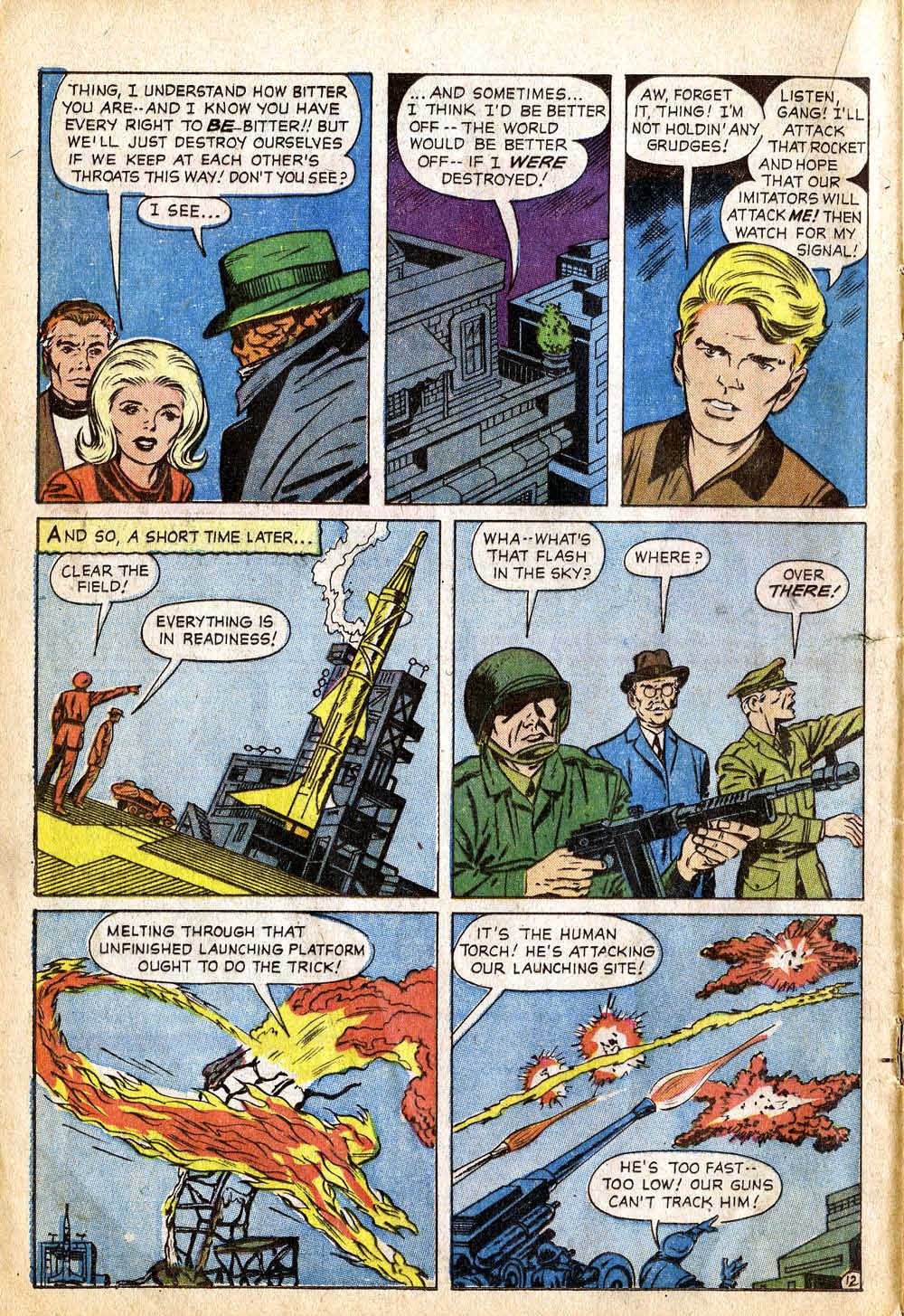
Here’s a weird choice on Kirby’s part: why is Panel 2 a shot of buildings? It doesn’t designate a transition to a new environment or the passage of time, because we’re still with the Torch in the room in Panel 3. I can’t even quite tell what the subject of Panel 2 is, what I’m supposed to be looking at or seeing here. I wonder if this image wasn’t changed in some way. Perhaps at one point this showed the Torch flaming on and flying off towards the rocket site.

Here’s another weird shot of a building mid-sequence, in Panel 5. I wonder if the intent here wasn’t that Reed let the Thing loose to brutalize the information the team needed out of the Skrulls, and we were meant to hear the violence but not see it. That shadow on Reed’s face in the final panel is an interesting choice.
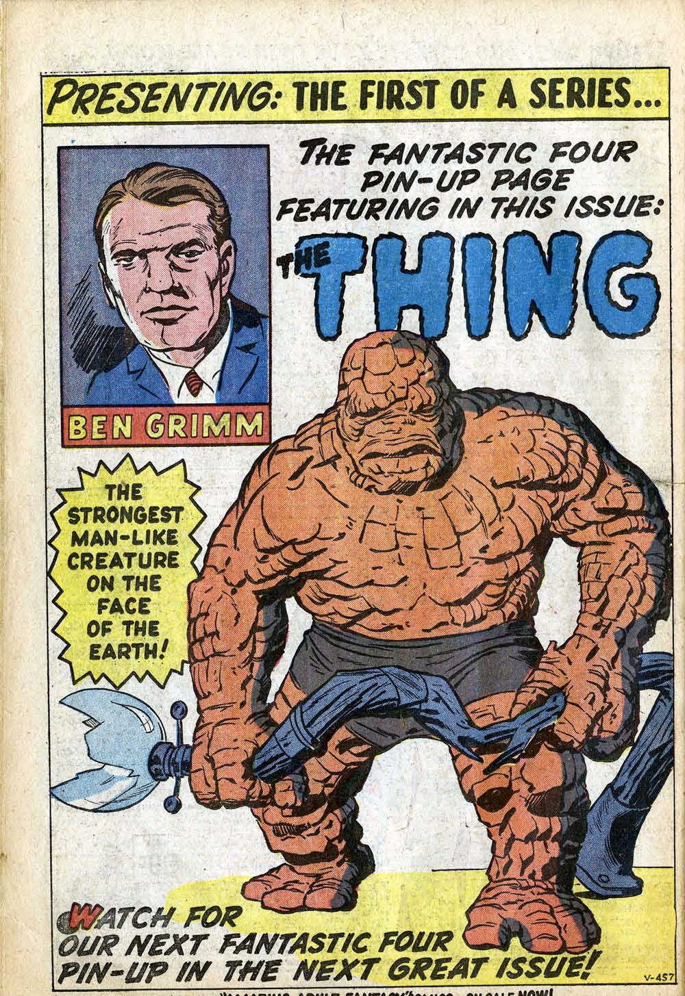
At around this point in the book, the first of a series of Pin-Up pages of the Fantastic Four characters runs. In his excellent book STUF’ SAID, John Morrow conjectures that these pages (at least the ones that ran in issues #2-4) may have originally been created as Kirby’s design shots of the team. That makes a lot of sense to me. The pin-up carries the same job number on it as the rest of FANTASTIC FOUR #2, but that number may simply have been assigned to it when the decision to use it as a pin-up in this issue was made. Stan also plugs his other pet project–one that may have meant more to him than FANTASTIC FOUR did–AMAZING ADULT FANTASY at the bottom of this pin-up page.

This is a strange layout for a chapter break for Kirby. He wouldn’t typically compress a splash image into that small a space, nor would he usually choose to run two tiers of panels underneath it. So something odd is going on here. Could be a Lee layout, could be playing around with the page after the fact a little bit.

Here, famously, Kirby screws up, forgetting that there had been four Skrulls left trapped in this apartment rather than three. Lee attempts to cover this fact in copy, but it doesn’t really work–we saw four Skrulls tied up back on Page 21. Reader Douglas Wolk correctly points out that THE THIRD ONE was clearly relettered in that first panel, likely from something shorter given how jammed in there it is.
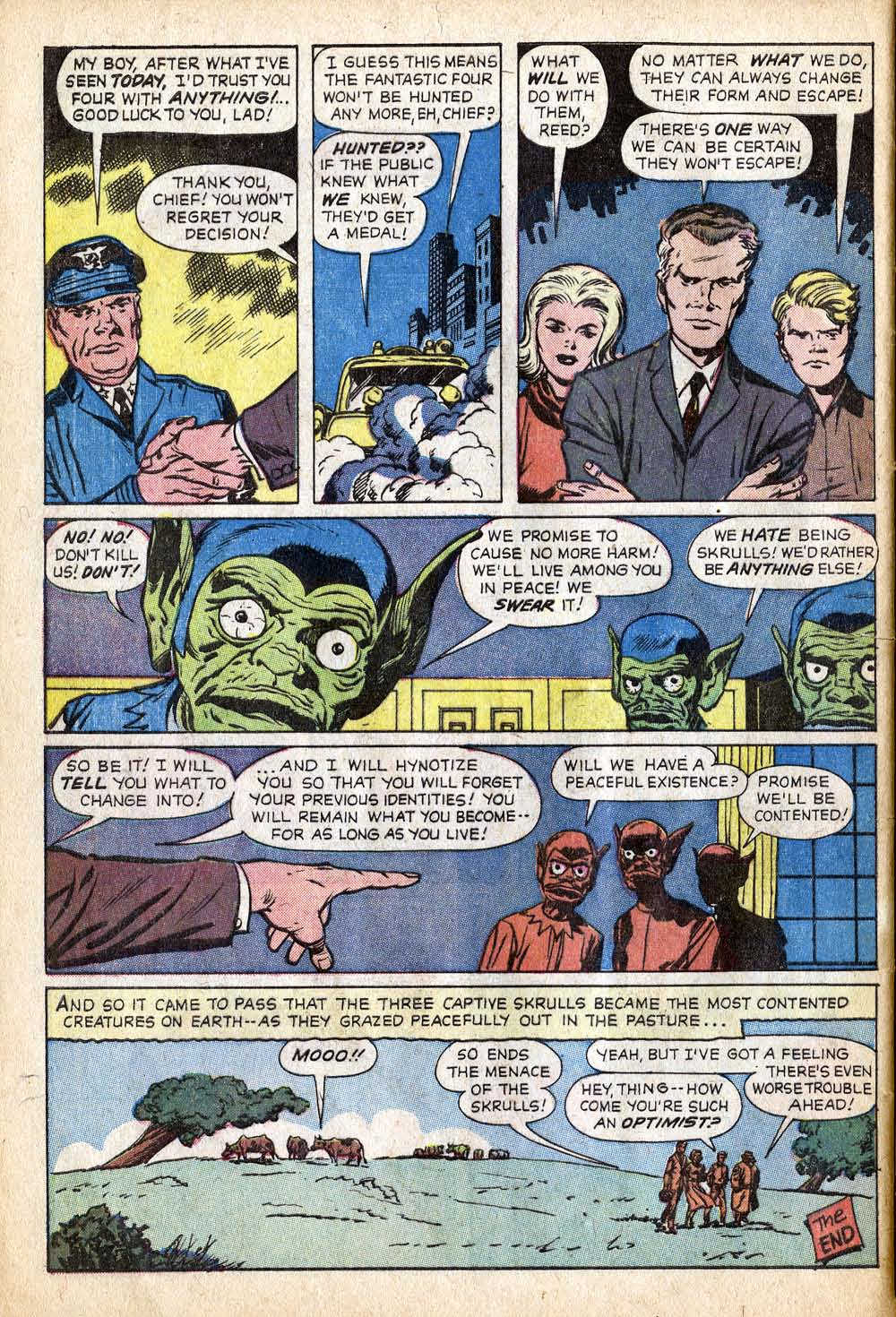
The issue ends on more horizontal panels, which make me think that Stan’s hand was involved here. Also, looking at panels 4 & 5, it almost seems like a fourth Skrull had been present in the pencils, but was removed here–the compositions are a little bit off, like there’s a missing man among those Skrulls. So I wonder if that classic screw-up wasn’t perhaps Stan’s, who thought the Skrull on the waiting ship was one of the four, and who had a figure removed here before the pages were inked. If so, then presumably there would have been some panels cut earlier where the Skrulls are trying to make their escape, as we only ever see three of them in flight.
Okay, next up, FANTASTIC FOUR #3, with a bunch of examples from the original art itself.

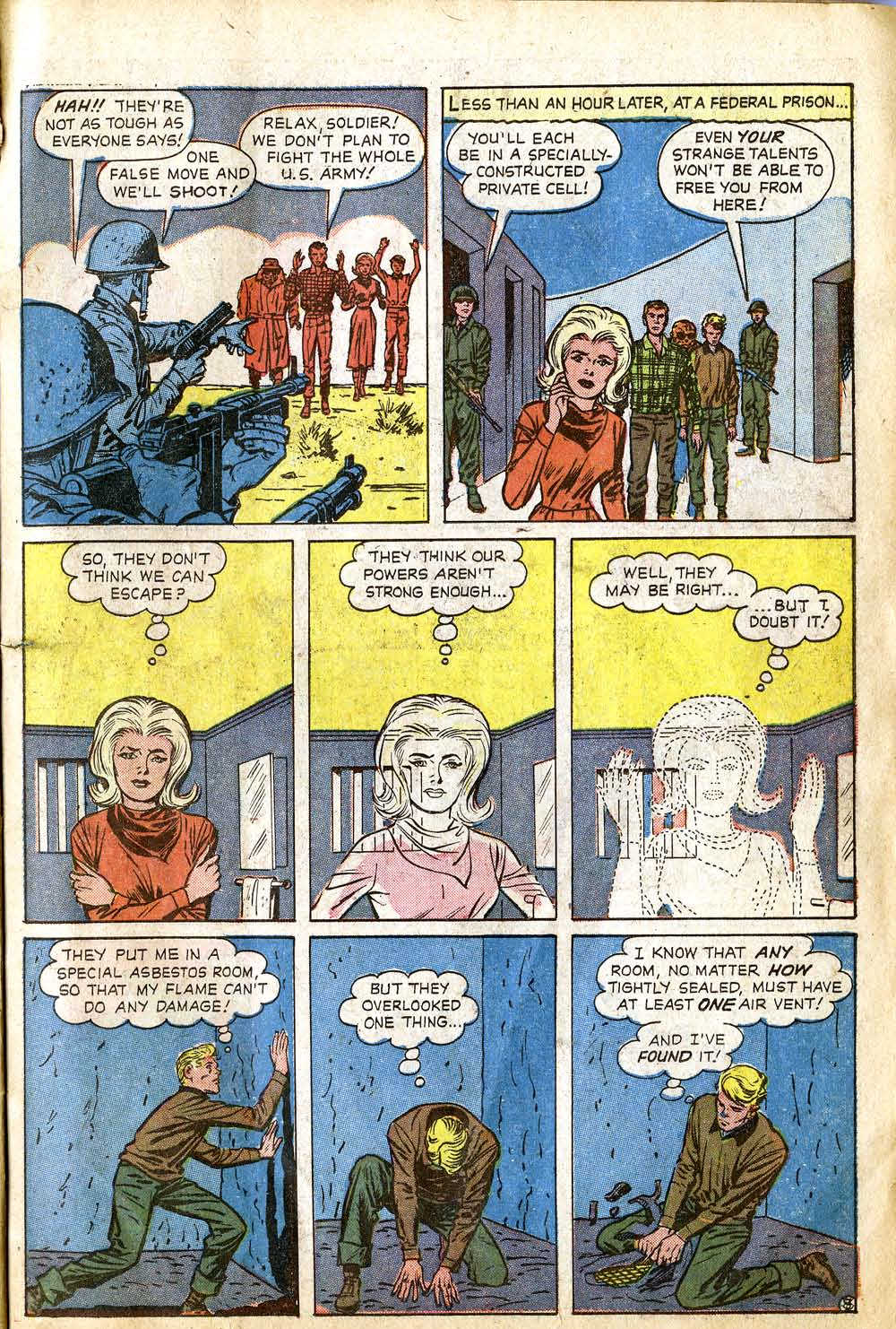

These are absolutely fascinating, Tom–thank you so much for your close, expert readings! (And–at the top of pg. 23, “third one” looks like it was relettered, and the “gotcha” panel looks a little odd to me too…)
LikeLike
Tom, I’ve really enjoyed these in-depth analyses of the first three Fantastic Four issues. They’re very insightful and revealing.
LikeLike