

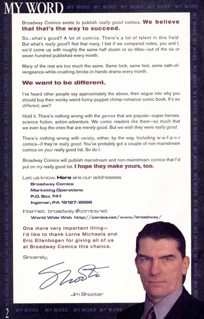
By the time that he launched BROADWAY COMICS in 1995, one gets the sense that EIC and Chief Creative Officer Jim Shooter was getting a little bit tired. After being ousted from Marvel Comics in 1987, he’s launched an unsuccessful bid to buy Marvel, pivoted into founding VALIANT when that proved unsuccessful, then was forced out of VALIANT and had to start up DEFIANT. When DEFIANT ran out of backing, that left Jim back at square one. Salvation came from an unexpected direction: SNL creator Lorne Michaels’ company Broadway Video. Lorne was convinced to finance another go for Shooter, and BROADWAY COMICS was the result. The venture only lasted for about a year, and proved to be the last such company that Shooter would helm. And I find its output just as interesting as that of his earlier ones.
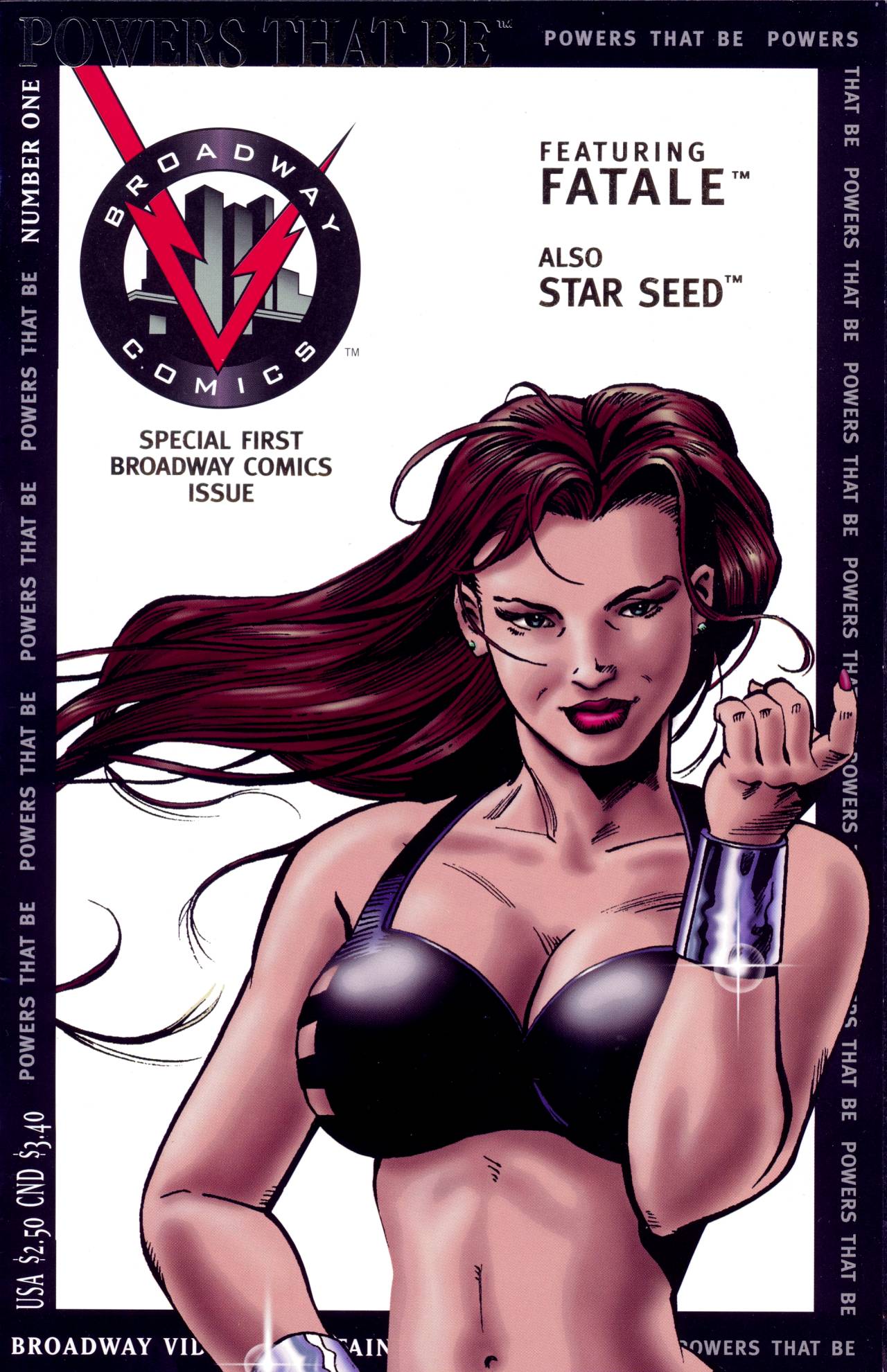
BROADWAY COMICS’ first release was POWERS THAT BE #1, which featured the debut of two new ongoing series: STAR SEED and FATALE. By the second issue, FATALE had been spun into a separate series and STAR SEED thereafter took over the title. With #7, it was officially retitled STAR SEED. BROADWAY took a unique position on design and creation. For the first six months, all of their covers were like this one, with figures in front of a stark white backdrop adorned with a black frame. this definitely made them stand out from the pack on comic shop racks, but often the actual images looked ill-composed and a bit unfinished. This first cover is the most successful use of this format, I think. Additionally, while he came up with the core idea for all of the different books, Shooter didn’t seem to want to do all of the hard work of writing the stories every month. So he instituted a policy of group-plotting each issue with four or five collaborators, one of whom would write up the actual script for the artist. This isn’t unheard of–it’s a very common approach in the world of television writers rooms, for example–but it was unusual for comic books. And while these stories all still feel like Shooter concepts, the actual execution is a bit more haphazard, as most of the people working alongside Jim on these efforts weren’t as skilled as he was. On this first issue, Janet Jackson, Joe James and Pauline Weiss all contributed to the plotting and the scripts for the two stories, with Andrew Wendel penciling the first, while newcomer J. G. Jones illustrated the second.
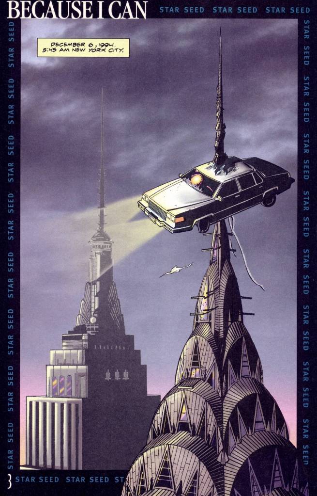
There was also a bit of a feeling of familiarity in the initial properties. STAR SEED, for example, can best be described as an alternate take on Superboy, a character that Jim had written for extensively. The star of the series is Cor, a young man born to a human mother and an alien father, thus giving him physical powers and access to technology beyond what is normally seen on Earth. Cor’s constant companion is Snoopy, a wrist-worn artificial intelligence unit that helps to guide Cor and to provide him with intel about the world. Cor’s scientist father has been abducted, you see, and their super-technology stolen, so he’s on the hunt to find both and get it back. The opening of the story starts with the image of a car impaled on the top of the Chrysler Building. This wasn’t done by Cor, he’s as surprised to hear about it as anyone when it gets brought up at the diner in which he’s getting breakfast.
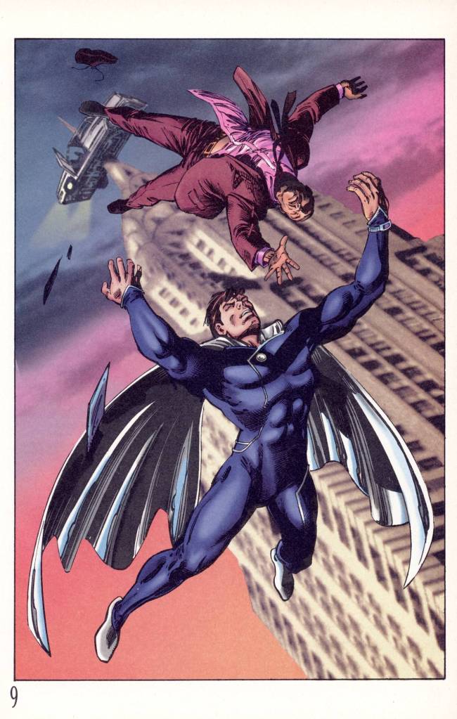
Cor learns that apparently the driver is still inside the vehicle, which appears poised to break off and fall Earthward any time. Excusing himself, he switches into his gravity vector suit, which allows him to flay and which features a strange split-cape, and races to the scene. There, he’s able to save the driver and catch the car, tossing it into the East River, though he almost clips the United Nations building with it as he throws it. Cor makes himself scarce, staying out of the limelight, but people have caught glimpses and are beginning to talk. The media doesn’t quite know what to make of it, but the papers all report on it
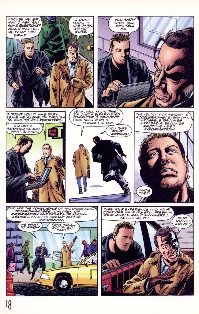
At that point, the narrative segues over to cliche goombah mob kid Pauly returning to his parents’ home. It’s clear from context that he was responsible for depositing the car atop the spire, and when his father gives him grief about how he’s making the money he’s throwing around, Pauly smashes the kitchen table and leaves, vowing never to return. He’s clearly going to be an opponent to Cor at some point, though not in this introductory story. The next day, a strange black-clad figure who appears to represent a Men In Black-style agency questions anyone who may have seen what happened when Cor intervened with the car and the driver. He tells one person that he represents the Technomancers, who share an intimate relationship with technology. The witnesses are told to simply type the details into any computer anywhere and the Technomancers will know about it. And the chapter ends with one of the bystanders doing just that. So this isn’t really a story, but rather a collection of incidents, and the introductions of the various characters is haphazard at best. While there’s some intimation of what the eventual relationships between Cor, Pauly and the Technomancer will be, none of those dots are really connected here. So it’s a baffling opening entry. It’s in no way difficult to understand, but it’s utterly difficult to find a reason to care about what’s going on.
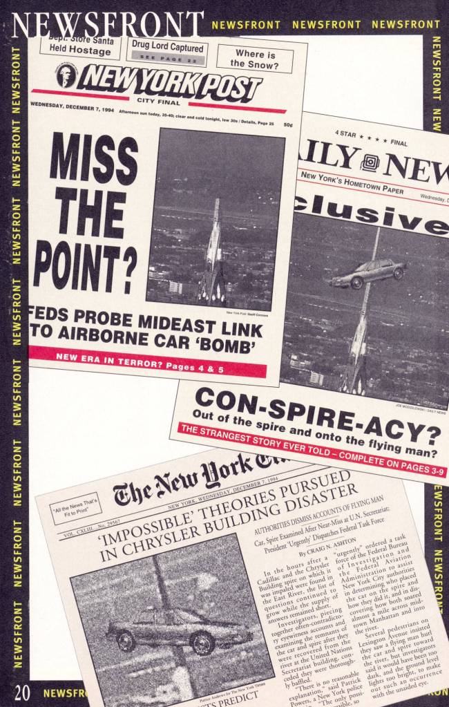
As a bridge between the two stories in this issue, Shooter runs this page in which the front pages of the three major New York-based newspapers run headlines and photos about the incident. It’s a fun idea, but the execution isn’t especially convincing, and it doesn’t really add anything to the plausibility of the piece. None of the cars in the mock-photos seem to be existing on the same plane as the building spire–I assume the technology that BROADWAY had to work with wasn’t yet quite at a point where this could be made convincing.
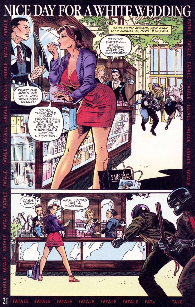
The back-up feature is the cover-spotlighted FATALE, which can best be described as a take-off on the popular X-Men character Rogue. Like Rogue, the lead character is a brown-haired woman who can absorb the physical abilities and knowledge of any person she touches, and who is being pursued by riot-squad-attired attackers for reasons that remain mysterious and unexplained. Memorably, BROADWAY COMICS stepped on a bit of a landmine in their promotion for this character when they ran an ad in a distributor magazine that was a full-page shot of Fatale’s boob with the caption “Actual Size” next to it. It was intended to be a commentary on the exaggerated and overly-sexualized manner in which most comic book women were drawn, but it wound up being received as pretty much the exact opposite. A bit of a tone-deaf choice, that one.
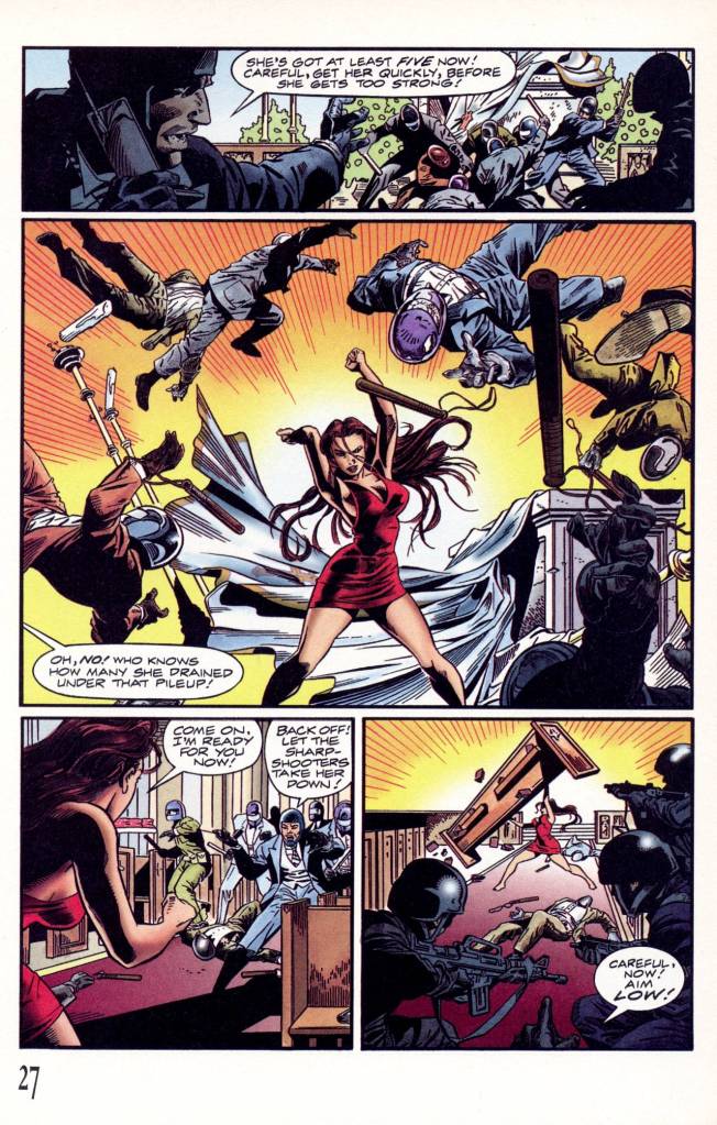
There isn’t a whole lot more to the story than an extended chase/fight sequence, but J. G. Jones, though still a bit raw, draws it all convincingly. Like most of Shooter’s work past a certain point, there’s an overabundance of medium shots, the clarity of which Jim loved, but J. G. is still able to get some drama and dynamics into the visuals here. When Fatale ducks into a nearby church in an attempt to lose her pursuers, it turns out that the congregation is full of additional operatives of the guys trying to catch her, a plot turn that seems completely implausible.
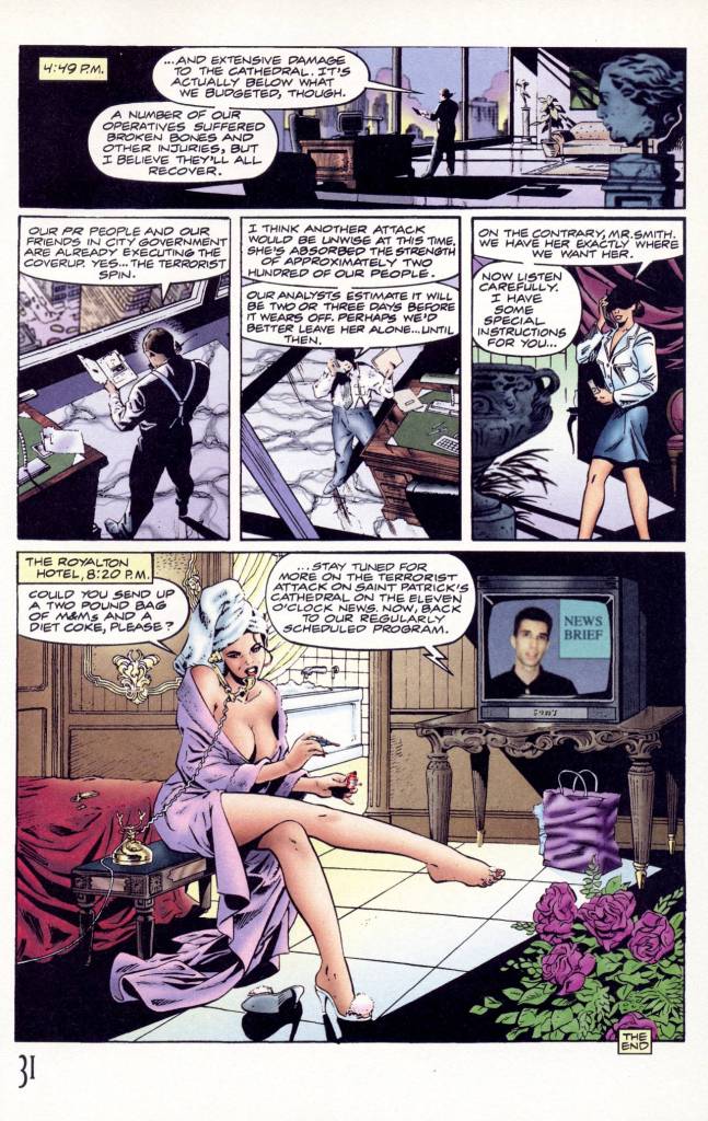
In the end, Fatale escapes her pursuers and holes up in a luxury hotel while the guys who are after her plot their next move. This story was more engaging than the lead, but still didn’t have much of a hook to get readers to come back for the next installment–which would appear in a totally different title. And the use of a photograph for the newscaster in this last panel is just plain strange–again, not a great choice.
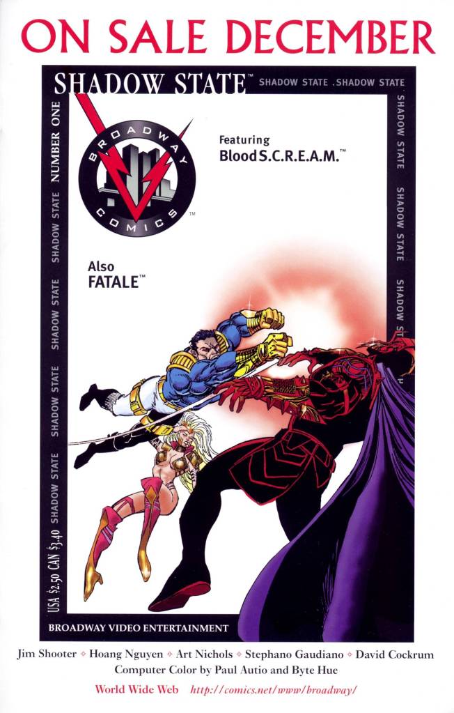
Here’s a final house ad for SHADOW STATE #1 that illustrates how subsequent BROADWAY covers produced in this frame format looked ill-composed and off-balance. This really looks like a piece that was done for something else, in some other format, and which then had its figures silhouetted out and placed into this frame. It is in no way an accomplished comic book cover–though again, the strong white cover would have made a strong statement on the racks. Almost the entire top half of the cover image is completely empty.


I bought exactly one issue of a Broadway Comics series, I think it was Shadow State #1. Dave Cockrum penciled one of the stories in it, a back-up with Fatale, and I was a fan of his art. Despite being the guy who’d co-created the All-New, All-Different X-Men back in the mid-1970s, by the time the 1990s rolled around he unfortunately wasn’t getting much work, so I tried to pick up the few & far between books that he did draw. I remember that his art on the book was nice, it was inked by Frank McLaughlin. But the actual stories left me cold, so I didn’t get anything else from Broadway.
LikeLiked by 2 people
It was sad to see Dave Cockrum’s star plummet after the X-Men. I picked up an issue of The Futurians from whomever punished it but never found any subsequent issues. Likewise, I plunked down some coins for his break run on Batman in early 1987. But I last track of his work after that. Kudos to you for keeping up that support.
LikeLiked by 2 people
In the late 1990s and early 2000s Cockrum was the penciler on the great supernatural comedy series Soulsearchers and Company written by Peter David that was published by Claypool Comics. I started following Soulsearchers for Cockrum’s artwork. Unfortunately, he was apparently not happy with the stories he was being given to pencil, and he finally ended up quitting the series. I continued reading it pretty much to the end. It had some of PAD’s best, and regrettably least-known, work. I just wish Cockrum had been happier with the book and had stayed on it.
LikeLiked by 1 person
I had no idea about that series. Being a fan of both Cockrum and Peter David, I will see what I can do find that series. Thanks!
LikeLike
I never heard of this comic company and I can see why. I would have dismissed those covers as Image wannabes and the story has always trumed art for me. Well, except for Colleen Doran anyways.
LikeLiked by 2 people
The only Broadway comic I found interesting, concept-wise, was Knights over Broadway, and I think we only got three issues of that.
LikeLike
I think that ad for FATALE made me think it was just going to be an aggressively T&A comic, so I didn’t buy any Broadway comics at the start. I might have bought one or two later, but I’m not sure — maybe future installments of this column will jog my memory.
I do remember that back around the time Defiant collapsed, a joke going around was that after Valiant and Defiant, Jim would be back with a third company — Truculent Comics!
I wish he had succeeded with a company or imprint in an ongoing way — there’s an audience for the stuff he was focused on, and a line that reached that audience well enough to survive would have been a good thing. I might not have read a lot of it (or maybe I would, who knows?), but Jim put in enough time and effort making and selling good comics that it would have been nice for him to have something he could do that was a secure and comfortable way to spend the rest of his career.
LikeLiked by 3 people
Broadway Comics lasted roughly as long ( 1995-1996 ) as Atlas/Seaboard Comics ( June 1974-1975 ).
LikeLiked by 1 person
That’s genuinely interesting. Coincidental/circumstantial non-evidence of a “Stan Lee Curse” on his competitors? 😉 Hmm. How long did the “DC Implosion” take?
LikeLike
The DC Implosion happened all at once, which is why it was called that. A sweeping cancellation of something like a quarter to a third of the line, which played out on comics racks over about two months, since some of the books were bi-monthly.
But the thing is, everyone was affected by the blizzards that caused the Implosion, and Marvel canceled a bunch of titles too — not as large a proportion of their line, but still pretty large. It just happened shortly after DC’s woes got all the press, so the DC part is what’s remembered.
LikeLiked by 1 person
Thanks! I forgot about that blizzard. “Whom the gods would destroy”, they send terrible weather.
LikeLike
The guy dressed as a Superman archetype uses some things that don’t seem to work together. The split cape, the shirt’s “chest button” (like the original Captain Marvel), Robin’s slippers, and pockets (?) on his “leggings”.
The car on the building spire wasn’t as glaring as some similar hand drawn images that I’ve seen in comics older than this one. I guess the real-life newspapers didn’t mind the mention, especially if Lorne Mihaels’ name was connected (even distantly) to the project? Worse was all the new “stuff” they thought might work, but was just distracting.
Like the border design with the name of the feature repeated like ticker-tape, as if having it appear only once at the start of the top of the 1st interior page (as most comics had done for decades) wouldn’t be enough for any possible instant memory loss? Than how would we retain what we’ve read from page to page? 😉
Or that photo of the head on the TV. Just because something hasn’t been done before doesn’t mean you should or shouldn’t do it. But maybe only hindsight reinforces the old-age adage; if it doesn’t serve the story, leave it out. That trick didn’t help the story. But I guess there was no way of knowing how jarring it looked until after the mistake had already been made…
Worst for me was the guy with the laptop, outside on a sidewalk, holding it with one hand while typing with the other. Then cramming his heavy handed life-mission statement into 3 or 4 word balloons.
The guys with the “motorcycle helmets” and business suits came close.
I didn’t like the inks on that first page of “Fatale”. But the dialog about, “Cash or…” “Hmm. Looks like a ‘charge'” was a clever little zinger. 😉
“Blood S.C.R.E.A.M.” simultaneously sounds silly and god-awful. I’m surprised it wasn’t already used as the name of one of Chris Clarement’s Marauders in his “Mutant Massacre” 8 years earlier.
I remember seeing these Broadway Comics when they were released. I get the business related reason for the company name. But it sounds boring and limited, for comic books. Which seems to set up the material as the same. By 1995, I’d long been avoiding any comics books with Jim’s name associated. That’s harsh, but that’s where my preferences were (or weren’t) 31 years ago. Pretty much since “Secret Wars 2”. (In 1986?)
LikeLiked by 1 person
This was published in November 1995 and features “technomancers”; meanwhile, just about one year before, Babylon 5 had given us “techno-mages”. I suppose the juxtaposition of technology with words associated with magic is something that could be invented independently, but I can’t help wondering.
LikeLiked by 1 person
And 2 years later we get Sunnydale High School computer teacher Jenny Calendar who is also a techno-pagan( She uses modern computers, the internet, and digital databases alongside ancient traditions, stating that email and bone-casting are both valid ways to receive information –Google AI Overview. First appearance “I, Robot…You, Jane” -season 1, episode 8 –the demon Moloch the Corruptor gets trapped in a book by a circle of priests in 1418 and scanned into a computer in 1997 ). I forgot all about Babylon 5’s technomancers, just remember the Shadows, the Shadow Wars and Jack the Ripper as an inquisitor. The Flash foe Abra Kadabra would fit the definition of a technomancer.
LikeLike