The new issue of CAPTAIN AMERICA continued on with what would turn out to be a six-part storyline, which was something of a rarity for this period. While you’d get soap opera subplots that might run for months and even years, the A-stories in the Marvel books would typically be dispatched in a couple of issues. Four parts was considered a long stretch, so six was an absolute epic. Looking back at it, I’m not convinced that writer Roger McKenzie planned for things to work out this way, he was feeling his way along month-by-month, and it simply took him six months to bring the story in for a final landing. As a reader at the time, though, I didn’t especially mind, though I also wasn’t massively on board with this sequence until the final chapter or two.

Last time Cap had fallen afoul of his old enemy Doctor Faustus, who had allied himself with the Grand director of the white supremacist National Force, who were a barely-disguised alternative for the Ku Klux Klan. The pair were attempting to inflame racial tensions between whites and blacks within the community, hoping to set off a race war through which they could enact their bigoted vision of what the United States should be. And as this issue opens up, we see Captain America in the midst of battle with some rioting African-Americans. But Cap isn’t quite right, he’s spouting the rhetoric of the National Force, which is a bit chilling. But the worst bit was yet to come.

For the initial few pages, McKenzie and artist Sal Buscema keep the front of Cap’s shield concealed so that this reveal can carry the proper amount of weight to it. And it does. As you can see, Cap’s shield has been repainted to show a flaming Swastika, the symbol of the National Force. The whole battle turns out to be staged, part of a propaganda film that the Front is putting together, so ap hasn’t actually hurt anybody who wasn’t an actor (Though, given that the National Force members who are filming this sequence are doing so in their full costumes, you kind of have to wonder what the black actors thought there were doing here. But hey, maybe they just needed the cash and the exposure.) Anyway, this clearly can’t be the real Captain America, right? It needs to be somebody else–maybe the Grand Director wearing Cap’s colors to help put across his message. That’s where my mind went when reading this story for the first time anyway.

Anyway, at this point the focus of the story shifts to the law offices of Nelson and Murdock, where the pair and their supporting players are watching the National Force’s broadcast with interest. Roger McKenzie was also writing DAREDEVIL at the time when he penned this story, and from here, the rest of the issue is almost more of an issue of the sightless swashbuckler’s comic. Not sure what’s going on with Cap, Matt decided to suit up in his red long johns and seek him out, to make sure the Star-Spangled Avenger is all right. He spends a few hours crisscrossing the city looking for Cap, but to no avail. But then he stumbles across a carful of National Force agents being chased by the cops. In order to escape, they shoot the tires out from one of the pursuing vehicles, sending it careening at a corner newsstand dealer. Daredevil is able to snatch the man out of the path of the vehicle before it can kill him, fortunately.
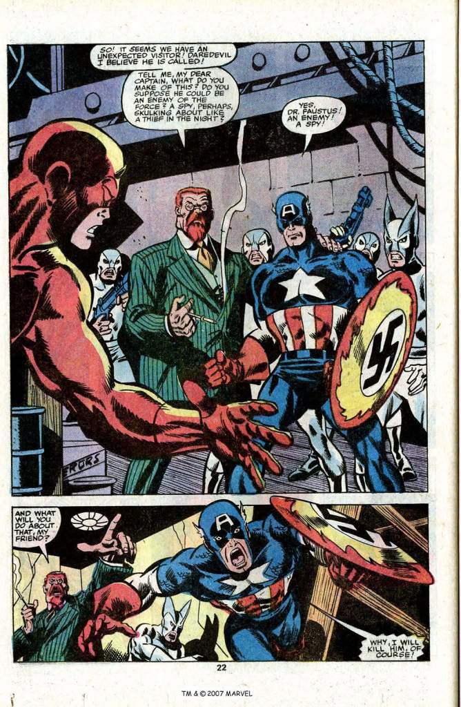
Quickly comparing notes with the police, Daredevil learns that the car they were chasing was chock-full of National Force goons, and so Murdock takes off after it, using his heightened senses to track it through the city. He comes upon it just as it pulls into a nondescript building, which Daredevil proceeds to break into in pursuit. But stealthy as he’s trying to be, the jig is quickly up. The lights turn on, and Daredevil finds himself confronted by Faustus, the Grand Director, a frothing Captain America and a bunch of National Forcers. Cap is all to happy to race forward at Faustus’ command and attempt to kill Daredevil for him.

What follows is a typical hero vs hero fight, albeit one that’s a bit more brutal than the norm. that’s because Cap is hardly in his right mind–he’s a raving lunatic, spouting National Force rhetoric as he tries to straight up murder Daredevil. DD’s not quite sure what the situation is, but at one point he winds up with Cap’s shield, and his sensitive fingers are able to feel (through his gloves, no less) the impressions of the new Swastika that’s been painted on it. As the pair continue to battle,. Daredevil smashes Cap with a barrel of oil, and the paint on his shield begins to thin and flake away. On the back foot, Daredevil implores Cap to look at his shield–and the sight of the familiar star and stripes snaps Cap out of his brainwashing. He’s back to himself, suddenly.

Unfortunately, Cap and Daredevil are still on the firing line, facing the many guns of the National Force. And as Doctor Faustus gives them the order to open fire, that’s where the story is To Be Continued. As I said, this winds up being more of a Daredevil adventure than a Captain America one, given that the Living Legend is a mesmerized pawn for pretty much the entire issue.

I always liked McKenzie and it’s a shame he never got his Big Story to raise him to the next level. His dialog and plotting were already better than some who had already achieved it. What I remember best about this arc is the horrible thing that happened at some point behind the scenes during it. (Did McKenzie even write that issue?) I’m still of two minds of whether I like that it was undone but this is comics. As long as you don’t get stuck in a cycle of the same thing happening and being undone over and over (it’s cool. Aquaman and Namor being deposed then getting the throne back is one of the best examples of this trope along with ‘Atlantis is destroyed. Oh, wait a minute…’.
LikeLiked by 1 person
The horrible thing behind the scenes was the work of new-regular-writer-for-a-single-plot Chris Claremont, and scripted by Roger. But it was confirming an earlier apparent thing that had been written by Roger, so maybe it was the intent all along.
LikeLiked by 1 person
I wonder why the creation of the National Force when the Sons of the Serpent had a number of different leaders with different agendas { The Avengers#32-33 ( September-October 1966 ) &73-74( February-March 1970 ), Defenders#22-25( April-July 1975), Avengers Annual 2000, etc. ]? Then there is the Dragon’s Circle ( also called Dragon Circle and the Circle of the Dragon — marvel.fandom.com ) [ Jungle Action Vol.2#19 ( January 1976 ) ]
LikeLike
Because the Serpents were three-time losers? Because their leaders were always driven by something besides bigotry and you could get at least one issue of pretending it was otherwise? Though I do recall the villains behind the Force being pretty bigoted.
LikeLike
You left out the hidden message that the foot soldiers in the Sons of the Serpent were all suckers ( Getting used by a Chinese agent, then both a Caucasian & African American and then in the Defenders a African American leader ). I guess the writers were saying Racists are all being used for someone else’s agenda ( Mostly power ).
LikeLike
Another IMHO excellent 1979 Pollard cover. As I may have mentioned in other comments from 1978-1980 he was as good as anyone doing covers at the time. The word underrated is way overused but in Pollard’s case for that era it truly applies.
IIRC this was my first book w/Daredevil in it. To this day in my minds-eye I see Daredevil with Sal’s art. Yes I’m big fan of the Miller era but this was my first. Yes, I’m a huge fan of Sal’s 1970’s art.
LikeLiked by 1 person
…an the sight of the familiar stars and stripes snaps Cap out of his brain washing: Decades earlier the sight of the American on the U.S. embassy in Moscow caused the mind-controlled Original Human Torch to stop, salute the American Flag and then snap out of mind-control [ The Human Torch#5b ( Fall 1941 ) page 24 panel ( Atlantean mind-control drug in his food — panel 6 the drug works: Torch at Namor’s command on his knees and if I remember correctly kissing his hand ( should have written that part down ) ); page 39 panel 5 ( sees flag ), page 40 panel 1 ( salutes flag ) & panel 2 ( snaps out of the mind-control ) ]. I guess their mind-control/brain-washing wasn’t as good as the one used on Spy Smasher.
LikeLike
As a kid, I never took to Don Perlin’s art. As a Defenders fan, I wanted the art to be tighter and more dynamic. But as an adult, looking back, I really appreciate Don’s inking. especially over other artists’ drawings. This issue is a great example. I like Sal Buscema’s full drawing jobs. Tom’s written before that Sal was one of the best storytellers, and he could breakdown, or layout an issue faster than many, so he often did multiple books a month, or came in late to help get an issue out in time.
Sal and Don’s work together here is pretty satisfying. Sal’s typically kinetic figures and expressions deliver, as usual. But Don’s thick inks add some very dramatic lighting. I’ve seen countless Sal jobs had more empty finishes. These are rock solid, but with a lush polish. Now I have an urge to see more of Perlin’s inks over other artists back ten who drawing I liked. Pollard. Gammill. Frenz (a few years after this). I’m curious what Don’s inks would look like over Ron Wilson’s drawing. Or over a DC mainstay like Chuck Patton, who’s work I thought was very competent, but lacked significant depth, which Perlin could’ve added.
I’ve seen Roger McKenzie pop up on these posts occasionally. I hope he’s able to for this one, too. Always great to get insight from the pros who worked on these comics.
LikeLiked by 1 person
I always loved Perlin on Defenders and when I realized why it helped me appreciate other artists as well. The appeal was a good storyteller whose style didn’t intellectually fit the mood of the book he was on. He would have been a natural on a Western and that worked to make the fantastical and supernatural stuff pop more for me. I enjoyed Calmee (I think. I don’t feel like Googling) on Alpha Flight for the same reason.
LikeLiked by 2 people
John Calimee had what I think of as a “quiet” style. Not always dynamic, but solid and more naturalistic in his figure proportions. It wasn’t bombastic as other artists’ work. I think a decent comparion would be maybe Paul Smith, but not as slick or satisfying as Paul’s art. John was capable of some really good stuff, but I think the monthly grind chewed up his best work, by not allowing enough time to really hone it. We got the “deadline style” version of his art. It happens to many artists, including Paul Smith.
Compare Paul’s more rushed art in consecutive issues in the late 160’s to #170. With the incredibly, nearly perfect rendering in #172, after he got a breather from #171 (very dynamically drawn by Walt Simonson).
I think John’s art would’ve looked even better had his monthly page count been shorter, or if he did fewer full-length issues. How that would’ve been feasible is beyond me. There were only so many back-up stories, fill-in issues, miniseries, and annuals available. Although some great artists like Art Adams were able to sustain themselves on a more limited output like that.
When I looked up how to spell “Calimee”, I stumbled on this informative article by our friend Ben Herman. 🙂 John Calimee – In My Not So Humble Opinion
LikeLiked by 1 person
I don’t remember reading it before (an aftereffect of injuries from being struck by a pick up truck back in July is I randomly find when rereading books and apparently blog posts as well I have no memory of the initial read) but there’s a comment from me that mirrors mine here about why I loved Don Perlin’s art!
LikeLiked by 1 person
Damn. Were you in a car when the truck hit? Or were you a pedestrian?
LikeLike
Pedestrian. I’m about 90% back to what I was but just the fact I lived through getting hit head on is a miracle.
LikeLiked by 1 person
Glad you made it and are on the mend. I can’t even imagine.
LikeLike
I agree, Perlin’s inks and Sal’s pencils worked very well together on Cap circa 1979. I really like the sense of dynamic movement in action scenes. Of course “comic art snobs” will disagree 🙂
LikeLiked by 1 person
Wehhhhl, Rift, I AM a “comic art snob”. lol
LikeLiked by 1 person
I’ve complained about John Calimee’s art on Alpha Flight all over the internet many times over the years, but I do agree with both of you here – it’s something I can go back and read if I’m in the right mood, and I can appreciate its qualities and enjoy it too! 🙂
LikeLiked by 1 person
I’d love to know how the responses compared between this and Nick Spencer’s “hail Hydra” moment.
LikeLiked by 1 person
For me it’s the difference between a moment, less than one issue, vs. a long arc that lasted months, crossed over to other series, & resulted in the total take-over of the US (maybe beyond, I don’t remember, I stopped reading the book at that point). By the character meant to embody the best attributes & values of the USA. I had zero interest in following the character down that path, regardless of whatever the explanation would be later. (Cosmic Cude, alternate doppleganger, etc.) It went on for far too long, & instead of a quick plot twist in a single story, it became a major event.
It seemed disrespectful to Jack Kirby, to me. And to the character he co-created. Disrespectful to Joe Simon, too, but Jack had a deeper relationship with Marvel. You could argue it was disrespectful to any US vets who fought in WW2.
Anyway, it’s uncomfortably close to what we’re approaching now, in real life. And we can’t blame a Hydra. It’s the misinformed, disinformed, or uniformed being misled by power & wealth mad pricks wrapped up in Nationalism disguised as Patriotism.
LikeLike
I was only a teen when this came out… but looking back… I think the political zeitgeist was different, and hate groups like American Nazis and The Klan were regarded as being so fringe or minimal by the late 70’s that they could rightly or wrongly be used like any other super-villain antagonist in a comic book. Without going into what’s happened over the decades… things have changed.
Nazis had been a staple for some time at Marvel and Cap at this point but the American grown version was a marked departure in this case… and I agree… uncomfortably close to what we’re approaching now.
LikeLiked by 1 person
The remark that the black actors “maybe they just needed the cash and the exposure” reminded me of a real quote from Hattie McDaniel, who played “Mammy” in “Gone With The Wind”. She was criticized for doing those sorts of roles, and reportedly retorted “I can be a maid for $7 a week, or I can play a maid for $700 a week.”.
The National Force seems to be more a mash-up of KKK and neoNazi elements than a pure KKK stand-in. But I think the mixing works well. That flaming swastika is an extremely forceful design. It would be an excellent name and insignia for a “Captain Nazi” type supervillain, maybe for an alternate universe since it’s so over the top.
The Force’s costumes need some work though. The ordinary minions resemble Silver Age Dove, and the Grand Director with the head side projections looks more like a rabbit than a fearsome Klansman.
LikeLiked by 1 person
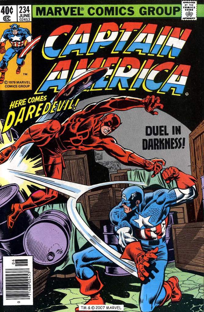
is that a Colan cover? The Cap posing looks like Gene’s work; Daredevil, not so much..
LikeLike