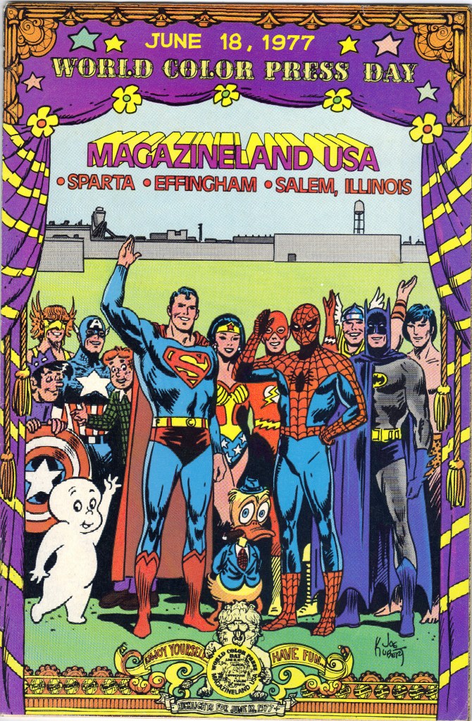
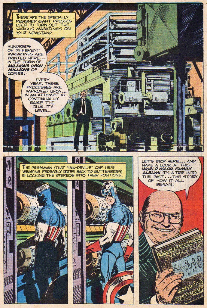
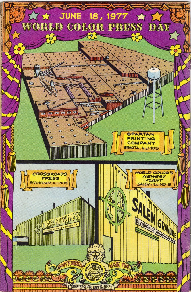
MAGAZINELAND, USA was a giveaway comic book designed for the celebration on June 18, 1977, which had been proclaimed World Color Press Day. World Color were the printers for virtually all of the comic books that were then available on the nation’s newsstands, including the output of DC, Marvel, Archie, Harvey and others. Accordingly, those companies gave their permission for their characters to appear in this commemorative edition, and even to be seen fraternizing with the enemy. As such, it’s one of the rarest and least-known crossover comic books ever produced.

The name of the author of this book has been lost to the pages of history, as is so often the case. But the artwork for this edition was provided by Joe Kubert and the students at his Joe Kubert School of Cartoon Art, which was then pretty brand new.

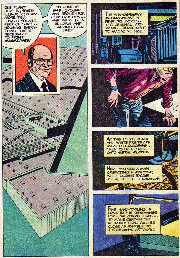
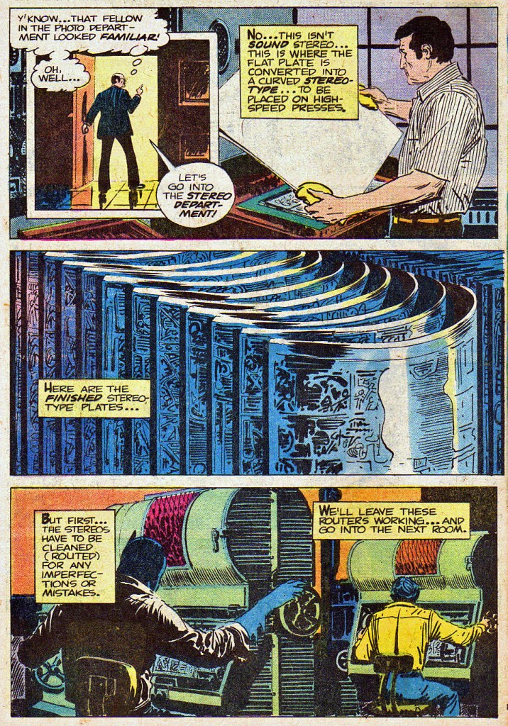
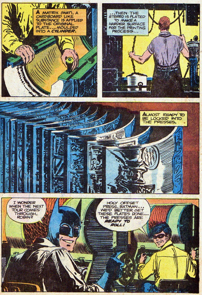
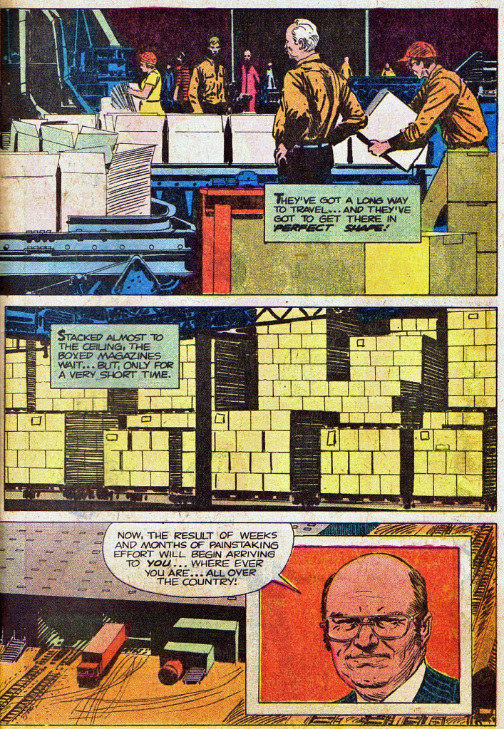
It’s a pretty thorough look at how comic books were created, produced and distributed in this period before the emerging Direct Sales marketplace change the game in a myriad of ways. For decades, this was how every comic book was put together.


Kinda weird to see Joe Kubert’s version of Spider-Man.
Joe’s forgotten to draw the star on Cap’s back here.
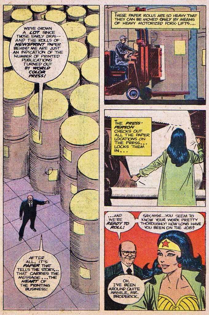
There’s an eight page section of photos of World Color’s history and staff here, but we’re going to skip over that section and get back to the comics.

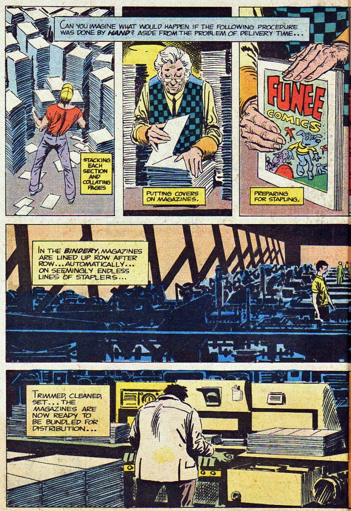
I love a good issue of FUNEE COMICS…
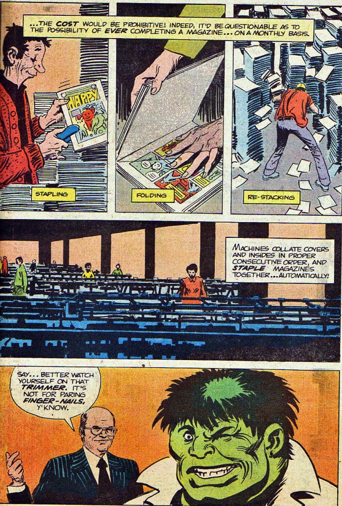
Kubert’s Hulk here is a little bit weird as well.


It’s good to be reminded of this place. I visited the establishment in the mid 80s and it left me with an indelible fond memories. Thanks.
LikeLiked by 1 person
Tom – is World Color Press still in business? I know there’s been so much consolidation in diverse industries – always curious to learn what happened to the good folks of Sparta, Illinois I used to read about in my DC and Marvel Comics of the 1960s and 1970s. Thanks! – Jim
LikeLike
Least-known crossover comic book, maybe these days, but not rare. There was a point when there was a copy in every collection we bought at the store I worked at!
LikeLiked by 2 people
What on Earth is Jughead wearing, there?
LikeLike
I think the idea was Jughead’s wearing his typical T-shirt, but it wasn’t drawn well and ended up with the same color as his beanie. The coloring on that page looks pretty bad. Jughead’s beanie dot should be red. Wonder Woman is missing the red in her star and bordering the emblem. Richie Rich’s bowtie is normally red, not green. And Batman’s missing the yellow from his emblem.
LikeLike
The lack of any sort of neckline, plus those little marks that seem to be indicating his collarbone, make me think that the artist was copying from a shirtless pic of Jug (maybe from a beach scene?). But the colorist decided (or was instructed) to “cover him up”.
It’s interesting that some of those vignettes seem to have been statted and pasted down from existing art, while others have been (pretty crudely) redrawn. Or maybe they’re all redrawn, and some of the students involved were just better at swiping than others. 😉
LikeLike
That’s what I was thinking. He’s drawn shirtless, but the colorist has converted him into wearing a skintight super-suit that goes all the way up his neck and is the same color as his hat.
LikeLike
The original Joe Kue’s work more than holds up. Wouldve been a blast to see his art grace some regular Marvel issues. Avengers. The F4. Nick Fury. Spidey vs. the Lizard.
I’d’ve settled for some semi-regular Superman output from him.
LikeLike
He didn’t actually like superheroes, so he wouldn’t have wanted to do regular runs on any of them.
In the Marvel Universe, he did some GHOST RIDER, some HULK penciling, and six issues of PUNISHER, which seem like the kind of stuff he was suited to — monsters and gunmen. And while he could draw a cool-looking Batman or Captain America, he wasn’t great at designing costumed supervillains, which is a key part of that kind of gig. He was wonderful at designing monstrous creatures like Blackbriar Thorn, but once you put a skintight costume on someone he had trouble taking it seriously and his designs showed it. So he was best off in the world of normal people (or near-normal), and occasionally a world of monsters or magic.
But I’d love to have seen him do more RAGMAN, as long as he stuck to fighting human-level criminals. And he’d have done an excellent Swamp Thing or Man-Thing. Nick Fury, absolutely. Wildcat. Black Canary. Maybe Green Arrow.
Maybe Shang-Chi, probably not Iron Fist. Wolverine in his Madripoor days. Werewolf By Night. Or something really up his alley, like 100 BULLETS.
Or a 20-issue run on the original CREATURE COMMANDOS with top-notch writing.
LikeLiked by 2 people
I have those Punisher issues he drew, somewhere. I hear you on the designs. Though he’d have done well on existing villains like Two-Face. Back Mask. Catwoman.
I loved his handful of “All-Star Sqyadron” covers. No one drew a better Hawknan.
I see him doing well on Cap’s Kooky Quartet. Even just a pin-ups. Reed Richards & his fantastic family. I liked all of your other suggestions, too. Shang-Chi, for sure.
I liked his Superman the too few times I saw it. Just a fundamentally solid style, perfectly lit, and expressive.
I picked up his Sgt. Rock “Hell And A Hard Place” written by Azzarello as it was released. Then his next Rock, which Jiw wrote & drew.
Thanks Kurt.
LikeLike
“I loved his handful of ‘All-Star Squadron’ covers. No one drew a better Hawkman.”
I liked them too. He drew a couple more that didn’t get used — as covers, anyway; I think they turned up as pinup pages. Len Wein told me once that even though everyone in the office liked them, the sell-though on those issues dropped, and came back up when someone else did the covers.
Which seems unfair. But if it was true, then apparently not enough superhero fans liked his superhero art, just as he preferred doing other things.
But I’m glad we got the stuff we got.
LikeLiked by 2 people
Kubert’s ASS covers and his other hero work (besides Hawkman) always looked off model to me so I understand if sales reflected it. I always loved his storytelling chops though and wish my tastes in comic content weren’t opposite his. As much as I loved his art, I had no interest in war stories then or now.
LikeLike
I can instantly recognize 17 of those 20 characters. I’m fairly sure of Tarzan and Conan. Who the heck is that guy just below Superman, with the weird flat-yellow skin? (Tell me it’s not Shang-Chi.)
LikeLiked by 1 person
Shang-Chi it is, apparently copied from a Paul Gulacy page.
LikeLike
Ugh. I thought coloring like that went out in the 1940s. Anyway, thanks for letting me know.
LikeLike
Out of all the comics that Jim Broderick is holding/dropping in the opening splash, the only one that appears to be based on an actual cover is Eternals, which looks to be issue #12 featuring the emergence of the Uni-Mind.
LikeLiked by 1 person
Thank you for uploading this, what a treasure!
LikeLiked by 1 person