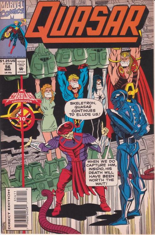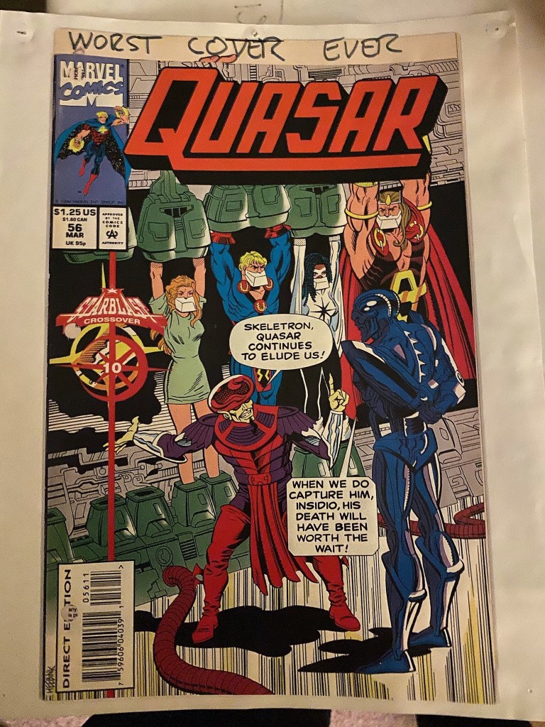
This is actually the opposite of what we usually do here, spotlighting a particular great comic book cover of years past. This time, though, we’re going to look at a cover that’s all wrong. This cover actually hung in my office for years as an example to people of how not to approach doing a cover. I’ve spoken about this at length on Twitter, and since that conversation came up again today, I thought I’d migrate it and expand on it over here.
Now honestly, there are probably more terrible covers you can find—but every choice made on this cover was wrong. To start with, the angle of the image. It’s a straight on medium shot without any drama to it. The artwork itself is pretty lifeless, lacking in any animation. The figures all look like statues. The rendering does the bare minimum, as everything is outlined in a basic line weight without any real attention paid to creating depth or visual interest. Spotting of blacks is practically nonexistent. It’s only a few steps removed from a coloring book image. Additionally, the lead hero, Quasar, isn’t on the cover, but remarkably the editor has found six other characters to feature instead, all of whom are less of a sales draw than even poor ol’ Quasar.
This issue was a tie-in to the Starblast crossover, and the tie-in identifier element goes down the left side. And it’s positioned almost perfectly so as to obscure the empty place in the line-up where Quasar will soon be hanging. But it’s not positioned so perfectly so that the Starblast star falls precisely upon the similar Quasar star that signifies that this is his space–it’s just far enough out of position to call attention to itself.
Those word balloons look crude and amateurish, and they add nothing to the cover apart from naming Skeletron and Insidio, two characters with some pretty goofball names. All those balloons do is take up real estate. And the coloring is simplistic, in the manner we used to call “sky-blue-grass-green”. The color isn’t used as a storytelling tool, or to heighten drama or intrigue. It’s approached like a paint by numbers.
For that particular month, this was no doubt the dullest cover on the stands. It’s not really surprising that the series ended a few issues later. This is worse than somebody who doesn’t know what they’re doing, this is somebody making the wrong editorial and design call at every turn.

This make-ready cover hung in my office for 25 years, ever since this issue saw print.

A brutal but absolutely justified takedown. It’s like a barely-serviceable splash page got repurposed into a cover, and why is the lettering so fugly?!
LikeLiked by 1 person
If I recall correctly, Quasar had been given his ugliest costume ever at this time. It not being on this cover culd count as its only saving grace.
LikeLike
And somebody approved it!
LikeLike
It’s not a successful cover, but labeling a cover “worst cover ever” might be a be a better lesson kept in the desk drawer instead of the internet.
LikeLike
This is a work of art compared to Ron Frenz’s work on the cover of Amazing Spider-Man #263.
LikeLiked by 1 person
I don’t really think there’s anything wrong with the cover to AMAZING SPIDER-MAN #263, and in fact I would approve it. What is it about it that bothers you?
LikeLike
The one that has stayed with me for decades ever since I first saw it on a newsstand was CAPTAIN AMERICA #126 which looked like it had been worked over by far too many hands. Since it was later used as the cover on an Epic collection I may be alone in this opinion.
LikeLike
I would bet money that the Cap pic was cut and pasted in from somewhere else.
LikeLike
I wouldn’t approve Ron Frenz’s work to appear on a take out menu. Just so flat and undynamic.
LikeLike
Honestly, it’s comments like these that make me reluctant to even graze the internet. Aside from the fact that Ron Frenz is one of the last comics professionals working in the traditional Marvel house style – and he’s REALLY great at it – does a critique like this really serve anyone? Does it make you feel more clever? That’s just nasty and uncalled for.
Just for the record, he’s also someone I know quite well, he knows than most more about drawing comics with a clear narrative, he’s an excellent style mimic, his career has lasted over forty years (which speaks for itself), and I’ve never heard him openly bad mount anyone like you smack-talked him.
If you don’t like his work, that’s one thing. But an insult like that? It says way more about you than it does about Ron.
LikeLiked by 1 person
Having stopped reading this series about 25 issues earlier, I might be missing the context, but it looks to me like this cover is a parody of kid’s cartoons, specifically Masters of the Universe. Especially with the way the figures are drawn and the ridiculously named characters boldly declared in those crude speech bubbles. You’re telling me this was meant to be taken seriously??
LikeLike
I remember buying this one new, because I had put Quasar on my pull list months earlier, and had not yet figured out that I didn’t need to keep buying a book that I wasn’t enjoying any more.
I remember nothing else.
LikeLiked by 2 people
We all had to learn that lesson.
LikeLiked by 1 person
I remember discussions in LCS’s. If sales remain strong, any complaints you have won’t get fixed. Editors & execs will think there’s nothing wrong. If sales slip enough, they might be interested in knowing why, maybe even gauging their readers’ reactions & feedback.
We get attached to characters, & don’t want to see their books cancelled. But for me it was better to follow good artists &:writers. They could make other characters worth reading. While poor quality on a favorite character just disappoints, & even frustrates readers.
I’d rather not read any new Batman comics than read bad news Batman comics. Support good stuff, don’t reward bad work. Eventually, they’ll have to change up. Hopefully they do their research to learn why a book with a popular character is under-performing.
LikeLiked by 1 person
Quasar was 60 issues of bad choices. Gruenwald indulging his worst inclinations for continuity fixes as storylines. Makes his Two-In-Ones stuff look light and breezy. IMHO The Starburst crossover stands out as complete gibberish.
LikeLike