
The potential of the burgeoning Direct Market in the early 1980s was the ability for publishers to expand the content of their wares. No longer stuck in the Newsstand, where comic books were considered the pastime of intellectual inferiors and children, creators would be able to produce more meaningful, more adult stories. Stories that didn’t have to kowtow to the dictums of the antediluvian Comics Code. It would be possible to pioneer new types of storytelling, new subject matter, to reach new heights of sophistication and complexity.
Of course, a lot of people simply used the opportunity to release their own super hero comics very much in the mold of what Marvel and DC had been pumping out.

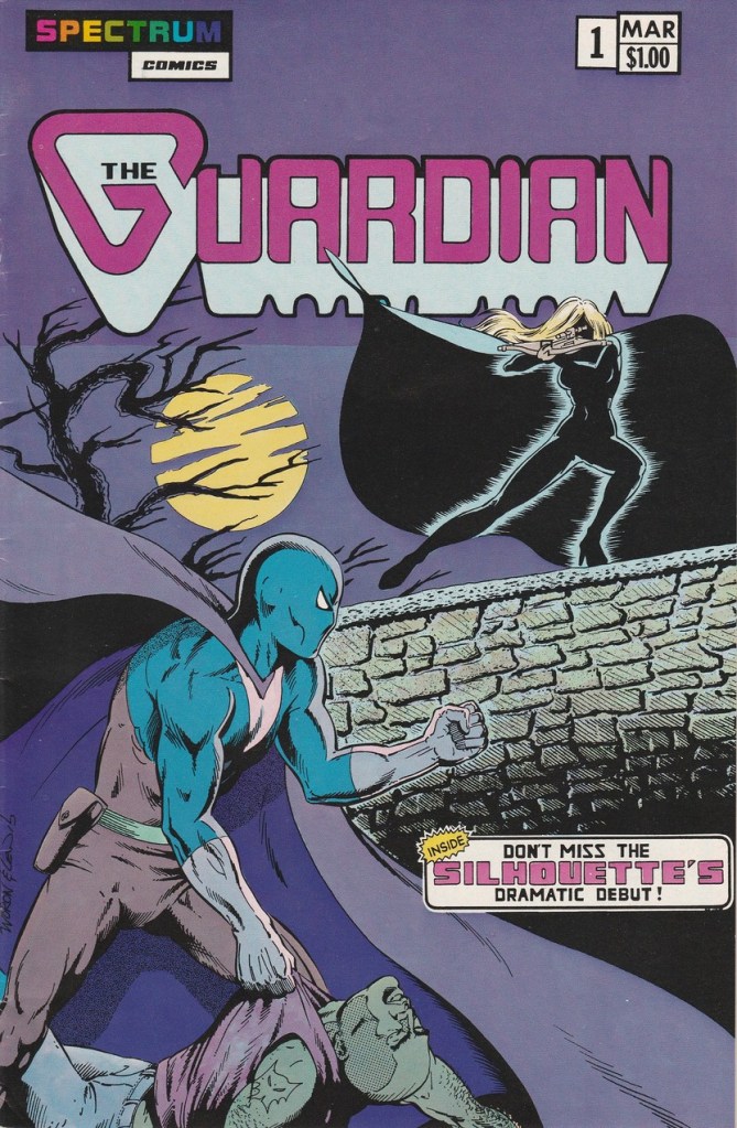
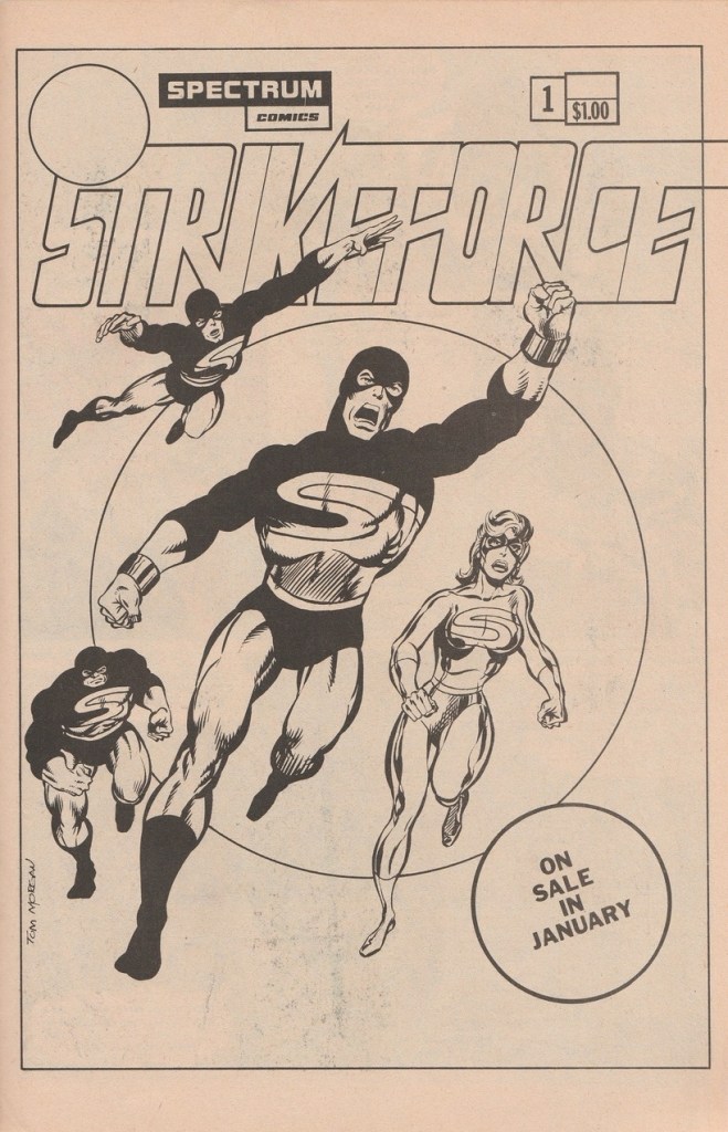
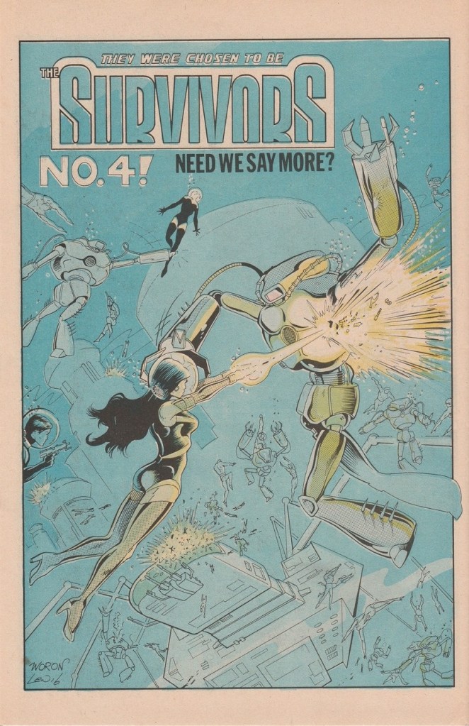
The short-lived company Spectrum Comics was one of these. It existed for only a short time in 1983 and 1984–the Direct Market was a potential gold mine, but it wasn’t without its hazards, especially for young and underfunded would-be publishers. In total, the company released three series; (THEY WERE CHOSEN TO BE) THE SURVIVORS, a science fiction super hero series with an emphasis on cheesecake artwork, CODENAME: STRIKEFORCE, an X-Men-like super hero team book that feels like a precursor to some of what Image would do years later, and this title, THE GUARDIAN, about a creature-of-the-night vigilante cut in teh mold of Batman or Daredevil.

THE GUARDIAN was the creation of writer Fred Schiller and artist Tom Morgan, both of whom would go on to do bigger and better things. Schiller plied his trade all around the comics field in the 1980s, including stints at NOW! Comics and the short-lived start-up MAJESTIC. He also was heavily involved at Eclipse at a certain point, and penned material for both Marvel and DC. Tom Morgan would eventually come on staff as Marvel as one of “Romita’s Raiders”, a training program where John Romita would oversee and train young artists and they would put their skills to good use in making any necessary art corrections on titles going through production. Tom did a bunch of work for Marvel in the 1980s and 1990s.

It’s pretty clear from looking over the material that Schiller and Morgan were attempting to do a strip akin to the aforementioned BATMAN and DAREDEVIL (the latter had become incredibly popular under the guiding hand of Frank Miller at this point.) I have to say, though, perhaps the biggest thing the Guardian character has going against him in this regard is the color scheme of his costume. Bright blue and brown are not exactly color choices to conjure with–not even during a time when Batman wore a similar blue as a stand-in for black. It’s an ugly get-up, and the coloring on the interior pages by Bob Lewis is often reaching beyond its grasp. It’s a messy, muddy look.
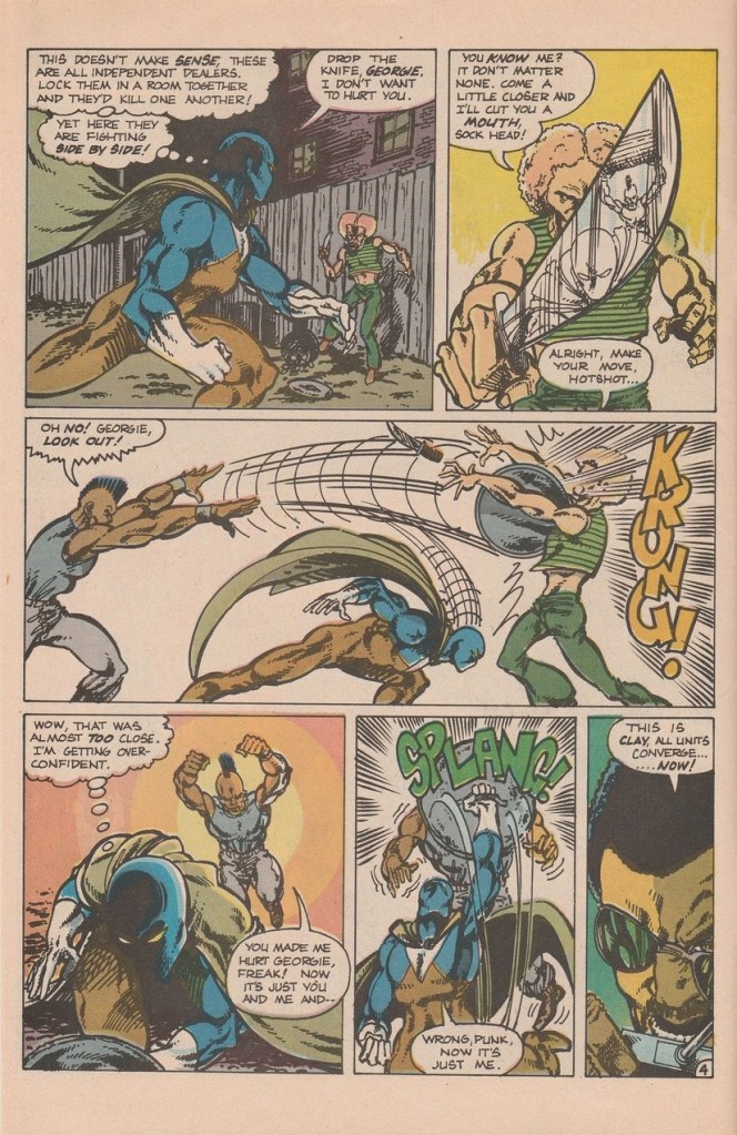
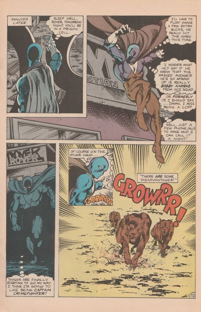
The Guardian was New York City police officer Bobby Karras, who was fired from the force by his Captain, who is in the pocket of local drug dealers. Undaunted in his desire to crack down on crime and to bring down the pushers and narcotics peddlers who are making his city unliveable. Despite having no particular source of income, Karras trained himself at his local gym and uses the informats he’s made on the street, in particular Vinnie “The Bug” Carmone, to put the hurt on street crime.
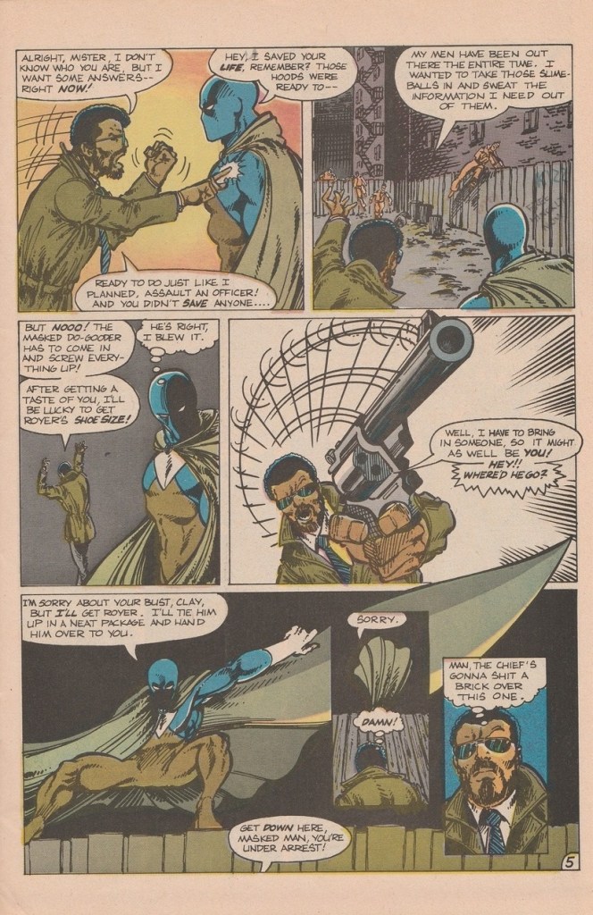
The Guardian is certainly an earnest series, but it clearly wants to be taken seriously despite pitching most of its story material at the level of a network cop show. There really isn’t anything wrong with this effort, but there isn’t enough right to really make it stand out (apart from miscues, like the Guardians’ costume color scheme.) It’s as forgettable as any random comic book published in 1984, though it was no doubt good training for its creators in honing their craft.

This first issue also introduces the Silhouette, a female vigilante who perhaps owes a bit to Catwoman and the Huntress, who was intended to be featured in a spin-off series that never materialized.

THE GUARDIAN lasted for two issues, and didn’t really make much of a ripple. But it was very much the kind of comic book that was best positioned to survive and thrive in the new marketplace–a super hero title in the mold of the mainstream, but without the limitations on violence, gore and content. It could take creators close to another decade before they’d truly attempt to compete heads up in this arena–but it was titles such as this one that helped to set teh stage for it.


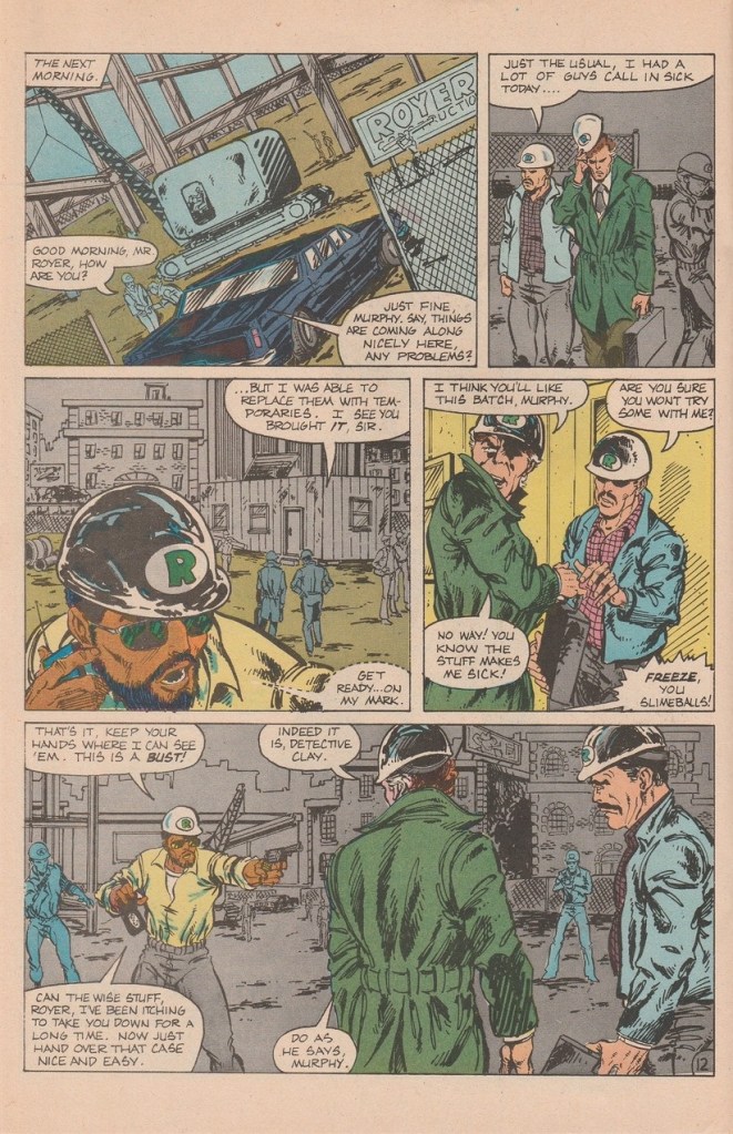


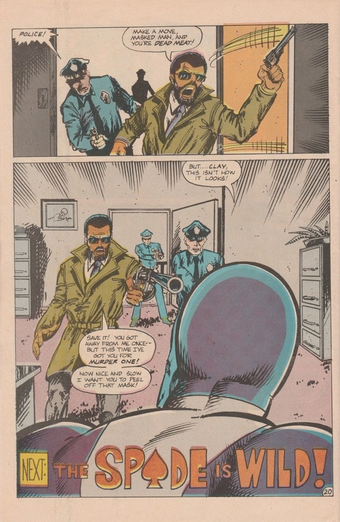
Upcoming villain the Spade is fairly definitively inspired by Daredevil’s enemy Bullseye.


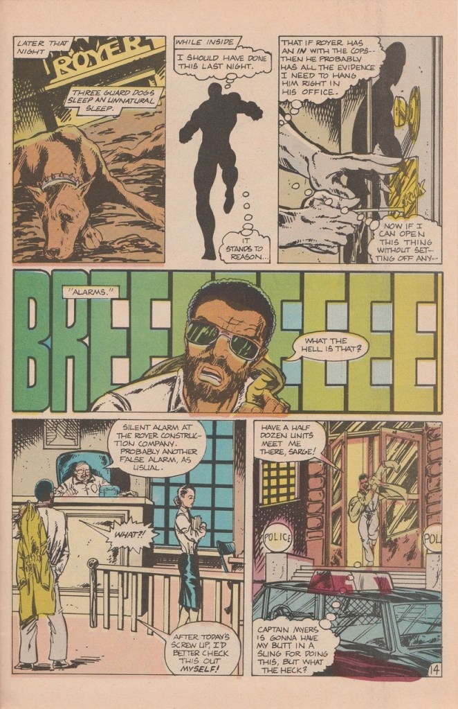
Several nice panels. Tom didn’t skimp on some of the exterior backgrounds, and seemed to know when to black them out. A few limbs looked too extended or out of proportion. Faces, too. Looked like there was a strong John Byrne influence, among others. But you can see he’s close to the quality of some of the 3rd tier pros of the day. Still some inconsistency I liked his inking.The pirate booties on Spade are definitely Bronze Age.
The script was farther off, for me. It was too wordy for as shallow as it came off. The exposition was too forced. Cliched.
LikeLiked by 1 person
Maybe the coloring is a victim of a bad orinting process.
LikeLike
Yeah, Morgan may have seen a page or 2 of John Byrne it looks like. 🙂
LikeLiked by 1 person
It’s hard to tell with the colouring, but is the Spade supposed to be African-American? That’s, uh, unfortunate.
LikeLike
I just saw this review by my old friend Mr. Brevoort. A couple points of clarity, or explanation, for what it’s worth, about this book. This was the very first paying comics work I ever drew. I was still a teenager and yes, I was a huge Byrne fan. This book was originally written by the creator of Survivors, Steve Woron and drawn (all but the last 6 pages) by a young Lee Weeks. It bears the original Woron cover. I was asked to finish the last 6 pages as Lee could not finish the job. I drew them and turned them in. My roommate and writer friend Fred Schiller convinced the publisher that he could create a more compelling story and we were given the go ahead to re-do the first issue. I inherited that costume and it was my idea to ditch the cape as fast as possible, so that’s why the dogs ate it. I pencilled, lettered and inked the entire story in two weeks, that was the basis for our getting the green light on it. Far from perfect and very rushed, but brought in on time. The coloring on the Spectrum books is another crazy story. The publisher was using a printing service that handled newspaper printing and the colors were created in gray tones with assigned percentage codes which were translated into color at the printing plant. YIKES!!! The colorist never actually laid down color, but rather various gray tones and hoped he was marking them correctly! What a nightmare! The translated codes produced muddy and often washed out colors. Not only on The Guardian but also on the other book I drew for Spectrum, Codename: Strikeforce issue #1. It was right after this that I started working for Marvel and joined Romita’s Raiders and subsequently started drawing various Marvel titles. A very fast intro into the comics creating world. Crazy, head-spinning days, but very good ones. -Tom Morgan
LikeLiked by 2 people
It was solid work for any new artist, especially a teenaged one. And there are worse influences to wear on your sleeve than Byrne!
LikeLike