
It’s time for another look at one of the short-lived wonders of the 1975 Atlas Comics line. For those who are unfamiliar, Atlas was a company started up by former Marvel Comics founder and owner Martin Goodman after his son Chip was ousted from Marvel in favor of promoting Stan Lee. Goodman wanted revenge, he wanted to take Marvel down. He also wanted to show that it was really his business acumen that had been responsible for the success of Marvel. That he failed in a year’s time is no surprise, what’s sad is just how much money he wasted in this attempt. (Within the industry, Atlas was often referred to as “Vengeance Inc.”)
In order to be able to attract top-flight talent to his new venture, Goodman initiated several policies that, while he himself may not have entirely followed through on them, forced the other companies in teh field to follow suit or risk losing their best creators. Chief among these was the return of the original artwork to the artists. Atlas also paid the best rates (at least at the outset) and offered some character participation. The fact that Goodman’s efforts caused other shops to start returning originals, raising rates and offering (slightly) better deals is probably Altas’ longest legacy.
The roll-out of Atlas Comics was a bit weird. Goodman hired two editors, Jeff Rovin and Larry Lieber (Stan’s brother and a Goodman family friend) as their editors. What Goodman wanted was what he always wanted, what he always believed in: knock-offs of whatever was popular in the marketplace. But Rovin in particular had different tastes, and saw this as an opportunity to do something different and to expand the boundaries of comic book storytelling, at least a little bit. Of course, he and Goodman clashed almost from the beginning, and he was gone from Atlas Comics before teh plug was pulled.
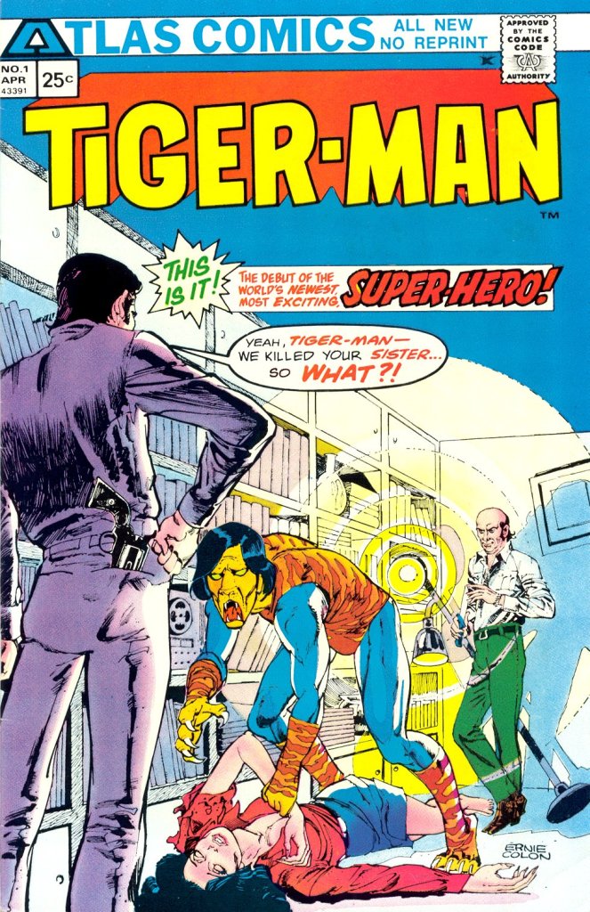
All of which leads us in a roundabout way to TIGER-MAN #1. At the outset, Goodman launched a full flight of 20 titles rather than staging his roll-out more gradually. His aim was to crowd Marvel (and to a lesser extent, DC) right off the racks with product that looked as much like Marvel books as possible. This, then, was the heart of Atlas’ misfire, especially in the earliest days, in that the covers of the books and the contents they contained were often very different in style and tone. I can imagine any number of readers picking up TIGER-MAN #1 expecting a super hero in the vein of Spider-Man or perhaps Werewolf by Night and instead getting something weirder and more esoteric. How many of those readers came back for more? Not enough.
Tiger-Man made his first appearance in the first issue of THRILLING ADVENTURE STORIES, a black and white magazine that functioned as Atlas’ inaugural release. That adventure, with teh character as a pre-existing figure, was written by John Albano and illustrated by Ernie Colon. But before the ink was dry on it, Tiger-Man showed up in his own color comic book series, this one starting out with an origin for the character. It seems likely that Tiger-Man was being groomed to be a signature character for the company, its Spider-Man. But things didn’t work out that way.
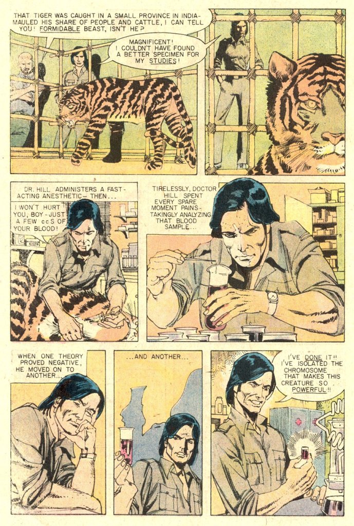
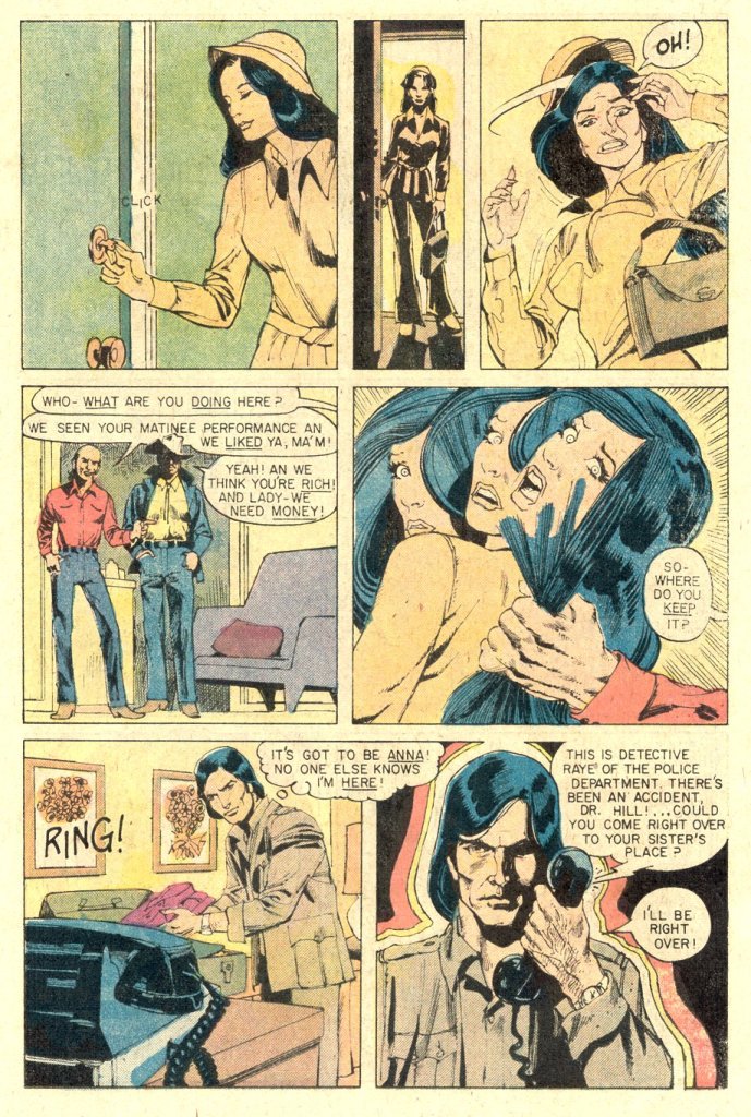
TIGER-MAN #1 was written by Gabe Levy and again illustrated by Ernie Colon–it seems likely that Colon was the primary creative force behind the character. The first issue cover displays some of the most memorable cover copy of the 1970s (as well as a ton of weird dead space, which makes me wonder if this piece had originally been commissioned as a cover rather than an interior splash page.) It was a weird way to introduce a new hero to the audience, showing him in a position of defeat and failure right from teh jump–but that was the style of the era, almost every Marvel hero cover of the period had the hero on the back foot and disclaiming about how they were “finished” or had “had it!”
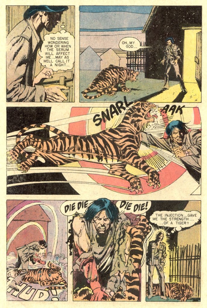
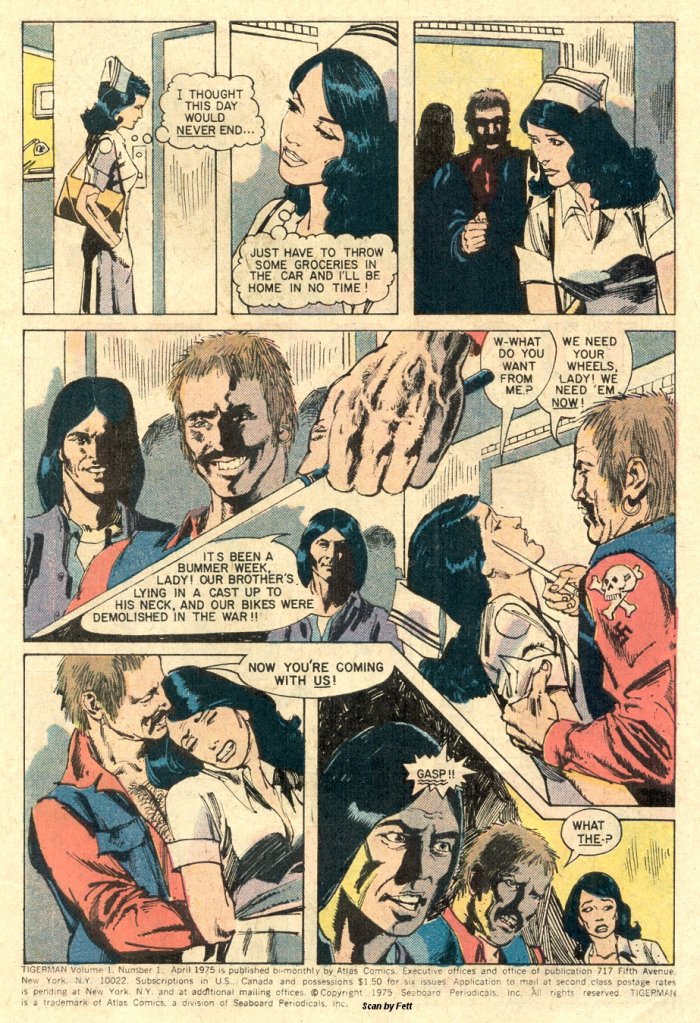
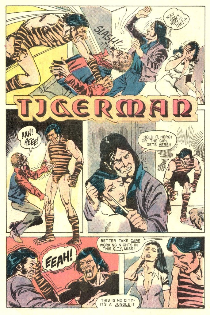
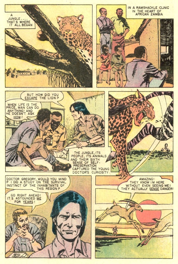
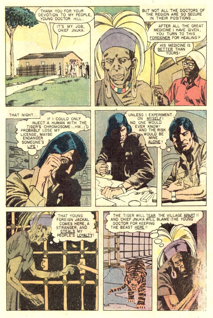
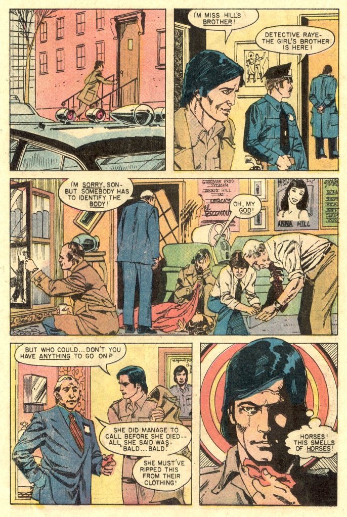
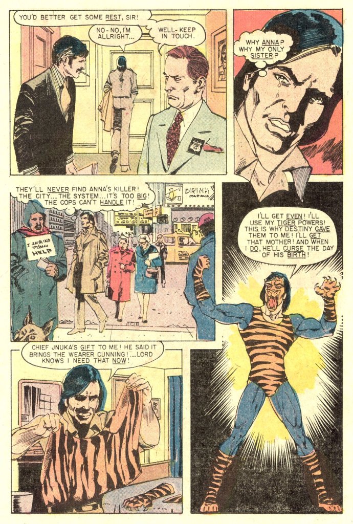
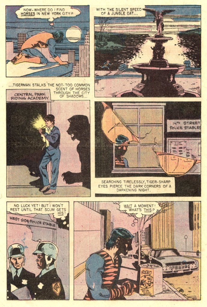
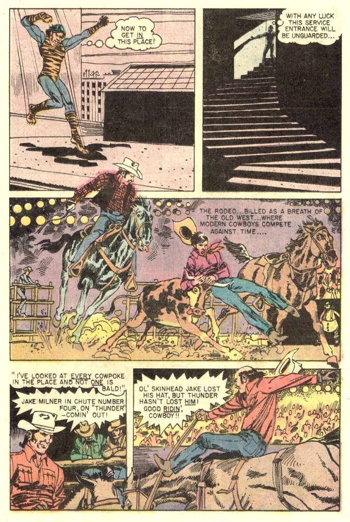
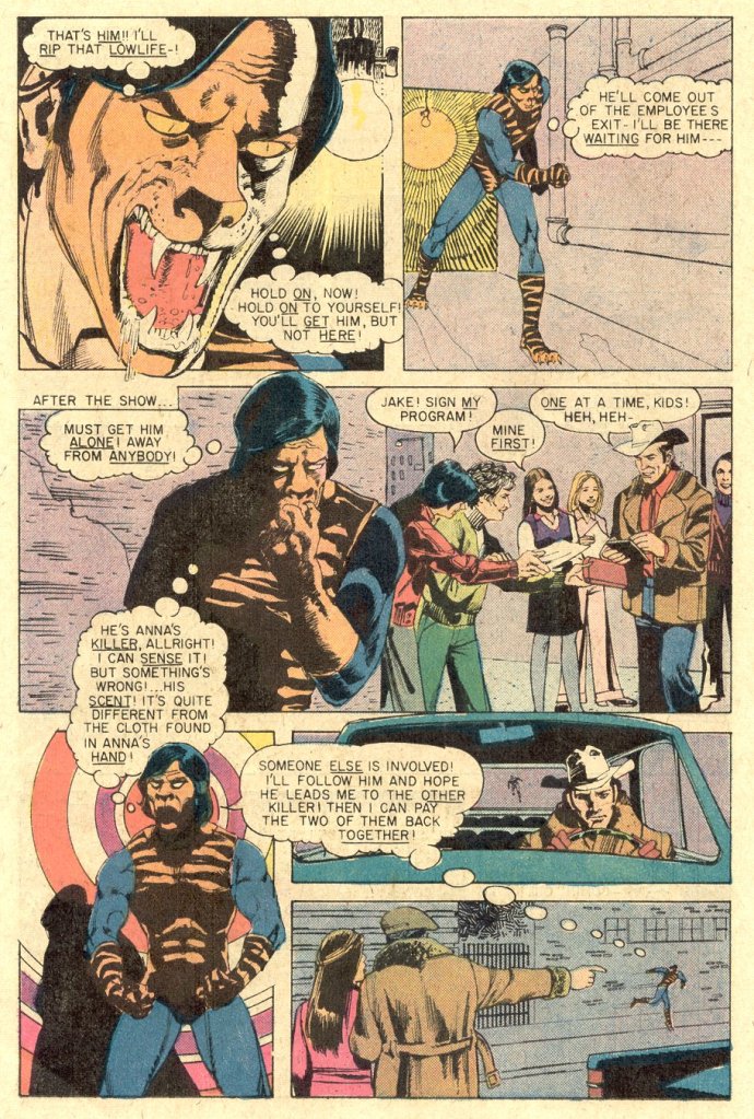
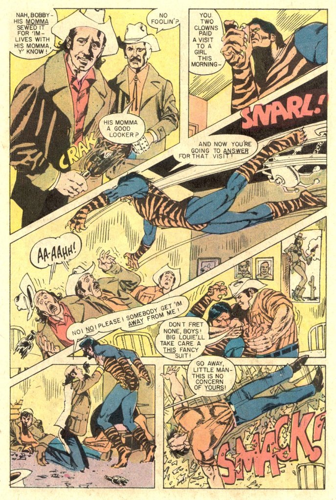
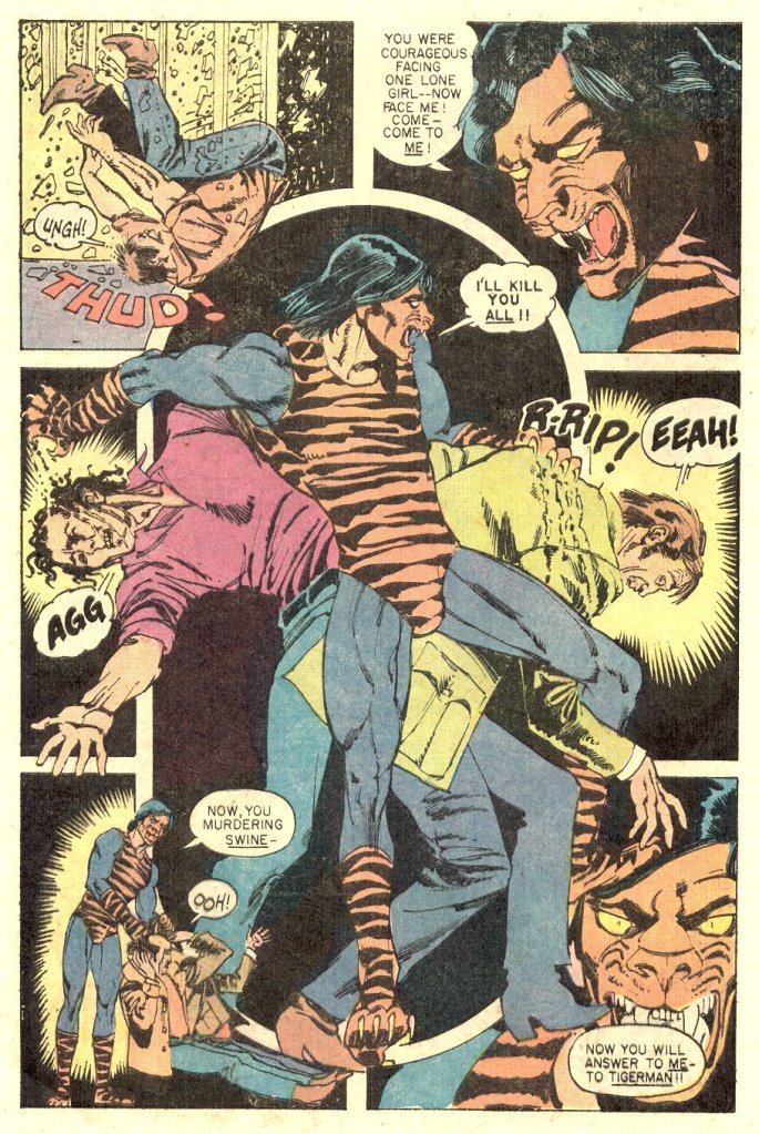
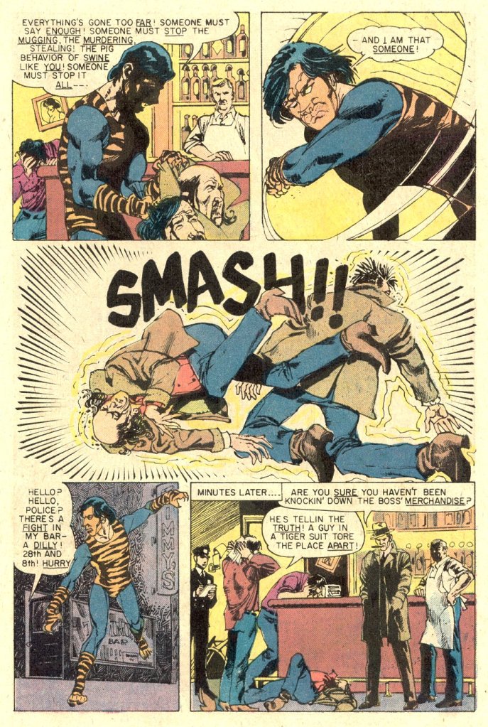
The story is glorious nonsense, and almost seems as though it had originally been commissioned for something else–which isn’t at all impossible given the haphazard manner in which Goodman set up Atlas in the first place. The use of Leroy Lettering (a mechanical lettering template used most notably by the EC Comics titles of the 1950s) gave the story a feeling of antiquity. The hero, Dr.Lancaster Hill, is one of those comic book scientists who is studying some forbidden field–in this case, he’s attempting to isolate the chromosome that makes a tiger so powerful–and who therefore decides to conduct his experiments on himself. This winds up giving him the strength, speed and power of a jungle creature, as well as facial features that can charitably be called laughable.

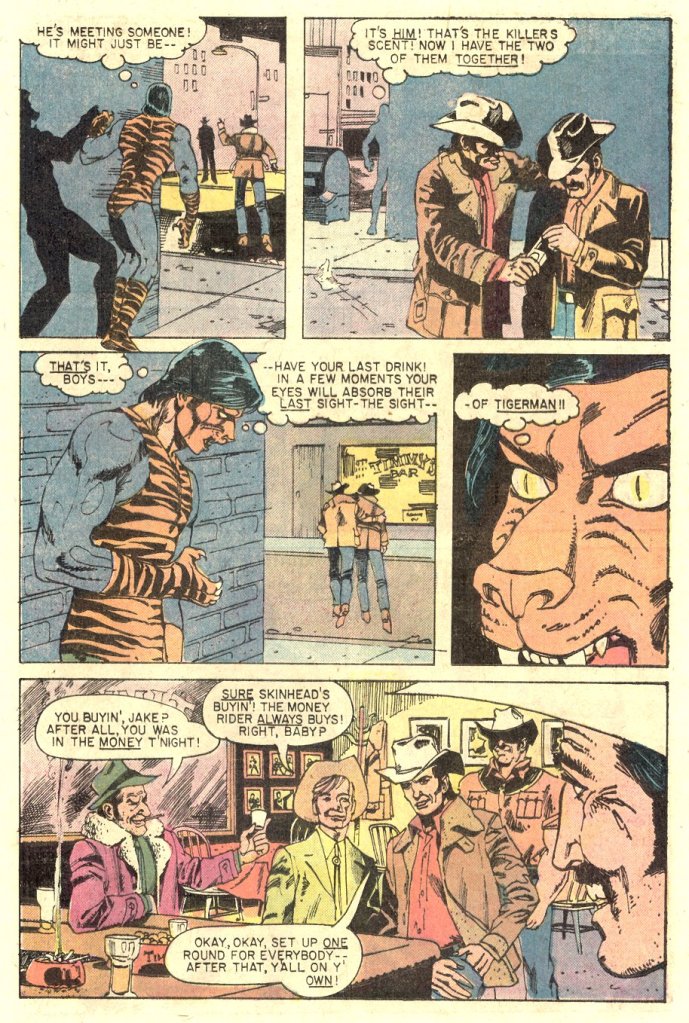
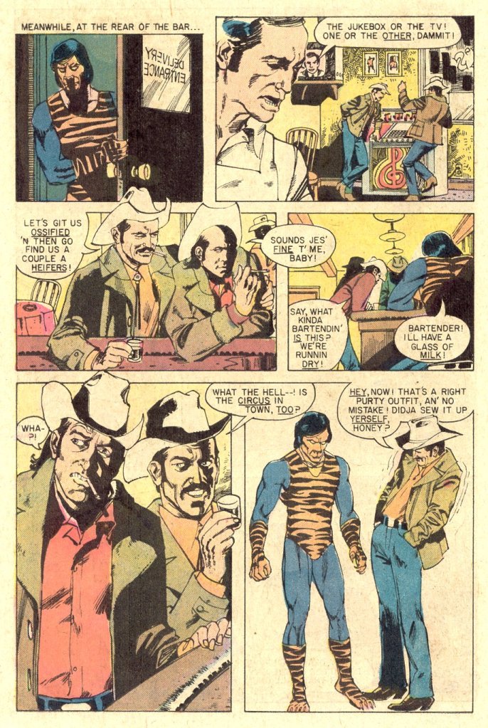
Seriously, the Tiger-Man design is not good. It’s a bit of a nightmare, functioning at cross-purposes. If the idea is to make him look fearsome, than the bright primary blue defeats that purpose. And if you’re trying to make him seem like a Spider-Man -style super hero, then the tiger onesie and the weird cat face that often looks like it’s weeping don’t help at all. The whole strip suffers from this manner of schizophrenia, this pull between trying to do something a bit more modern and quasi-realistic (the story plays like nothing so much as a television pilot for a low-budget horror series) and needing it to evoke Spider-Man and the Marvel heroes as much as possible. The whole thing is a car wreck–but it’s at least an interesting car wreck!
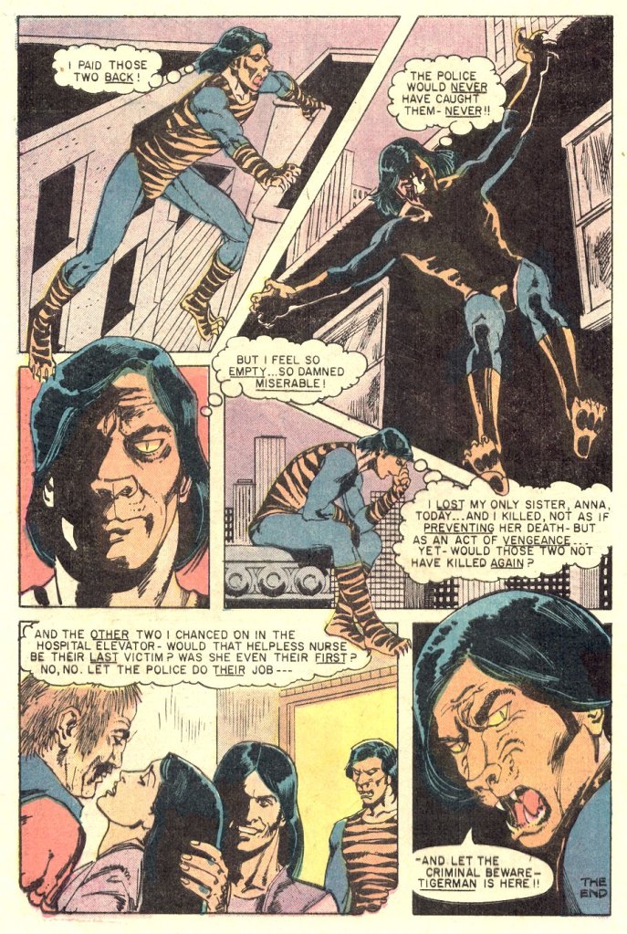
The cover tips the book’s hand on the rest of the story: when his sister is killed by a pair of stereotypical-for-the-era B & E artists, Hill adopts the costumed identity of Tiger-Man to seek out vengeance. Which he gets, more or less, in a relatively by-the-numbers kind of a way.
TIGER-MAN ran for three issues under the Atlas banner, and as was typical of their output, the character started to get retooled a bit by the third release, None of it helped, none of it worked. At the same time, it seems like Atlas was operating from a poor position as far as distribution was concerned right from the start. Reportedly, much of their product was returned by the distributor unopened. It was never difficult to find copies of TIGER-MAN and the other titles in the Atlas line all throughout the 1970s and 1980s–every dealer had copies, often a lot of copies, in stock.

I followed Ernie Colon’s work in the 80’s. Cool to see this older stuff. The storytelling is more stiff than his art years later. The story, dialog, and costume are just awful. The typed text is boring, too.
LikeLike
Yeah; this was a train wreck of a comic, like most of the Atlas line. A few years ago, I took it upon myself to buy every issue of the Atlas (four color) output, and then read them all in succession. After hitting numerous conventions and several comic stores, I successfully amassed every issue (outside of a couple from the Vicki line) and then sat down with the best of intentions of plowing through all of them. What I found was consistently flashy covers with barely readable interiors. After slogging through “The Brute,” “The Destructor,” “The Scorpion,” (what was it with the article, the”), “Police Action,” “Tales of Evil,” “Phoenix,” “Targitt,” etc., I couldn’t do it any longer. I really tried to get into them, but the artwork was subpar and the writing convoluted. Complicating matters were the radical changes made to the lead characters across the line after a couple of issues (while never improving the product). It didn’t surprise me that the entire enterprise folded as quickly as it did.
LikeLike
Marvel began returning original art in late 1973. Goodman didn’t start Atlas-Seaboard until the summer of 1974. I know it’s comics lore that Atlas-Seaboard was first and that move was behind Marvel and so forth finally returning art, but like a lot of comics lore, it’s not accurate.
LikeLike
This doesn’t really track with memos I have copies of where Stan Lee explicitly offers the return of original art to contract Marvel artists as a hedge against Atlas and Goodman—who, while not named directly, are clearly the ones at issue.
LikeLike
I’m at a disadvantage here because I can’t access the computer with my photocopies of the TCJ reporting on the Kirby original-art controversy. I’m certain that’s where I read that, most likely in the article about Irene Vartanoff and the ’70s warehouse. But my recollection is that towards the end of 1973, Marvel sent a memo to all creative personnel informing them that all original art from comics cover-dated January 1974 onward would be available for return. .
I am very curious about Lee’s language and the memo dates. If you’re at liberty to print the memos, please do. Thanks.
LikeLike
As uneven (to be kind) as their output was, it taught me a lesson that stuck. I was 12 when I bought their first comic, PHOENIX #1, and the feeling I had back then of being in on the ground floor of a new company launch was exciting and memorable. I try to keep that in mind when I want to roll my eyes at new fans today raving about some new line of books that I recognize as crap.
LikeLike
That’s absolutely true. The potential of Atlas and many other companies to come was always there, even if it never reached fruition.
LikeLike
That whole plotline with the resentful witch doctor has not aged well (and had whiskers on it at the time, though as a kid I wouldn’t have known that).
LikeLike