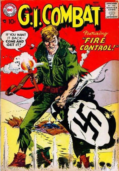
It’s the word balloon that really puts this one over the top, that and the strong primary red background. And that logo pops like crazy. Artwork by Jerry Grandinetti. A great cover that tells an entire story in a single image, and is cool as hell. You can understand why DC sold so many war comics over the years with covers like these.

First: LOVE this series on “Great Covers.” I’ll probably steal the idea for my Facebook posts.
Second: You’re right, DC’s War comics had an unusually high number of excellent covers. Could this be because so many of the creators had first or second-hand knowledge of war, and understood it in ways you really can’t understand science fiction or superheroes? Just spitballing here.
Of course, later on Kubert would come along, and almost every one of his covers are striking and arresting in some way. I think of Kubert as being in a very rarified class, along with Bolland and Mignola— their very STYLE makes you stop and take notice. Quite honestly, if you look at the compositions of some of Mignola and Bolland’s covers— they could have turned out boring and uninteresting SO EASILY. It really comes down to their style as the energizing force.
Third: The thing I love most about this GI COMBAT cover is the background! You could argue that the soldier holding the nazi flag, shooting straight at the reader, with bullets hitting the ground at his feet— that’s all you need. It would be a striking image. But the background is what tells the STORY— his steps showing his relentless trek through the dunes, taking out some sort of Nazi outpost single-handedly (where he must have gotten the flag), before ending up where he is on the cover. Masterfully done.
I’d quibble about the bullet shots at his feet— too much of a straight line; it really flattens the image. I think it would have been stronger to show some of the dune at his feet, just so the bullets could hit the ground in a more irregular pattern, or even in somewhat of a diagonal across the image. My two cents.
LikeLike