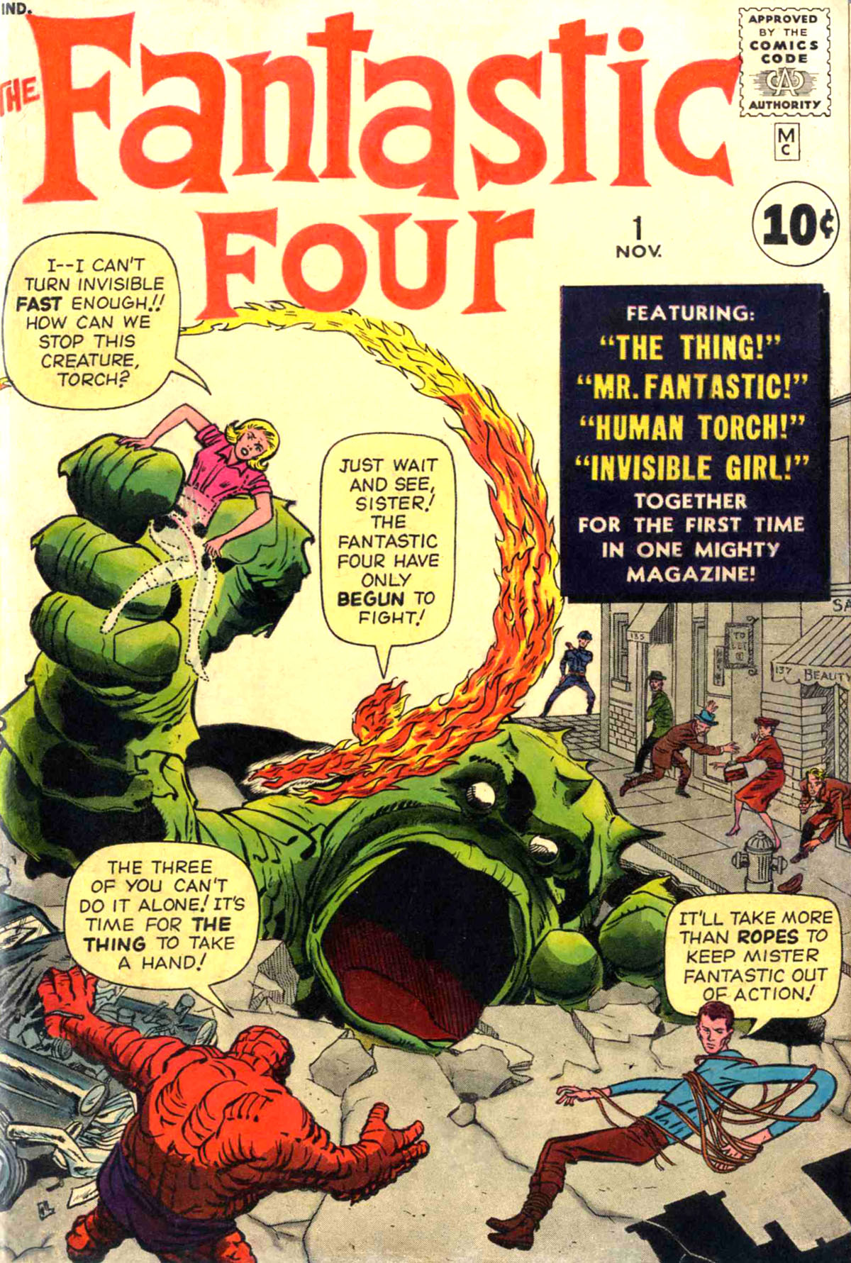
FANTASTIC FOUR #1 was the beginning of what would grow into the Marvel Age of Comics, where Stan Lee and Jack Kirby revolutionized the field and unleashed a wave of characters and concept that have achieved worldwide popularity and renown in the decades since. So it’s now seen as an important issue. And from what evidence exists, it was an important issue to both Lee and Kirby as well, in different ways. For Stan, it was a chance to break out of the mold of the many lackluster stories he’d done before and to try something a little bit more sophisticated. For Kirby, it was the chance to get back to doing super hero action-adventure stories, his forte, and to make the kind of impact with these new characters that could turn around the fortunes of the struggling company he was working for, and secure his future.
The specific genesis of FANTASTIC FOUR #1 and the characters introduced therein has been hotly debated, with both Lee and Kirby giving contradictory accounts as to how everything transpired. I’m going to table most of that discussion for this essay, both because I don’t believe it’s possible at this late date to know for certain who did what, but more importantly because it was the end product of the combined talents of these men that made the work work, and so the only credit that makes any sense to me on that score is “Stan Lee & Jack Kirby.”
However, there is a bunch of evidence within the issue and on the pages themselves that indicates that a whole lot of changes were made to FANTASTIC FOUR #1 as it was being produced–and that, in fact, some or all of it may have been intended to run in another magazine entirely. (AMAZING ADVENTURES, which became AMAZING ADULT FANTASY at this same time and which Kirby stopped contributing to, seems to be the most likely supposition.)
The original artwork to FANTASTIC FOUR #1 and #2 has not surfaced, and it would tell us a lot more in terms of what was done here. The earliest FF art that still exists in the public eye is a number of pages from FANTASTIC FOUR #3. And on the backs of a number of them are crude sketches by Stan Lee showing how he’d like to break a certain sequence of panels down, or how he wanted to display a bit of staging. My guess is that these were made at Lee and Kirby’s regular weekly/biweekly office meetings, where Kirby would bring in the pages he’d drawn in the interim and go over them with Stan, describing the story that he’d put down. Stan would typically jot notes in the margin to himself during this process, to remind himself of plot points when he went to script the pages. But in these instances, it seems as though, either before Kirby had penciled the pages or after, Lee had comments that altered or affected what the final pages turned out to be. Taking the FF #3 methodology as my basis, I’m making the assumption that the same process was used on the preceding two issues as well.
There are a number of places where the storytelling in FANTASTIC FOUR #1 and #2 doesn’t really track with the established storytelling rhythms that Kirby had evidenced before this, on the other stories that he was doing for Marvel at that point, and even earlier. So my guess is that those were places where Lee was calling the tune in terms of how the breakdown of the pages was orchestrated. Additionally, if the material in FANTASTIC FOUR #1 began life as slated for another publication, then it would have been reworked, expanded and changed when the decision was made to feature it in its own magazine. So we’ll point to a few places where that may have been done. All of this is speculative, of course, but I’m going to point to what I see and then everybody can make up their own minds–at least until further evidence presents itself.
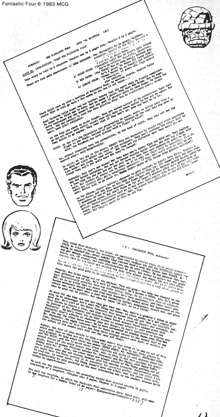
One thing i do feel honor-bound to bring up here is the existing synopsis for FANTASTIC FOUR #1. I first saw this printed in the fifth issue of David A. Kraft’s COMICS INTERVIEW alongside an interview with Stan, and it’s been reproduced a number of times since then. Roy Thomas has said that he can recall seeing this synopsis as far back as 1966, when Stan came across it and brought it into the office to show Roy, knowing that he had an interest in such comic book history. Some have questioned the authenticity of this document, which is understandable given that there have been other instances where creators have forged material intended to bolster their own claims as to the authorship of a particular work or character. But assuming that you believe Roy’s story about seeing this document in 1966 (and I do) then I find that I must assume that it is authentic. At that point, there would have been little reason to forge such a document–the schism between lee and Kirby hadn’t boiled over quite yet, and there was no reason for one to need to create evidence over the other at that point. Also, were you to be doing that, surely you would create a document that was closer to what was actually published than this.
All that preamble aside, this document does put a pin into the balloon of the notion that FF #1 was assembled from parts, as it seems to clearly lay out that the first 11 pages of the book will be the origin of the team (the gathering and origin took 13 pages in the final comic,) and then the remaining 10 or 13 pages (there’s a handwritten note from Stan changing the 10 to a 13) will comprise their first adventure. So much of what I’m about to lay out here may be complete nonsense. But let’s look at the book anyway.
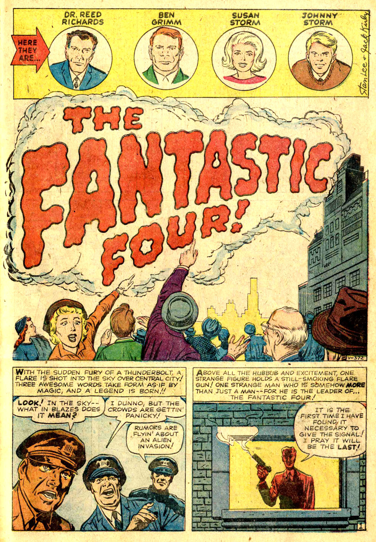
It always struck me as weird that on this opening splash page, in the roll call, Ben Grimm was depicted in his human form. That makes sense if you’re hiding the fact that he’s been turned into a Thing, though–although the cover of the book has already given that fact away. The left edge of that signal-cloud in the main panel was added in production by somebody with a less-deft hand. The top box is signed by Lee and Kirby, and in both cases the signatures appear to be their handwriting, albeit crammed into a very small space.
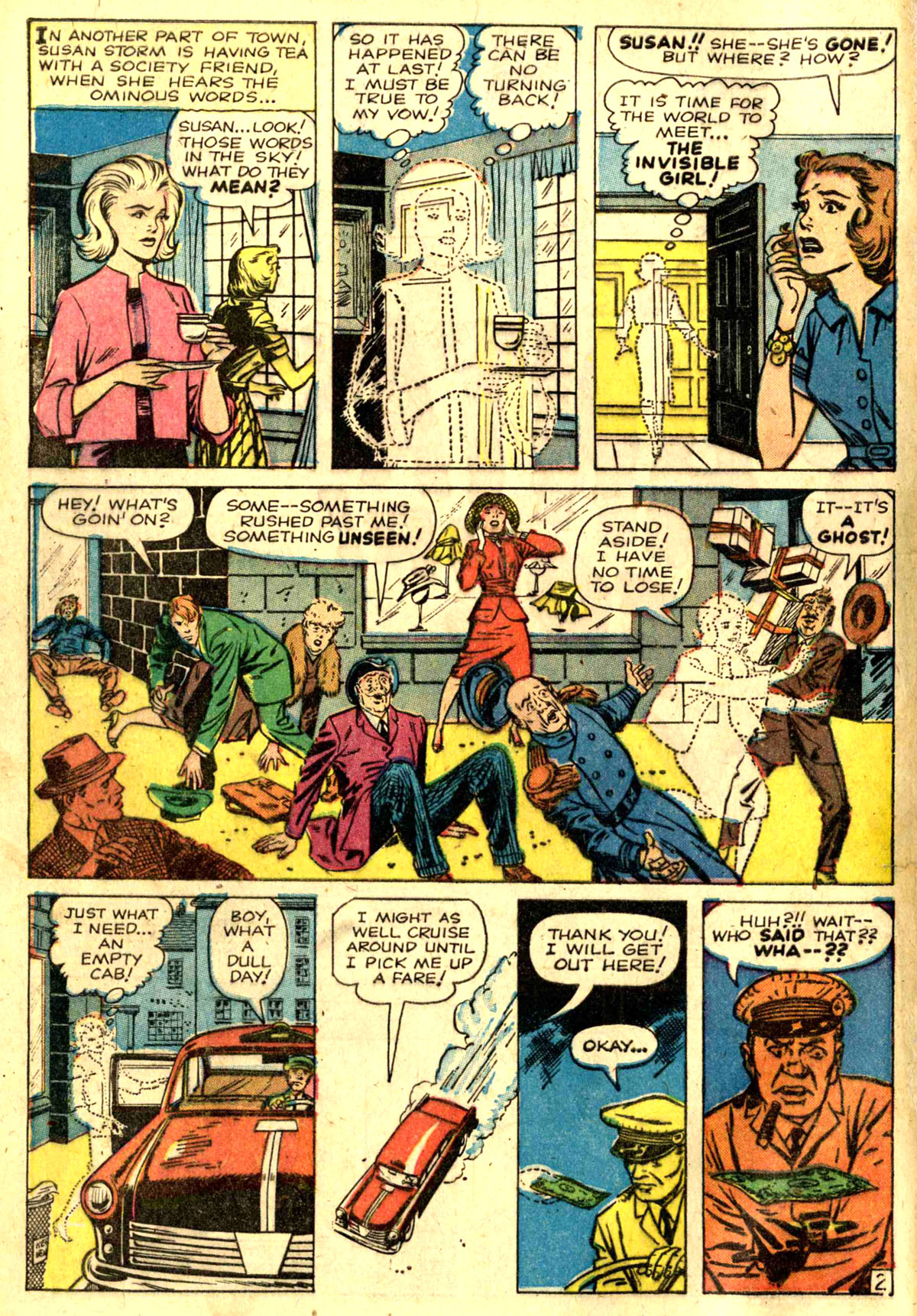
On this page, we see the first instance where I believe Lee changed the storytelling. This is a very typical Kirby page layout with the exception of the two middle panels in the bottom tier. I suspect that Kirby drew a single panel there that was replaced by these two more slender images which conveyed the information better–possibly the fact that the cab takes Sue to her destination. It’s possible that the third panel in that row actually filled the whole of that space and was reduced in size to make room for the shot of the cab driving. That’s a lot of dead black space at the top of it, and the sequence would still work that way–just without Sue actually going anywhere in the cab.
The early Marvel comics were primarily colored by Stan Goldberg. Stan G used an interesting approach on the material, involving a lot of “knock-outs” (objects colored in a single, simple color). There’s no reason the cab driver in Panel 3 should be red, but it sure heightens the moment. Similarly, the next two tiers use selective knock-outs to focus the eye on the most important elements of the scene, and to create simple depth and heighten the mood.

This is a more typical Jack Kirby layout of the era, almost certainly entirely staged by Jack.

Another typical Kirby page. Somehow, the characterization of Johnny working on his hot rod feels like a Kirby innovation to me–the sort of visual characterization that Kirby would typically employ.
This one’s a little weird, with the final two panels each taking up two tiers’ worth of space, not a typical go-to for Kirby. The drama is Kirby, but I suspect the panel layout is Stan. I love that melting car in Panel 4, a nice touch.
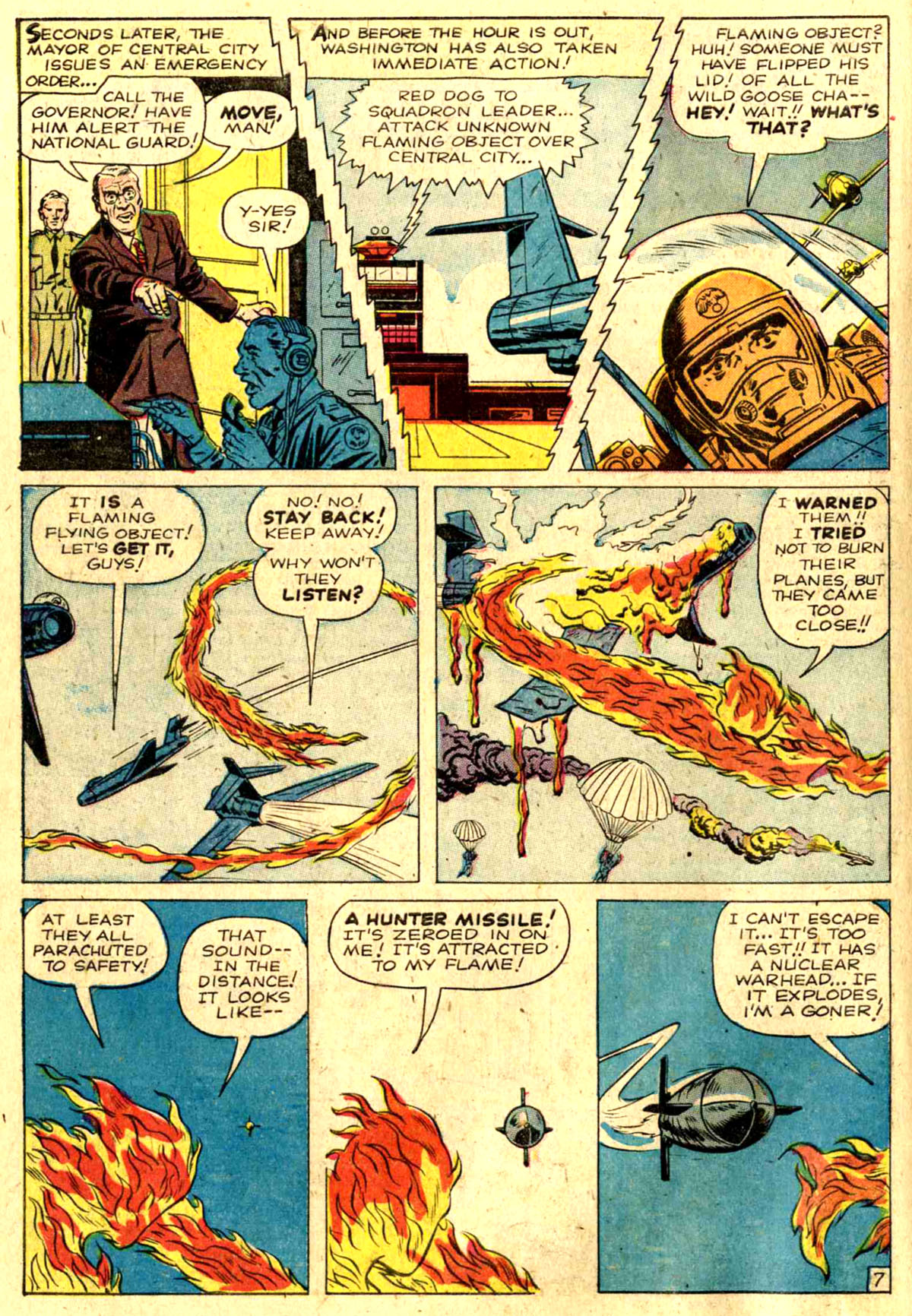
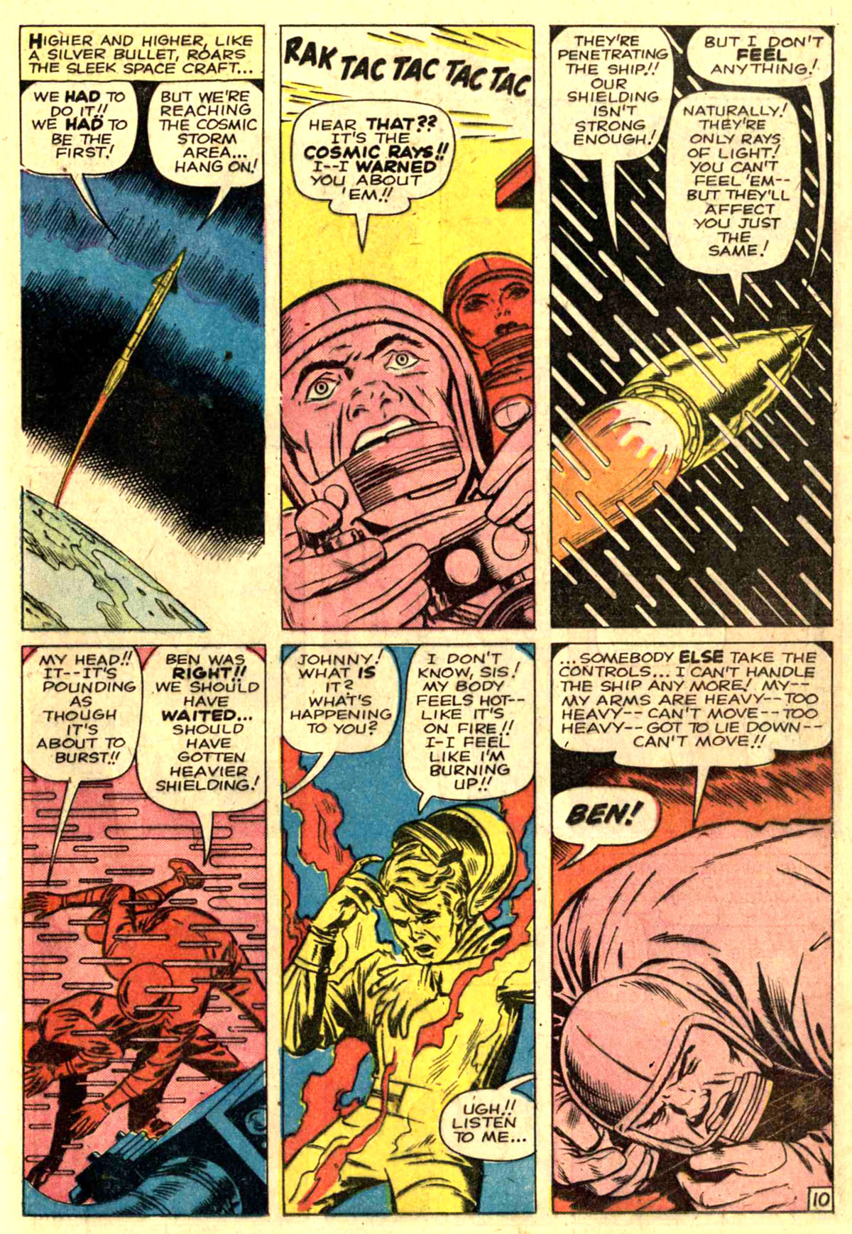
Those electrical borders on the top tier are certainly a Stan touch, as are the slanted angles on them.* Meanwhile the triptych approach of the missile in the final three panels is a Kirby touch. I wonder if those parachuting pilots in Panel 5 were added in during the inking or in production, they feel a bit pasted-in to me (and too close to the bottom border.)
Straightforward Kirby layouts. It’s interesting that the Thing is back in his overcoat, hat and glasses in the final panel, to link up with what comes later on in the issue.

This is so not a typical Kirby page layout, and seems like an instance of somebody, Lee or Kirby, attempting to cram a lot of material into a small space. That first panel has a caption on the left side of the panel, as a number of frames in this job do. It leads me to wonder if perhaps the art for that top panel was either originally shorter, or if it was shifted to the right at some point in the process. Take out that caption and it doesn’t make a lot of sense for Kirby to have framed it that way.
Straightforward Kirby page layout.

Typical Kirby layout, although there’s something odd about the ship’s contrail in that first panel. It looks a bit to me like the left side of the panel was extended and the bits of the contrail awkwardly connected. The shot is framed weirdly. Also notice that “Invisible” is misspelled as “Invinsible” in Panel Six.
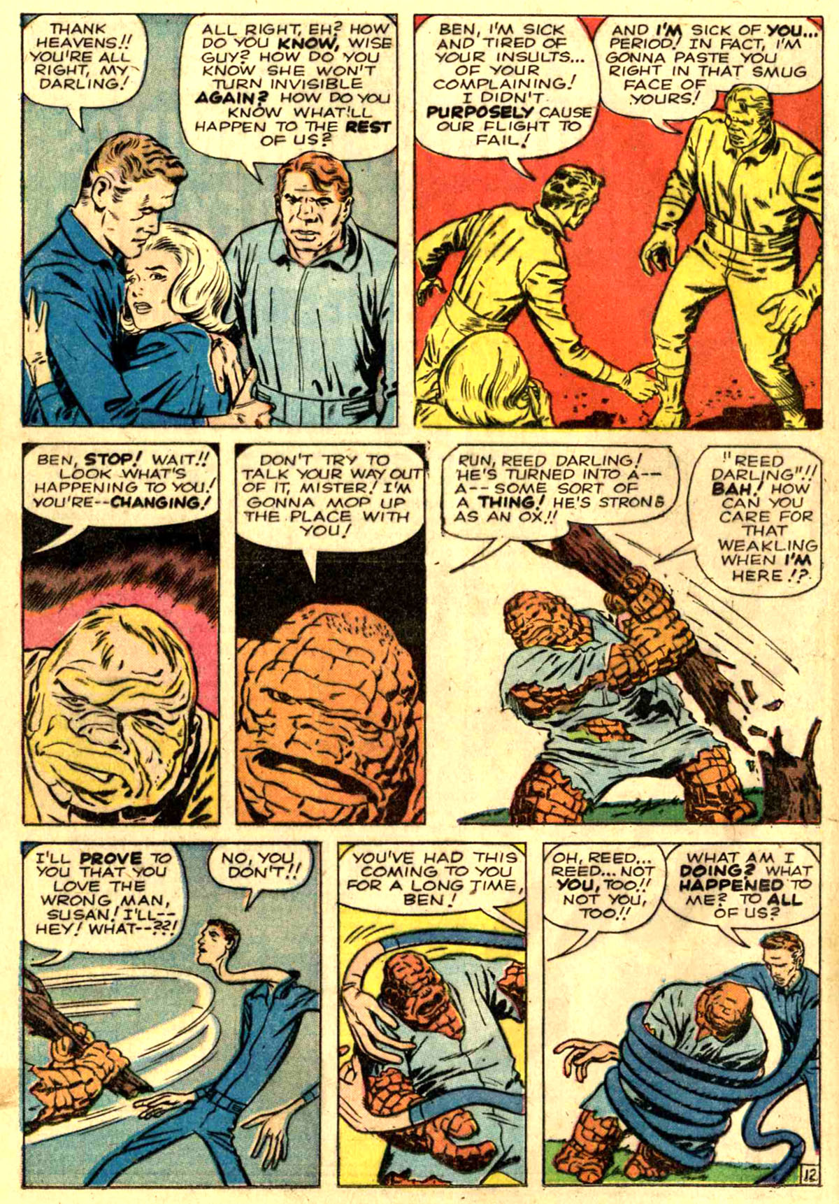
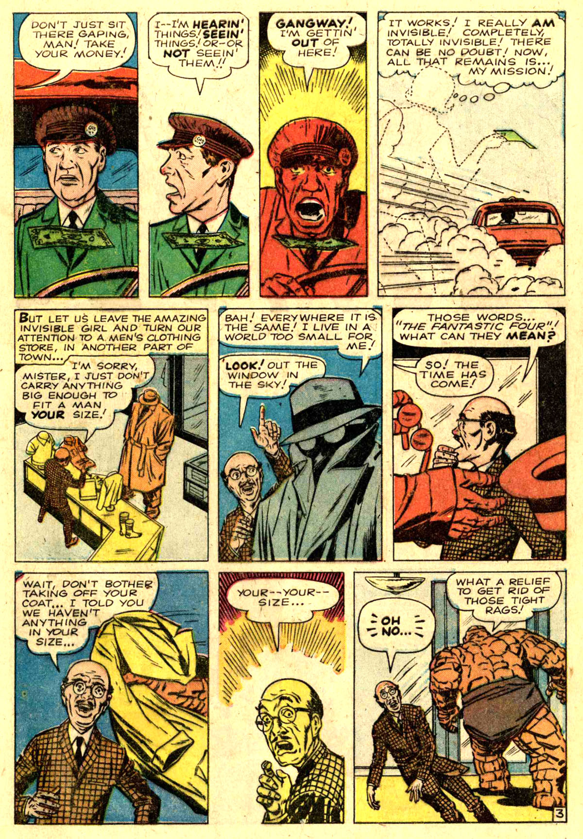
This page is a little odd, in that it’s not far from a typical Kirby arrangement, but those final three panels in particular seem jammed in somehow. Not sure what might have been going on here. Also, the Thing’s transformation appears to have been set up as a triptych where the first panel, of normal-looking Ben Grimm, was eliminated at some point. Kirby almost always depicted a transformation such as this one as a three-panel progression, it’s one of his signature moves, so the fact that only two steps shown here points to something having been changed around. That last panel of the Thing ripping up the tree also looks like it was widened to me. And the top tier panels all seem to have been extended slightly at the bottom. Down below in the comments, Glen David Gold correctly points out that the Thing’s balloon in Panel 4 appears to have been cut out and replaced with new copy. Wonder what it might have said in the first place–or if it perhaps had been a caption in an earlier iteration.
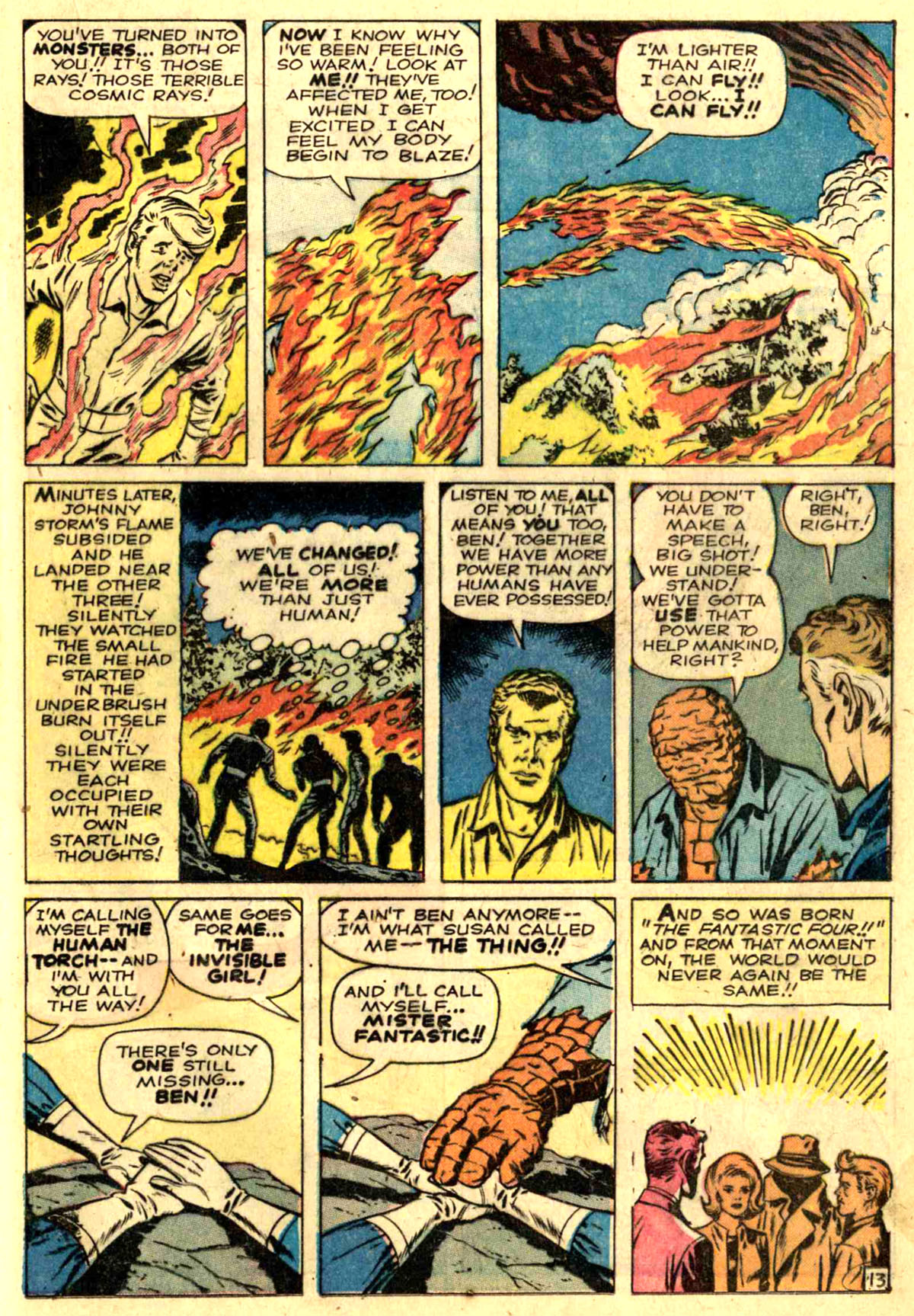
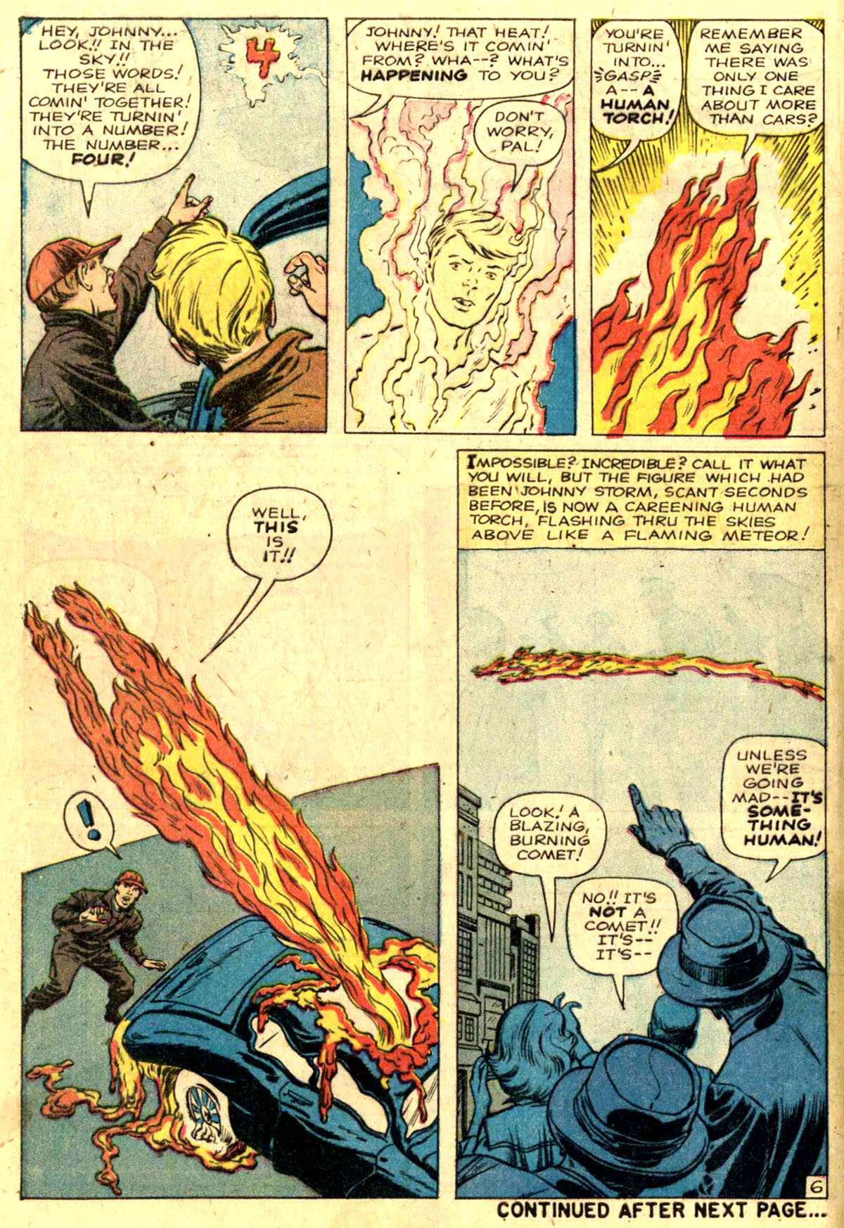
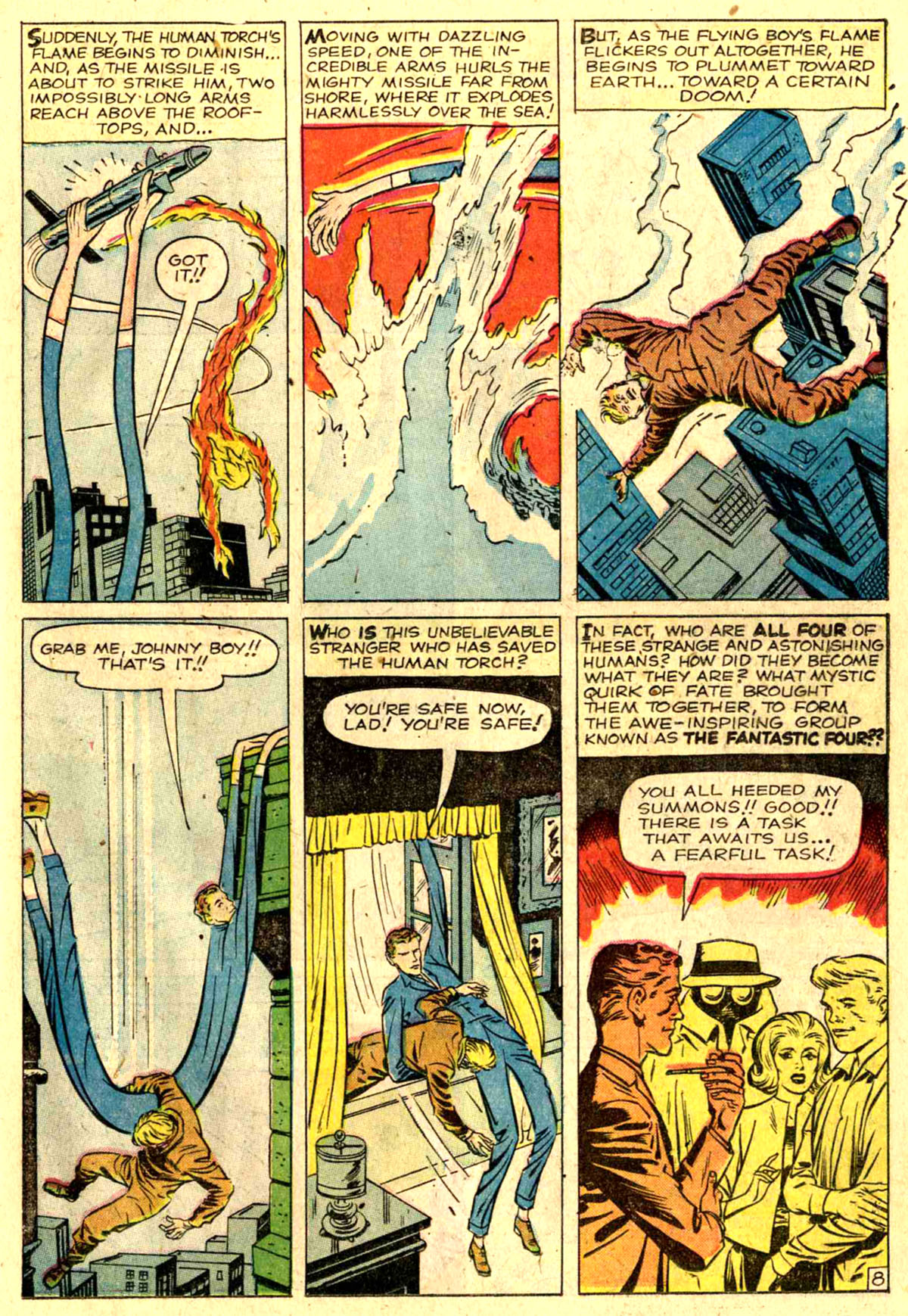
That left side caption in panel 4 is a bit strange. It seems like maybe Stan was trying to minimize the fire that the Torch’s takeoff has set. That thought balloon seems larger than you’d need for that copy, and is oddly shaped, like it’s been designed to obscure more of the background deliberately. That final panel also looks like something that was maybe added in house–for one thing, the Thing is back in his hat and coat, even though he doesn’t wear them in the origin proper. Those shock lines in the middle of the panel also look crude to me, like somebody trying to fill the space. So I wonder if that shot of the team wasn’t meant to go across the middle of the panel originally, with a caption at the top and a next issue-style blurb at the bottom. Kirby used that arrangement at the end of a few stories. One of the prevailing theories floating around is that this origin sequence was originally produced as a stand-alone story intended for one of the fantasy books such as AMAZING ADVENTURES. If that is so, then perhaps the edits that were made to it here were designed to bring it down to a fewer number of pages. Practically all of the origin sequence pages are cramped, with tons of tiny panels forced into less space than would be ideal.
That takes us through the first half of the issue, so it’s a good place to break before this entry gets so large that it collapses under its own weight. I’ll walk through the back half of the book shortly.

There’s so much here to take in. I’m curious about the narration’s shift in tense — the flashback is all in past tense except for two panels on p. 9 and p. 10. That might just be Stan’s legendarily bad sense of panel-to-panel continuity (“Only one of us will walk out of here / and it won’t be me.”) or the result of two stories being edited together. Also on p. 12, panel 4 looks like its dialogue balloon was replaced — there’s a line below it and some smudging that extends into panel 5. And I’ve never tried before to count how many fingers and toes The Thing has from panel to panel. They do come and go, don’t they?
LikeLike
That’s a great catch on the change to the Thing’s balloon on Page 12, Glen. I’m editing that into the body of the piece.
LikeLike
Tom,
Very fine analysis of this pivotal comic. Your look at the composition of every page is fascinating and based on the breakdowns that exist by Lee on the back pages of FF # 3 make sense. Your point about the parachutists being added on is entirely possible. Perhaps Kirby left them out in his drawing and Lee wanted to emphasize to the Comics Code that they were not injured (or this could have been added at the request of the Code). As you noted,panel 4 on the last page may have been tampered with in order to lessen the impact of Johnny’s forest blaze, since Lee, in his copy, notes the “small fire”. The Thing also appears to be altered or revised by another hand, likely Sol Brodsky, in several panels throughout the story, possibly to make him look less frightening. I look forward to further speculation.
LikeLike
Thanks for the great post! To your point that the origin story was cramped because it was repurposed from another book: page 9 is a bit crowded, then pages 10 & 11 open up (and reflect Kirby’s usual layout style), and pages 12 & 13 are increasingly crowded as the origin concludes. So the origin is cramped at the beginning and the end, exactly where you’d expect it to be if it was compressed to fit in the middle of another adventure. That seems implied in your analysis, but not outright stated.
LikeLike