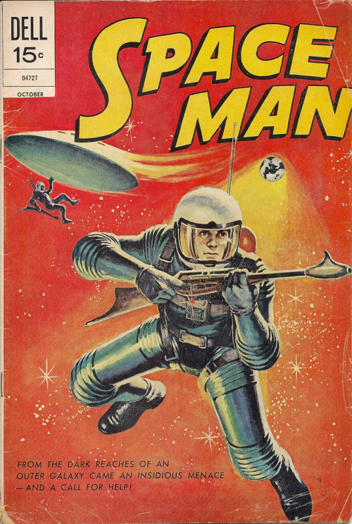
On that same trip that I talked my grandparents into taking to the distant Sun-Vet Mall so that I could go to Ed’s Coins and Stamps, one of the very few shops that I knew of in my area that sold back issue comic books, my younger brother Ken also bought a copy of this issue of SPACE MAN. I have no idea why he landed on this book–probably, the painted cover simply appealed to him. He was perhaps just a bit more space-oriented at that moment than I was, having fallen under the spell of STAR WARS and its assorted knock-offs such as BATTLESTAR: GALACTICA. Whatever drew him to it, he took the book home with us–and in a few years it wound up being absorbed into my collection.
To be honest, I’ve never been a big fan of the output of DELL COMICS. I’m aware that there’s a bunch of very good material among the titles they published, but they somehow never appealed to me as a kid. That’s probably mostly down to the fact that DELL never really did super hero comics, and super heroes were what I was most interested in as a reader. DELL mostly specialized in licensed properties from animation, television and film, which made them the number one publisher of comic books in the United States for most of the 1950s. A split between the DELL ownership and Western Publishing, who had been producing the content for their comic book line and who controlled the rights to many of the firm’s most lucrative properties, in the early 1960s led to a split between the two, which resulted in the similar-but-competing GOLD KEY COMICS line being launched. That together with a decision to increase their cover price to 15 cents rather than the 12 cents that became industry standard cost them a good chunk of their business.
Additionally, I simply didn’t like the look for a lot of DELL comics. Their storytelling was absolutely clear but also absolutely rigid, confined in a tight six-panel grid much of the time. Exaggeration and dramatics weren’t what DELL was interested in, clarity was the whole ball game for them. And while their comics were clear, they also struck me as bloodless and even a little bit boring much of the time. They’d also play around with having borderless panels, which struck my kid sensibilities as being wrong somehow. and I never entirely warmed to their use of painted covers, as nice as many of them were. Finally, even for films or shows that I might have an interest in, the DELL stories struck me as being surplus to requirement. They were often just a hair off-the-mark for what made the shows in question work for me, and they could never quite capture the essential essence of the performers they were cartooning.
By the early 1970s, much of DELL’s output had been turned over to reprints of stories that they’d commissioned in earlier times. So it turns out that SPACE MAN #10 is an almost exact replica of SPACE MAN #2, which was released almost a decade earlier in 1962. The script for it was written by Ken Fitch and it was illustrated by Jack Sparling, an artist whose work I was somewhat familiar with from his assorted DC assignments. Sparling was a guy whose arrival on DC series seemed to spell their end, and he rode more than one title to cancellation in the late 1960s in this manner. His work was always a bit rough and sketchy, with a shocking use of spotted blacks that was coming from the Milton Caniff school. So I didn’t really find his work appealing as a kid, though I see a lot more value in it today.

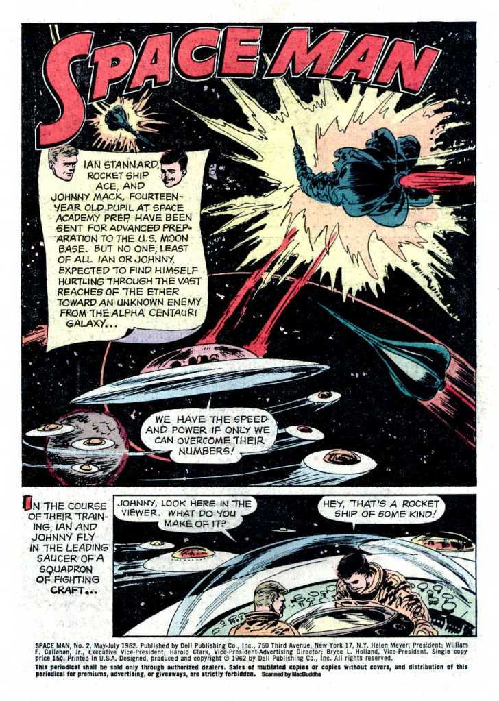
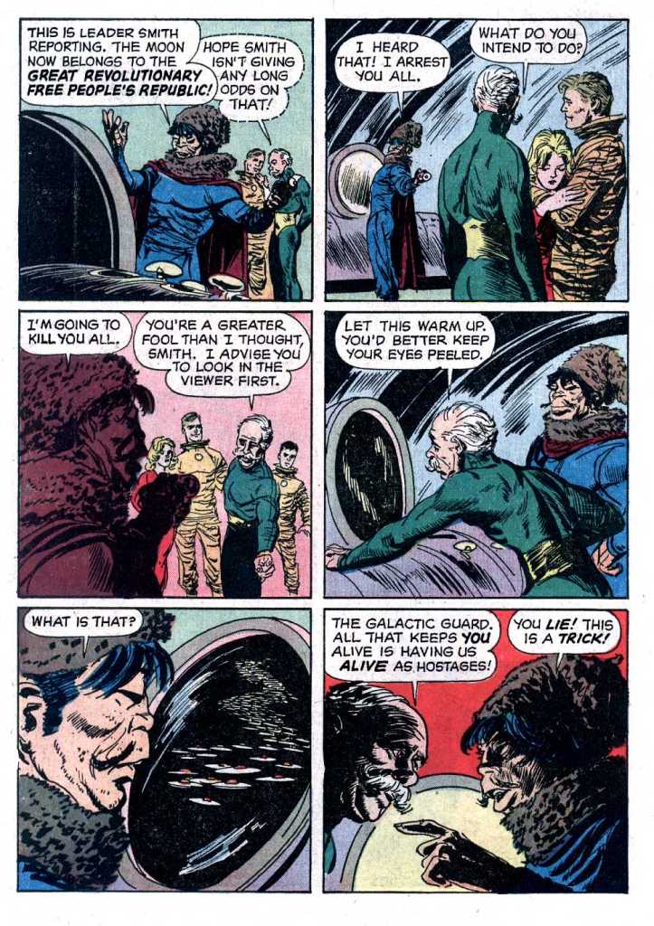
SPACE MAN concerned the adventures of pilot Major Ian Stannard of the United States, described as a “rocket ship ace.” It was pretty straightforward space opera of the era, with a strong bit of pro-American patriotic jingoism to it. Among Ian’s friends were his sidekick fourteen-year-old Johnny Mack, his fiancée Mary Lansing and his boss Colonel Hooper. They’re at odds with the Great Revolutionary Free People’s Republic, who are godless Asian caricature space communists. They’ve thrown in their lot with Garrak-Axos and his alien forces from Alpha Centauri who wish to conquer the Earth. But our brave space men are up there fighting for truth and virtue and apple pie and Chevrolet, and they won’t let the bad guy aliens win! The whole endeavor feels like a throwback to an earlier time, like a Golden Age story even though it was produced more recently than that.

So there are the usual space battles and flag-waving, exploration and discovery, double-crosses and daring do. But somehow, it’s all been drained of any excitement. Everything is straightforward and clear, but totally unexciting. It feels almost like a textbook somehow. It was also written for a younger and less sophisticated readership that even I was by 1978. As such, I didn’t find a whole lot to love here. I was fascinated by the fact that the story had originally been released in early 1962, right at the point when Marvel was just starting to introduce its super hero line. It was simple to compare even just the first issue of FANTASTIC FOUR to this comic and see just how much better and more exciting it was.

DELL’s books didn’t carry any advertising at all, so the story was a whopping 32 pages long, Even the inside and back covers were devoted to content rather than ads. So it was a pretty good bargain if you liked the material being produced. And in its way, it was a more realistic treatment of space adventure than a lot of the imaginative nonsense that filled the pages of, say, DC’s science fiction comics. And it reinforced a conformist 1950s-style picture of America as a land of virtue and goodness and right aligned against the interplanetary evils of Communism and having darker skin. (The People’s Free Republic characters were mostly colored in a stereotypical heavy orange hue that made them seem more “other” than most of the actual aliens introduced in this story.)
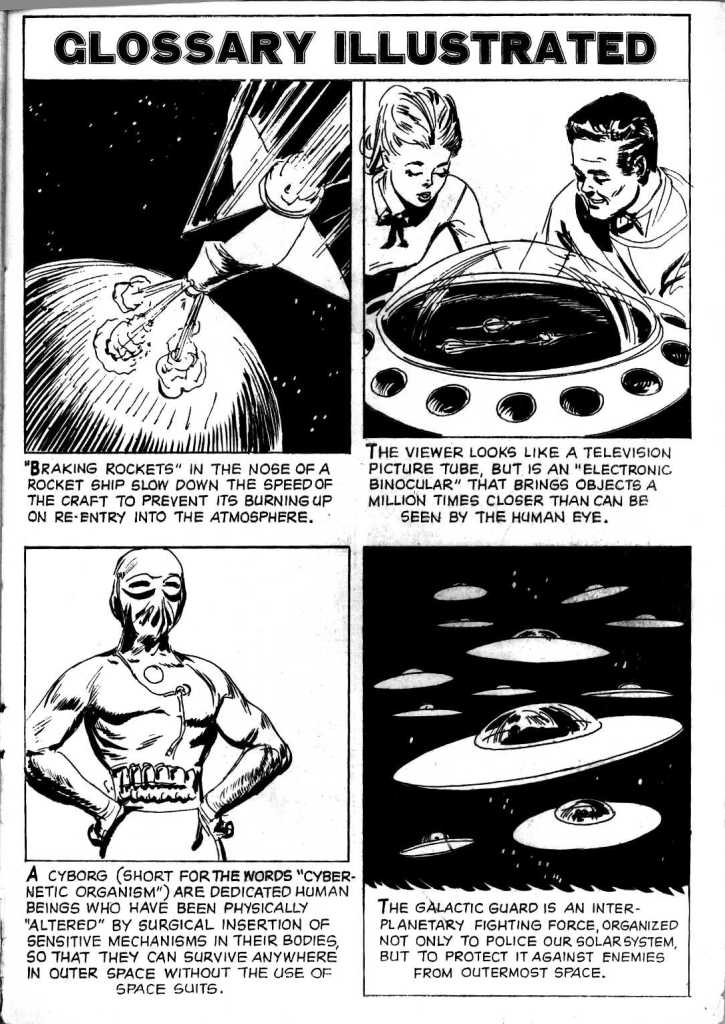
The inside back cover included a glossary of terms that had been used in the story, which also made it felt as though it was intended for younger readers than myself.

The back cover too was rife with genuine science facts determined to impart some actual educational knowledge upon its impressionable audience–and perhaps to blunt parental criticisms about comic book reading being a waste of time.

Around the time they were reprinting Space Man, Dell was also reprinting a lot of Sam Glanzman written and drawn war comics from the early 1960s, that were somewhat in the “slice of life” style of writer Cornelius Ryan, in his somewhat contemporaneous book, The Longest Day.
It was nice work and somewhat in danger of being forgotten. You can see why people like Charlton’s George Wildman and DC’s Joe Kubert were so quick to hire Glaznman away when Dell started to fail.
LikeLike
Sparling was never my favorite, but this is not bad at all. He certainly seemed to be enjoying drawing Mary in her skin-tight jumpsuit!
LikeLike
I may have bought one Dell and Gold Key not realizing what they were. Or it probably was none because I would’ve been turned off just flipping through it at the drug store.
What I want to ask is something I’ve always glossed over not understanding. What are spotted blacks? I’ve never cared enough to research it and I guess that hasn’t changed since I’m asking here instead of Googling.
LikeLike
Augie De Blieck wrote a very good piece on “spotting blacks” some time ago.
https://www.pipelinecomics.com/spotting-blacks-with-jeff-smith/
LikeLike
I also felt the same way about Charleton comics in the 70’s. I’d go to Woolworths (always looked for a store that may sell comics) and they always only had Charlton. Maybe it was a contract, I don’t know. But I never picked up any of those Charlton comics. Maybe it was because Marvel was ‘in’ (they had trading cards and stickers after all).
LikeLike
In the mid-late ’60s, Woolworth’s was the only place anywhere around that carried THUNDER Agents & other Tower titles. In the early ’70s, they were the only place you could find Gil Kane’s Blackmark paperback, & that was from Bantam Books… Ours never carried Charltons, tho’…
LikeLike
I like that the Commie usurper guy, who is drawn as an Asian guy with some Mongol-style accoutrements to his future-suit, is named “Smith.”
As for Sparling, he was a (comparatively) polished illustrator who was just not an exciting storyteller (even when he tried), and polished illustration has become much more in vogue in recent times.
LikeLike
I recall reading a James Blish juvenile Space Opera in 1974 or early 1975 that had similar elements, with Eastern Commies with WASP-y cover names.
The Blish novel was written in 1960 or so. i wonder if it influenced this.
LikeLike
I suppose he was in comparison to many of his ’40s/’50s contemporaries, but “polished” was never a word I’d’ve thought to apply to Sparling’s work. “Sausage-fingered,” maybe. (Not necessarily Sparling himself – I wouldn’t known – but certainly most of the characters he drew.)
LikeLike
Heh. Back in my earliest comics-reading days, when childhood diseases were a big factor, I was laid up in bed with I think it was chicken pox then, & my dad asked if there were any comics I want. I’d seen ads in DC Comics for Mystery In Space, which I really wanted to read, so I asked him to pick that up.
He brought me an issue of Spaceman. I was not pleased, tho’ I didn’t tell him that. (Some things you need to swallow with grace.) I didn’t remember Jack Sparling having anything to do with it, but now I wonder if that had anything to do with my lifelong hatred of Sparling’s art…
LikeLike
Alpha Centauri “Galaxy”, I knew the writer got this was wrong since Alpha Centauri is the closest star system to our sun in the real world ( Located about 4.37 light-years away in the Centaurus constellation, and is actually a triple star system consisting of Alpha Centauri A, Alpha Centauri B, and the even closer Proxima Centauri, a faint red dwarf )– the star system DC Comics that Adam Strange travels to using Zeta Beams from the planet Rann. Marvel has 3 races from Alpha Centauri : Alpha Centaurians [ Sub-Mariner#17 ( June 1969 ) ], Centaurians [ Marvel Super-Heroes#18 ( October 1968 ) Yondu’s race ] & the Centauri from Proxima Centauri [ Thor#258 ( January 1977 ) ].
LikeLike
I’ve see Dell books in back issues growing up but never owned an issue, but Dell’s Space Man out lasted Atlas Age’s Spaceman [ Spaceman#1-6 ( September 1953 – July 1954 ) called Speed Carter Spaceman on the covers but under Spaceman at comics.org & atlastales.com ] and the U.K.’s Spaceman ( 1953 series ) out lasted both with 15 issues.
LikeLike
It’s an older usage. “Galaxy” back then could mean what we would now call a solar system.
Right, Yondu. Who would have guessed that primitive, blue-skinned Alpha Centaurians would catch on?
LikeLike
Dell must have taken the CCA to heart and made it their mission to deliver no thrills. I like the art well enough, but no sequence is anything particularly explosive or dramatic. As mentioned above… Mary lounging in her suit is the story’s highlight.
LikeLike
Dell was the company that didn’t need to heed the Comics Code, b/c they had Mickey Mouse & Donald Duck & newsstands sold Dell Comics Code seal or not. You didn’t get any cleaner than Walt Disney!
Their overt stodginess was just the Dell house style, tho’ they occasionally cranked out something pretty off the wall, like the Bernie Krigstein adaptation of 87th Precinct. (He didn’t write it, but the art was fabulously nuts.) By the early ’60s, tho’, when the schism that resulted in Gold Key Comics (which mostly didn’t get any more exciting than Dell) was fomenting, any chance of that was gone…
LikeLike
Space Man wasn’t the only one in the 1960s to tackle space commies, see the original Star Trek series episode The Omega Glory ( Season 2 episode 23 ) with USS Exeter’s Captain Ron Tracey who allied himself with the invading Kohms ( Communists ) against the Savages/Yangs ( Yankees — who had a U.S. flag and Constitution though the butchered the words to it )
LikeLike
A surprising number of people don’t seem to understand the concept of “star system” and move directly from “planet” to “galaxy”. This is a bit like saying “continent” when you mean “town” of course. On that first page we also have the ether, which was an old-fashioned scientific concept of a substance for light waves to be waving, long outmoded.
LikeLike