
So I was back in the habit of buying ACTION COMICS every month after a short hiatus that was motivated by I don’t know what. It was always a reliable purchase: never the most exciting comic book in my stack, but always dependable for an enjoyable story. A bit of a disparity had begun to creep in between the covers and the interiors, as the cover images tended to be by newer and more dynamic artists (such as Jose-Luis Garcia Lopez here) while the stories within were still handled by the reliable Curt Swan. I’ve always appreciated Swan’s work, but I can see where this inconsistency may have left some purchasers dissatisfied. The Superman they were being shown on the outside wasn’t really the same as the experience they got on the inside.
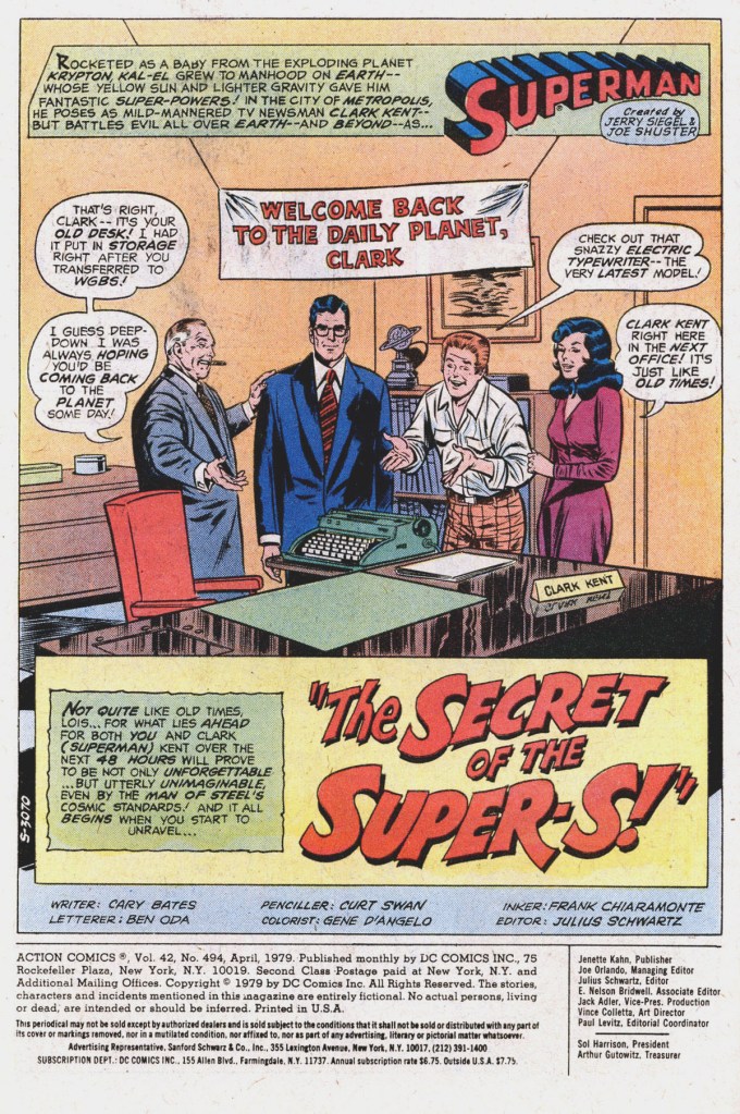
The stories were also maybe a little bit out of step with the times, with the one in this issue being absolutely absurd in some areas. But it opens with Clark Kent having come back to being a Daily Planet reporter after years of acting as the Newscaster for the WGBS news program. This was definitely a move made in response to the SUPERMAN THE MOVIE film which was then in release. With the world once again knowing Clark Kent as a mild-mannered reporter, it was simply good business for teh comics to follow suit once more. the story takes pains to tell us that this arrangement is only intended to be temporary, but Clark would begin to perform regular double-duty from this point on.
And the first story Clark is to investigate comes courtesy of an anonymous letter sent to the Daily Planet by someone claiming to know all kinds of secrets about Superman. As proof, the letter includes the design for an alternate S-emblem that Superman had considered adopting when he first made his costume. Sensing a scoop, Lois Lane convinces editor Perry White to allow her to accompany Clark back to Smallville to seek out some answers. They’re meant to be met at the train station by Clark’s old friend Police Chief Parker. But Parker doesn’t show up, and so a concerned Clark and Lois make their way to the old Kent home on their own.

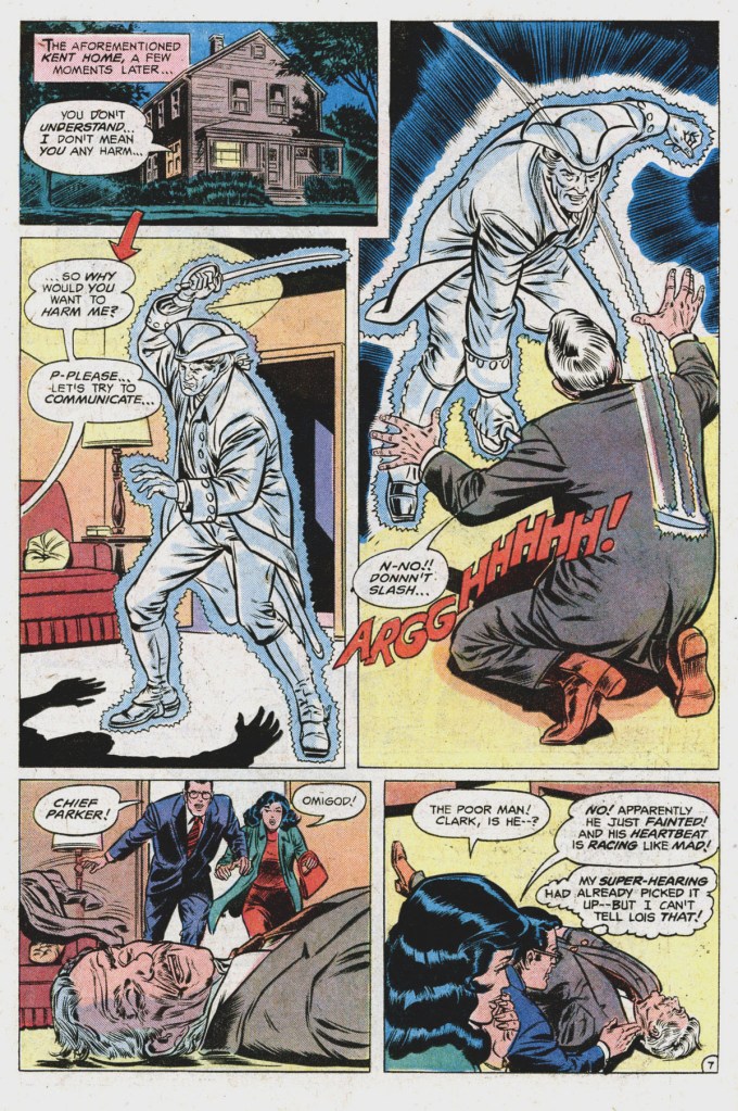
As Lois and Clark arrive, they find Chief Parker being struck down by what appears to be the ghost of a colonial minuteman. Fortunately, apart from shock, Chief Parker is all right, and though none of those present have any explanation for the events, they decide to go back about their business. Turns out Chief Parker has been trying for weeks to get some proof as to the apparition’s existence, functioning as a one-person ghost chaser. Chief Parker cooks up some stew for the visitors while Clark goes into the basement and locates a still-hidden secret trophy shelf which contains the alternate S-emblem that Ma Kent had designed for him years earlier. It’s the S in the Superman logo in a circle, in case you were wondering.

That evening, Superman decides to fly a patrol of Smallville just as he did as a boy years ago. He winds up waylaying a trio of vandals on motorcycles calling themselves the Scorpions. And Superman is amazed when he discovers that one of the Scorpions has painted an exact replica of his unused S-emblem on a wall in town. The gang member who painted it says that the design just came to him–coincidentally, when he was directly in front of the Kent family home. Superman has more questions, but just then his super-hearing picks up a scream, and he has to dash off.

Turns out the scream came from Lois, who is confronted in her guest bed by an apparition of a World War II-era general, who threatens her with a gun. By the time Clark and Chief Parker can get to her, though, teh ghost has vanished and Lois is unharmed though shaken up. But what’s more, there isn’t any physical evidence of the ghost’s presence that Superman can detect with his super-vision. What he does learn, however, is that the fingerprints that he earlier discovered on the secret S-emblem are identical to those of chief Parker. So the Chief must have been the one who sent that letter to teh Daily Planet. But Superman can’t believe that Chief Parker means him any ill, and so he figures that the old law officer must be possessed by some spirit that is causing him to do things against his will and without his knowledge. Because yeah, that tracks, obviously.

The next morning, Clark awakens with an attack of dizziness. To clear his head, he races off toa nearby spring to douse himself with cold water. Back at the Kent house, Chief parker and Lois compare notes, and theorize that the spirits they’ve both seen were perhaps the same entity, appearing to each of them in the form of the most daunting warrior they know of. And this seems to be the case as, back in the spring, Superman is suddenly attacked by the apparition of a mythical Dwalu, a seven-foot warrior from the past of Planet Krypton. But this attack doesn’t simply pass harmlessly through the Man of Steel but rather staggers him, and he falls into the spring, disappearing below the surface. And that’s where this story is To Be Continued. It’s all a mystery, all right–but a mystery that I can’t say that I found particularly captivating.
This issue of ACTION COMICS included the yearly Statement of Ownership on its SUPERMAN IN ACTION letters page. And it tells us that, over the previous year, the book had been selling 213,076 copies on a print run of 389,940, giving it an efficiency percentage of just under 55%. That’s a good percentage for this era, and no doubt is reflective of the building excitement for the then-impending SUPERMAN film.
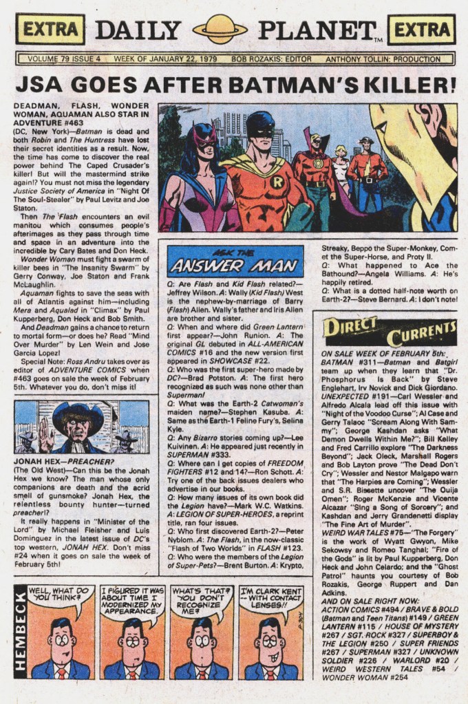
This issue also included another installment of the weekly Daily Planet promotional page, which included another dumb, dopey gag strip by fan cartoonist Fred Hembeck. I’m a huge fan of Hembeck’s work, and these short strips were my first real exposure to his efforts.

Hembeck was a delight for sure.
Cary Bates and Curt Swan were a masterful team and if you liked Bronze Age Superman you got the best presentation possible. This entry has reminded me of when I read this issue and I’m only sorry I can’t recall the conclusion!
LikeLike
I think it was around this time that I stopped reading both ACTION and SUPERMAN. Looking back, there wasn’t any drastic drop in quality (although I was not a fan of Frank Chiaramonte’s inking)…I think I was just getting older, and my tastes were changing. Marvel was getting more of my attention at this point, though I still followed Batman, Legion of Super-Heroes, and other DC titles.
LikeLike
“A bit of a disparity had begun to creep in between the covers and the interiors, as the cover images tended to be by newer and more dynamic artists (such as Jose-Luis Garcia Lopez here) while the stories within were still handled by the reliable Curt Swan. I’ve always appreciated Swan’s work, but I can see where this inconsistency may have left some purchasers dissatisfied. The Superman they were being shown on the outside wasn’t really the same as the experience they got on the inside.”
I’ll say. When DC, in the wake of the Implosion, had Julie give up the Batman books and keep the Superman books, they made the absolute wrong choice. By having an “old-fashioned” Superman when the movie came out, they missed a huge opportunity to revitalize the line.
That said, while I didn’t start reading Julie’s Superman books until 1980, I grabbed a bunch of Cary Bates back issues very early on, and this was one of them. I liked it a lot — it was very comfortable reading, very dependable stuff. And I’ve since collected the entire Superman suite of books from the first post-Weisinger issues to the end of Julie’s run and liked it a lot. [And, for that matter, the Triangle Era and onward, up to to a point sometime after I stopped writing the series, but post-Triangle, that was research and me being on the comp list for years.] And I liked what became of the Bat-books post-Julie, too.
But in late 1978, they needed a re-energized Superman line a lot more than they needed a re-energized Batman line.
LikeLiked by 2 people
Thank you Wikipedia – I wondered if I was confusing her with a different character but, I knew I remembered Lois Lane seeing a ghost of a soldier in another story: Action Comics#832 ( December 2005 ) the “ghost” of General Sam Lane appeared before Lois while she was trapped in a car ( Story was set during Halloween with the Spectre & Satanus in it ). To bad Jose Luis Garcia-Lopez wasn’t the default Superman artist back then.
LikeLike
I wonder if the alternative S-emblem was meant to be a bit of a homage the simpler version in Superman’s very first appearances. That would have been clearer if it was in a triangle instead of a circle.
LikeLiked by 1 person
That splash page is a perfect encapsulation of why I disliked pre-Crisis Bronze Age Superman comics so much (even as a kid). This page is the opportunity to draw the reader into the story in a dynamic manner, and they chose instead to use that valuable narrative real estate to talk about an electric typewriter? It’s not even that it’s about something mundane. It’s that it’s presented in such a visually banal way: a long shot of four people just standing behind a desk. Someone like Alex Toth or JLGL could have illustrated that scene with visual drama, with style. But (for me) everything that Curt Swan (who, from what I’ve read, was a very nice man) drew was like that: presented in the most visually uninteresting way possible. It’s one of the dangers of having verbally oriented editors in a visually oriented medium: they don’t even notice things like this.
I was 13 when John Byrne took over the character in 1986, and I still get a thrill remembering how much of a seismic event that was at the time. How much swagger he brought back to the character after years of Bronze Age mundanity like this.
LikeLike
Swan was likely a nice man and without a doubt a great artist: if you compare his pencil work to the seldom seen Alex Ross drawings (not paintings) their style is very much alike, pending the generation gap. Their mastering of anatomy and realism is incredible, in the case of Curt, few inkers could recreate the control he had over the scene, and the lack of details was mostly due to the necessity of providing a huge amount of pages as much as the awareness that more than an inker would have likely neglected them. That said, I challenge anybody to find a single panel by Curt with a factual error, a wrong anatomy detail or where the characters are not recognizable or characterised.
The lack of dynamism expresses a vision coming from classic movies, like a “frozen action” photogram, that can be found in other talented artists as Dave Gibbons, and Ross himself, who compensate with perspective and physicity given by paint. Probably today an editor would try to elicit the potential a bit more than 70’s Schwarz, but I would have exchanged 90’s spreading lack of proportions, anatomy, details and perspective with Swan’s “stillness” anytime.
Look at the unpublished Wonder Woman pencils by Swan that Tom posted a while ago to appreciate his capabilities to render a scene.
LikeLiked by 1 person
I started reading Superman when Swan and Anderson were the art team and their art really grabbed me. To me, the later inkers just didn’t do Swan as much justice…..just my two cents (actual value).
I never really committed to Superman as much as other heroes because, well, he was Superman and I never really thought there was anyone or anything that could get the best of him. There never was the same sense of urgency in his battles.
LikeLike
Man Garcia-Lopez Covers back then were the SH**! I can only imaging how highly regarded he’d be today if he done some FF, Avengers, She-Hulk, Spider-Woman Covers in the late 70’s
LikeLiked by 1 person
All the men Swan drew reminded me of either younger or older versions of Ed McMahon. Body type, body language, faces, and expressions. Especially in suits. His Superman’s body type was more Johnny Weissmuller and George Reeves. But I’ve always seen Superman more like Steve Reeves. His ladies were almost all Betty Whites. Even the brunettes and orange heads. I liked Betty White, but, come on. 😉
I wanted to keep reading the Superman titles. Cary Bates was writing good stories. I’d just had enough, Curt had been drawing Superman my whole life, all through the 70’s and then the early 80’s. And it really paled compared to the way-more dynamic styles of so many other artists. Even before Byrne, I’d’ve given more Super-gigs to Buckler. And asked Bob Hall to come over from Marvel for a Superman title. Keith Pollard drew an annual. I’d’ve asked him to do more. Same with Kerry Gammill, instead of waiting ’til after Byrne’s run.
And the ’80’s were bringing many fine new artists, chomping at the bit. Paul Smith. Rick Leonardi. Art Adams. Mark Beachum. DC’s editorial was too old school (or really, just Julius Schwartz was). Meantime, Marvel was scooping them on the best new talent. DC did give jobs to Denys Cowan and Jerome Moore, who were excellent new artists. But Marvel’s great new finds seemed to outnumber DC’s for a while.
Post-Superman, Swan would appear here and there for DC. Even with excellent inkers like Eric Shanower, or (I think) Al Gordon on characters like Aquaman, I just couldn’t jump on. I was just burned out on Swan’s understated style.
LikeLiked by 1 person