
In 1972, Marvel Comics entered its second phase. Editor Stan Lee had been promoted to Publisher and, momentarily, President, and Roy Thomas had been made his successor. What’s more, former owner Martin Goodman was gone, as was the limitation on how many releases the company could put out which had been imposed upon them by their previous distributor, Independent News. So expansion was the name of the game, and both Lee and Thomas were anxious to branch out in all sorts of directions, including into untapped genres and untapped audiences.
By the early 1970s, comic book sales were shrinking across the line, leading people in the industry to wonder whether the super hero fad that had generated such interest and sales throughout the preceding decade was finally dying off. As a result, all sorts of alternative genres old and new were tried, in the hopes of hitting upon some new subject matter that readers would connect with and steadily buy. This included everything from teen humor to sword and sorcery, from horror (labelled “mystery” so as to not violate the tenets of the Comics Code) and monsters, and from westerns to war comics. No stone was left unturned.

One area that was clearly undertapped, so far as Lee and Thomas were concerned, was the female audience. Throughout the 1940s and 1950s, the readership for comic books had been divided virtually equally between boys and girls. But since the Code had come in, girl readers had been deserting the spinner racks in droves. Comic books were now chiefly seen as a product for young boys. But Stan and Roy hoped to lure that departed audience back (or, really, to capture the next generation of it.)
Women’s Liberation was a topic in the media during this time, so it was perhaps only natural that thoughts might turn to creating a new line of books aimed at women. Accordingly, Marvel launched a trio of titles with a female demographic in mind; SHANNA THE SHE-DEVIL, a jungle girl adventure series, NIGHT NURSE, a soap opera/medical drama series, and THE CLAWS OF THE CAT, a full-fledged all-new costumed super-heroine. All three of these series would be written by women as well, at least at the outset. The bench for female talent in the Marvel Bullpen in 1972 wasn’t incredibly deep, so a number of wives and girlfriends were given an opportunity here to prove what they could do.

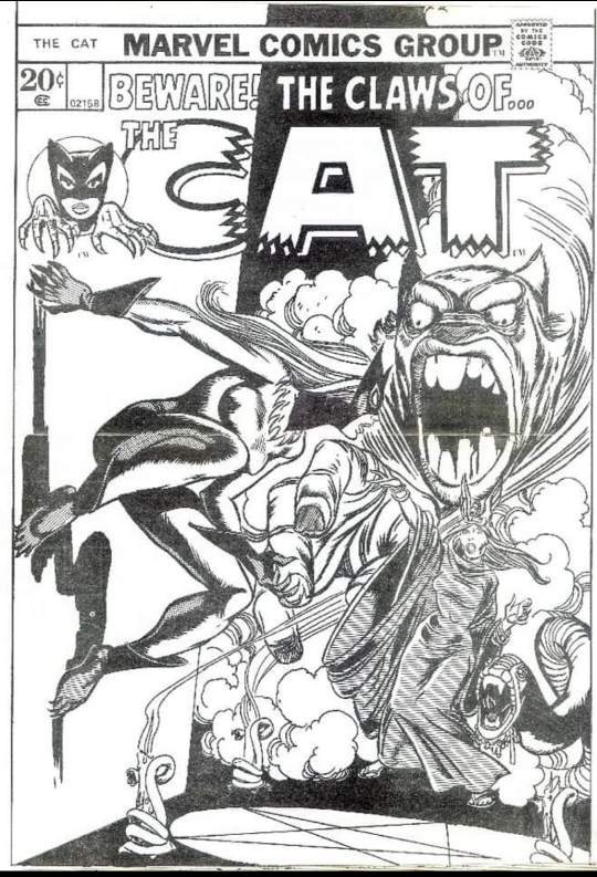
THE CLAWS OF THE CAT introduced Greer Grant Nelson, the wife of a cop whose husband was killed in the line of duty. With the help of her feminist mentor, Greer learns to actualize her own inner power and, armed with a costume that enhances her physical abilities and which possesses a set of grapple-line claws, she sets out to bring to justice the men who killed her husband. The first issue was the work of writer Linda Fite (with some co-plotting from Roy Thomas) and some very nice artwork from Marie Severin and Wally Wood. Reportedly, the puckish Wood caused the project some consternation, as he inked the character in the nude on the first cover (and in some accounts, throughout the first issue entirely), causing Severin to have to go back and correct the Cat’s figures throughout.

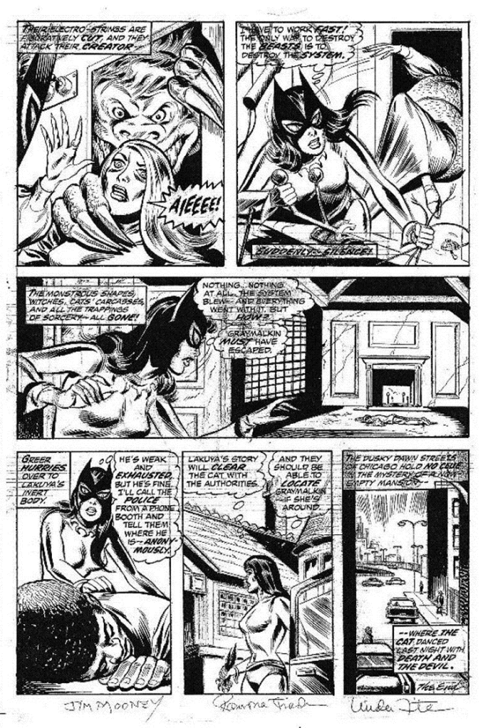
(Page 6 of this issue is still undiscovered out there in the wild, and thus is missing here.)
That first issue of THE CLAWS OF THE CAT was a solid debut (and was reprinted years later in THE SUPERHERO WOMEN, the fourth ORIGINS OF MARVEL COMICS paperback volume released by Simon & Schuster). Unfortunately, this entire line of titles failed to find any traction in the marketplace, and the books were all swiftly discontinued–CLAWS OF THE CAT and NIGHT NURSE after four issues, SHANNA THE SHE-DEVIL after five.
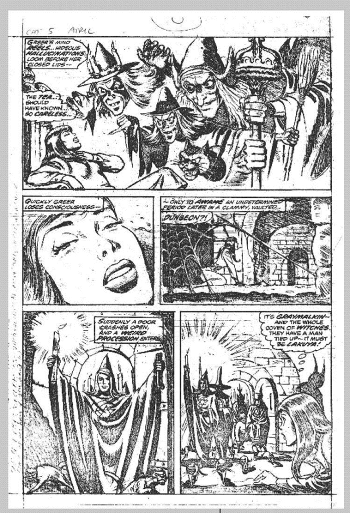
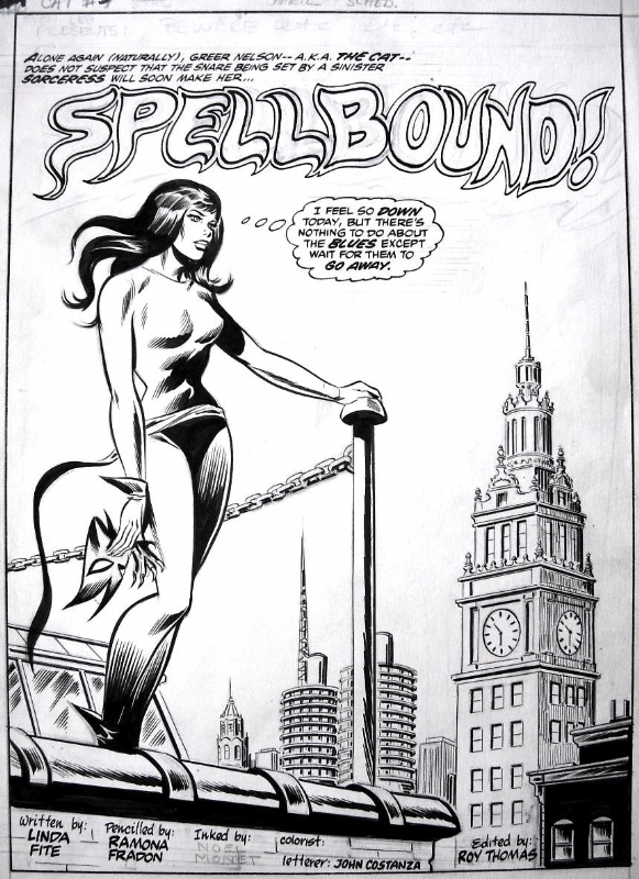
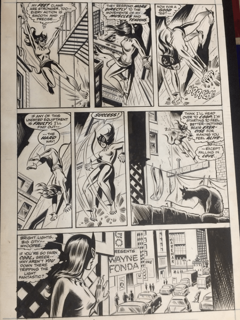
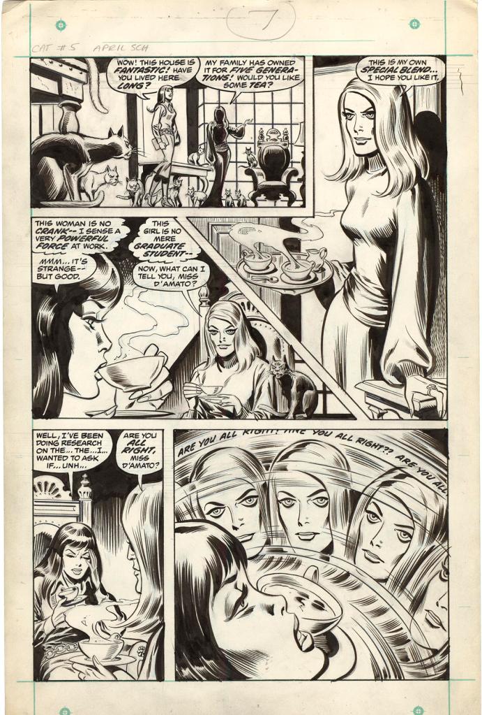
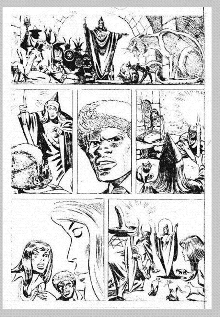
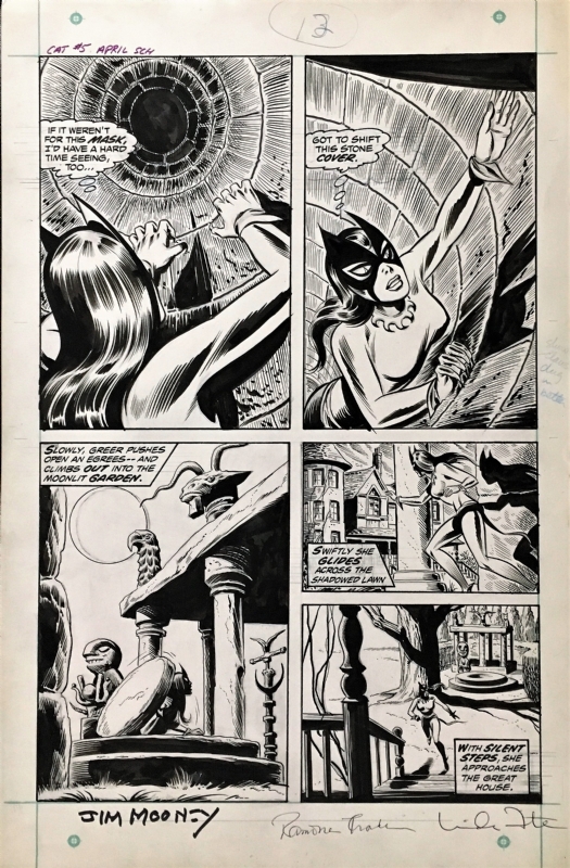
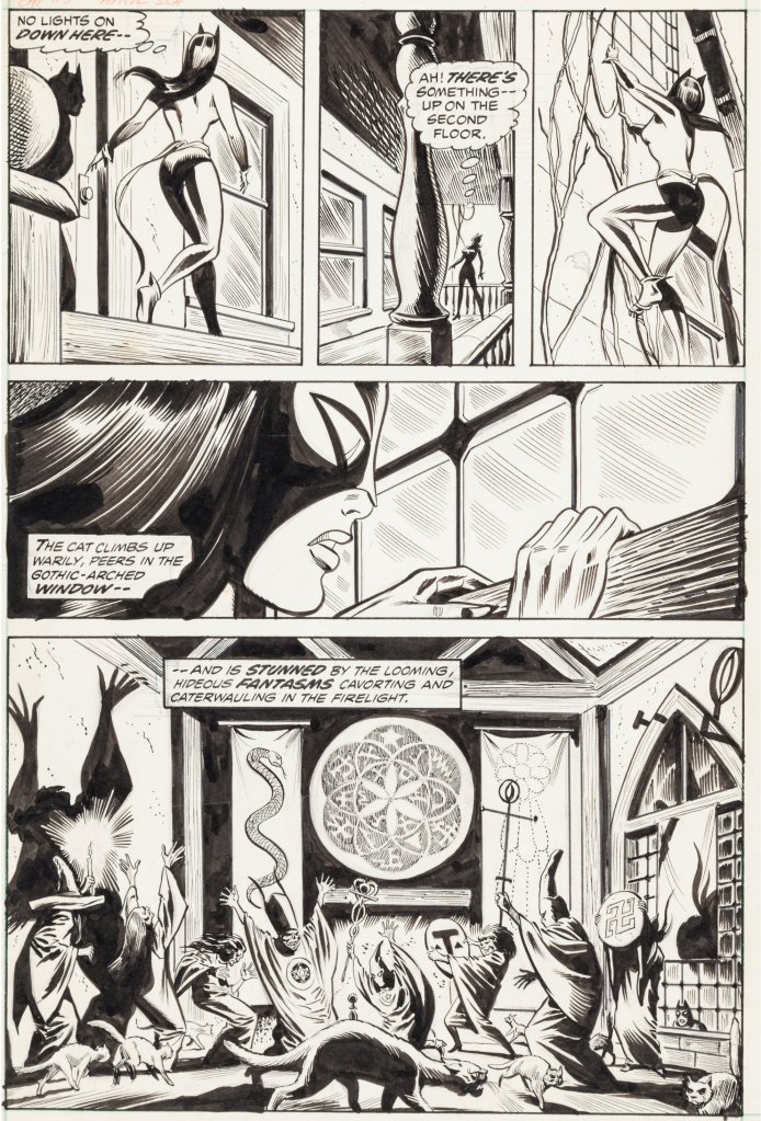
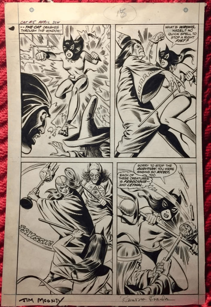
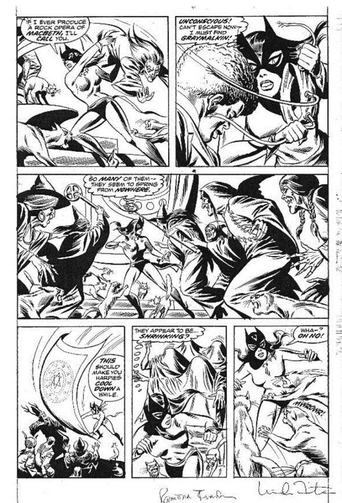
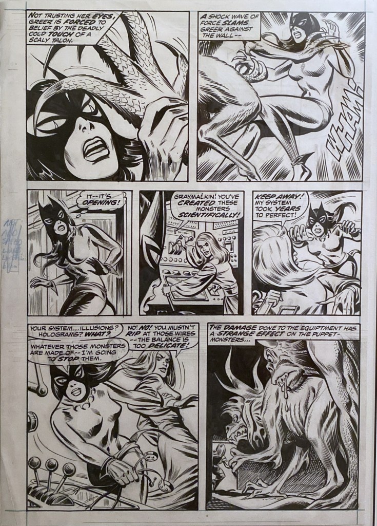
This decision came relatively late in the game, though, and so there was a fifth issue of THE CLAWS OF THE CAT that was almost ready for publication. It had been completely written, penciled, inked and lettered before it was pulled, and it was never repurposed for any future story. Pages have turned up here and there throughout the years, not all of them in their final form–as you can see from the pages assembled here, some are the finished boards, others just the unlettered pencils by Ramona Fradon. Jim Mooney was the inker of this story. Fradon was intended to take over the title, but that plan was aborted when it was discontinued. The cover was by Gil Kane.
Apart from a single issue of MARVEL TEAM-UP in which she shared an adventure with Spider-Man, the Cat disappeared after the fourth issue of her series. Many months later, writer Steve Englehart, looking for a way to empower former teen character Patsy Walker and turn her into a super hero in the pages of AVENGERS would have her find and don the Cat’s discarded uniform and become transformed into Hellcat. At around the same time, Tony Isabella would bring Greer Grant Nelson back in the pages of GIANT-SIZE CREATURES #1, where he reworked her backstory somewhat and transformed her into Tigra, the Were-Woman.

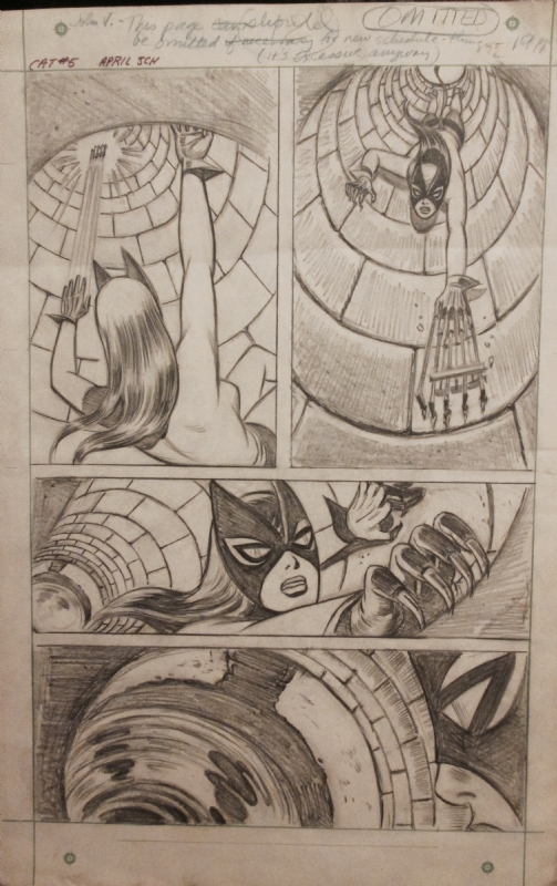
There’s a note at the top of this page indicating that it should be omitted from teh final story as it was unnecessary and redundant.


Gil Kane’s rough pencils for the cover to this issue.

Tom, I couldn’t tell by the top, light photocopy, did Gil ink himself or are those tight pencils? Too bad Ramona wasn’t made regular penciler earlier for some cohesion and continuity as every one of the 4 issues was done by different artists. Thanks for sharing as I don’t recall seeing this before.
LikeLike
Those are inks, but whose inks I couldn’t tell you.
LikeLike
It’s definitely not Gil’s inks — that’s almost entirely brush-inked, and by someone really good at it.
The occult priestess’s face, plus the textures on the posters face and in the smoke make me think it’s Tom Palmer, but if so he was being more reserved than usual.
Maybe it’s Adkins?
LikeLiked by 2 people
Adkins was my first thought, too, since he was inking a lot of Kane’s covers in that era. Those areas of zip-a-tone(?) on the Cat figure does look like something Palmer would’ve done, though. Or even Klaus Janson, who I think was just starting out at Marvel around that time?
LikeLike
Palmer and Janson are my favorite inkers/finishers over Kane. If this was Palmer, it was “reserved” indeed. It could be Adkins but I can’t remember him using zip. But that doesn’t rule him out. (Sinnott wasn’t known for using zip but he did on occasion.) Too bad this photocopy of the image is so poor.
LikeLiked by 1 person
That’s not Klaus.
While that issue would have been scheduled for the month before his first credits turn up at Marvel, so the timing could work, the only thing Janson-like about that cover is the zips. And even then, that’s not how he would have used zips at the time — he’d have been far more likely to use them for a cast shadow or a background, rather than to indicate form.
Also, Marvel didn’t give him covers to ink until the following year.
LikeLiked by 1 person
Bob: Yeah, VERY reserved. But I can’t think of anyone with a line like that at Marvel at the time who might have done it instead.
If it was Weiss or Brunner it’d be buried even further, and Ploog wouldn’t look like that (plus, how often did Brunner or Ploog ink other pencilers?). Everett inks wouldn’t have looked like that, and he had almost certainly died by then. Even with Adkins, I think it’d have been crisper — Adkins inked Kane in a more Sinnott/Giacoia/Romita mode.
But those flowing long brush lines and that face feel very Palmer, while all that open white space…doesn’t. The TOMB OF DRACULA covers Palmer inked over Kane at this time have lots more shadows and rim lighting and juicy blacks everywhere.
So I keep thinking Adkins would have been more faithful and Palmer would have been less faithful.
Still, who would have inked the top of the Cat’s breasts like that, in 1973?
LikeLiked by 1 person
It’s a pity this didn’t take off, it looked fun!
LikeLike
Looks like Greer’s face on the splash was redrawn by John Romita.
LikeLike
Too bad these pages couldn’t have been used as bonus material in the Tigra trade paperback a few years ago.
LikeLike
The inker’s name in the splash page credits is faintly penciled in as “Noel Monet.” I know that Jim Mooney occasionally worked under his “Jay Noel” pseudonym (“Noel” being his middle name), but Noel Monet is an assumed name that I don’t believe he ever used elsewhere. Is this an “Alan Smithee” situation, where he didn’t want to be associated with the work?
LikeLike
He did deaden some of Fradon’s appeal here but he didn’t extinguish it. I can’t see why he’d disown it.
LikeLike
Maybe they wanted to make readers think the book was entirely written and drawn by women?
LikeLike
Hadn’t thought of that–you may be right!
LikeLike
Either that or Jim was making a joke — that’s his handwriting.
LikeLiked by 1 person
The first issue was excellent but the quality didn’t keep up. Three and four felt like “let’s just put something on the page to fill the issue.”
I wouldn’t have guessed Fradon — most of her work I’ve seen is more cartoony (though appropriate to the series, like Metamorpho or Super-Friends).
The opening scene here is startling as cops in comics back then didn’t usually shoot to kill that quickly, as Greer notes.
LikeLike
I wish this issue could be published, since almost all of the artwork exists in one form or another.
LikeLiked by 1 person
Incidentally, the cover logo looks like Sam Rosen’s work to me. Can anyone confirm this? If so, it’s some of his last work before leaving the comics field in late 1972.
LikeLike
Could the cover inker possibly be Russ Heath?
LikeLike
I’d say Heath would be much, much tighter, less gestural, and he wouldn’t have used zips on her legs or given the priestess that kind of face.
Plus, I don’t think Heath had done anything for Marvel since the late 1950s, at that point.
The following year he did a SGT. FURY title, and a couple of stories in 1975 — plus, he must have been working at Continuity, because he shows up as an inker in a number of “Crusty Bunkers” gang jobs. So it’s within the realm of possibility that he could have turned up in 1973, but that just doesn’t look like him.
I’d really like to know who it is, because Palmer’s my best guess but it’s not a confident one.
The Cat’s right foot looks like it could be Craig Russell, but (a) not at that point in his career and (b) the rest of it looks nothing like him.
¯\_(ツ)_/¯
LikeLike
Might be Tom Palmer… also thinking it could be Ralph Reese… but wouldn’t put any money on either guess.
LikeLike
Apologies, I might have had a senior moment and meant Ralph Reese when I said Russ Heath. Ralph Reese was doing inking for Marvel on his own and with the Crusty Bunkers from 1972 onwards. If it is a Crusty Bunkers job, that would explain the difficulty with identifying a single style? (and I know Russ Heath worked with the CBs as well, but not until 1975-76?)
LikeLike
I don’t think the Crusties ever inked a cover — they jam-inked stories, so they could be working on multiple pages at the same time and get the job done faster. When it’s just one page, it’s harder to do that. There are plenty of covers where an inker has done the main figures and an assistant has done the background, but I don’t think Continuity ever called a job like that a Crusty Bunkers job. Plus, it doesn’t look like one person inked the Cat figure and another inked the candles and another inked the monsters, and so forth. It looks like all the same hand, mostly — it doesn’t even look like it’s got retouches on faces. We just can’t figure out whose hand it looks like.
But for whatever it’s worth, I’d say it doesn’t look like Reese to me either — if anything, he was super-precise, not very gestural.
I don’t think we’re likely to solve it, at least not unless the original art shows up and we can get a better look at it. I doubt Roy would remember. Of the names that were seriously suggested, Klaus Janson and Ralph Reese are still alive, so if someone wanted to show it to them they might have some thoughts. But they might be as mystified as we are.
kdb
LikeLiked by 2 people
Great stuff, looks almost exactly like a thread a started over on CGC boards six months back. I didn’t have an image for the cover though.
LikeLiked by 1 person
Thanks for this, I’ve wanted to see all the pages since I learned about this a few years ago. It’s a real pleasure to see so many together here. Something that puzzles me is that the style of the Cat’s costume has changed from the first four issues of the series. The mask, boots, and gloves are all a different style. The mask in issues 1-4 is more of a head-emcompassing style while this looks like it just coders her face. The gloves and boots are form-fitting but here they have flared cuffs. There’s also a neckpiece here that looke like necklace of clays that’s missing in the rest of the series. It’s odd because there’s no mention of any of the changes in the text. Was this Fradon’s decision?
LikeLike
It was likely a mutual decision. When a book wasn’t selling all that great, it would start to be tinkered with. This is why Marvel Girl’s mask underwent the same evolution earlier. I suspect that Stan figured a girl hero would be more attractive if her mask didn’t cover her hair so much. Too little, too late in this instance.
LikeLike
Interesting to come upon this after Googling Marvel the claws of the cat. Was hoping for some modern fan artwork — since I’ve been too lazy or preoccupied to create my own.
I was introduced to the Cat in Avengers #144 (The Hellcat Cometh) — my very first regular issue of the series (had recently purchased the Avengers Marvel Treasury Edition. As much as I liked Hellcat’s debut, it was those few illustrations of the Cat by Perez that made me prefer her to Patsy’s version (anyone know why the claw emblem was discarded for Patsy?).
A couple of years later, I was gifted The Superhero Women for my birthday — and though it contained a lot of great stories, the reprint of the Cat was my favorite. I couldn’t understand how a series this good was cancelled so quickly. The a year or two later, I was finally able to find a back issue dealer out of Canada who had the entire series. Then, I saw how quickly the book declined.
I doubt that keeping Marie Severin and Wally Wood on board would have saved it, but it may have given the Cat a fighting chance. The Severin/Mooney issue didn’t look bad. Actually, Paty Greer’s issue looked pretty good – except for some bland backgrounds. Didn’t Bill Everett ink that issue — I see Kurt mentioned above that he had died by the time the Gil Kane cover was inked. Jim Starlin and Alan Weiss’ issue is probably a black mark on both of their careers (and likely a rush job since the Witch story had been promised at the end of issue 3 and likely wasn’t finished in time for publication.
But I think what hurt the book the most was the loss of Roy Thomas as co-plotter after issue 1. I’ve only read Linda Fite’s work on the Cat and a Marvel Girl backup in X-Men, and found her to be a talented scripter, but she needed assistance with plotting as issues 2-4 (and even 5) were kinda drab. She even repeated some of the same moves with the cat somersaulting down buildings that we had seen in issue 1.
This final story feel very appropriate given that all of Marvel’s supernatural characters were about to be debut, but the protagonist isn’t very memorable. Also, the loss of that great cat mask is better left unpublished, but I do prefer the dark neck on the cover as an extension of the mask. It would have been nice to see Ramona draw Greer in her original outfit.
LikeLike