

This is a story that’s been kicking around for a number of years now, and yet, despite the fact that the pencils for this job are complete, it’s never been finished or published officially. It’s a short 10-page Wonder Woman adventure produced in the late 1970s, and if nothing else, it gives us the rare opportunity to take a look at the uninked penciled pages of DC backbone artist Curt Swan. Swan’s work was always top flight, but the end product often varied depending on who was doing the inking. If you put a Murphy Anderson or a Bob Oksner over Swan, you’d get magic. Whereas a Vince Colletta would kill the pencils. Accordingly, fan opinions of Swan’s work tend to run the gamut. So here’s an opportunity to look at what he did without any filters.
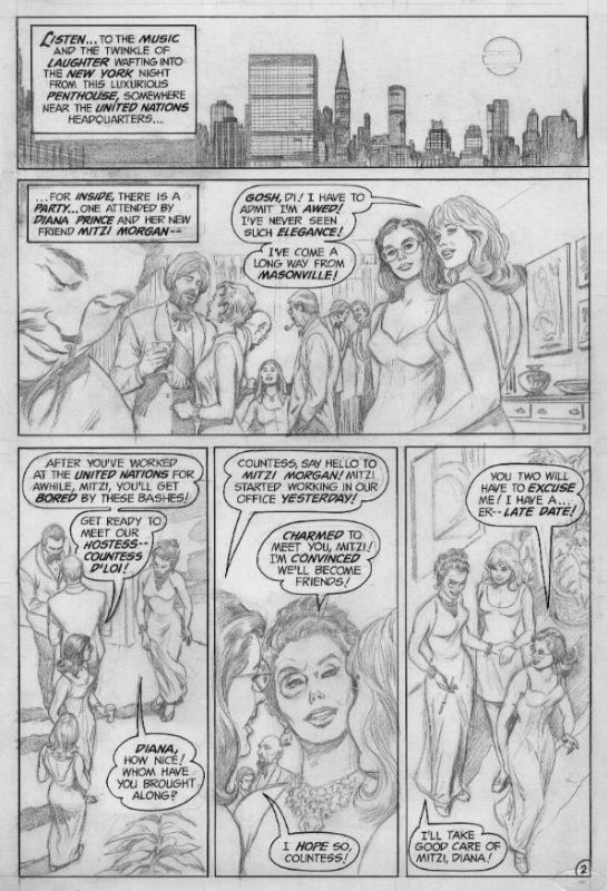
Well, that is apart from the opening pages, which were penciled by John Rosenberger. This job was apparently still on Rosenberger’s drawing table at the time of his death, and so it was handed over to Swan to complete.

There’s some disagreement concerning where this short story was intended to run. Some think that it was being done for ADVENTURE COMICS when that series went to the Dollar Comics format, but that doesn’t entirely track for me. No, this feels more of a piece with the earlier Julie Schwartz-edited era on the amazing amazon’s title. It has the flavor of a Schwartz-edited job somehow. The three-panel sequence on this page showing Diana using her lasso to change into her star-spangled costume was a bit that Julie and his creators repeated ad infinitum during their tenure.

No, I think the more likely explanation is the other one I’ve seen offered up: that this story was being done for a special anti-drug comic book that somehow never got completed. There’s a similarly unpublished Batman story from this era of the same length and with a strong anti-drug message, so I’m inclined to think that they were both for the same unfulfilled project.

The story was written by Denny O’Neil, who was Schwartz’s go-to guy at a certain point for stories with a message behind them. He had already produced the famous GREEN LANTERN/GREEN ARROW drug issues with artist Neal Adams, so he would have been a natural fit for an anti-drug special assignment.
So why didn’t this job ever get completed? My guess is that the short length was one factor in that outcome. After the anti-drug project fell apart, you couldn’t make this story a whole issue of WONDER WOMAN–even in the 1970s, you’d need to include a back-up story as well. And it doesn’t quite fit properly into ADVENTURE COMICS or WORLD’S FINEST COMICS either, both of which carried shorter Wonder Woman tales at separate points. More crucially, the status quo of Wonder Woman in this story–working for the United Nations–was one that went away after the Wonder Woman television series became popular and her adventures were switched to a World War Two setting. So it may simply have been out of tune with what was wanted from Wonder Woman stories at that point. And thereafter, it may have been forgotten about entirely.

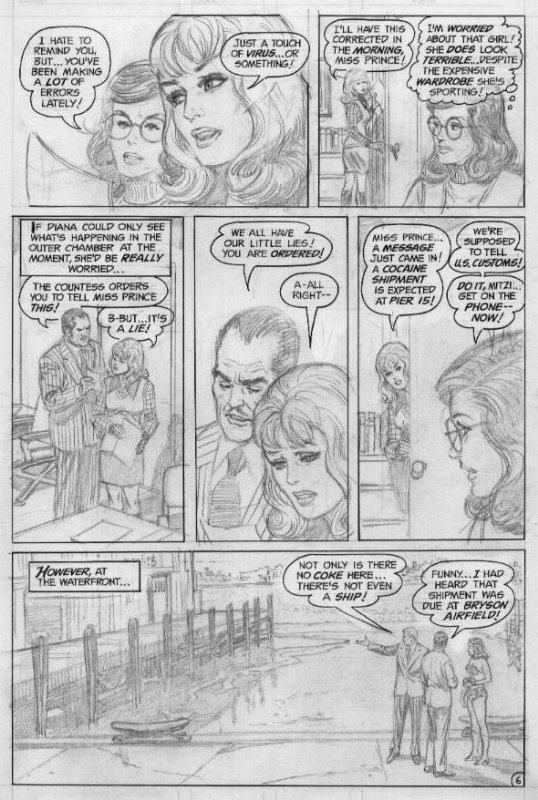
And to be honest, it’s not a great story. But it is a good one, solidly crafted in the manner of a lot of DC’s output in the 1970s.Its events are basic and told in a straightforward manner that makes sure that every action any character takes is explicitly spelled out–not simply because htis was a story likely intended for relatively young readers given its anti-drug message, but because that was very much the ethos of DC during that decade.
And it has to be said that Curt Swan could draw just about anything, but he was especially good with emotion, as in the case of Mitzi’s face in Panel 5 on this page. There was a wonderful subtlety to Swan’s work–subtlety isn’t a quality that is routinely cherished in comic books, especially super hero titles, where artists are much more often judged on their ability to depict bombast and destruction (and maybe the prettiness of their people.) Swan’s work always felt classy and reserved compared to a lot of his contemporaries.


Based on the “S-1729” job number on the first page the story was done in 1974, too early for ADVENTURE COMICS as you state. And the unpublished Batman story by O’Neill and Frank Robbins has a “S-1725” job number so you are most likely correct in assuming that the stories were done for the same project.
LikeLiked by 2 people
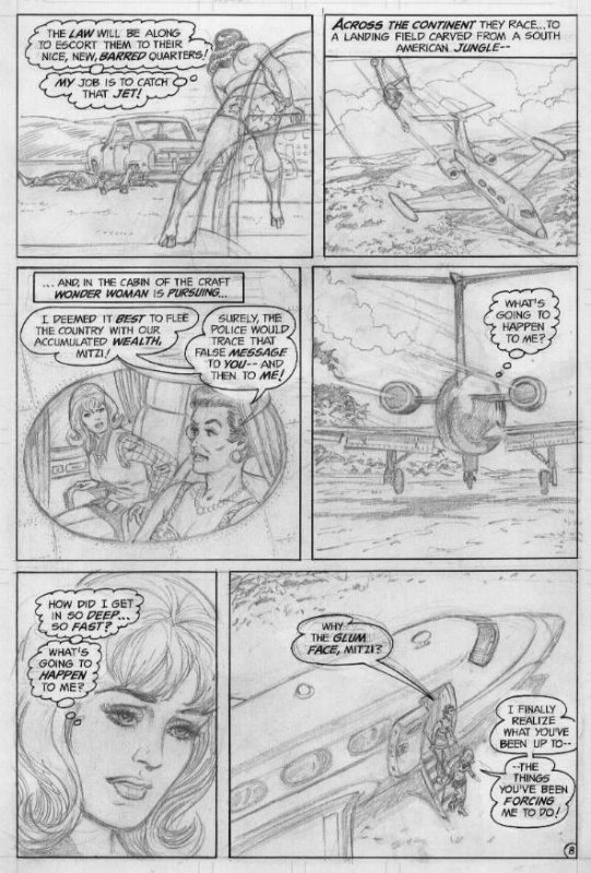
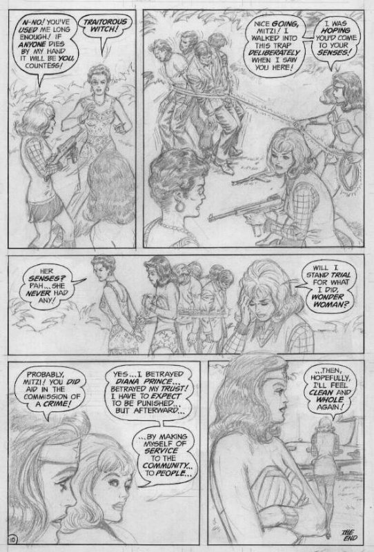
Despite the truncated story and the hokey dialogue, I am very impressed with Swan’s ability to tell an emotional story completely with his pencils. Emotions weren’t only subtly indicated facially, but with body language. Diana seems quite casual with a “Really? Bullets? Seriously guys!” And Mitzi’s aggressive stance with the gun also shows a slump of resignation. A repentance scene that could come off as clichéd and too quick, feels more real than the story warrants in ten pages.
We never quite knew what we had with Curt Swan, because it was so easy to take this kind of storytelling for granted.
LikeLiked by 3 people
Swan’s work is so unflashy it’s easy to underestimate.
LikeLiked by 1 person
Give those pages to Jerry Ordway and have him finish ’em up. He’d capture Swan’s nuance and still make them look snappy and as commercial as they’re capable of looking.
LikeLiked by 1 person
The action in the panels is less static than I remember from reading Swan’s work in the 70’s & early 80’s. Good active figures. The female faces and figures make me think of the old romance comics. I’d be surprised if Curt hadn’t drawn some of those. Then I see the 2 guys in business suits, and that’s what I remember most from Swan. Straight out of 1950’s TV shows or movies I’d see as re-runs. All those scenes in still offices inside the Daily Planet. Not as exciting to me as a kid.
I honestly don’t know who I’d pick to ink these pencils. They’re so delicate, fragile. I’d almost want them reproduced as they are, with more concern for the colorist. Betty Breitweiser, maybe. Or even Lee Week- his coloring is ethereal.
If I had to choose, I think someone with a lighter touch could work, like Gary Martin. Or Bob Smith. Or even someone whose work isn’t delicate or fragile, but could still bring out the beauty in Curt’s work, like Joe Rubinstein. Sadly, Al Williamson is long-gone.
LikeLiked by 1 person
There’s a discussion of inking Swan in the Krypton Chronicles, the consensus being the inkers never thought they could improve him — all they could do was not screw his pencils up.
I know what you mean about the business suits. Much as I love Steve Ditko’s art his sense of fashion never seemed to go beyond the early 1960s, even in his 1970s work.
LikeLiked by 2 people
I love me some Big John Buscema, but his background characters in the 80’s also looked 10 or 20 years behind. It took some artists a long time to catch up. I think younger guys, like Rick Leonardi, JR, Jr, Art Adams, were the first I noticed who drew contemporary looking “extras”.
LikeLike
John Romita was amazing at making the Spider-Man cast look hip. I imagine years of working in romance comics gave him an eye for fashion.
Mike Ploog did a good job on the early Werewolf by Night stories making the teen characters look contemporary.
LikeLiked by 2 people
It took some comics artists up until the mid-2000’s to stop drawing nurses in whte dresses & those white hats with the red cross. Lol. When they’d been in scrubs on TV since the 80s.
LikeLike
Wow! These look amazing! I have to confess, there is a lot of work that Curt Swan did during the Bronze Age that I’ve found underwhelming… but I’ve gradually come to realize that during the 1970s and 80s he was often paired up with inkers who were NOT a good match for him. Frank Chiaramonte and Tex Blaisdell are the two artists who immediately come to mind. Personally I find their inks over Swan’s pencils to be a very poor fit. Looking at the beautiful uninked Swan pencils on display in this post, I really wonder how many great jobs he did that were ill-served by the embellishers.
LikeLiked by 1 person