

Yes, I know we covered a portion of this issue before, but there’s still some fascinating stuff to look at in the other stories contained in FANTASY MASTERPIECES #6. To recap a bit; Marvel had begun reprinting the earliest Captain America adventures from 1941 within the book’s pages. But, because the Comics Code had come to prominence in the years between then and 1966 when this issue was published, certain aspects of the stories had to be altered to pass muster. So we’re going to take a look at how the Code prevented the youngsters of 1966 from becoming the sort of perverted maniacs their parents had become from reading the unexpurgated story in 1941. Unfortunately, I don’t have a workable copy of CAPTAIN AMERICA COMICS #7 to hand, so we’re going to need to look at the 1941 version from a later reprinting. So all of the coloring is a bit suspect on this version.


The biggest change here didn’t have anything to do with the Comics Code. Despite the fact that Jack Kirby was still a major contributor to Marvel at this time, the byline of himself and then-partner Joe Simon was stripped from the reprint. Part of the reason that these early Cap stories were being reprinted in FANTASY MASTERPIECES in the first place was to support Marvel’s claim to them, then under legal contest by Joe Simon. So it’s unsurprising that publisher Martin Goodman didn’t want Simon’s name on the strip in the reprints.
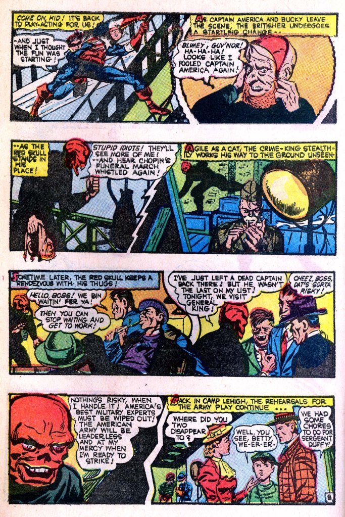
A more visual change, and one that we’ll see throughout this story, is the redrawing and toning down of the Red Skull. The Comics Code found the Skull just a bit too gruesome–and indeed, this was a recurring problem even with the new stories that were being done in 1966 and thereafter. The revised Skull doesn’t look quite so demoniac or supernatural–he looks more like a big meatball, to be honest. Also, for some reason a decision was made to add more cross-hatching to the top of this splash page in the reprint. It’s a strange and nonsensical alteration.


Because the physical dimensions of comic books had shrunk a bit in between printings, the 1966 reprint had to add additional gutter space between tiers in order to keep the art from seeming tiny on the page. The big change here, apart from toning down the Skull again in the final panel is the redraw on Panel 6, where the Skull’s traitorous lieutenant is gunned down. I’m kind of surprised that the image made it through even in this form, with the guy’s pained head replaced by his hand. This is really violent for a 1966 Code comic.


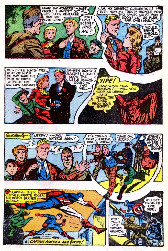
I love this Eisneresque sequence across the middle tiers with the blowing newspaper. It doesn’t advance the story much, but it’s a cinematic visual touch. Interestingly, there’s a bunch of redrawing and adding of cross-hatching on this page of the reprint. I’m guessing that whatever reproduction materials Marvel was able to scare up for this story, they weren’t very good, and required extensive retouching. In particular, the dead man’s body is obscured in Panel 1. But there’s a lot more hatching in the following panels as well. The Skull didn’t fare too well , the redraws look particularly crude on his face here.


Nothing much to see here apart from the excess of additional hatching on the reprint page again.

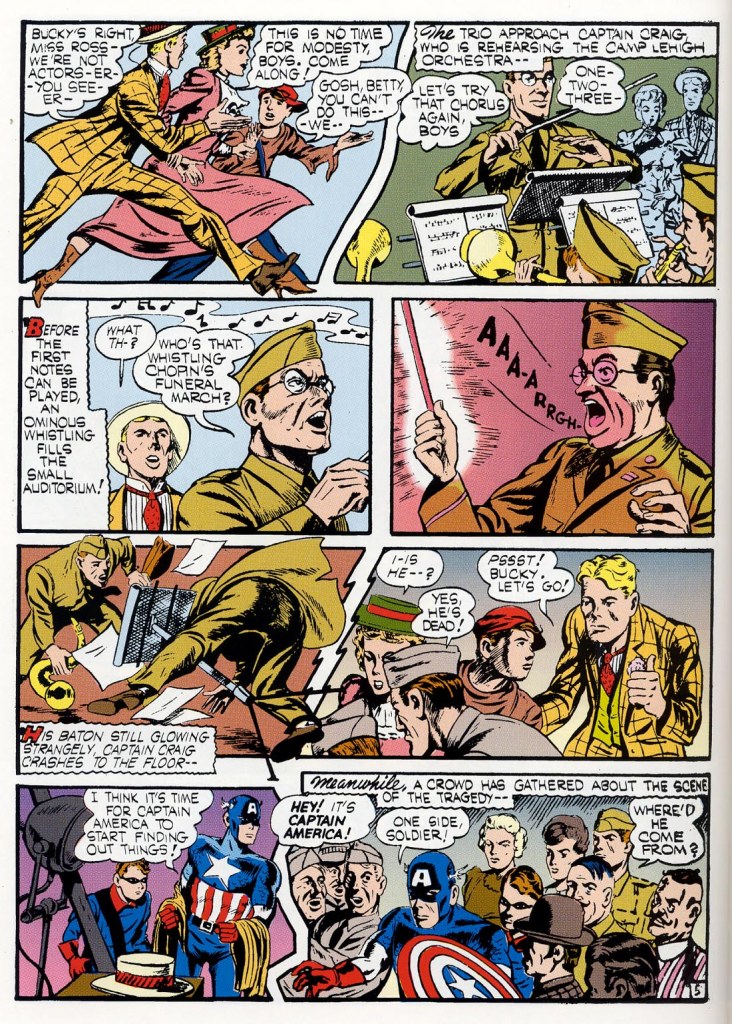
In Panel 4 on this page, the reaction of the Captain has been toned down–a balloon has been added to him making it seem like he feels a pinprick rather than the death-rattle that surges out of him in the original. But in both versions, he still winds up equally dead.

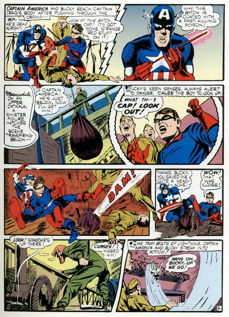
Some more heavy-handed retouching on this page, but no real changes to speak of.

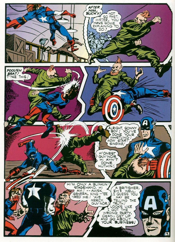
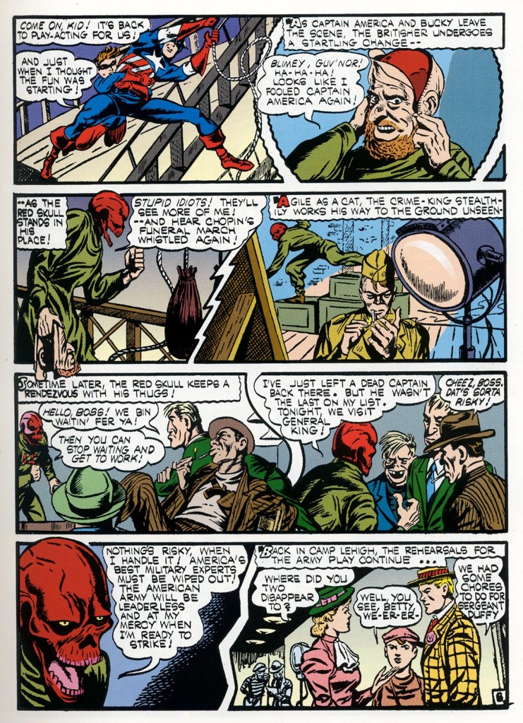
Oh, Cap, you dope! Of course that guy is the Red Skull! And in the smaller panels, his head is left alone–it’s only really in Panel 7 where it’s redrawn entirely here.


More rough, crude-seeming changes to the Red Skull’s visage.


More meatball-Skulls.


And finally, some changed copy. Ad FANTASY MASTERPIECES wasn’t a monthly as CAPTAIN AMERICA COMICS was, “Next Month” (spelled incorrectly in the original as “Nonth”) becomes “Next Ish”. But overall, apart from the dodgy reproduction and the adjustments to the Skull, the rest of this story sailed through intact.

Tom, you’re right about the Red Meatball. I prefer the original’s coloring of Cap & Bucky- the blue in their costumes. And the shield’s star has its blue circle around it. Why the 1966 version has the star in a red circle seems like an avoidable mistake. But I do like the darker army uniforms in the ’66 version. And on page 4, Steve’s civvies look very ’66, almost modern without the tie, compared to the same panel from ’41. Another miss- later page, as Cap is leaping, one of his legs is colored white. Overall, the ’66 colors are garish. While ’41’s are bland (except for Cap’s costume).
LikeLike