It’s been a while since we looked at some international covers for assorted Marvel masterworks of the past. So here are a bunch more–interesting in how the material was localized.
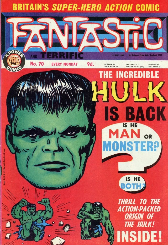
One of the first places that Marvel material appeared in the United Kingdom during the 1960s was in the pages of the weekly comic book series FANTASTIC and TERRIFIC. As was the custom with British weeklies, the two titles were combined after a point. This cover features a Hulk head freely adapted from the cover to INCREDIBLE HULK #1, but colored green here. And based on the blurb, that’s the story that’s reprinted herein as well–though the insides would have been black and white.
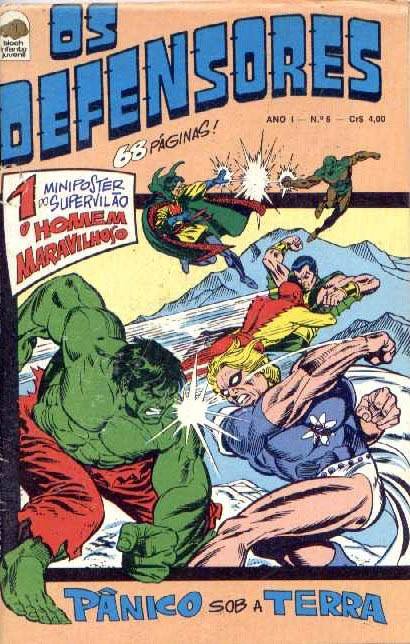
This DEFENDERS cover is neat for just how many characters are sporting newly made up color schemes–including Doctor Strange, who was a series regular. (It sort of looks like Doc was miscolored as Doctor Spectrum, the guy he’s fighting–and poor Spectrum has lost most of his own color.
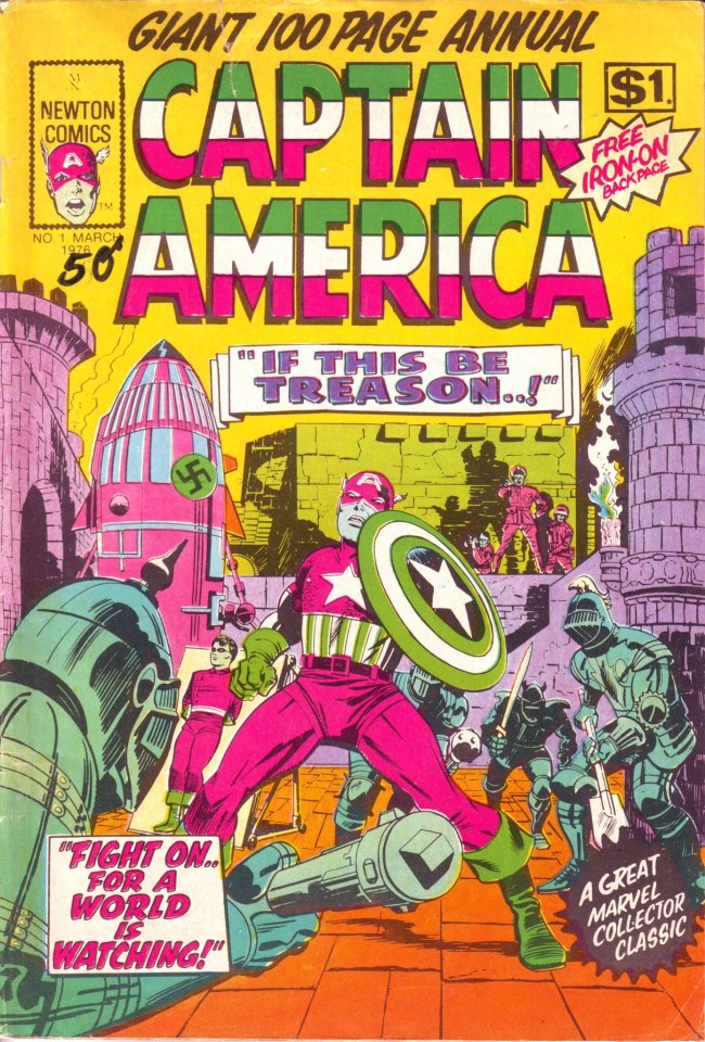
Australia’s Newton Comics would often go hog-wild with their coloring, as in this instance where captain America is screamingly, shockingly magenta. I suspect this may be due to printing plates being accidentally switched in this instance. This piece has almost a luminescent treatment to it–I wonder how it would look under a black light.
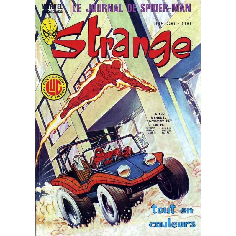
A great cover for STRANGE featuring that perennial 1970s favorite, the Spider-Mobile. How often do you ever see that thing painted?
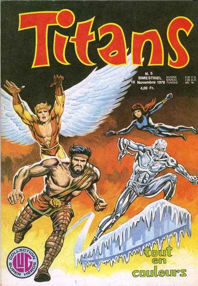
Here’s a copy of TITANS that I believe is from the same line, showing off the Champions in all their painted glory. Boy, almost nobody wore a shirt on that team, did they?
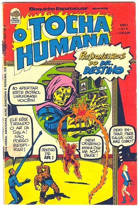
Some more weird coloring on this issue of O TOCHA HUMANA. Seems like the Human Torch was the headliner here rather than the Fantastic Four. And Sue’s sporting a strange sleeveless mini-skirted version of her costume as well.
By the 1970s, the United Kingdom was being served by an entirely different set of Marvel-themed weeklies. A lot of these books carried new covers since single issues had to be split into chapters and serialized.
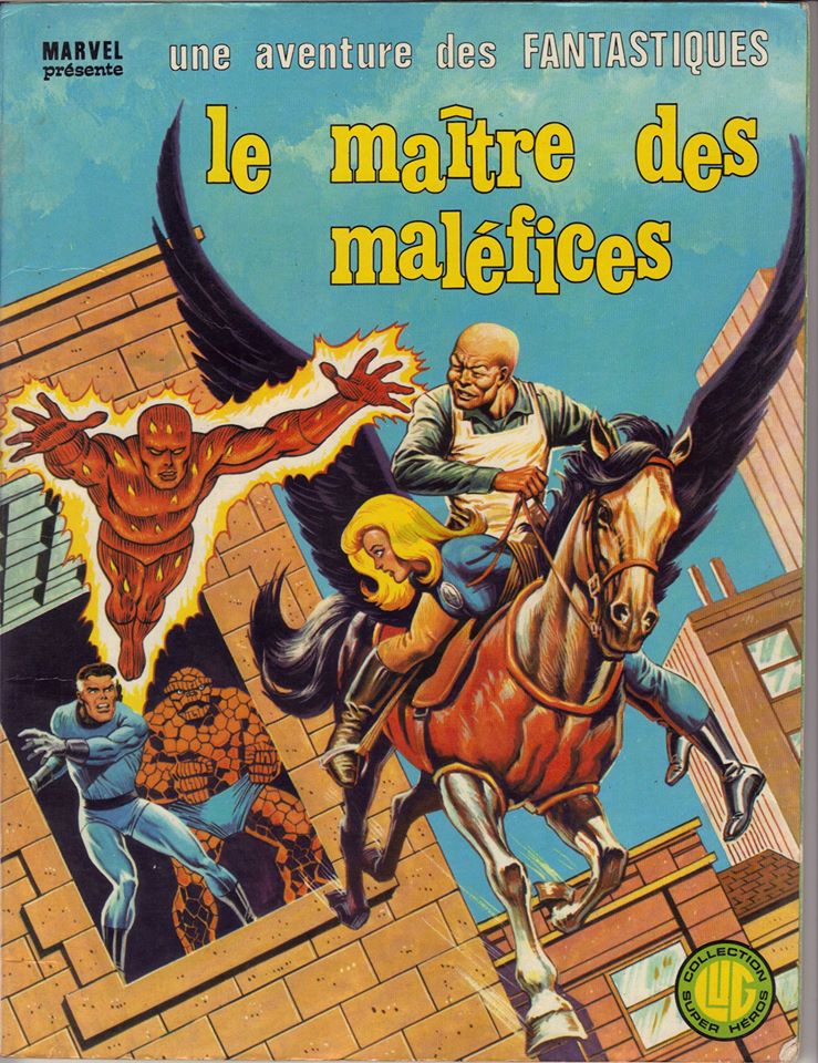
These French albums often carried great new painted covers, based on images from inside the stories.
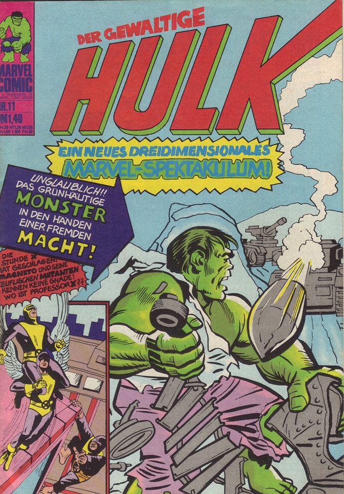
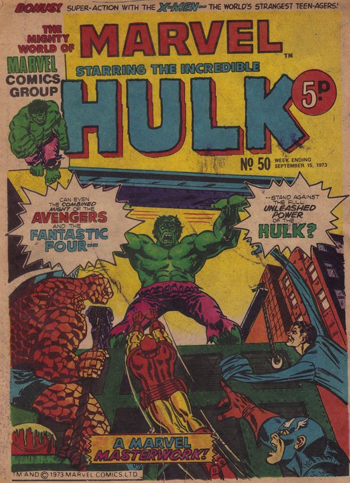
This HULK cover is half-new, as the image of Giant-Man was jettisoned in favor of a new drawing of the X-Men, based on interior images. That Hulk drawing is presented a lot larger here than it was on the TALES TO ASTONISH cover as well.
You need to separate your whites and your colors in the wash, Frank, otherwise they’re gonna run.
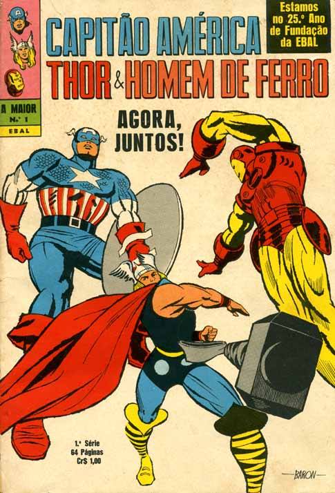
This local artist, Baron, pushes things a little bit too far in terms of his figure foreshortening. Look at the size of Capitao America’s foot there! And Homem De Ferro is almost colliding with the logo text.
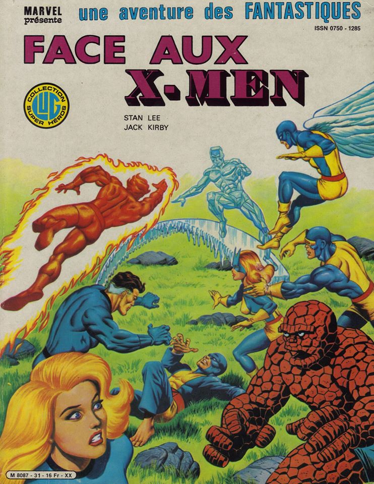
Couldn’t resist sharing another French FANTASTIQUES album cover, this one featuring the team in combat with the X-Men. The expression on the Thing’s face here is pretty priceless. He’s not having any of it.
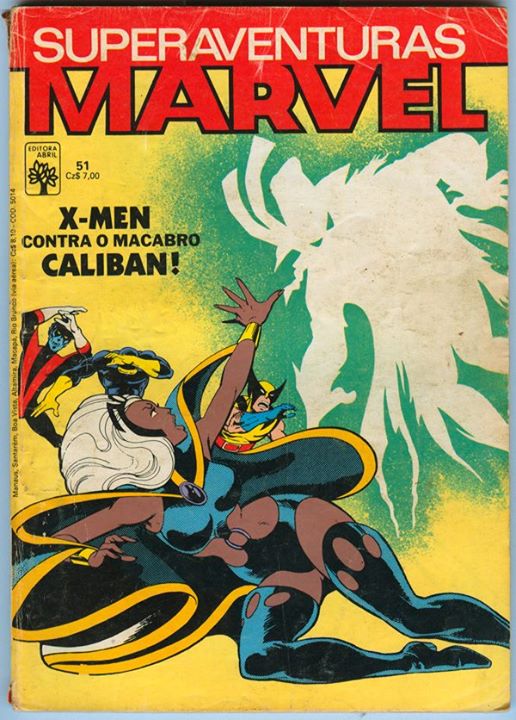
This issue of SUPERAVENTURAS MARVEL repurposes an earlier John Byrne X-MEN cover for a reprint of a later issue, substituting the original drawing of Proteus with a silhouette of Caliban.
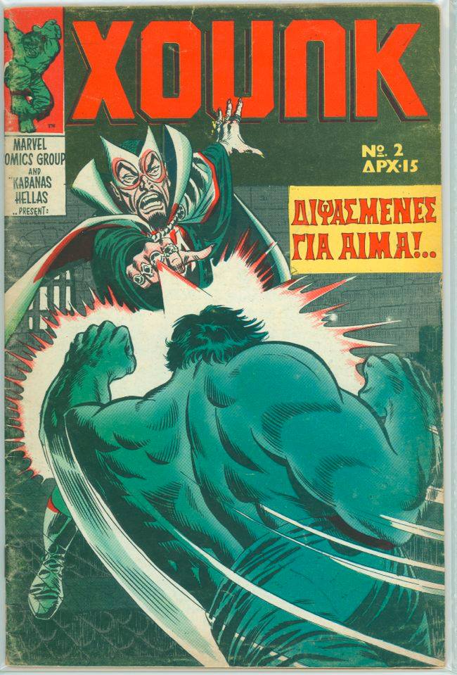
And it’s not just the Hulk–absolutely everything is green on this XOUNK cover.
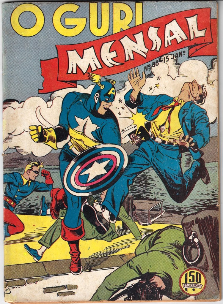
And we’ll wrap things up this time out with a cover for O GURI MENSAL reprinting golden age Captain America adventures. The Star-Spangled Avenger seems to have lost his torso stripes somewhere along the way.

That GURI issue was published in Brazil in January of 1944. An earlier issue (http://www.guiadosquadrinhos.com/edicao/guri-o-1-serie-n-73/gu070100/37972) had different errors in Caps uniform colors… Bloch Editores, Marvel´s brazilian publisher in the early seventies, altered the characters colors not only in the covers (like this red&blue Iron Fist: http://www.guiadosquadrinhos.com/edicao/punhos-de-aco-n-3/pu004100/41132) but also in the stories. Their versions of Dr. Doom (http://www.guiadosquadrinhos.com/edicao/tocha-humana-o-n-10/to004100/41140) and Dr. Strange (http://www.guiadosquadrinhos.com/capas/defensores-os/def04001) allways had those weird colors
LikeLiked by 1 person
Awesome!
LikeLike
I still have the early Mighty World of Marvel early issues that got me into Marvel back in October 1972, and I guess I haven’t looked back since. I also picked up the odd issue of Pow and Terrific when I stumbled across them,. A lot of the early UK Marvel covers were drawn by Jim Starlin who reimagined the original covers of the stories that were reprinted, Not entirely sure why for some, as the original could have been used – like Spider-Man comics Weekly No 4 which reprinted ASMI 12 for example. They could have used Ditko’s cover but instead got Jim to do that one too, along with a reimagined Thor as the comic contained a Thor story as well as Spidey back then.
LikeLiked by 1 person
The three companion titles to Fantastic and Terrific were Smash, Wham and Pow, which eventually all got swallowed by Smash, leading to the gloriously titled Smash! Pow! It’s Fantastic Summer Special which had a great line-up of stories, as per this article http://hcomicsworld.blogspot.com/2019/03/smash-pow-fantastic-summer-special.html
LikeLiked by 1 person
That cover by Baron might be my favorite. Though by putting Thor out in front at the size he’s shown, he could be misinterpreted as either really small, or “Capitao” and Homem de Ferro are just honkin’ huge. Cap’s leg is a little too exaggerated, but it reminds me of the Kirby homages by LaDronn. And that must be Stark’s secret stilt-armor. 😉 Thor, though, is in near perfect form & balance. The figure is spot on, even if the style is deceptively simple. Makes me think a blend of 2 other artists; if Mike Allred had finished a drawing started by Paul Pope…
LikeLike