
We’ve spoken before about how Wally Wood, the master illustrator and cartoonist, was wooed by new start-up company Tower to create a series for them. What Wood and his collaborators came up with was THUNDER Agents, a fun hybrid of spies and super heroes that is fondly remembered by those who read them, even though they weren’t able to find long-term success. Wood was joined in this endeavor by a fleet of other creators, including one forgotten figure who is a bit maligned. It’s that artist that I’d like to speak about today.

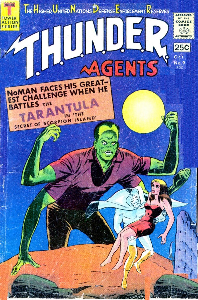
Manny Stallman had been a regular contributor to various comic books since the 1940s, and he was one of the better artists of the period, with a lush, full style that showed the influence of Milton Caniff (as so many others in that era did.) He was a long-time friend of artist John Giunta, which may have been how he came to be a contributor to THUNDER Agents at around the same time that Giunta began doing work for Tower. Or it could be the other way around, that Giunta got his in because he knew Stallman. That’s Giunta’s work on the cover, by the way.

Stallman is best remembered today as the artist of the Big Boy comic books, which he worked on for almost two decades and which reached millions of readers who frequented the hamburger chain. He was perhaps an odd choice to take over a super hero feature in 1966, but that’s just what he did. And the results are revelatory.
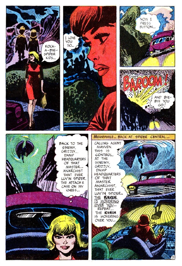
While the rest of THUNDER Agents emulated the sleek, polished, open style that had been all the rage since the super hero boom of the 1960s began, Stallman instead poured gallons of ink onto the page. His beefy, impressionistic line reminds one of that of Harvey Kurtzman whenever Harvey would draw his own material . Stallman was also somewhat inventive in his pacing and compositions–his work looked like nothing else that was being published in 1966.
Unsurprisingly, many of the fans of the era hated Stallman’s work and mocked it openly in their letters and in fanzines. Comic book fans have often had very narrow boundaries for what they consider an appropriate style for a super hero strip. And Stallman was coloring way outside of those lines with his work.

But it is amazing and striking stuff. Once you see Stallman’s RAVEN stories, you can never truly forget them. I first encountered Stallman’s work while collecting the run of THUNDER Agents in the very early 1980s. And like so many, I found it jarring and a bit ugly in its intensity. But now, I think it’s amazing and wonderful, and I wish we had gotten the chance to see Stallman do more in this era. In particular, it seems as though he would have been a perfect fit for the mystery titles that Joe Orlando would innovate over at DC in a few years.

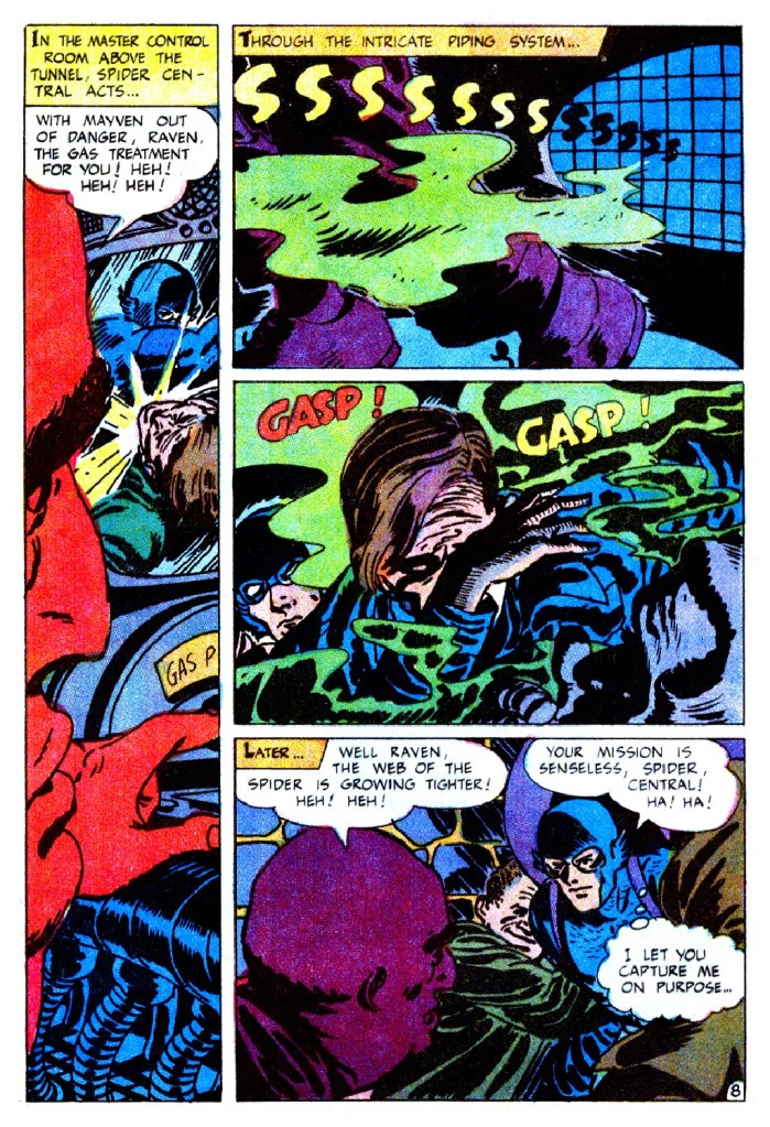
Raven was a new feature introduced in the 8th issue of THUNDER Agents to replace the failed Menthor strip. And like Menthor before him, the lead character was at first depicted as an enemy agent who intended to use the flying equipment that THUNDER had developed for his own personal gain, before having a change of heart. One gets the impression that nobody was all that interested in taking on the regular Raven assignment, and so it went to Stallman by default. But that is pure supposition on my part–I would not be at all surprised to learn that Wood was a fan of Stallman’s bold strokes.
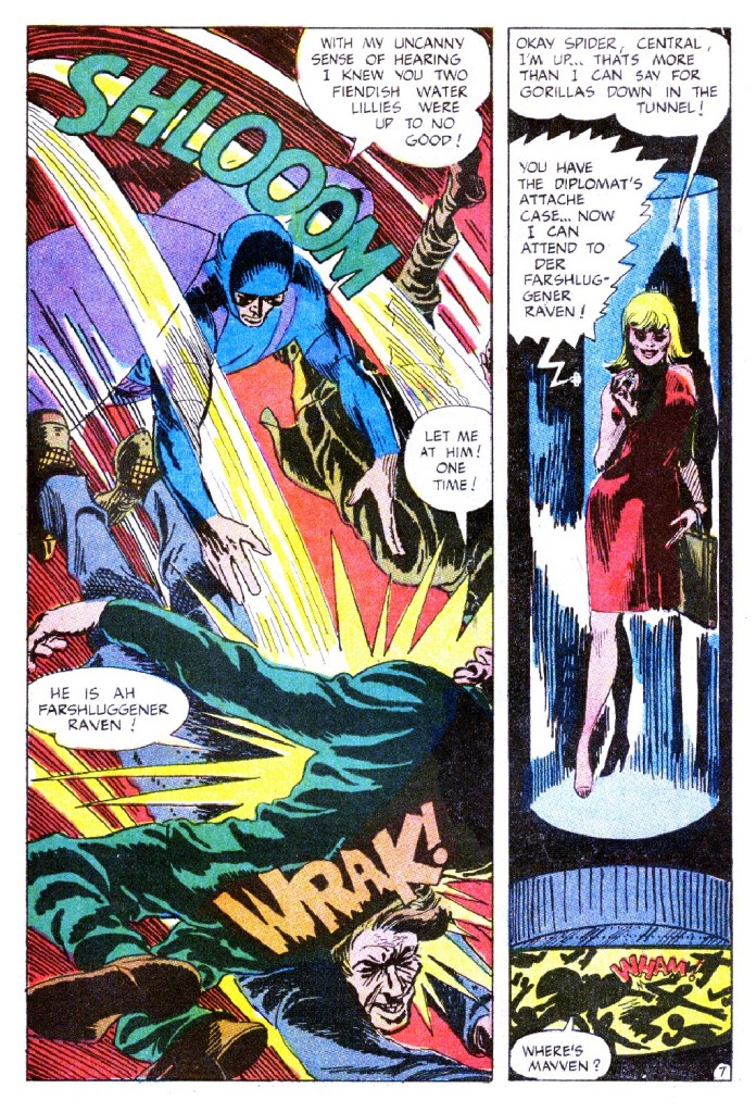
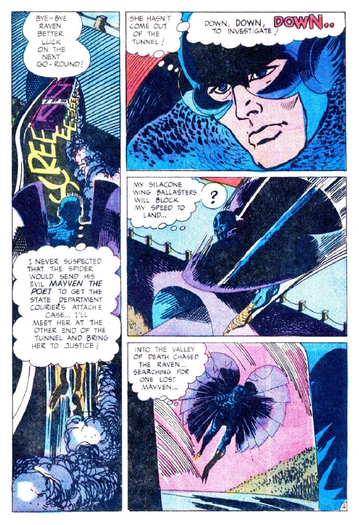
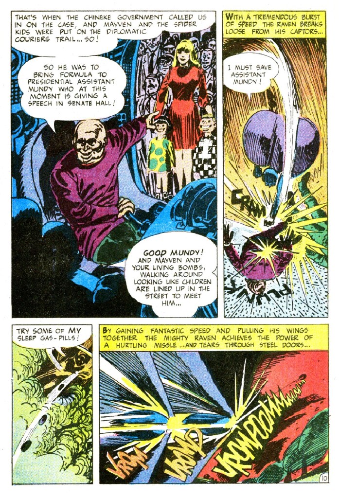
Stallman redesigned Raven for the stories that he worked on, giving him enormous concave wings that could be brought together to cocoon him like a projectile in flight. They’re so enormous that the character often seems awkward and ill-balanced. The line on this page HE IS A FARSHLUGENER RAVEN! seems to be a deliberate tip of the hat by Stallman to Kurtzman, as it’s a paraphrase of a line Harvey used in MAD in the 50s.
Stallman only produced five Raven stories in total. After that, the strip disappeared from THUNDER Agents for an issue or two, replaced by inventory from UNDERSEA Agent and DYNAMO, titles that had been discontinued. When it returned, it was under the more fan-pleasing hand of Gil Kane. And so fandom in general breathed an audible sigh of relief.


As a kid, Stallman’s work suffered, at least to me, by what I now know to be unfair comparison to Wood, Crandall, Ditko, Kane, and even George Tuska, all of whom were also in the books where Stallman’s work appeared. In later years, as I grew more seasoned in my appreciation of comics stylists–and saw some of his work for Warren!–I slowly warmed to his art. By the time the Internet came along and I could see some of his 1950s comics stories, I was a fan! Things change!
LikeLiked by 1 person
Who was writing this Raven story? Was that role performed by Manny as well?
LikeLike
Presumably, yes.
LikeLike
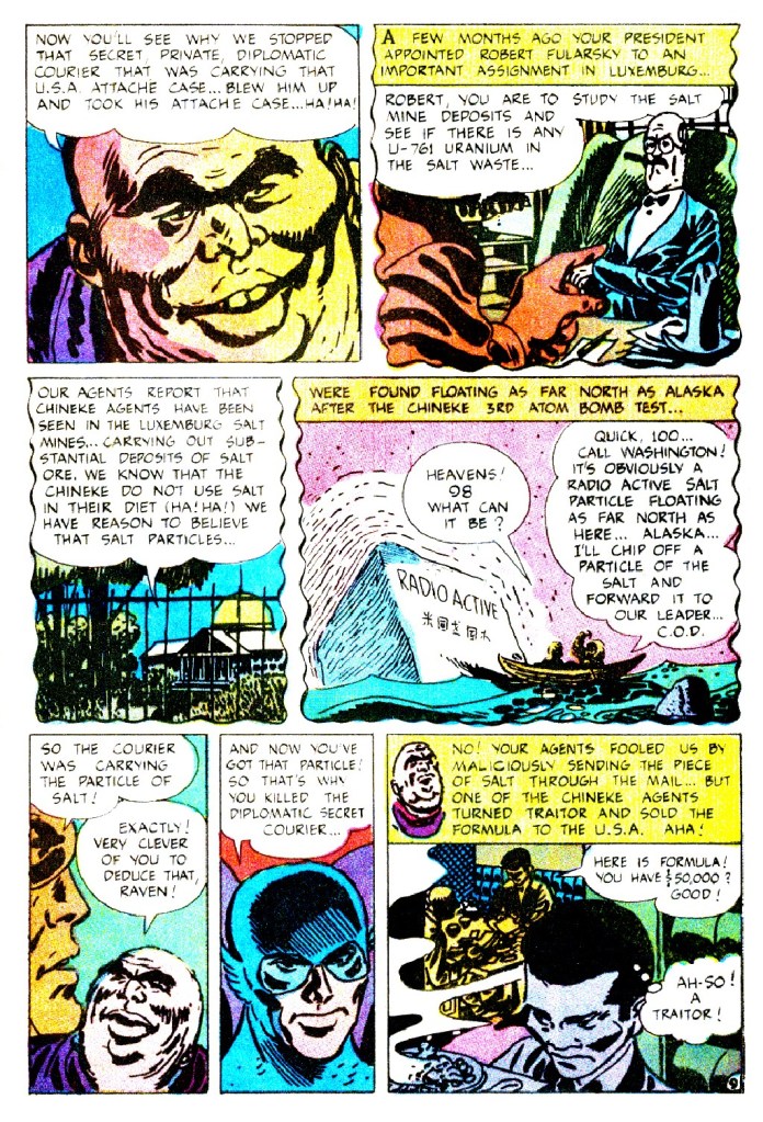
If I had been a kid in the 1960s I probably would have disliked Manny Stallman’s artwork, as well. Looking at it as an adult, though, it definitely has an appeal. I totally agree, Stallman would have been a good fit for DC’s horror anthologies in the 1970s. His work has a genuinely unsettling edge to it. Those wide-eyed, smiling exploding children are incredibly creepy, and Mayven is the perfect icy femme fatale villain.
LikeLike
I liked his work back then, it reminded me of another of my personal favorites, Nick Cardy.
LikeLike
I admit that I found Stallman’s art odd at the time, but I remember enjoying the odd stories. I have a complete run of the Tower books, so probably should go back and see how I feel about it now. The story you reprint certainly brought back memories.
LikeLike