A post from my old Marvel blog talking about the history of Marvel cover philosophy. And yes, this is Part 7–these blog posts aren’t in my files in any particular order, so what comes up, comes up.

April 28, 2007 | 1:00 AM | By Tom_Brevoort | In General
Continuing our review of covers and cover philosophy down through the ages, we’re now up to the glory days of the 1990s.
By this point, cover philosophy had changed again, possibly due to the fact that Tom DeFalco had replaced Jim Shooter as EIC. There was something of a move back towards the flavor of the ’70s, with more emphasis on copy, and a more chaotic arrangement to most covers in general. One of the things that set a tone for the approach towards covers was that a study was done that indicated that covers with copy on them would be looked at by a potential consumer by a fraction of a second longer than a cover without copy. As a result, with rare, rare exception, all covers were required to have some cover copy of some sort on them. And often, a lot of it.
But the biggest change, the one that distorted the very fabric of the industry, at least for a time, was the advent of the “enhanced cover.” There was a general boom in comics during this period, fueled somewhat by the entrance of scores of speculators into the marketplace. These were people who, on some level, viewed comics as commodities, and were out to make their fortune by investing in them. And Enhanced Covers were a way of luring them in.
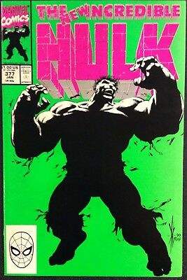
They started very quietly. The cover to HULK #377, the issue in which Peter David united the fragmented psyche of Bruce banner into an all-new Hulk, was printed with a Fifth Color ink (so called because it was a special mixture of ink in addition to the typical four colors-magenta, cyan yellow and black—that were typically used to print a cover.) The fluorescent green really popped off the racks, and the book sold out, with demand unabated. It went through at least one additional printing—and people began to get the sense that they were on to something.
From there, things spiraled out of control very quickly, as Enhanced Covers were proven to cause a spike in sales, often a major one. At their height, Marvel was scheduling more than one of these a month, on one title or another. They also made for a good excuse to raise the cover price on a title, and so increase the profit margin on that particular issue. Every gimmick that you could think of was tried—there were embossed covers, die-cut covers, holographic foil covers, glow-in-the-dark covers, hologram covers, fold-out covers, chromium covers—you name it. And some of them were executed really well. But any time you roll out this many items so hastily, quality is going to suffer. The die-cut on that PUNISHER WAR ZONE cover to the left, for example, doesn’t do anything to enhance the image in any way—it’s just die-cut for the sake of die-cutting, and almost randomly done.
The 90s were also the era in which printing and computer technology advanced to the point where computers could now be used to color comics. Pioneered largely by the Image artists, particularly Steve Oliff on SPAWN, coloring techniques took on a whole new dimension. There was an art to coloring before this, but it was never make-or-break—and you only had so much control over the final product, since the actual color separations were being done in a printer’s workshop somewhere by hourly laborers. But at this point, coloring became much more an integral part of the artwork, and colorists began to attract the same sort of acclaim previously reserved for pencilers and inkers.
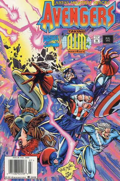
However, like any new technology, it took awhile for people to work out the bugs, both in the calibration of the software, but more in the aesthetics of the process. Now having unlimited colors to work with, rather than the standard-until-this-time 64, most colorists went a bit nuts, resulting in a lot of covers that either printed dark, or look like they came out of an explosion at a crayon factory. Tones and textures were added haphazardly, regardless of whether they fit in with the artwork. And again, not in every case, but by and large, this led to a whole parcel of covers that looked modern, but also were difficult to make out, or to see from a distance. The AVENGERS logo on that cover to the left, for example, is very difficult to read.
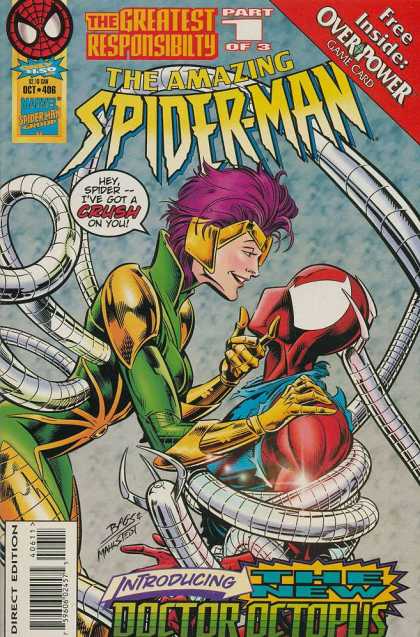
Otherwise, the decade was a melange of everything that had come before, plus more. As outfits like Richard Starkings’ Comicraft refined digital lettering techniques, more and more cover lettering was produced on a computer, rather than by hand. This was a double-edged sword—it was good in that the overall quality of cover lettering had gone way down as the number of titles being produced had gone up, but it also meant that all of the cover copy tended to have a certain sameness about it, using the same font styles over and over again. And cover advertising came back, as seen on the last AMAZING cover on the left, but at least here it was confined to the triangular “Nabisco corner” rather than bannered across the top. (but could you find anywhere else to squeeze another word onto that cover? Shades of the ’70s indeed!)
The bottom line with many of the Marvel covers of this era is that, for all of these reasons and more, they tended to be very difficult to “read,” especially from a distance. And that sets the stage nicely for the move into the 21st Century.
More later.
Tom B
0 (0)
Report
