
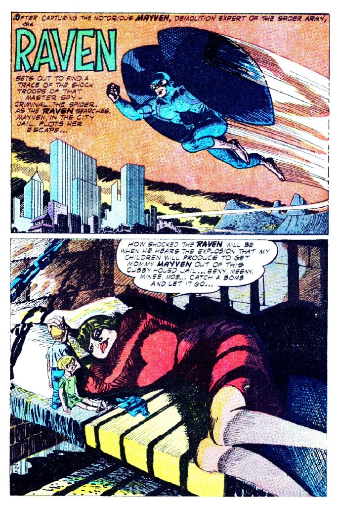
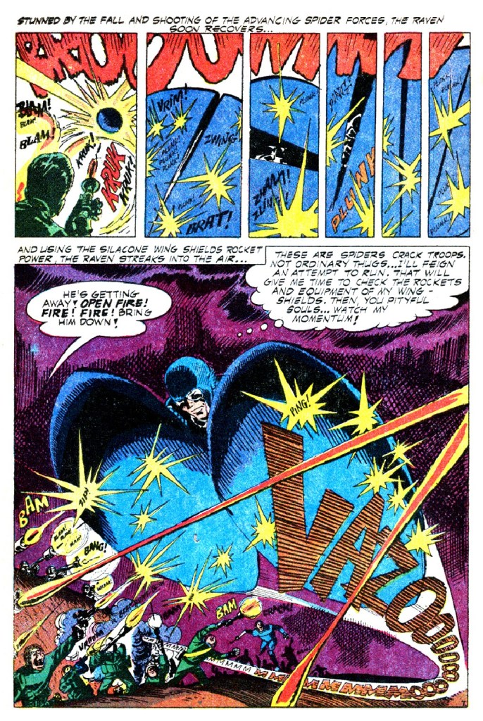
It’s been a long time since we last looked at the unique work produced by veteran creator Manny Stallman on the short-lived Raven strip that ran in T.H.U.N.D.E.R. Agents for the Tower Comics imprint. As opposed to the rest of the title, which was steeped in the clean and elegant linework of creator Wally Wood, Stallman’s work owed more to that of Harvey Kurtzman. It was impressionistic, stylized, wildly cartoony and drenched in black shadows. It truly looked and read like nothing else in the Silver Age–and consequently, fans of the era hated it.
And in truth, even today, Stallman’s style is something of an acquired taste. I can remember being repulsed by it when I was first collecting these THUNDER Agents books in my teen years. It seemed muddy and dirty to my eye, uncontrolled and strange. The stories were pretty weird, too. I only grew an appreciation for the boldness of the presentation in later years.
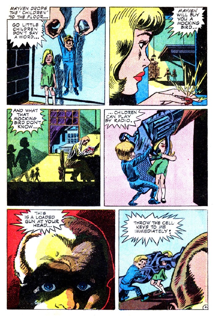
This earlier Raven story hews to fairly basic, straightforward storytelling, but within a few issues, Stallman would begin playing around with panel layouts and pacing in the manner of the great Bernard Krigstein, if not with the same mastery. But these experiments also evoke the work of Will Eisner, who would similarly stretch just what the medium could do while still telling an engaging story.
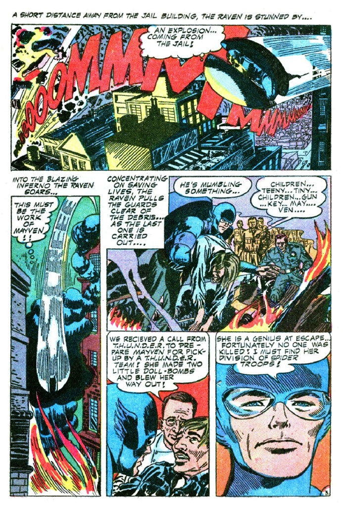
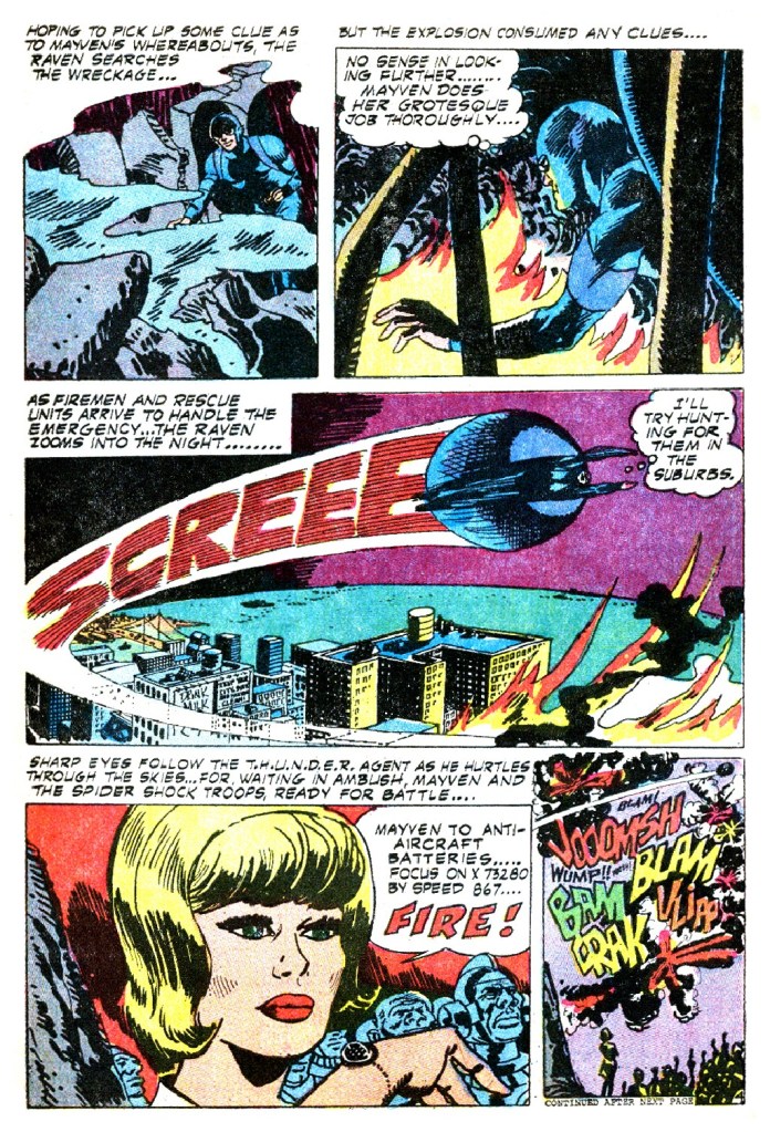
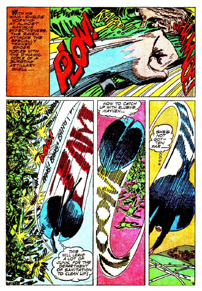
Stallman also did his own sound effects, integrating them into the artwork in a pretty effective manner. I’m not certain, but it’s also possible that he did his own lettering as well, the lettering in the Raven strip didn’t seem to match any of the rest of the book.
Stallman’s redesign for Raven is absolutely bananas as well. Gone are the simple underarm winglets of the character’s first story, replaced by a pair of concave wings so large that they can encase the character completely in a protective shell. They looked less like wings and more like the halves of a colossal ball that Raven was carrying around on his back. If Hawkman had trouble fitting through doorways, Raven could barely fit into a garage.

I find Stallman’s work fascinating, at once entirely out of step with what was then popular in the world of super hero comics books and uncompromisingly devoted to its own unique vision. At a time when some comics had begun to feel a bit like plastic products, Stallman’s work was utterly unique.
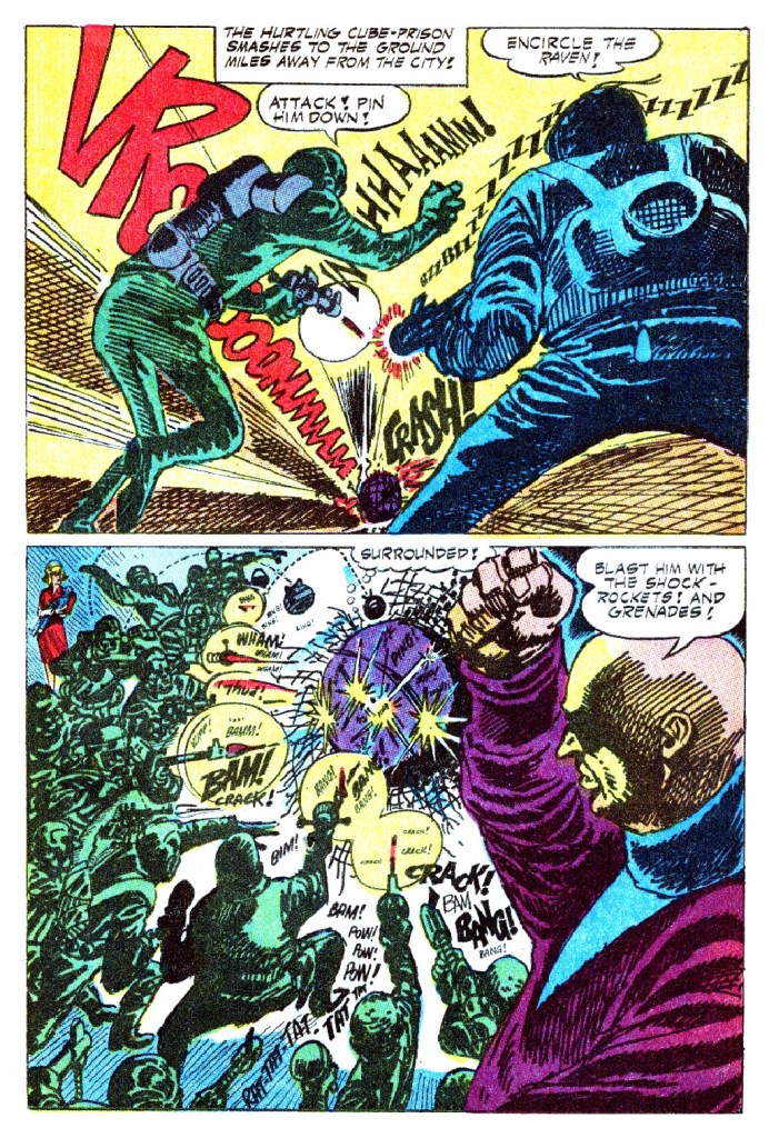
Just look at this insane page. It’s at once repulsive and transfixing.

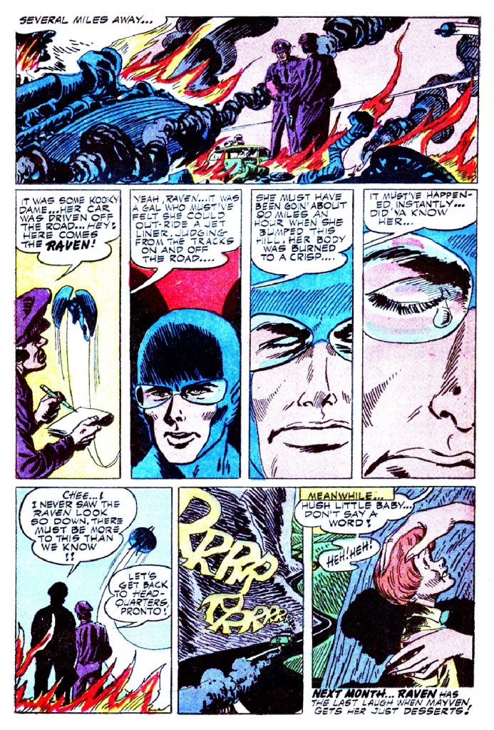
Stallman only produced five Raven stories before the strip was given over to more commercial hands. I’m sure we’ll return to this series again in the months to come.

I feel people hated it because it wasn’t very good. No need to overthink it. It has nothing redeeming. Similar to bottom of the barrel 1960s Marvel or most of 1960s DC.
Fawcett did all the “firsts” 20 years before and after their disgusting suppression by DC 25 years was spent pretending to think up what they’d already done and filling in the gaps with swill like this.
LikeLike
Sorry, I gotta disagree — this is fantastic! Powerful, explosive action, there’s not a dull panel in the whole story. The use of sound effects, and the way they become part of the scene, is really inspired. There are comics where you can tell the artist is really going all-in, and having a blast, and this feels like one of those.
LikeLiked by 2 people
I agree. I found it great as well and not the least bit repulsive. That’s a word I use only for Frank Miller’s current style.
LikeLiked by 2 people
I’d read old issues of the T.H.U.N.D.E.R. Agents and wonder who’s faster — Lightning or the Flash?
LikeLiked by 1 person
I love the ‘wings’ but the suit would make more sense as a Blue Beetle costume, as awesome as it may look here.
LikeLiked by 1 person
I was thinking the same about the wings being more beetle than Raven ( What is it about Raven heroes that they get the wrong wings: Timely Comics Red Raven got bat or dragon-like wings in Red Raven Comics#1 ( August 1940 ) ). I don’t know what issue the Raven got his underarm winglets back but he is seen on the cover of T.H.U.N.D.E.R. Agents#14 ( July 1967 — comics.org ).
LikeLiked by 1 person
I think the storytelling is fine but those circular wings look awkward and uncool.
LikeLiked by 1 person
I remember when I first encountered these Raven comics, I thought (rather dismissively at the time), “These look like those free comics from Big Boy!” I was not surprised to learn several years later that they were both drawn by the same guy! As my tastes matured, I found new appreciation for his style (and for others whose work I found grotesque in my youthful years, like that of the great Joe Kubert).
LikeLike
I think Stallman’s layouts and storytelling are amazing — riveting and energetic. And I like a lot of his ink textures.
I’m just not that fond of his drawing. But on the right project, I’d probably love it.
LikeLiked by 1 person
Can’t say who the letterer is, but they did plenty of TIPPY TEEN stories (ad UNDERSEA AGENT, too, I think!)
LikeLike
Now I have that “Thunder!” song with the needle-y guitar part by AC/DC in my head. 😅
I doubt there’ll ever be a T.H.U.N.D.E.R. Agents movie. But that song should be in one, even if it’s just for the end-credits.
Kind’a sort’a like Sabbath’s Iron Man.
LikeLike
Manny Stallman was a sweet little man who literally cried if someone said a harsh word about his work. He was very proud that he had once worked for Will Eisner on The Spirit but I gather he didn’t do much for Will. Late in life, he did the Big Boy comics for a while as his health failed…a very nice guy who loved to draw. I’m pretty sure he didn’t do the lettering on his stories for Tower but you’re right that he did do his own sound effects.
LikeLike
I actually really like the artwork. For me, the coloring is the bigger problem – very jarring and all over the place.
LikeLike