
This next issue of IRON MAN was something of a pause in the run, a fill-in issue albeit one that had been integrated into the ongoing story narratives. It was also something of a throwback, recounting the events of Iron Man’s origin and updating them slightly. I had already read Iron Man’s origin in SON OF ORIGINS OF MARVEL COMICS, but I was nevertheless fascinated by this issue, as creators Jim Shooter, David Michelinie, Bob Layton and guest-penciler Carmine Infantino recreate panels and whole sequences from that earlier story right down to the dialogue. So I would get both stories out and compare them, studying the similarities and differences like a rabbinical student studying ancient scripture, looking for the essential truth of events. Origin flashback issues such as this one used to happen with a bit more regularity, as the common wisdom in that era before wholesale reprinting and collecting of older stories was that the audience in 1979 was likely to never have seen the earlier adventure.
The weird thing about it, in retrospect, is the fact that this wasn’t the first time that this had been done in IRON MAN, nor would it be the last. Several years earlier, in the pages of IRON MAN #47, Roy Thomas and Barry Smith had done the exact same thing. And many years later, John Byrne and Paul Ryan would repeat the trick in IRON MAN #267 & 268, though they would wind up making more extensive alterations to events as even by that point in 1991, the passage of time made setting Iron Man’s origin in Vietnam problematic.

From an artistic standpoint, the issue is one of the better jobs that Carmine Infantino produced for Marvel during his years there. No doubt a lot of the credit for this must be given to inker Bob Layton. Layton could be a heavy hand, and here it seems as though he spent a lot of effort sanding down Carmine’s rough edges, softening the angularity of his characters’ faces and making all of the technology look shiny and futuristic. What remains from Carmine is his page and panel compositions and his sense of storytelling (although even this is subsumed a little bit in the need to replicate moments from the original story, which meant that Carmine was having to reproduce panels verbatim at times.) While he was an industry giant, the young readers of this period often found Carmine’s artwork divisive–he wasn’t a real fan favorite anymore, for all that he had plenty of fans and admirers. So Layton’s approach helped to make Carmine palatable to a 1979 IRON MAN fan.
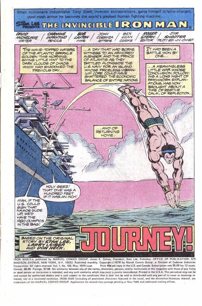
The story is a familiar one. Having departed the island where his last battle took place in the prior issue, Iron Man jets back towards home, and while he goes, his mind casts backwards to the events that made him who he is. Years before, Anthony Stark had been a weapons manufacturer under contract to the American government. But on a trip to the front lines to put his inventions to the test, Stark winds up tripping a booby trap that annihilates the unit he’s with and critically wounds him. He’s captured by the forces of warlord Wong Chu. Stark has only a week to live before the shrapnel lodged in his chest pierces his heart, but realizing who he is, Wong Chu puts the inventor to work manufacturing weapons for his forces. Stark realizes from the jump that the warlord’s offer of medical help is a ruse, so he decides to try to save his own life and to escape and get his revenge on Wong Chu by his own hands.

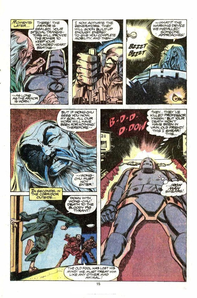
With the assistant of captured physicist Professor Yinsen, Stark constructs an iron shell for himself that contains a device that will keep his injured heart beating and prevent his death. But even as it’s ready to be activated, Wong Chu and his men approach, and Yinsen creates a diversion, giving his life so that Iron Man can live. Thereafter, having eludes the warlord, Iron Man returns to face him in personal combat, and he routs the warlord and his forces with the powers and weaponry build into his iron shell. In a relatively brutal fashion for the era, Iron Man blows Wong Chu up directly, worrying little about the typical super hero code against killing. But, hey, there was a war on.
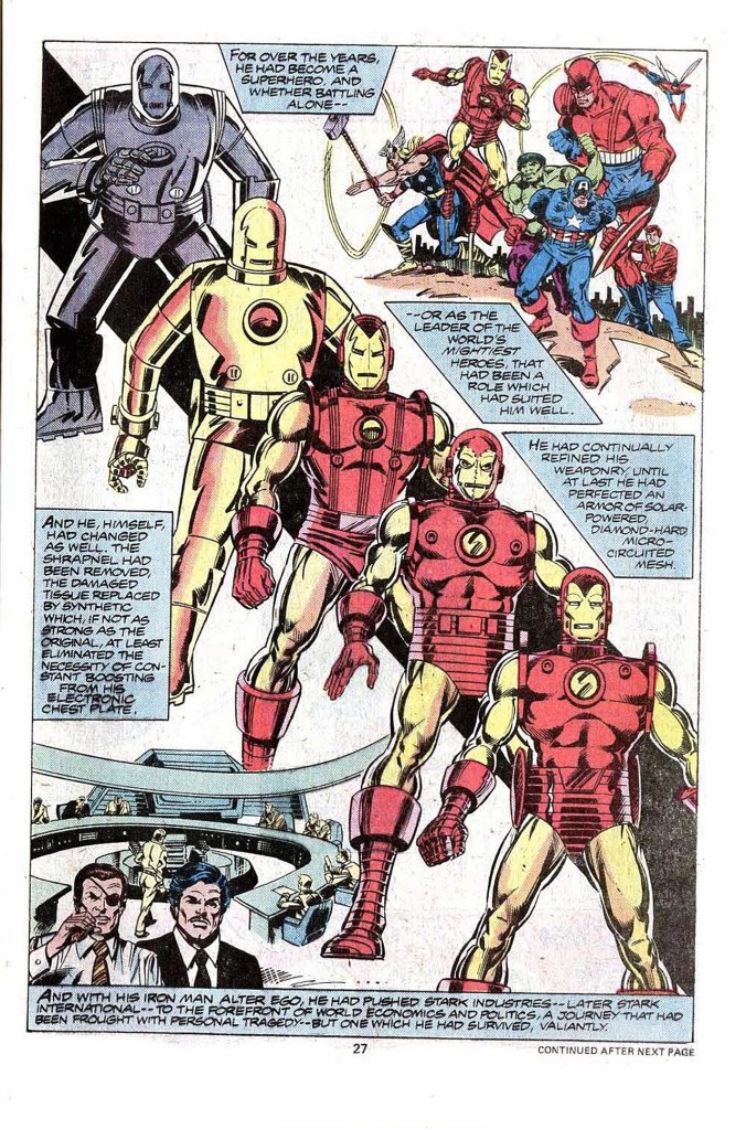
I can remember being fascinated by this page that comes after the origin wraps up, which recounts Iron Man’s development from that point forward, including the several redesigns to his armor. I was a sucker for history such as this, and more than anything else in the issue, this page is what kept bringing me back to look at and study this particular issue in the weeks ahead.
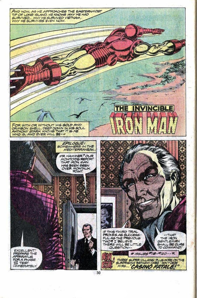
At the end, the story segues back to the present for the wrap-up, as well as the reveal of the mysterious Justin Hammer who has been responsible for many of Iron Man’s recent woes. Hammer was visually based on actor Peter Cushing, and you can really see this resemblance in the final panel on this page; hereafter, he tended to become a bit more generically-drawn. Also, it’s a weird choice on Carmine’s part in that top panel to show us only Iron Man’s back. Surely this moment called for a more dramatic hero shot of the main character. But apart from minor quibbles such as that, it was an entertaining story, even if I had experienced most of its particulars before.

I thought that Justin Hammer was supposed to have been based on Christopher Lee’s frequent co-star, fellow Hammer great Peter Cushing.
LikeLiked by 1 person
Got my proof-reading head on: Page 27, which fascinated you so much – the Avengers’ group-shot is a not very well done redrawing of the cover of Avengers #5, and the word ‘fraught’ has the novel spelling ‘frought’, even with a very professional editor and editor-in-chief involved.
LikeLiked by 1 person
It is interesting that about the time Infantino was doing an Iron Man fill-in, Don Heck was doing some work on The Flash strip in Adventure Comics.
it is also interesting that both Heck and Infantino had started out with a strong Caniff influence that faded with time.
LikeLiked by 2 people
I think you meant Peter Cushing, not Christopher Lee, but otherwise: great article. I loved this run of Iron Man!
LikeLiked by 2 people
Powerful Cockrum/Layton Cover!
================================
Nitpick & Science time:
10,000 volts is NOTHING. The average static shock has more voltage than that. Amperage is key. Average static shock had virtually zero amperage. BTW as little as .1 will kill most humans.
Changing to “Danger 10,000 Watts” would be a bit better. Watts (aka power) is P=VI . Still even that is really not a lot near home generator range.
It should have been worded “Danger 10,000 Amps” now that would have been some serious stuff!
This has been bothering me a long time!
================================
As a child reader I was not an Infantino fan but even then I liked the art overall here. Circa late 1970’s Layton inks made everyone’s pencils look slick and fresh!
Love how Namor appears in the first 3 pages tying up 120-121 – this type of stuff as child gave me a warm type feeling of that interconnected universe.
Agreed on the last page #30 on what should have been a heroic panel, we get a lame butt shot.
LikeLiked by 2 people
Layton was a notably good inker for Cockrum, almost like Sy Barry had been for Cockrum’s mentor, Murphy Anderson (Layton had been a Wood assistant as Cockrum had been an Anderson assistant).
LikeLiked by 1 person
I love Sy Barry’s stuff, especially “The Phantom”. The best efforts of guys like Steve Epting or Mike Maley remind me of Sy’s art.
LikeLike
I don’t think Sy Barry gets his due.
The DC “House Look” is usually attributed to Infantino & Anderson, but probably really begins with Toth & Barry on Johnny Peril in 1952 or so . . . .
LikeLiked by 1 person
Younger Me was not a big fan of most of Infantino’s art in this era besides Spider-Woman and Star Wars. Older Me thinks I was an idiot for failing to appreciate it. Jessica Drew certainly would not be considered a femme fatale had Infantino had Infantino not improved on her costume as he did. And Layton improved everybody’s work. As an example, look at Romita under Green or Jansen instead. The former looks to be working with scratchy incomplete sketches and the latter has to drown the art in blacks.
LikeLiked by 1 person
Layton’s good. For 1980-2012’s JR, Jr. though, I’d personally take Janson first, then Dan Green. JRJR & Klaus’s “AMS”, despite the embarrassing fashion choice in street clothes, hairstyles, etc., was “amazing”. The Hobgoblin never looked more menacing. Then fast forward to their Avengers issues w/ Bendis. Tremendous. The sequence where Spidey saves a falling, unarmored Tony Stark made me feel those static images were really moving. Probably their last great collaboration. As JRJr’s DC stuff was a big letdown for me.
And Dan Green’s inks over JRJr in UXM was “my” era. Mood, tone, atmospherics, emotionally charged action. The visuals totally, like fer sher, fit the whole noble but desperate vibe of the stories and characterizations. I wouldn’t have changed it.
Gotta include my second JRJr inker, though. ALWILLIAMSON. Their “Daredevil” was sublime, masterful.
And Bob Wiacek’s inks on JRJR’s too brief return to IM (the lug boot era, 1990?) helped make this quick run superior for me to JRJr’s more celebrated time with Bob and Dave.
Dick Giordano also did a very good job over JRJr, too.
LikeLike
When JRJR started on Ironman his story chops were already pretty solid though his drawing wasn’t altogether resolved….which was more noticeable when he had a more or less naturalistic style early on. IMO his drawing greatly improved 20 issues into the run. He definitely was bringing something to the table throughout because I prefer the JRJR inked by Layton issues to the ones where Layton is doing both pencils and inks…even though the finish is still consistent. I think Layton works best as a finisher.
I like Williamson and Wiacek inking JRJR as well. They both let way more JRJR “the stylist” in.
Janson looks good on everyone. I liked their run on Thor…. the art felt “large” ala Kirby and Simonson.
LikeLiked by 1 person
I agree. Layton’s inks give the art in this issue a slick visual consistency so that Infantino doesn’t particularly stand out as a guest penciller. I own the original art to pages 15 and 16 of this issue. It’s been a while since I looked at them, but there’s a heavy use of ben-day screens by Layton and Infantino apparently used blue pencil.
Given reader turnover… I don’t think it’s too weird for an origin to get retold every now and again. It had been over 70 issues since Shellhead’s origin was previously recapped which was more than 2 years longer than the last time from issue #1.
LikeLiked by 3 people
I have this issue but I can’t remember any other Marvel hero getting this much detail in their origin flashback, the others are always very short. I agree that Bob Layton did a great job on Carmine Infantino’s pencils. Justin Hammer was one of those villains I loved to hate ( Like J.R. Ewing only he was smart enough not to ever get caught, at least back then ).
LikeLiked by 2 people
It probably wasn’t planned when they retold the origin here but Michelinie and Layton do swing back and add a part two to IM’s origin about 20 issues later that fills in how Tony met Rhodey.
LikeLike
Even now, it’s so strange seeing Infantino drawing Marvel characters. I’m not a huge Bob Layton fan (nothing against him or his work, I just generally find his inks to be too mechanical and lifeless for my tastes), but I think he’s a particularly incongruent pairing with Infantino’s more organic pencils.
I wasn’t reading comics on a regular basis in 1979 (I was six at the time), but by the mid-1980s, I remember seeing his work on the Red Tornado mini-series and the tail end of the original Flash series. As a 12-year-old, I wasn’t impressed. And even today, looking back on it, it feels like he was just phoning in his later work. But looking through the early Flash omnibuses of his work in the 1950s and early ’60s (which I only discovered later in life), I was pleasantly surprised at how good he was in his prime. He was a really amazing and inventive page designer. But by this issue, he clearly wasn’t concerned with that anymore.
LikeLiked by 1 person
I can attest that his RED TORNADO pencils were really good; moody and striking, until Frank McLaughlin did his usual inattentive, disappointing inking job on them.
LikeLiked by 1 person