The world of super heroes is never a stationary place, despite feelings among certain fans that nothing ever seems to change. And primary among the places where alteration can be seen is in the attire of classic characters. Giving a lagging hero a costume redesign can sometimes enhance their appeal and help carry them to new heights. On the other hand, the opposite can also happen, and redesign efforts can produce results that are laughable and off-putting and bad. That’s what we’re going to be focusing on here. So here are Five terrible Marvel Super Hero Costume Redesigns:
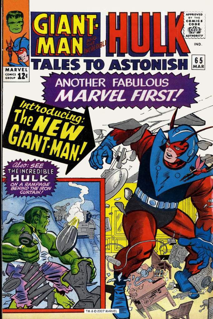
Giant-Man, TALES TO ASTONISH #65: It’s no secret that the Ant-Man series struggled to find success for the entirety of its run in the early Marvel days. In an effort to make it more appealing, the strip was retooled on several occasions: introducing the Wasp as Ant-Man’s partner, and transforming the character into Giant-Man and letting him get large as well as small. But nothing worked. In a last-ditch attempt to save the series, Stan Lee and Bob Powell decided to give Giant-Man a visual overhaul. They also added to his powers, gifting him with a helmet-mounted device that could cause other things to grow and shrink, a projected version of Hank Pym’s own powers. But this design was the essence of putting “a hat on a hat”–the new Giant-Man literally looked as though he was wearing a new helmet right over the top of his old one. In fact it’s so bad that there isn’t really a clear image of Hank Pym wearing the whole ensemble anywhere within its debut story. Suffice it to say that this new ensemble didn’t do anything to reverse the fortunes of the ailing series, and it was dropped four issues later in favor of Namor, the Sub-Mariner. Giant-Man’s new powers were quietly forgotten about, and this outfit was consigned to limbo.
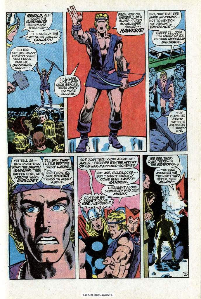
Hawkeye, AVENGERS #98 – The late 1960s hadn’t been especially kind to the Avengers’ battling bowman. for a number of years, clint Barton had given up archery, choosing instead to use Hank Pym’s growth formula to replace Pym in the colossal guise of Goliath. But eventually, the benefits of that choice ran their course, and Hawkeye returned to being an archery-based hero. But not without a radical change of wardrobe, one that was even more revealing than his chest-bearing Goliath outfit had been. In fairness to Hawkeye, he picked up this costume while performing in a circus. But he also chose to keep wearing it for several months before inevitably returning to his original attire. And not a minute too soon, either. This was a bare-armed, bare-legged, chest-open-to-the-navel and what-the-hell -a headband-too disaster. Roy Thomas and Barry Smith were responsible for this ill-fated overhaul.
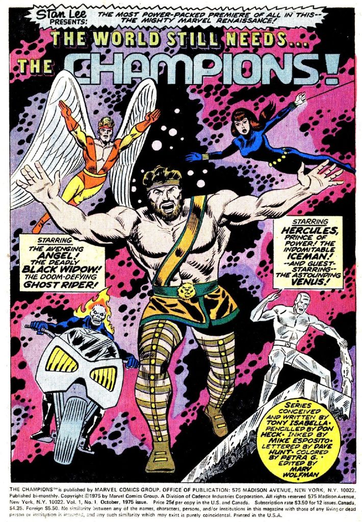
The Angel, CHAMPIONS #1 – But the headband-and-open-shirt look wasn’t done with just yet. The Angel had worn some truly ill-considered outfits after having worn the right to sport his own individual costume after graduating from Professor X’s School for Gifted Youngsters, but this one has to be the nadir. Not only does it have the aforementioned elements, but it’s otherwise relatively generic, and yet also just busy enough in its red and yellow to remain unattractive from most angles. Fortunately, this sui, inaugurated by Tony Isabella and Don Heck, only lasted for around nine issues before Warren Worthington swapped it for a version of his earlier Neal Adams-designed duds with a red color scheme rather than the dark blue. But this costume still haunts my nightmares.
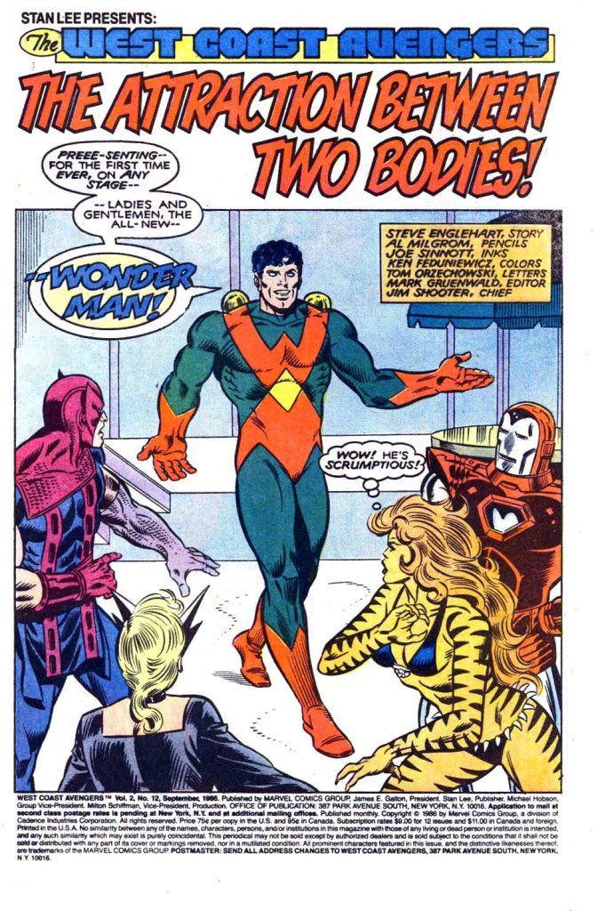
Wonder Man, WEST COAST AVENGERS #12 – Wonder Man had been working on coming up with a new look for himself virtually since the WEST COAST AVENGERS ongoing series started. And from the look of this monstrosity, he should have kept looking. This Christmas-themed abomination also coincided with a pronounced shift in Simon Williams’ personality. Having previously been one of the more humble and understated Avengers, his move to the west coast and attempt to establish himself as a serious actor had him becoming arrogant, egotistical and brusque–and wholly unappealing. Writer Steve Englehart apparently designed this costume himself, though it was executed in print by Al Milgrom. Sadly, even Wonder Man’s fellow Avengers couldn’t bring themselves to tell him just how bad it looked. Like these other design disasters, this suit was swiftly mothballed hereafter.
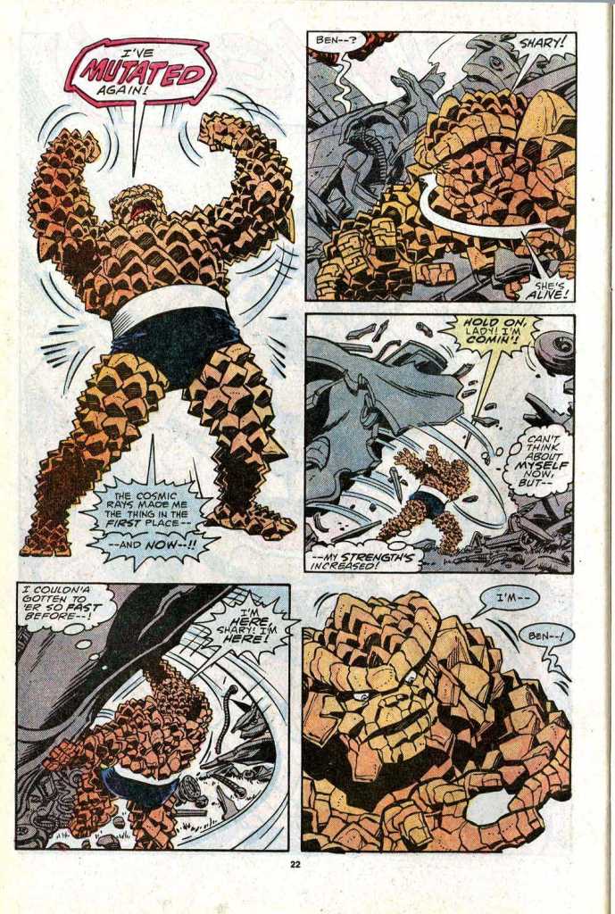
The Thing, FANTASTIC FOUR #310 – Writer Steve Englehart strikes again, this time exposing the powerhouse of the World’s Greatest Super Hero Team to another dose of Cosmic Rays, one that mutates his stony body even further. Keith Pollard was the artist behind this ill-considered though well-intentioned transformation. The character suddenly looked like either a porcupine or a pineapple, depending on who you asked (except for the area covered by his shorts. Comics are weird sometimes.) And this wasn’t a short-lived deal, either. Seemingly in defiance of the fans who decried this new look for Ben Grimm, Englehart and his successors on the series kept it in place for a number of years. The intention, I expect, was to get to something that would harken back to the earliest appearance of the Thing, who was more of a monster than a big teddy bear. But this design simply didn’t accomplish that goal.

You have to wonder what they were smoking at Marvel to give a thumbs up to any of these changes. As for the Angel, they should have kept the original Neal Adams blue costume cause I hated the red version. The blue version say ANGEL to me.
LikeLike
I think the Adams costume is the best the Angel’s ever had, but I think it works in blue or red, so that didn’t bother me.
Since the Black Widow and Ghost Rider were in dark blue (technically black, but blue on the page) and Iceman was in light blue, having the Angel in blue would have made Hercules look like the odd man out; having him in red meant that they had two non-blue characters.
Stuart Immonen’s designs for the All-Young All-Original X-Men were very nice, too.
LikeLiked by 1 person
Yeah, I just thinking about what Roy Thomas said in the letter page of Marvel Premiere for changing the colour of the Thin Man’s Timely Comics costume from blue to green.
LikeLike
That Neal Adams Angel design was great, as was his Robin Costume . . . .
LikeLike
Sal-Buscema’s tweak of Neal’s design in X-MEN #66 was my personal fave Angel look.
LikeLike
This hero redesign: The feline version of the Beast or as I called it in my head –Disney Beast. Plus Iron Man’s red and silver suit ( Too bad it didn’t look like the one Iron Man was wearing in his fight on the race track in Iron Man 2 — that suit was a winner ). I wasn’t a fan of the armour Thor made in Thor#378 ( April 1987 ) or the new costume in Thor#475 ( June 1994 ). DID like the one in Thor#1 ( March 2020 ).
LikeLiked by 2 people
Then there is Nova, I liked the minor tinkering to his original costume [ The New Warriors#14 ( August 1991 ( given to him )) & #15 ( September 1991 ( Worn )) ] but the one after that I hated. Plus the New X-Men#114 ( July 2001 ) series Team Outfits sucked. I like John Byrne but Doc Samson’s red outfit [ The Incredible Hulk#318 ( April 1986 ) ] I was not a fan of ( Doc Samson’s original costume wasn’t one of the greatest costume designs ever but it was still better than the red outfit ).
LikeLiked by 1 person
I do like the 70’s blue beast best. Several great versions. George Perez’s. Simonson’s. Gene Colan’s. Alan Davis’s. But for all the criticisms I have of John Byrne’s style, I dig his Beast the most
The “Disney” Beast as you say, well, I liked Morrisson’s characterization of Hank more than the change in appearance. I also liked the idea of additional mutations.
Except for a few really well done interpretations in the 70’s & 80’s, I wasn’t as floored w/ Iron Man until Adi Granov’s 2006 redesign. For the 1st time to me, the armor made functional sense. Hinges. Joints. Plates. I never bought into Layton’s “micro-machine fibers” or whatever they were called.
Reading ahead to you Doc Samson comments, I couldn’t get past the similarities to the original Flash. I think my fave Doc suit was with the vertical black section on the shirt, w/ red sides & short sleeves, & the bolt on the chest. I don’t know who designed it, but I credit Daniel Arcuna for the the image I have of it in my head.
LikeLike
Magneto as a good guy outfits ( one with the big M on it and one with the collar, white gloves, belt & boots ) — I hated. Doc Samson becoming Doc Sasquatch or being robbed of his real name Leonard Samson ( renamed Leonard Skivorski Jr. ) and his hair being the source of his strength ( Claiming it was because his mutation wasn’t stable — why would it target his hair? ) — he his clearly related to the biblical strong man Samson [ Venus#4 ( April 1949 ) fist story “whom the Gods Would Destroy!” -( spelt Sampson and living in Olympus. Zeus must have saved him, restored his eyes and made him immortal ) — Plus Sampson/Samson could be active during WW2 like his Fox Publication counterpart Samson [ Fantastic Comics#1 ( December 1939 ) ] and the gamma rays activated the Samson genes. I don’t know Herb Trimpe designed Doc Samson’s costume or why he put a lightningbolt on it when he should have put a Sun on it since Samson’s Hebrew name Simson ( means “Man of the Sun” — there are symbols above both S, lines over the I & O too ) or use the Hebrew S ( Shin ) it looks cool ( I looked it up ).
LikeLike
Sif’s outfit on the last page of Thunderstrike#2 ( November 1993 ) is repulsive. I just see a Marvel Norse god wearing that, maybe someone who works for Mistress Spanks-A-Lot. Plus I hated Namor with long hair as much as I did Superman. Doc Samson, Arkon, Ka-Zar, Thor & Conan’s long hair does not bother me — but Namor & Superman just look to primitive and wrong with long hair. Then there is John Byrne’s Puck who was born a dwarf and ALMOST TWICE HEATHER HUDSON’S AGE [ Alpha Flight#20 ( March 1985 ) page 13 panel 4 “Even were I not almost twice her age.” ] — so unless Heather Hudson is in her 60 or 70s no way Puck is almost twice her age ( FYI I HATE EVERYTHING after JOHN BYRNE LEFT ALPHA FLIGHT: I would have had Snowbird ask the Inuit god The Shaper to created a new body for Walter Langkowski with the ability to change into a class 100 strength Sasquatch to help her in her mission against The Great Beasts or the Beyonder show the same curiosity he did when he created Kurse or empowered forgettable character Thundersword and give Walter a new body that shape-chances into Sasquatch. The Master of the World I would reveal teleported Guardian out of his armour and healed his damaged body and do to him what Ultron did to Hank Pym in Avengers#161-162 ( July-August 1977 ).
LikeLike
Madison Jeffries getting knee-capped by being made the new Box, when he is more powerful ( manipulate metal, plastic & glass ) than his alien villain counterpart The Metal Master or the original Box ( Roger Bochs ) being killed off and if John Byrne wanted the Canadian members of Omega Flight he never would have had that robot Delphine Courtney mind-control (a.k.a. able to persuade others — see Alpha Flight#12 or Official Handbook ) them ( All of them were meant to be Canadian heroes — Diamond Lil, Smart Alec, Wildchild & Flashback ( whose powers like the Multiple Man’s are greatly under used — imagine what Shang-Chi or The Batman could do with their powers ).
LikeLike
ALTERING HER TRUE ORIGIN ( by make her mother Kree –WHY? ): TRUE ORIGIN— MS. MARVEL/CAPTAIN MARVEL ( Carol Danvers ) [ Ms. Marvel#19 ( August 1978 ) page 21 ] – “She remembers lying semi-conscious beneath the PSYCHE-MAGNITRON, wishing she had POWER to stand with MAR-VELL as an EQUAL. And the Kree MIRACLE MACHINE had TURNED HER WISH into REALITY, drawing energy from MAR-VELL’S NEGA-BANDS and USING IT TO LITERALLY REBUILD CAROL CELL-BY-CELL… COMBING in her the BEST ELEMENTS OF KREE and HUMAN. But the process — a complete GENETIC RECONSTRUCTION — WOULD TAKE TIME. So, to BRIDGE that NECESSARY GAP. The Machine created a COSTUME that would electronically MIMIC many of Carol’s NASCENT POWERS and SUMMONED her back to the cave, weeks later, to FIND it. Unfortunately the Psyche-Magnitron had DONE ITS WORK TOO WELL. It had GIVEN Carol not only the POWER of a KREE, BUT the MIND of ONE AS WELL( an memories as seen in Ms. Marvel#7 ( July 1877 ) — probably Mar-Vell’s ). The resultant conflict had SPLIT HER PERSONALITY in HALF.” Oh, look it was done again to a human [ A-Next#2 ( November 1998 )] when John Foster ( son of Bill Foster/Giant-Man II ) was turned into Earth Sentry ( a Human-Kree hybrid ). Let’s NOT FORGET TIGER SHARK ( Human-Altantean-Shark hybrid — Human Technology can do this but Advanced Alien Technology can’t? ). Plus the Kree have a longer lifespan than Humans so no way her mother could magically start aging at the same rate as her Human husband.
LikeLike
A friend of mine who was a life long Iron Man fan immediately dubbed the silver suit “The Buick” and I have bee unable to think of it in any other way. 😛 I roll by eyes whenever it is referred to as the Sliver Centurion.
The less said about Big Kitty Beast the better.
LikeLike
I would have added any change to The Vision’s original look, but especially this:
LikeLike
Agreed!!!
LikeLiked by 2 people
My own personal least favorite (and thankfully short-lived) change was the masked version of Doctor Strange. I could see the logic in making him a more traditional superhero complete with a secret identity, but this failed on so many levels.
LikeLike
THE ANGEL: That first outfit when the X-Men got their individual looks— designed by Heck? It looks like his work, to my eye— was hands-down the worst, IMO. Nothing made any sense on it. The CHAMPIONS outfit was generic, but I wouldn’t say it was bad (boring, yes; bad, no). Only that Neal Adams outfit has ever worked on that character.
THE THING: Yeah, that was a BAD look. But the page you printed has one of my personal pet peeves— when a character is suddenly “stronger/faster/more powerful than I’ve ever been!” Far too often that’s just a (lame) attempt to jumpstart the character and/or get readers’ attention, Far too rarely does the creative team actually SHOW how the Thing is suddenly stronger, or the Flash suddenly faster, or make it essential to the story. And the “increase” is usually forgotten in a few issues. I seriously doubt the Thing did anything that made readers say “Wow! He really IS stronger!”
I much prefer when creators expand a character’s powers by reconsidering what having “Power X” really means. And it seems far more natural, too— this new application of the power had never occurred to the character themselves, just like it never occurred to the readers.
My two cents.
LikeLiked by 2 people
That first set of individualized X-costumes was designed by Ross Andru, who was intended be the regular artist when he designed them, but was gone by the time they debuted. The Angel’s is the only one that didn’t work.
LikeLiked by 2 people
I thought those individualized X-men costumes were Heck designs but a little checking confirms you are correct.
LikeLiked by 1 person
Kind of interesting how Don Heck is represented on this list. He gave Angel two bad costume designs, but he also designed Wonderman and Hawkeye’s original outfits which are both classics imo. He also designed Giant-man/Goliath’s blue and yellow costume that replaced the Powell version….arguably Hank’s best look since debuting as Antman.
Heck’s costume redesigns for the other X-men stuck the landing better since Adam’s didn’t bother to redo them I suppose… and pretty much any suit Cyclops, Jean Grey, non-furry Beast, and Bobby wear pay homage to them by varying degrees.
The Adam’s Angel design is a great suit…. and as others have noted…. best in the original blue.
LikeLike
Hawkeye wore that atrocity for a YEAR!
Gotta figure Roy had BWS change it because (a) the story didn’t allow for him to have access to his old costume, and (b) Roy had decided that Hawkeye was not popular, so he looked for ways to make him more engaging to fans and maybe he thought this might work. And then Roy left and Steve Englehart picked up the book in a schedule mess and did stories that used inventory art and juggled multiple artists, so he didn’t have a chance to fix things until 109. Still, a YEAR!
That Don Heck Angel costume is so boring I’d forgotten completely about it. Given that CHAMPIONS was one of the books Marvel put on the schedule hurriedly to force Atlas-Seaboard off the stands (and Carmine Infantino from DC, though that wasn’t the intent), maybe Heck got the assignment with no development time.
I wonder about that Giant-Man suit — given that the cover is the clearest look we get at it, could it have been a Kirby design?
LikeLiked by 2 people
I’m thinking that it’s not a Kirby design, but I’m only basing that on the helmet and shoulder vest fins looking like Powell visual elements ala Man in Black. He seemed to like those shapes.
At least as far as Hank is concerned… KIrby tended to subtract elements.
LikeLike
I’m pretty certain that the Giant-Man costume was a Powell design. I can’t lay hands on it at the moment but I have a copy of the design sheet somewhere.
LikeLike
I almost wonder if the second Hawkeye uniform was a take on Adams Green Arrow redesign from 1969, more stylized, a bit more (perhaps, too) “modern.”
LikeLike
I liked the Hawkeye redo but I also wish he had stayed Goliath and never become Hawkeye again. I’ve always found the original suit bland and not fitting for a Bowman, much less one from a circus. The pantsless uniform at least could be blamed on a circus background.
And I’ve been reading comics since 1973 and this is the first I’ve heard of Pym casting growth or shrinking on others. The costume was a stinker but that power isn’t. It’s too bad Ant-Man couldn’t channel whatever it was that made Doll Man the shrinking hero with the greatest longevity. A bland blonde look and a dull personality didn’t help. Maybe if Stan had created Pym whole cloth rather than using a random short story as a springboard would have helped too.
LikeLike
Hmm, I don’t actually mind any of these, except maybe the Wonder Man suit. And even that one is no worse than any of his other many bad looks. I’ll agree with Karl Kesel that Angel’s “red suspenders” outfit in those later X-Men issues was worse than his Champions suit.
Honestly, I think you could pick up any random ’90s comic and see an uglier redesign than anything listed here. Daredevil’s armored suit, anyone?
LikeLiked by 1 person
What, no mention of Namor’s “disco suit”?
LikeLiked by 1 person
Namor’s disco suit is good.
LikeLiked by 3 people
I liked it also. Didn’t Roy Thomas say in his Editorial that John Romita based it on some stories Bill Everett had used something similar in the early days for Namor in his role as a Prince . . . .. (Amphibian business formal).
LikeLiked by 1 person
Which isuit s that? John Romita, Sr.’s design of the black suit w/ the under-arm “wings”? I liked that one. Was brought back a few times, including in the “Illuminati” stories.
LikeLike
I wondering the same thing yesterday, but I know it can’t be his Sub-Mariner#67 ( November 1973 ) black suit because he looked good in it when George Perez drew in in flashback [ The Avengers#154 ( December 1976 ) and when Jim Lee drew him in it in Heroes Reborn Fantastic Four series[ Fantastic Four#2-3 ( December-January 1996-1997 ) ]– never understood why other Atlanteans got to wear more clothes than Namor.
LikeLiked by 1 person
Namor was mocked as a kid for being a “pinkskin” or something similar. I wonder, after he was able to beat up his bullies, if he didn’t show off as much of his “half-breed” heritage as an act of defiance. A “screw you AND the sea beast you rode in on”. And then he just got used to it.
LikeLike
I think that particular overwrought Giant-Man suit may have had a lasting impact on the great Mike Allred. I could see him liking how over-the-top this look for “High-Pockets” is. The antennae, the overkill, all have shown up in some of “Doc” later designs.
Maybe Roy Thomas & BW Smith were still affected by their trips together through the Hyborean Age, & this is what Clint might’ve worn in Aquilonia. 😉 It wouldn’t have looked as ridiculous surrounded by more of the same.
Surprising it took so long for the Angel to get a decent solo suit. I guess the House of ideas was so big, there were too many closets to choose from. Even when they changed Neal’s design’s color scheme to red & white, somebody thought the gloves & boots should be yellow. Eye-sore, or soar if he’s flying… EVENTUALLY, the gloves & boots were white, just in time for the scheme to change back to black & white, which wasn’t bad. It worked OK back in the X-Men. But in the “new” Defenders, it turned red again.
I know Wondy’s red jacket era still gets some love. Not from me. But worse were his green & red messes, & THIS one was the WORST. That whole Steve/Al/Joe WCA run pushed me away. Such a letdown after the fun Stern/Hall/Breeding set-up miniseries. Bob Hall drew a good Wonder Man. The suit he drew for him in “Emperor Doom” was the best. Red wristbands & glasses. The W across his chest, NOT going over the shoulders. The collar rising tightly up on the neck. Byrne got the W & the shirt right in the issue of the “Hulk” monthly, where we saw vs. Wondy, Iron-Man, Namor, Herc, & Doc Samson (another wardrobe story). But Wondy’s glasses were green, the wristbands gold. I hated Byrne’s later look for Simon. Slicked hair. (And the awful mullet started earlier by Milgrom, I think. UGHH.) Stringy tank top that just looked cheap. And saving time in rendering my blacking out the suit. I see Wonder Man as a descendant of Superman in many ways, so I prefer the dark blue & red for his suit. Jeff John’s 1st several issues the WM monthly was on model, but the width of the shirt kept getting more narrow. Then it went off the rails by adding long sleeves & gray.
I guess you can’t have spikes protruding from Ben’s crotch & butt-cheeks, even if his underwear IS made of unstable molecules. 🙂 I think Peter David & Jeff Purves made good use of this more extreme appearance & power upgrade in the issue of “Hulk” that Ben guested. Hulk was in weaker Joe Fixit mode, but he couldn’t let Ben beat him, & exposed some disadvantages to the Thing’s changed body. Fun story.
LikeLiked by 1 person
*Jeff Johnson’s first several issues of the WM monthly*
LikeLiked by 1 person
The thought balloon of Tigra calling Wonder Man “scrumptious” is proof positive to me that Tigra has vision similar to a cat’s…
“From scientific observations, cats do not appear to perceive the full range of colors that humans can. Some scientists believe that cats see only blue and gray, while others think they also see yellow, like their canine counterparts, making their vision like someone who is red-green color blind.”
https://vcahospitals.com/know-your-pet/do-cats-see-color
LikeLiked by 1 person
I don’t think Wonder Man has ever had a costume that wasn’t an eyesore. And he needs a code name change, too!
LikeLike
I think Wonderman’s first outfit has it’s silver age charms even though it was only originally intended as a one-off. The red, yellow, and green Perez outfit he wore briefly between his original look and the safari jacket was terrible…..though not as bad as the one sited here.
LikeLiked by 1 person
Even Perez hated that in between costume, if only the coloring. I remember reading that while he did the design he wasn’t allowed to have a hand in the coloring choices.
LikeLiked by 1 person
I liked the Angel’s red-yellow-and-blue suit (with suspenders, not open chested), but do prefer the iconic one (in either color).
Anybody know who designed Mantis’s second costume, the famous one? Was it Romita Sr. or Jr.?
LikeLiked by 1 person
On Hawkeye: if you’re gonna be a Pretendian, you gotta wear the feather war bonnet, like that guy from the Village People.
Enuk-chuk.
LikeLike
I liked the idea of Wonder Man NOT wearing a uniform, some kind of practical civilian clothes, because he has already lived and died. (Why would you care about the superhero game if you are that strong and you have already lived and died?
LikeLike
I always thought the Gemini Space Suits were an influence on that Giant-Man outfit. I actually somewhat liked it . . . .
LikeLiked by 1 person