
A post from my ancient Marvel blog, part of a sequence on the history of approaches to covers.
April 28, 2007 | 1:00 AM | By Tom_Brevoort | In General
Continuing our series on the history of covers and cover theory.
By the late 1940s, after the second World War had ended, sales on super hero comics slowed. Public tastes were changing, new genres were becoming more in favor, and a general ennui among the readership was setting in. Additionally, the end of the war meant the end of paper rationing—whereas once anybody who could get their hands on a supply of paper was virtually guaranteed a decent sale on any comic book they chose to print, now the newsstands were being choked off by a steady supply of more and more and more comic books, as new fly-by-night firms all tossed their hats into the ring.
In this atmosphere, the focus of most comic book covers changed. While previously, the cover image often had little or nothing to do with the insides of the magazine, this was the birth of the “storytelling cover,” a cover image designed to tease and tantalize the reader as to the particular tale being spun.
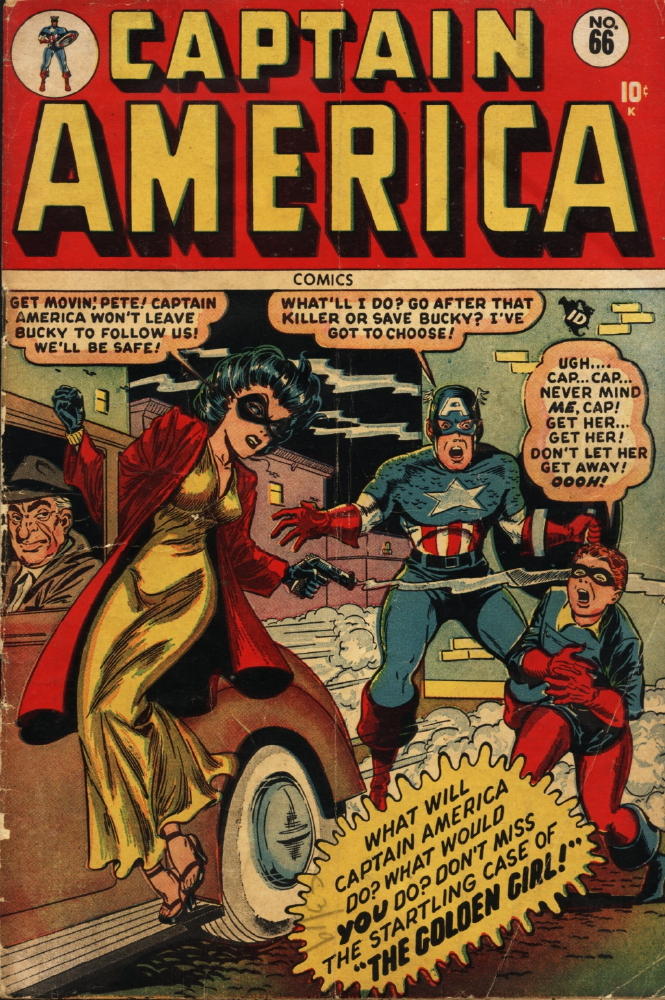
Where most covers up till this time had been about action and mayhem and kineticism, many of the covers of this era were primarily about intrigue, and surprise, and anticipation. In some cases, the visuals are almost secondary, an afterthought to the story concept. The CAPTAIN AMERICA cover at the left is a good example of this theory in practice. The selling point is the story question: does Bucky get shot? (He does, and severely enough that he’s retired in this issue, replaced as Cap’s partner by Golden Girl.) You can see Stan beginning to experiment with the sort of provocative cover copy and blurbs that characterized the Marvel covers of the early ’60s here—some covers of this era have upwards of 800 words of text on them!
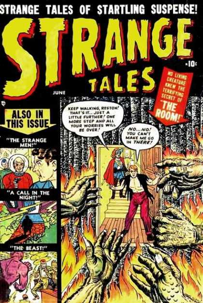
The same sort of approach held for the anthology titles—only more so! It wasn’t uncommon for a cover not only to spotlight the most compelling tale in the issue, but also to do vignettes of all the others. This tended to lead to covers where the illustration tended to be subordinate to the text—the STRANGE TALES cover at the left is difficult to see from any sort of a distance, and almost seems to give you the hard-sell when you get up close to it. But this is what they thought would best sell the magazine at this period.
As the years rolled by and you got into the 1950s, especially after the Senate Subcommittee hearings on comics prompted the creation of the Comics Code, you tended to most often get a combination of these two approaches on a cover—what I’d call a hybrid approach. This was an image that was story-specific in nature, and had word balloons or copy that gave them context, but which might not actually be reflected in the stories in the issue. This certainly liberated artists and editors to dream up the most eye-catching or provocative images they could imagine for their covers—but it also led to a certain amount of reader dissatisfaction, when a buyer discovered that the compelling moment he bought the book for didn’t actually take place in the issue, or happened under circumstances wildly different from what the cover promised.
More later.
Tom B
0 (0)
Report
