A post from my long-ago Marvel blog, the start of a series on bad comic book stories I had written.
Bad Comics I Wrote: Avengers #383
April 28, 2007 | 1:00 AM | By Tom_Brevoort | In General
Appearing for this week only, it’s time to delve into the musty past for more stories of the comics of yesteryear gone wrong. Yes, this week’s theme is going to be BAD COMICS I WROTE.
First off, a simple ground rule: I’m going to be discussing some of the conditions surrounding these bad comics, but don’t in any way think that I’m trying to pass the buck on them. They’re bad because I made them bad–it’s just that other people may have helped along the way, as we shall see. But the final blame rests with me. Got that? Okay.
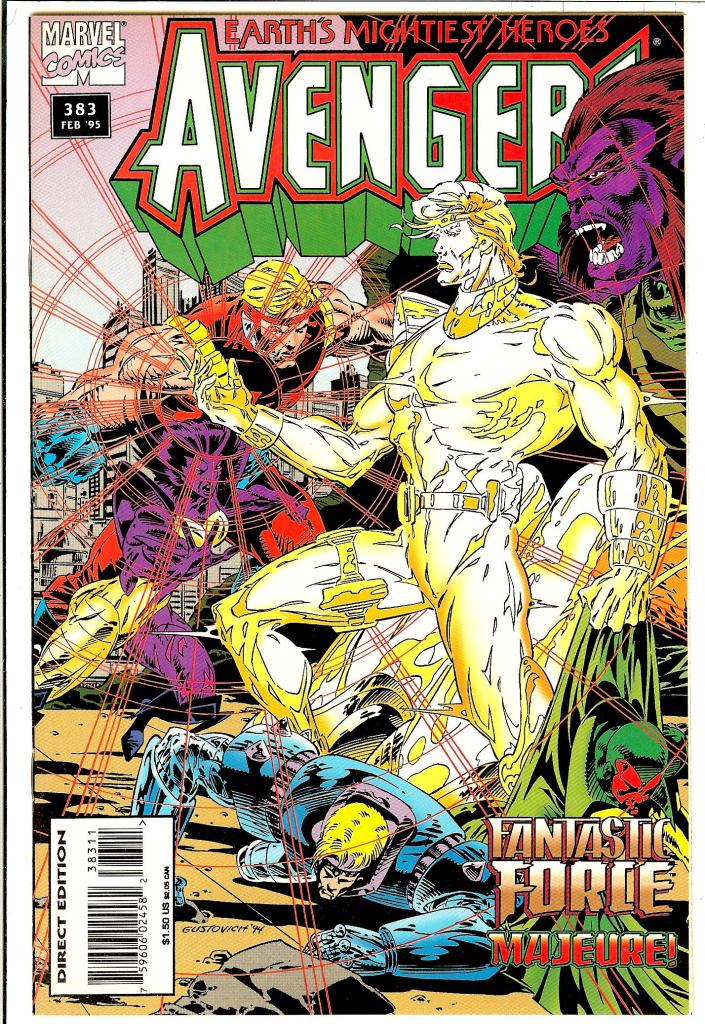
Our inaugural selection is AVENGERS #383, fittingly enough since I’m now the person who’s edited more AVENGERS comics than anybody else. But back in the early 90s, this was my first real point of contact with Earth’s Mightiest, and it’s a botch-job.
At the time, Bob Harras was the regular writer on the series, and Mike Deodato had just come on board as artist, following Steve Epting. Bob and Steve had just wrapped up a long and well-received storyline featuring the Black Knight and Sersi and a group of villains known as the Gatherers. But following that, Bob’s workload as X-Men Editor was growing to the point where he needed to bring in Terry Kavanaugh to help him out with writing AVENGERS–but before that could happen, I got drafted to write a fill-in issue.
At the time, we were in the process of launching the FANTASTIC FOUR spin-off series FANTASTIC FORCE (more about that later on in the week) and AVENGERS editor Ralph Macchio thought this would be a good opportunity to showcase those characters in another title and thus bring them to the attention of more readers. His intentions were good.
Unfortunately, I had never dealt with this large a cast of characters before–a full team of Avengers coupled with a full compliment of Fantastic Force members. Additionally, the Avengers roster of the day was made up mostly of latter-day heroes, people that I didn’t have a whole lot of connection with.
Additionally, the artist of the issue apparently worked one page at a time–by which I mean that he didn’t read ahead in the script before drawing, to see where the story was going. So a key turning point in the story in which the villain of the piece removes his helmet to discover that he’s been turned into an empty suit of armor manipulated by sentient energy doesn’t come off at all, as the artist designed the character with an exposed face and no helmet.
There’s also a staggeringly bad bit of exposition when Deathcry leaps into a room through a hole in the wall and states her name and background.
That’s a pretty unattractive AVENGERS logo, too.
More later.
Tom B
0 (0)

I’ve made peace with all of my trespasses from the 90’s. AT least yours were entertaining ^_^
LikeLiked by 1 person
I have to agree – the logo is pretty bad. lol. I hate to admit this: the 90s in my opinion seemed like a bad time for artwork specifically at Marvel but I digress. Back to this issue , In your opinion should the Title logo overlap with the artwork…? Maybe as a watermark or semi-transition overlapping…? I’m going to purchase the digital version but is there anything wrong in regard to the layout, specific panels, etc. As always thanks for sharing!
LikeLike
I have this issue. It was actually fun. And I think Deathcry’s entrance works fine. I hadn’t read much in the way of Silver or Bronze Age stories at this point, so I had no clue about “the War of the Three Galaxies” so some helpful exposition was appreciated.
Interesting background about why the villain was wearing a headband, um, I mean a photo-mesonic regulator instead of a helmet. I suppose there’s a lesson to be learned here: If you’re writing a comic book script and a character needs to have his face covered by a helmet so there can be a dramatic unmasking later then indicate that at the very beginning so the penciler doesn’t miss it.
LikeLike
ugh… that “art”
LikeLike
Everything about that cover is confusing and unpleasant.
LikeLike