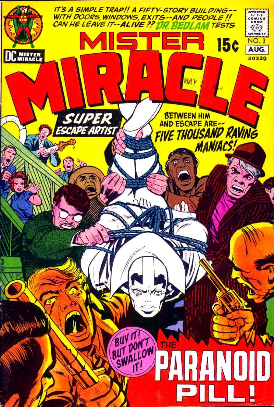
When Jack Kirby went over to DC in the early 1970s, he wasn’t a great fit in terms of the office’s aesthetic, and they often had no idea what to do with him or his work. Take this MISTER MIRACLE cover, for example. For some reason, they decided not to color the central figure, but rather to leave him black and white. It does make him pop on the cover, but it’s a really weird choice, it makes the whole cover seem unfinished–it feels like a mistake or a printing error rather than a creative choice.

Great cover? Not so great? This is one of those times when it might be either. Possibly because nothing could dissuade me from buying each issue of each Kirby 4th World title. Possibly because my teenage self was convinced that someone(s) at DC was determined to sabotage Kirby’s titles. And in those days of flipping through the racks (hopelessly crushing the comics’ spines) dynamic covers made the difference in purchase. At least until the next year, when I could drive, get a job, and significantly increase my comics budget.
LikeLike