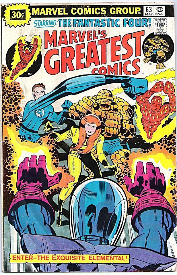
DC weren’t the only ones who could louse up a perfectly good Jack Kirby cover in color, Marvel did it occasionally as well, as on this FANTASTIC FOUR cover. Knocking all of the other elements back to browns and reds definitely helps Crystal to pop as the center of the composition, but it’s actively unattractive. Compare it with the same cover colored for the reprint of that issue in MARVEL’S GREATEST COMICS. That coloring isn’t anything special, but it does show that the image could have been colored more normally and still been effective.

