
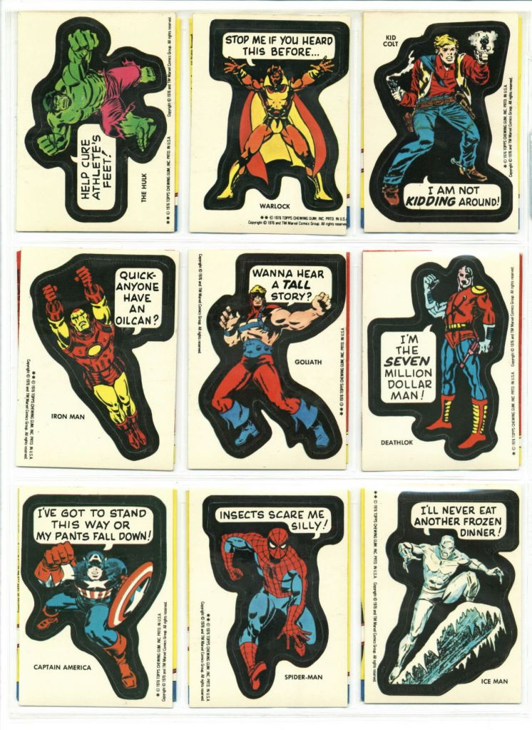
The first run of Topps’ Marvel-themed super hero stickers had been a solid success, which meant that they decided to do another run the following year. Like the first run, these stickers came five-to-a-pack with a piece of stiff chewing gum, and each one featured the image of a Marvel hero with a quasi-comical word balloon added to it. Somehow, these balloons didn’t come across as mocking the characters per se but rather conveyed the idea that Marvel was secure enough to laugh at itself, a good trick.


As with the first run, this second series (now named MARVEL SUPER HEROES stickers so as to garner a bit more brand recognition) also included a card in each package that depicted 1/9th of an image that had to be assembled. This time out, the image in question was the cover to CONAN #1 by Barry (Windsor-) Smith

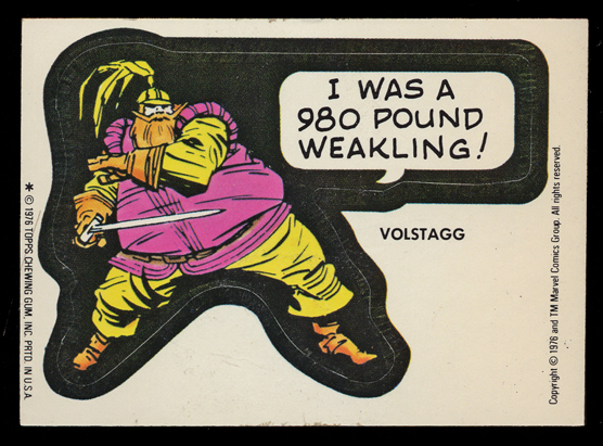
As before, all of the cards used pick-up art, figures that had appeared on covers or pages in pre-existing Marvel comic books rather than being newly-drawn for this set. As with the first set, this gives us a relatively good sense of what the Marvel Universe was like and what the Marvel publishing line was focused on during this period.

As with the previous set, there were certain cards that carried multiple different slogans on them during the run, such as the Loki card above.

Same thing here with the Conan card.
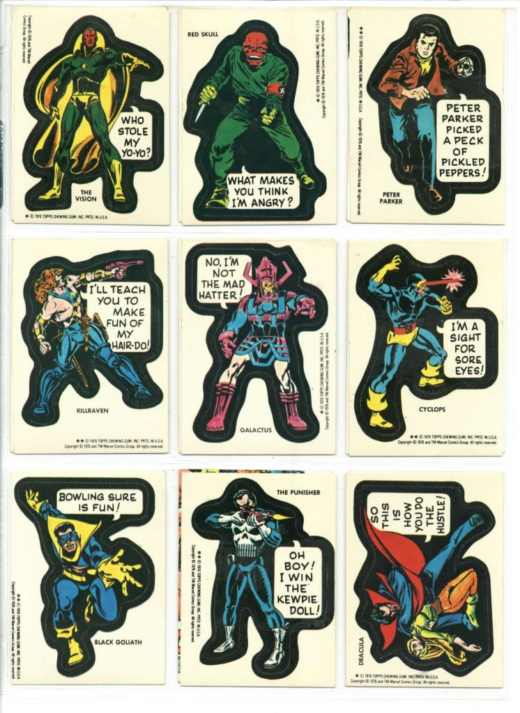
I’m kind of amazed that they left the swastika on the Red skull sticker.

And the same thing here with Hercules.

And here are two other variant slogans.
This 1976 set was the last one in this line of stickers, but the results of it seemed to stick around for many years thereafter, affixed to books and doors and lockers and all manner of places.

I got a bunch of these when I was 7 or 8 years old and put them all over my dresser. (In retrospect, I’m stunned that my parents allowed that.) Of course, a few years later I had to remove them all, which was a lot of work.
LikeLiked by 2 people
presumably, a licensed character would not have the kind of prominence in a project the way Conan was in this.
LikeLike
Looking back at this, I kinda wish the figures didn’t have the black background and the thick line. Maybe that was to keep the character within the bleed boundaries … but it sort of takes away from the art.
LikeLike
These stickers were 3 + 1 puzzle piece card to a pack plus a stick of gum, not 5 stickers.
LikeLike
There was a sixth variant. The second was Luke Cage saying “Two all beef patties, please.”
LikeLike