
And so, we come to the end of the line. This is the final issue that I got in my Windfall Comics purchase of 1988, where I bought a box of close to 150 silver age comics from a guy I bumped into at the post office for $50.00. And it’s a good place to sign off, as it represents the moment when the Silver Age first began to give way to the Bronze Age, even though that transformation was still a few years off. This issue of ACTION COMICS represents the first Superman cover produced by artist Neal Adams, who would become associated with the character. Neal’s more realistic interpretation and modern approach helped bring the Man of Steel more in line with the times. Though here, he’s still illustrating the sort of kid-oriented story that was editor Mort Weisinger’s stock in trade. The look of the Annihilator’s juvenile delinquent son feels at least a decade out of date by 1967 when this issue came out.

What’s more, the actual story was illustrated by Wayne Boring, whose artwork also felt like a throwback to an earlier decade. So the visual disconnect between the cover and the interiors is massive. The story is the middle portion of a three-part adventure written by Leo Dorfman. By the latter 1960s, Mort had softened his opinion on continued stories and started to produce them regularly, particularly in ACTION COMICS. This one involved a new enemy for Superman, the Annihilator, and his similarly super-powered son.

The Annihilator is biochemist Karl Keller who lucked into some strange chemicals from Krypton that gave him an explosive touch. What’s more, Keller’s form is so charged with explosive energy that if he’s struck by Superman or shot by the authorities, he’ll explode like an atom bomb. So Superman can’t confront him directly, and he’s forced to protect the Annihilator from the rest of law enforcement as well as the criminal goes about his wave of crime. At a certain point, on a whim, the Annihilator decides to adopt a juvenile delinquent, Pete, as his son as a part of his secret identity cover. The kid is only too happy to have a super villain as a foster father, but he’s also sharp enough to realize that his new dad’s powers come from those chemical vials, and swipe them.

Quick pause here for another DC House Ad, this one for its short-lived licensed version of BOMBA THE JUUNGLE BOY. As super heroes cooled as a genre in the marketplace, DC and other publishers were actively struggling to find another category that would hit big and keep them in business.
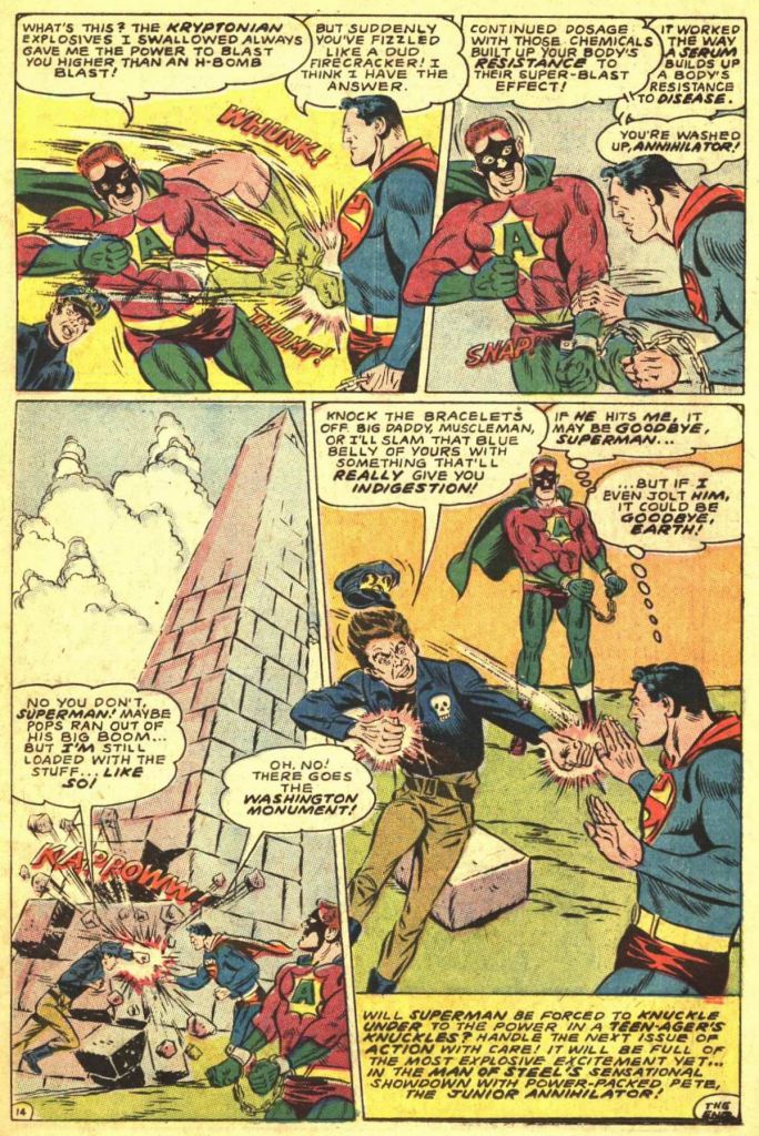
The end result of this is that the Annihilator loses his power just before he can fatally strike Superman with his explosive punch. The Man of Steel theorizes that the Annihilator has built up a resistance to the chemicals that gave him his powers, but Pete dissuades him of that idea by demolishing the Washington Monument with one punch. So now Superman is back in the same situation that he was in at the start of the story, but with a volatile teenage no-goodnik in the driver’s seat. And that’s where Part Two is To Be Continued next issue! This story contained a decent amount of action, but it still felt like a throwback to some earlier age, a misguided attempt to appeal to the youth culture of the time, and woefully out of step. it’s also an instance where the cover illustrates the final moment from the story, a complete cheat to the reader that would require them to seek out the next issue if they wanted the closure that they thought they were buying.

Next came the Metropolis Mailbag letters page for the issue. It’s a pretty average representation of the page with not a whole lot to call out about it. So let’s move on.

The Supergirl story in this issue was written by an author who was a little bit more plugged into the times, that being college student Cary Bates. Here, he joins with artist eternal Jim Mooney for a story in which the Maid of Might appears to be losing her super-powers. But the eventual twist is even crazier than that. Returning from a mission overseas, Supergirl finds herself tired–something that should be impossible for her given her powers. As she goes about her business over the next couple of days, she finds her abilities waning as she uses them–they aren’t as potent as they should be, and they’re fading all the time.

A time out at this point for a house ad for TEEN BEAT, DC’s attempt to start up a magazine dedicated to popular teen culture. It wound up having to change its name to TEEN BEAM after an issue due to a conflict with another publisher. And while it represented another attempt for the firm to diversify its output, it was a bust as well.

After Supergirl gets weaker and weaker, she eventually falls out of the sky. Luckily, Superman becomes aware of her situation and flies to her aid. Unfortunately, this is a day he’s been dreading. When Kara recovers, superman tells her the truth: that she isn’t a human being at all, but rather an android created by her father Zor-El of Argo City to assist Superman on Earth. But the power source that Zor-El used to give his android super-powers was finite, and now it’s almost all used up. It’s a pretty crazy explanation, but Superman and Supergirl both treat it as being absolutely true, and Kara is heartbroken about this revelation concerning her true nature.
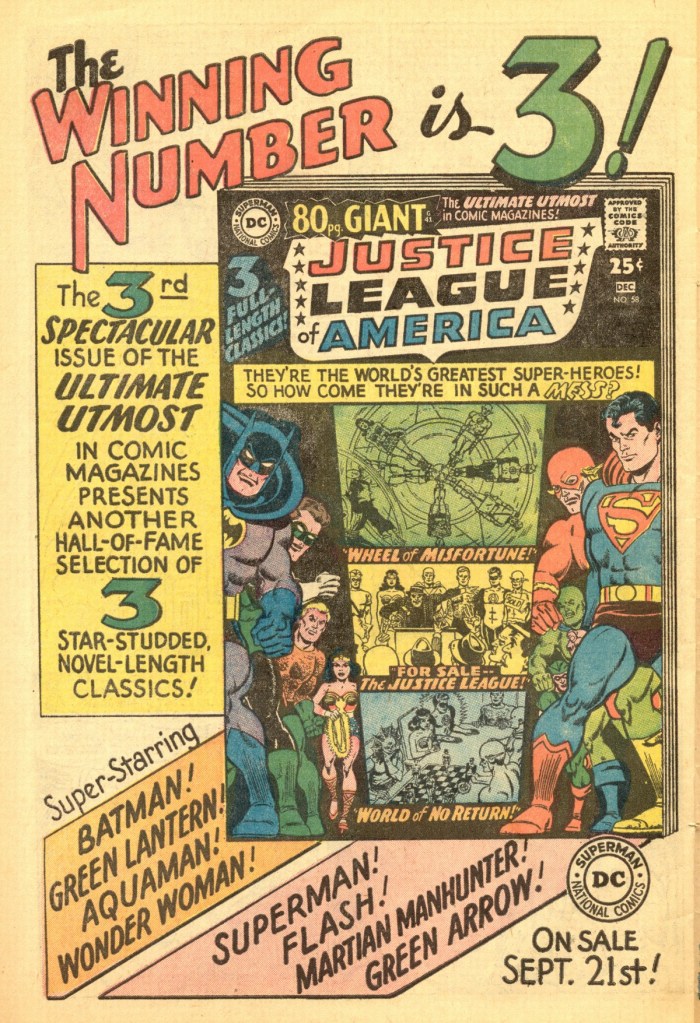
Another stop here to remind readers that the Justice League of America will be starring in the next 80 Page Giant filled with classic reprints. There are some weird proportions on that cover, particularly on Superman and the Flash.

Anyway, a short time later, Supergirl’s android body runs out of power and crashes lifelessly to Earth. And then Superman wakes up–this has all been a dream that he’s been having, not reality at all! Whew! He heads out to rendezvous with his cousin for an engagement they have, and is horrified to come across her lifeless android body! Oh, no, it IS true after all! And that’s when Supergirl wakes up from the dream that SHE’S been having, a dream that included the dreaming Superman. It’s a strange double-bluff that doesn’t do all that much to disguise the fact that this entire story was nothing more than a dream (but not a hoax or an imaginary tale!)

The Direct Currents page is back again this time, and we can see the beginnings of the changes to the DC line. Notably, the cover images are less staged and more visceral, more in the manner of this issue’s Neal Adams cover. This was part of an attempt to make DC’s wares more appealing on the stands. Carmine Infantino was brought on as cover designer for the line, creating sketches that were stronger on visuals and with less emphasis on story concept to sell the issue. This was the beginning of his rise to power within DC.

And the inside back cover features an ad for DC’s efforts in television, including the SUPERMAN/AQUAMAN HOUR OF ADVENTURE, which would also include segments starring the Flash, Green Lantern, Hawkman, the Atom, the Justice League of America and the Teen Titans. And of course the live action BATMAN television series, then entering its third and final season, was also spotlighted, including new addition Batgirl.

For all the (justified) mockery Bob Haney gets over his teen slang, Dorfman’s JDs make Haney look like a documentary on youth culture. It’s also ludicrous how quickly Annihilator and Junior jump from a marriage of convenience (so to speak) to a father-son bond.
LikeLike
“The look of the Annihilator’s juvenile delinquent son feels at least a decade out of date by 1967 when this issue came out.”
The Annihilator himself looks pretty creaky, too, and someone should have pointed out that his mask looks like it’s got a fake Groucho mustache built in.
LikeLiked by 1 person
That was to hide his actual mustache. No, really.
LikeLiked by 1 person
That mask is so messy that it looks like it was drawn on at the last second to correct an error of some kind!
LikeLike
Great post. Agreed w/ Tom’s description of this feeling like a throwback, even at the time it was published (Wayne Boring played an important role in Supes’ history, though). Same for Kurt’s calling out the “Groucho” mask. I did like the Jim Mooney stuff. I think it’d have popped more w/ inks by Bob Oksner, but maybe Bob wasn’t in the biz then.
LikeLike
Oksner’s comics career started in 1943 (if not earlier), but as of the November 1967 books he was sort-of out of comic books. At least in that his time was taken up drawing the short-lived SOOZI newspaper strip, an assignment he rapidly came to hate and was glad to see canceled.
But even if he’d been doing comic books at the time, he wouldn’t have inked Jim Mooney; Mooney inked his own stuff. I think he may not have inked anyone else until he went over the Marvel, and didn’t have his pencils inked by anyone else until years after that.
LikeLiked by 1 person
Thanks! 🙏 I didn’t know all of that. I thought I’ve seen Mooney credited as an hour inker for others, too. And that Marvel has others ink him, too.
Oksner, too. I’ve liked his thick, crisp, clear inks for as long as I can remember, which is probably only a 1/3 of his career. I’ve seen his inks over his own drawings, too. But I like the sharp clarity he brought to other artists’ stuff. He & Dave Hunt were 2 Old School artists whose styles still worked really well for/with other artists’ work, that came up decades after Jim & Bob started.
LikeLike
I can’t remember seeing Oksner as an inker but it would have been early on in my reading so credits were often overlooked. Hunt though is one of my all-time favorite inkers. He could make anyone look their best or even better. I actually preferred him on Byrne over Austin. Austin was good but he added his style over any artist he inked, unlike Hunt.
LikeLiked by 1 person
Oksner ‘s credit w/ separately inking Win Mortimer, Jose Delbo, & Mike Sekowksy on Supergirl in “Adventure Comics”.
Curt Swan, Kurt Schaffenber even Keith Griffin in “Action Comics”.
Also Carmine Infantino on Supergirl & on Flash.
Don Heck on Wonder Woman.
Over JLGL on “Superman”. I wanna see that.
Chuck Patton in a “Secret Origins” issue of the CotU.
LikeLiked by 1 person
Wow, I’d never have guessed that was an Adam’s cover at first glance.
LikeLiked by 1 person
Wayne Boring’s Superman has never appealed to me… I tend to call him ‘barrel Superman’ as his midrif got wider and wider (while at the same time his forehead got smaller)… But on the other hand – while George Reeves’ TV-Superman may look ‘off model’ to modern eyes, he was a very good personification of the Boring Superman…
LikeLiked by 1 person
I’ve always thought Supes should veer more towards Steve Reeves (Hercules). Steve Rude’s Superman reminds me of Steve Reeves. Though Rude’s version also calls back to Shuster’s.
LikeLike
“Boring Superman”?? You think Superman is boring? 😉😅🙄🤔
LikeLike
Well, the weird thing is – I reread the few 1970s issues I had of Superman of when I was a child, and enjoy them, but when buying a lot from the same period on ebay I quickly lose my patience with them… Steve Reeves – I did a photoshop mock-up of him as Superman, many years ago. He’d have been an awesome Superman, physically… What I mean is that George Reeves does match the Superman of the time, Boring’s – including the peculiarly flat profile…
LikeLiked by 1 person
Agreed on G.Reeves & W.Boring’s version. And I’ve found whole chunks of Superman runs a little boring. As much as I like the character, not every writer can really provide what satisfies me about it. And it the art has to work.
But what I think works doesn’t for everyone . I still can’t figure out why ‘Ringo’s & Carlos Pacheco’s (w/Kurt!) weren’t the loudest buzzing runs. Those were high points to me. I can take a wide range of visual interpretations or Supes. Both of those had their own inherent appeal
LikeLike
I grew up watching batman and superman.
I have also publish an article (10 best supervillains in dc comics), do read and share your comments
https://gobookmart.com/top-10-female-supervillains-in-dc-comics/
LikeLike