
Some recent comments by reader and historian Ferran Delgado prompted me to go back and to take a closer look at DAREDEVIL #1, the last of what we would consider the formative Marvel titles to be launched and one that was plagued in its delivery by a variety of delays. I’ve written about those delays here before, twice, but I will give a short recap as we go here for anybody who may not be aware. It was intended to have been launched in 1963 alongside either X-MEN or AVENGERS depending on which theory you happen to believe, but it didn’t manage to make its way to store shelves until February 2nd, 1964. And it’s a bit of an all-hands-on-deck job. So let’s see what, if anything, we can discover by looking a bit more closely at this final issue.

The first thing to understand is the pre-history of DAREDEVIL. In the 1940s and 1950s, an earlier DAREDEVIL was one of the most consistent and long-running series of the era. The character was created by the Jack Binder shop as a back-up strip in SILVER STREAK COMICS #6, thereafter popularized by Jack Cole, who put him up against the star of another feature, The Claw, and finally turned into a surrogate father figure to a kid gang of Little Wise Guys under the watchful eye of Charles Biro. By the 1950s, Daredevil himself had exited the strip, and the Little Wise Guys headlined until publisher Lev Gleason got out of the failing comic book business in 1956. The first seeds of the Marvel DAREDEVIL lie here.
As the story is told, in 1963 as Marvel’s fortunes began to improve on the backs of the new super hero titles, in particular FANTASTIC FOUR and AMAZING SPIDER-MAN, publisher Martin Goodman, whose pattern was to milk dry any trend in publishing that he found, instructed editor Stan Lee to come up with a knock-off of FF and a knock-off of Spider-Man for them to publish. These two books would become X-MEN and DAREDEVIL, respectively, and you can see on both the cover and the splash page that Lee tries to make the connection between Spider-Man and Daredevil overt. He even guest-starred the sightless hero in an issue of AMAZING SPIDER-MAN early on in the sort of cross-promotional effort that was becoming a typical part of the Marvel playbook.
So Goodman wanted another Spider-Man, and apparently he even had an idea as to where to get it. He told Lee that he’d made some investigations and that the trademark and copyright to DAREDEVIL had been allowed to lapse. Goodman thought it would be a good idea to pick that character up–perhaps he was equating the golden age Daredevil’s completely masked costume with that of the similarly covered up Spider-Man. But either way, that starting point was given to Lee. Goodman didn’t care whether Lee used the same Daredevil or made up a new one. Lee’s firs stop was to Steve Ditko. According to Ditko, Lee put the proposition of launching the new Daredevil to him, saying he could either bring back the original or do something new so long as it was kind of like Spider-Man. But Ditko was then busy with Spider-Man and Doctor Strange and the Hulk serial he had started in TALES TO ASTONISH, and so he turned the assignment down.
ADDITION: Mark Clegg points out that the Hulk serial in TALES TO ASTONISH was still a ways off, and so wouldn’t have been a factor in Ditko’s decision.
From here, Lee apparently turned to his superstar Jack Kirby to at least design the new character. Kirby’s design sheet was ultimately reworked into the bulk of the final cover image, albeit with many alterations made to it. But for whatever reason, Kirby too didn’t end up working on DAREDEVIL regularly. it could be as simple as Kirby not wanting to pick up somebody else’s idea, as they’d be doing in this instance. At this point, Lee’s mind fastened on Bill Everett, the creator of the Sub-Mariner. Everett had left comic books years before and now had a day job at a greeting card company. But before that, he was a jack-of-all-trades and one of the best cartoonists in the field. He could write, pencil, ink, and letter–the whole package. And if he were to return to Marvel, it wouldn’t overtax the Bullpen’s already thin resources. It also helped that Martin Goodman always had a bit of a soft spot for Everett personally.
As fortune would have it, Everett was interested in doing a bit of moonlighting, so Lee sent him Kirby’s design drawing to start with and the two men began to brainstorm on the new feature. Everett’s own daughter Wendy had been born visually impaired, and so that inspired Everett to make the new Daredevil blind. He also reworked the costume, adjusting Kirby’s design as he inked the cover image. The idea here was that he was going to illustrate, ink and letter the new title. (It’s possible that Everett was scripting the early pages of DAREDEVIL #1 as well, but going over them, I don’t think that’s the case. Looking at the copy, there are too many of Stan Lee’s rhythms in them for them to not have been written by Stan, even in the earlier versions lettered by Everett.)
Unfortunately, whether because he simply couldn’t get enough work done on it given his day job or because of the alcoholism that he struggled with all of his life, Everett missed the deadline for DAREDEVIL #1, leaving Lee to scramble to get either X-MEN #1 or AVENGERS #1 together in time to make the print date–in that era, if you booked print time, you paid for it whether you printed something or not, so there needed to be a book on press regardless. In the end, even after a number of additional months, Everett still didn’t have DAREDEVIL #1 finished, and he wound up handing over everything that had been completed to Lee in a state of disarray. Lee was forced to enlist the aide of Steve Ditko and production man Sol Brodsky to help finish up the inking and the backgrounds on the issue, so that it could finally go off to print.
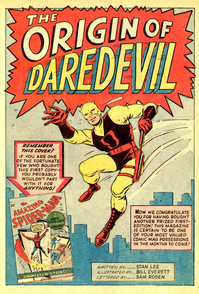
Everett had also loused up the splash page to the story while he was inking it, making it ususable. Rather than trying to salvage the image, Lee had a new opening page built out of scraps. A stat of the Kirby/Everett design sheet figure from the cover was made, the cover to AMAZING SPIDER-MAN #1 was added in the corner, and Sol Brodsky drew a crude skyline behind it all. This wouldn’t win any awards, but it would make do for the page.

So here’s the first actual story page of DAREDEVIL #1. As you can see, on the original artwork the paste-up new lettering by Sam Rosen has fallen off in several places, revealing Everett’s original lettering underneath. From what I can piece together, it looks as though Everett lettered the first 8 pages or so of the issue and then stopped–and so when Lee had to call in Rosen to complete the rest of the job, he had him go back and redo the opening pages as well so that the style would match. In every instance where I’ve looked at this, the copy appears to be the same, so nothing was being changed in the switch-over except the hand of the letterer.

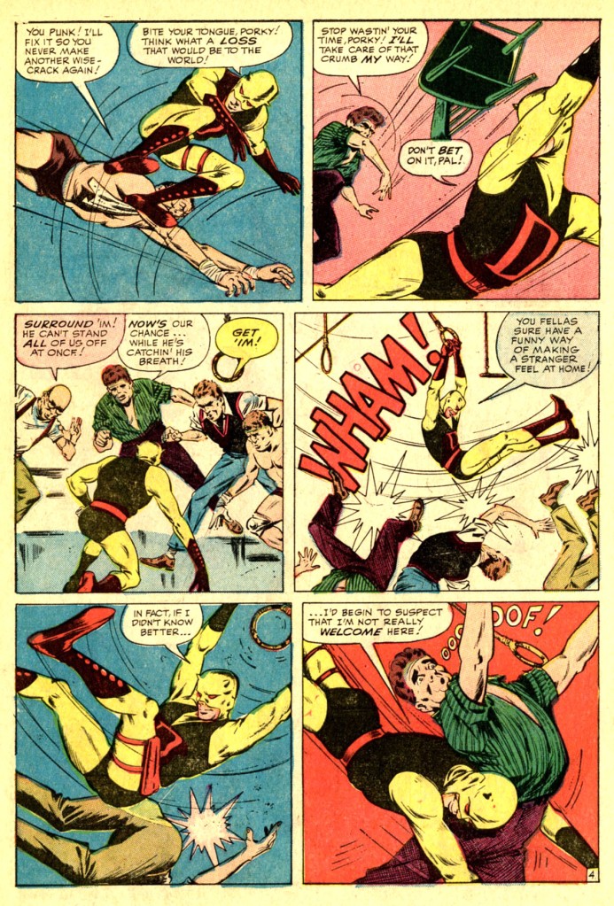

Yu can see that even on these early pages, there are a lot of spare, sparse backgrounds. I’d be willing to bet that Brodsky or Ditko made some additions on Page 2’s backgrounds and in a few places here as well. Also, you find the occasional balloon which is an odd shape or has odd dead space in it. This is no doubt due to the face that Everett’s lettering tended to be larger and take up more space than Rosen’s which replaced it.

Here on the original artwork to Page 6 we can see that Everett is still doing the initial lettering. There are also a few border notes visible at the top of the page running down for scripter Stan Lee just what is meant to be going on in each panel. The two fragments that can be read say ENVIOUSLY WATCHES SCHOOL TEAM PRACTICE and UNCONSCIOUSLY BEGINS TO RESENT PROMISE TO DAD
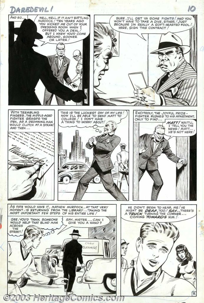

By story page 8, however, Sam Rosen is lettering directly on the boards, so it seems as though Everett only lettered the first section himself. The rest of the issue is lettered this way. On Page 9, a couple of changes are evident on the original. The second panel has been expanded on the left side and slightly at the bottom, indicting that it was already drawn for someplace else and then cut and pasted in to replace or shorten a sequence. In non-repro blue pencil at the left top margin there is an indication that something in this sequence is meant to be cut from the scene–likely some moment in the pencils that Lee didn’t care for. At the top of the page is a note from Everett: THIS PAGE IS ROUGH BECAUSE YOU HAVE SEEN THE PREVIOUS PENCIL–FUNDAMENTALLY, THERE IS VERY LITTLE CHANGE. There’s also a new border note from Everett: MATT LEAPS OVER HOOD OF CAR. There’s also a fragment by the next panel: OUT OF WAY. The final two panels on this page were cut out and pasted in here from presumably later on in the story–so it’s likely that this origin sequence was originally a longer affair and Lee had Everett cut it down to what we see here.


There’s more cut-and-paste here on Page 10. The top tier of this page was wedded to the bottom 2/3 of a later page, so again some sequences were cut out. That first panel on the page was also extended slightly on the right side and top. Page 11 is also a hatchet job. The first two panels were cut and dropped in individually, meaning they may not have been next to each other originally or even on the same page. Panels 3 & 4 were cut out together, dropped in and extended–it looks like either a caption or another element was cut out of the bottom of Panel 4 from wherever it was taken from originally. The fifth panel again is an individual unit pasted in, and then the final two panels together form a unit. I wonder if Everett was more leisurely in establishing the background and the world of his protagonist, and Stan Lee was in more of a hurry to get to Daredevil in costume, as the audience might be.
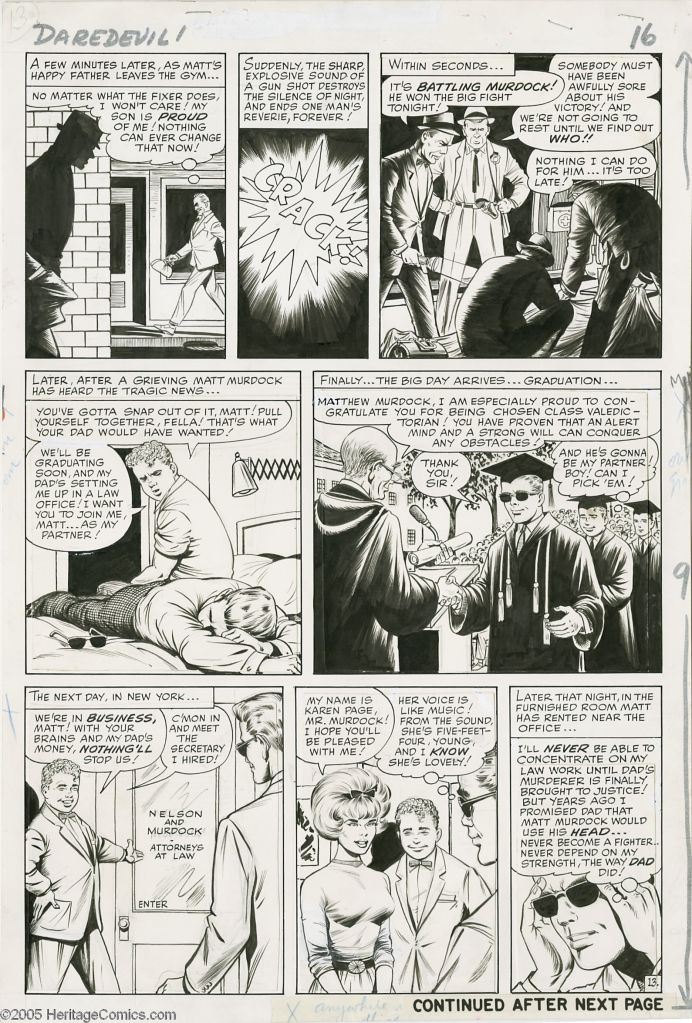
This is one of the most complete looking pages in the job. But it still had some work done to it. That middle tier is comprised of two panels that were cut and pasted from elsewhere and extended on the sides to fit. Panels 6, 7 and 8 are the same way. It may be that some of these panels had been drawn on different tiers together and wound up being cut and moved either because Lee wanted to eliminate a panel or panels or because he wanted to add a panel or panels into the sequence. There are some notes in non-repro blue in the margins asking for blacks to be spotted anywhere there was an X, an indication for where either Brodsky or Ditko should finish things up here.


I’ve never come across a scan of the original artwork to Page 14, but it seems clear that it was cut and pasted as well, in that some of the way the panels are arranged doesn’t follow basic sequential storytelling. Those stacked panels on the top tier smell of Lee squeezing in information, and the way the bottom four panels are all on different levels doesn’t feel deliberate either. I also wouldn’t be surprised to learn that the top tier on Page 15 had been attached to a different lower 2/3, as there does seem to be a bit of a disconnect similar to what we’ve already come across elsewhere.


As we move into the back of the book, you can almost see the background disappearing. I’d be willing to bet that Brodsky added most of these in, apart from maybe the street scene behind Foggy on Page 18. The way the background lines converge on that one mob guy in Panel 1 of Page 17 is especially sloppy. Ditto the crude background in Panel 4 of that page. And I’d be willing to bet that the middle two panels of tier two on Page 18 were redone to add in the additional action at Lee’s request.


And then the final three pages of the story seem pretty straightforward, without a lot of reworking done on them.

I did want to talk about the cover a little bit more, as like the splash page, it appears to have been cobbled together from multiple sources drawn by multiple hands. As I’ve already stated, the main image is the reworking of Jack Kirby’s character design sheet, with the costume modified by Everett. Everett also made the lead gangster there resemble the Fixer on the inside of the book. Some of the goons in the background do have a little bit of a Ditko look to them, which makes me wonder whether Ditko might have inked them–it’s possible, though, that Everett’s approach and Ditko’s is close enough to cause confusion. In the lower right, there are three vignettes, one of Matt, Foggy and Karen, that sure look as though they were clipped out and composited together from somewhere else. These shots don’t appear within the book, so I expect they must have been grabbed from Everett’s character sheets for these characters. The Spider-Man head and figure isn’t by Kirby or Everett, but by Sol Brodsky, one of the reasons it looks somewhat off-model and a bit funky. And the Fantastic Four heads were cribbed from the corner box of their own magazine–except for Sue’s. As Will Murray pointed out, that isn’t a Sue Storm head at all. Rather, it’s a Millie the Model head that’s been used in Sue’s place. So that means that yet another artist contributed to this cover in a minor way, Stan Goldberg. (Goldberg would have been the person coloring the issue anyway.)
After a rocky start and a rocky first couple of issues, DAREDEVIL eventually stabilized and went on to become another cornerstone of the Marvel Universe. But as we see, it was a troubled birth, and it took a veritable army to bring this first issue to the readers.

hi Tom! Thanks for that the highly entertaining history lesson! On page 2, do you think it’s possible Ditko worked on more than backgrounds? Some of the figures in the fight resemble Ditko’s style – as opposed to later in the issue.
LikeLike