
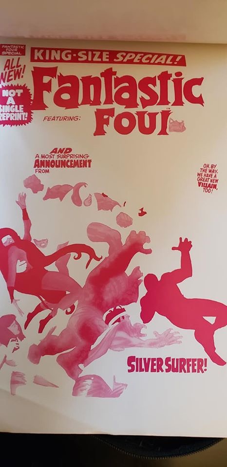
I saw this posted by its current owner and I thought it was worth both sharing with a wider audience and explaining in a bit greater detail. What you see below is the 3M proof for the cover to FANTASTIC FOUR ANNUAL #5. Also sometimes called a progressive proof, this would have been sent to Marvel prior to printing to check the color separations and make sure that everything was in order before the presses rolled. These proofs were only supplied for covers–on the interiors, you might get much simpler thermal proofs to look at or even no proofs whatsoever. But the cover was considered the most important part of the magazine, the thing that sold it, so extra care and effort was taken there.


The proof contains four sheets of acetate, one for each of the four ink colors used in printing. Up until the mid-1980s when the Direct Market made it financially feasible to put more money into the product, comic books were limited to a palate of only 64 colors–those colors being achieve by percentages of the three primaries, Cyan, Magenta and Yellow, along with a black plate for the linework. You were permitted to have 25%, 50% or 100% of each color in a particular area (though you couldn’t exceed a total of 250% without damaging the paper–most outfits never built colors that came even close to that.) So if you wanted a primary green, you needed to combine 100% yellow with 100% cyan to make what would have been coded on the color guides as YB.


These limitations account for why much of the coloring done during this period falls into the category of what we used to refer to as “sky-blue-grass-green”. In other words, the coloring wasn’t being employed as a storytelling tool so much as it was simply filling in the open spaces in the lineworks. Everything was colored naturalistically except in the most extreme instances. As time went on, the younger artists who were coming into the field, creators such as Jim Steranko, Neal Adams and Barry Windsor-Smith, began pushing the boundaries of what coloring was meant to achieve. They advocated for using the colors as a storytelling tool, to enhance the mood and atmosphere, to help transition from scene to scene, and to accentuate the dramatics of the story. Over time, this new approach got greater and greater traction (though especially in the early days, it was often done poorly by those not as talented as these three gentlemen–there was a learning curve.)

You can see here too that between the time when this cover was separated and when it was printed, a decision was made to remove those shock lines in the background around Psycho-Man and the logo. In this instance, those deletions would have been made at the printer. Marvel’s publisher Martin Goodman was a fiend for clarity and visibility on the racks, and would often make decisions to silhouette elements on the covers more greatly.

I think that Marie Severin’s work for EC is possibly the first attempt to advance storytelling with experimental coloring. (She also often used it to slightly obscure gory scenes that she thought were in bad taste.)
LikeLiked by 1 person
How much does a color separation of a late 60s Marvel sell for?
LikeLike
No idea offhand.
LikeLike
I think clarity is underrated as something you should have on a comic book cover despite the cover having far less to do with selling the comic than it did in those days. I sometimes have to study a cover on a current comic for ten or more second to even figure out what I’m looking at. (Lest you think I’m picking on comics, just study any big store’s arrays of current PS4/Xbox/Switch games, and try to figure out what you’re looking at without knowing anything about the game itself. I guarantee, you won’t be able to do it.) Composition and clarity are as important as skilled illustration, and most covers I see today simply failr at the former despite the abilities of the artists. Romita,, Kirby, Infantino, Swan and many other ’60s artists knew how to do it to sell comics. Because people don’t really care what’s on the covers now, few current artists don’t.
LikeLike
I have a good sizable amount of this kind of production art from mainly the 80’s and 90’s if you are interested or know of a possible colleague that would be feel free to contact me and let me know. My name is Michelle and look forward to hearing from you.
LikeLike