It caused quite a stir a couple of years ago when the entirety of the original artwork to AMAZING FANTASY #15, containing the very first Spider-Man story, was anonymously donated to the Library of Congress. The art was among the earliest to go missing from Marvel’s warehouse back in the late 1970s/early 1980s and nobody had seen any sign of it until this donation was made. The question of who had the artwork all this time and why they chose now to make this donation. The Library has continued to honor the anonymity of the donation, never revealing the identity of the donor but confirming that it was not Stan Lee, Steve Ditko or Marie Severin, the three most often-conjectured suspects.
I don’t really want to get into the question of who donated the artwork here. Rather, the fact that the art exists in such a publicly-accessible forum gives us the opportunity to study it more closely and see what secrets we might unlock about the creation of this story. Let me also start by saying that I also don’t intend to litigate any of the issues revolving around Jack Kirby’s involvement, or Joe Simon’s, or anybody else’s. Those issues have been well-covered elsewhere, and the chain-of-custody that begins with an unsold series in the Simon & Kirby shop in 1953 to the debut of Spider-Man in 1962 has been speculated upon in depth. With all of the principles now deceased, unless Kirby’s reported Spider-Man pages or design sheets turn up at some point (which isn’t out of the question, given that this whole book of art showed up seemingly out of nowhere) we’re unlikely to know any more.
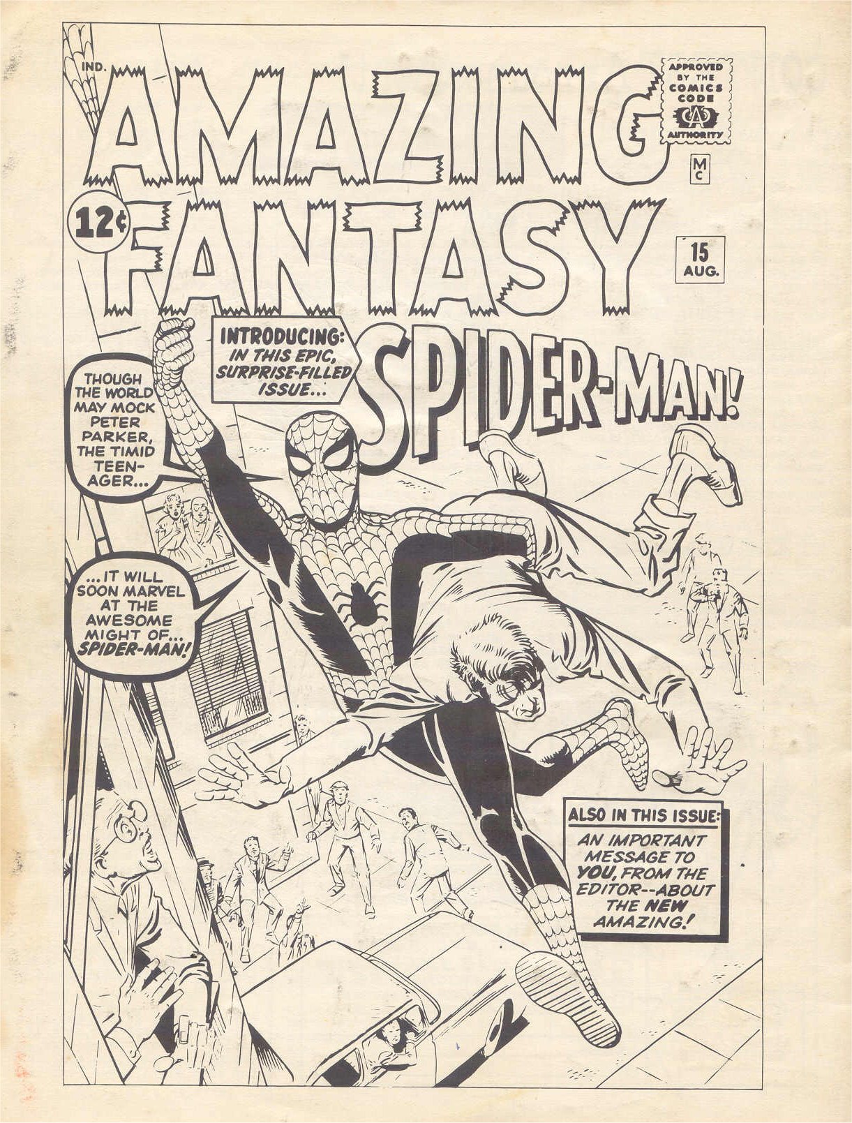
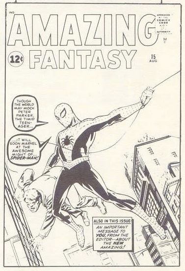

To start with, wile it wasn’t included among the materials donated to the Library, there’s the cover. The cover initially produced by Steve Ditko (seen here as it appeared in an issue of MARVELMANIA in the late 1960s) was discarded in favor of a more overtly super-heroic and presumably more salable version by Jack Kirby. I would imagine that this decision was made by Martin Goodman, as the one aspect of all of the comics that he cared about the most was always the cover, which is what sold the product. What’s interesting here is that most of the copy lettering was picked up from the original cover and statted for use on the replacement piece. The exception is that Spider-Man logo, which wasn’t carried over (although possibly that was the intention–Kirby’s original version of the AMAZING FANTASY #15 cover is shown here in the center as it appeared in MARVELMANIA in the late 1960s, and it didn’t yet have the INTRODUCING SPIDER MAN blurb on it–possibly the idea was to carry over that logo-text as well, but it just didn’t look good in the space they had for it.) That logo would wind up being used on the opening splash page, however.
Even the logo for AMAZING FANTASY was redone from the version on the original Ditko version. This is due in part to the fact that, despite what legend has often said about it, AMAZING FANTASY #15 was not intended to be the final issue of the magazine when it was being put together. In fact, researcher Will Murray was able to lay out a compelling case for what the contents of AMAZING FANTASY #16 would have been, working off of the story job numbers written on each story’s splash and used for accounting purposes.
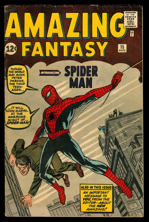
On Kirby’s final version, the clouds of the background and the motion streaks are created entirely in color. The balloons and captions have been shifted slightly to create more “air” around the central figures, and the web-line has been shortened so that it no longer traverses Spidey’s body. Tellingly, that INTRODUCING SPIDER MAN blurb has been added, but without the character’s signature dash in it–as we shall see, that dash was something of an afterthought, and barely used in his first appearance.


Here’s the first page of that first Spider-Man story, from the original artwork. And there’s that logo culled from Ditko’s cover, the one with the dash in it. But it’s clear looking at this board up close that something has changed from when it was drawn. because an entire web-pattern radiating out from the tiny Spider-Man figure at the upper right has been whited out. Examining the work more closely, custodians at the Library of Congress lifted up a corner of the logo stat to reveal a portion of the original logo as drawn on the board still in place. For whatever reason–possibly to introduce that dash as a factor into the proceedings (virtually everywhere else it appears in this story, SPIDERMAN is written as a single word, including on this page) –the logo was changed and the web-pattern removed.
Additionally, editor Stan Lee has had Ditko’s face for Liz Allan touched up on this splash page by teen/romance artist Al Hartley. Drawing pretty girls was never really Ditko’s forte, and Lee must have thought there was something lacking in the attractiveness of Liz on this opening splash.

This second page contains a bit of an amazing mystery, an instruction at the bottom of the board: BILL – SHOOT THIS PAGE TOO! – GIVE TO STRIPPER. This would appear to be a note made at the printer, but it opens up a whole can of worms. Was this page not originally intended to be a part of this story, and only added later? If you read the book without it, it still works, though there’s little characterization of Peter Parker left in that case. Or was this page somehow misplaced at the printer, having to be located and dropped in after the fact? I don’t know–but it’s pretty interesting!
There are a few other minor corrections here. In the first panel caption, letterer Art Simek left out the word A before PRETTY. In the second panel, there’s an erased note from Lee to Ditko pointing to Aunt May’s plate; STEVE – CHANGE TO WHEAT CAKES. Who can say what Aunt May had been serving before that, but the entire history of Spider-Man comics was altered with this one small correction! And in Panel 4, Lee changes some more standard number (it’s impossible to say what, though, as the white-out still obscures it well) to the more comical UMPTEENTH. And doesn’t Sally in Panel 5 look like a proto-Betty Brant? In Panel 6, it looks like SCIENCE had been misspelled.

PAGE 3. There are a couple of interesting note remnants here. In Panel 6, there’s an erased note from Lee: STEVE – REMOVE SPIDER – CHANGE POSITION OF HAND. And indeed, you can just about see the erased hand that Lee is referring to in that panel, still upraised slightly with the spider still in it. And there’s a similar erased note below the final panel as well; STEVE – MAKE THIS A COVERED SEDAN. NO ARMS HANGING OUT. DON’T IMPLY WILD, RECKLESS DRIVING. And indeed, you can just about still make out teh penciled hand of the driver, waving angrily at Peter from the driver’s side of what must have been a convertible when Ditko penciled it. There are also minor lettering corrections in Panels 2 and 8

PAGE 4. It looks as though Artie Simek misjudged his space at first in Panel 3, requiring him to white out and reletter the first balloon so as to be slimmer–the original is still somewhat visible. Panel 5 has an erased note from Lee again: STEVE – MAKE THIS A GLOOMY BACK ALLEY SO NO ONE CAN SEE HIM. Ditko accommodates in the inks.

PAGE 5. In the final panel, Simek initially lettered the second man’s balloon as a thought balloon going to Maxie the agent. This may have been the way Lee wrote the scene initially, only changing his mind later after reviewing the story and adding in a different sentiment for Maxie. Or it could simply have been an error on Simek’s part. In Panel 4, there’s a line denoting the side and back of the ring that Peter and Crusher Hogan are wrestling in that Ditko has opted not to ink, making the composition read a little bit more clearly.

PAGE 6, and the end of Chapter One. In every instance on this page, SPIDERMAN is written as one word, with no space or dash. There’s an adjustment to make a balloon slimmer in Panel 3 and a lettering correction in Panel 6, but nothing noteworthy.

PAGE 7. Again here, SPIDERMAN is consistently one word. Interestingly, Ditko creates the spider-insignia on the back of Spidey’s costume with white paint after everything but the central circle has been inked in. In Panel 3, there are a bunch of erased attempts by Ditko to get Spidey’s left hand into just the right upraised position to be firing is webbing in that direction. At the top of the page, in Ditko’s handwriting, erased, it reads AMAZING 15 SPIDERMAN PART 2 DITKO

PAGE 8. And there’s a big change on this one: that center panel close-up on the escaping burglar wasn’t what Ditko initially penciled! But let’s start with Panel 2: there’s an erased note from Lee there which reads STEVE – THIS (illegible) NO SENSE TO BE HERE (WITHOUT ANY SMILING). From the context, it seems like Lee may be objecting to the idea that this chase after the burglar is happening inside the same building where Spidey was performing. In any event, next to Panel 3 there’s an erased note from Lee that reads: STEVE – OMIT CROOK! SHOW DOOR SLAMMING! Obviously, neither of these changes was actually implemented, so presumably Ditko was able to walk Lee through his thought process for this sequence enough to convince the editor. But where Panel 4 is now, you can still see evidence of an erased panel that existed there in the pencils, It seems to be a lead in to the next panel, with the guard racing up and confronting Spidey, who has his back to the camera–the head of the guard is what can still be most clearly made out. So was this exchange between Spidey and the cop three panels long originally as Ditko brought it in? Or did Ditko rethink his own pacing before that and change it prior to Lee seeing the pencils?
ADDITION: Taking another look at this a day later, I think that note in Panel 2 actually reads STEVE – THIS (illegible) NO SENSE TO BE HAPPY (WITHOUT ANY SMILING). Seems like what Lee was objecting to was the expression on the escaping burglar’s face, which Ditko adjusted in the inks. But comparing the face with Panel 3, you can almost get a sense of how he might have been smiling in Panel 2.

PAGE 9. SPIDERMAN is still consistently one word here. Not much else to point to other than Simek having to reletter a line in Panel 6 to center it better when he realizes that DESERTED won’t fit in the space he has left.

PAGE 10. Again, some adjustments from Simek, but nothing particularly noteworthy.

And finally PAGE 11. SPIDERMAN is still one word here, and Lee writes the phrase with which he’ll one day be most identified. For effect, Ditko lets Peter’s pupils show through his Spider-Man mask in Panel 4, which is still a disconcerting effect. In Panel 6, there’s a third cop that Ditko didn’t ink in the center bottom of the panel. The reason for this omission may be found in an erased note on the left side, presumably from Simek (it’s not Lee’s handwriting, nor Ditko’s, nor Sol Brodsky’s–there aren’t many other suspects) : SORRY ABOUT THIS–HAVE STEVE LIFT IT UP! with an arrow pointing to where the bottom caption is going over much of that third cop. Ditko may have decided that it was easier just to leave that guy out. Speaking of that bottom caption, it’s pretty clear that the book title AMAZING ADULT FANTASY had originally been lettered in that space, which means that the move to change the series to the more straightforward AMAZING FANTASY happened after this page was scripted and being lettered, but before Ditko’s cover was finalized. And a minor note, the page number, 11, was whited out from the lower right corner, presumably so that there wasn’t a box inside that final caption.

I would love to see this in an Artists Edition!
LikeLike
Tom, Fascinating and detailed analysis of this historical artwork. I’m wondering if Ditko perhaps drew the criminal smiling to denote his brazen demeanor. It seems like the kind of touch he would come up with. As to the final panel with the lettering altered to Fantasy; it could have been a last minute change in title, or perhaps Stan made the error in his script to Artie, or Artie himself could have erred and written the original title since he was so used to it. If only we had Artie and Sol to ask all these questions to (its unlikely they would remember such minutia, but you never know..)
LikeLike
Thanks for this. Interesting as it is, I have to be careful on these sort of ‘reviews’ and all…otherwise I…er…might spend too much time on it and …agh! Nice!
LikeLike
So, the handwritten numbering both on top left and on bottom right of the pages jump from 6 to 8? Chapter One had originally 7 pages or what?
LikeLike
No. Those are line-up numbers. There’s an ad on Page 7.
LikeLike
Oh, I see, thanks.
LikeLike